Magazine Convention Comparison
•Download as DOCX, PDF•
0 likes•351 views

I compared the conventions of my A2 Media Magazine to that of an existing magazine, to show how my magazine makes use of conventions.
Report
Share
Report
Share
Recommended
Form research
The document provides guidance on formatting magazine columns and layout. It recommends using different column widths and numbers of columns for different stories to avoid rigidity and encourage creativity. While columns can provide order, the document advises mixing up the formatting to make the magazine more visually interesting and engaging for readers. It also emphasizes treating each story as a separate unit and focusing on readability.
Magazine convention 1cover page
The magazine cover uses a bold masthead and large prominent images to attract readers' attention. The main headline promotes an exclusive interview that relates to the cover image. Additional headlines and blurbs in varying fonts and sizes around the image describe different articles inside and encourage readers to learn more by purchasing the magazine.
Music magazine analysis
This document analyzes the design conventions used in magazine covers. It notes that magazine covers typically feature a masthead in a strong font behind the cover image. Text is commonly justified to the right. Covers also typically use a limited color palette, often black, white and red, with additional colors like gold used for branding. Barcodes, issue numbers and prices are also standard elements. Photos generally depict models looking out at the reader. Multiple covers may be produced to increase sales and attract collectors.
Magazine conventions and_terminology
1) A masthead displays the magazine title to familiarize readers.
2) The main image typically features people or objects related to the main article.
3) A selling line below the masthead introduces the magazine's content.
Evaluation question 1
The document discusses how the media product, a magazine, uses conventions of real magazines. It describes including a masthead positioned using the rule of thirds, medium shots for the main image, larger cover lines for the main story, consistent house style, bar code in the bottom corner, large bold masthead, cover lines about artists, large numbers by subheadings, box format for contents, bold subheadings with small text, multiple images, recurring house style, and information about next week's issue. It also discusses using columns for body text, large mastheads for double page spreads, large artist images, consistent house style on double page spreads, and different colors or bolding to indicate speakers in interviews.
Evaluation
This document analyzes the forms and conventions used in a mock magazine product. It notes several ways the magazine follows conventions of real magazines, such as using a splash page, masthead font, positioning statement, large cover line, and ordered contents page. Features like dominant images, simple color scheme, and varying image sizes based on article importance also match conventions. The document then evaluates strengths and weaknesses of the product and its use of media technologies. Strengths include the splash, color range, and legibility. Weaknesses include needing a larger cover line and filling empty space. The technology use is praised for organization and customization but could benefit from more color and a background.
Main Task - Magazine Analysis
The document summarizes conventions for magazine design based on research. Key conventions include: using prominent images on the cover to attract readers; consistent color schemes across elements; prominent mastheads and sell lines; barcodes located unobtrusively; advertisements near the front with large images and short text; contents pages with bolded headings and brief descriptions to aid navigation. Variations exist but magazines generally aim to guide the eye, convey key information quickly, and establish a professional, cohesive brand identity.
Task 2 media
The document provides an analysis of the design elements used on the cover and contents page of a punk music magazine. It summarizes that the masthead font stands out to catch readers' eyes, the cracked font style reflects the magazine's brand identity. A jagged serif font for the headline creates a punk aesthetic that matches the genre of music covered. Photographs on the contents page advertise featured articles and correspond to individual stories. The minimal color scheme, use of photos and white space in a double page spread creates a clean, visually appealing layout that draws readers in without overwhelming them with large blocks of text.
How did you attract/address your audience?
The document discusses the strategies used to design different elements of an electronic dance music (EDM) magazine to engage and entice the target audience. These elements include the font styles, images, layout, and language used in the front cover, contents page, and a double page article spread. Consistent fonts are used to make each element look professional while varied fonts, colors, and images highlight important information. Symmetrical and formal layouts make the content easy to read. Colloquial language appeals to the young target audience. The overall goal is to attract readers and build a customer base through an engaging and accessible magazine design.
Question 1
My media product uses conventions from real magazines in its design and layout. It follows conventions like placing the masthead in the top left corner, using bold fonts for cover lines, and incorporating full page background images on the cover and inside pages. However, it also challenges conventions by developing a unique masthead font and using a combination of red, white, and black colors in the design. The goal is to both leverage recognized magazine conventions to appear professional while also distinguishing the product through its own style and identity.
Question 1
My media product uses conventions from real magazines in its design and layout. It follows conventions like placing the masthead in the top left corner, using bold fonts for cover lines, and filling the front cover with large background images. However, it also challenges conventions by developing a unique masthead font and mixing red, white, and black colors primarily. The goal is to both leverage recognized magazine conventions while introducing new elements to distinguish the product and appeal to its target audience.
Research task 2b
The document summarizes the key elements of a magazine contents page layout, including the masthead, issue date, main image and article, index, page numbers, layout and design, and grab quotes. Specifically, it notes that the masthead, issue date, and consistent design elements create brand recognition and a professional appearance. It describes the main image using a model to draw the eye to the accompanying article. The index and page numbers allow readers easy navigation to find articles of interest. White space, borders, and rule of thirds create an organized, eye-catching layout that appeals to the target audience.
Question 1
This document evaluates how the media product uses, develops, or challenges conventions of real magazines. It summarizes each section:
The front cover sticks to conventions with a solo singer looking at the camera. The contents page highlights important articles and uses images and subheadings. The double page spread uses a large leading image and pull quote to grab attention. It also uses a popular Q&A interview format and columns to structure the text.
Question 1
The document discusses various ways the product uses and challenges conventions of real media products.
It summarizes how the front cover uses conventions like a masthead and font positioning. The main image challenges conventions by including both scenery and a model.
The contents page and website layout conform to conventions like columns, headings, and navigation tabs. However, the billboard image challenges conventions by featuring regional scenery instead of people against a simple colored background.
Question 1
This document summarizes how the product uses and develops conventions of real media products.
The front cover uses conventions like a masthead in the top middle, overlapping images, and multiple fonts. However, the main image challenges conventions by including both scenery and a model.
The contents page uses conventions like images, columns, section headings, and numbering to easily guide readers. The images follow conventions of variety in shots and use of people.
The advertisement uses conventions like a sell line, brand logo, listing products and prices. The main image shows the models' expressions and clothes being advertised.
The website layout mirrors the magazine with a masthead and tabs for navigation. However, the main image challenges convention
Evaluation front cover
The document summarizes the strengths and weaknesses of a magazine front cover created using new media technologies. The front cover utilizes some magazine conventions like positioning of masthead, cover lines, main image, and barcode. However, it also challenges some conventions through its masthead font, larger price text, and fewer exclamation points in cover lines. Strengths include realistic skyline, contrasting backgrounds, and unique text effects. Weaknesses are a large splash graphic, non-distinct masthead font, and oversized price text. The creator encountered limitations in shape and font options using the software.
Question one
This document analyzes how the product uses, develops, or challenges conventions of real media products. It summarizes the key design elements of the front cover, masthead, images, text, fonts, and layouts. It explains how most elements conform to typical magazine conventions, such as placing the masthead prominently and using images to promote articles. However, some elements challenge conventions, such as placing two images on the right side of the page and using the full front cover image on the website homepage. Overall, the goal was to appeal to the target audience while also distinguishing the product through some unconventional design choices.
Generic conventions
This document outlines several generic conventions for magazine layout and design. It discusses conventions for front covers such as central images of artists and plugs with pricing information. It also covers conventions for contents pages like listing sections and using pun captions. Double page spreads typically feature large central images of the main artist and branding at the bottom. Interviews are commonly structured with quotes embedded in the text. Music magazines generally include features like interviews, reviews, listings, posters and competitions.
Main task magazine analysis
The document discusses conventions for magazine design including:
- Using catchy sell lines and prominent mastheads to attract readers.
- Consistent color schemes and prominent covers featuring celebrities or iconic locations.
- Placement of barcodes and advertisements to maximize visibility without overcrowding.
- Varied layouts for contents pages with headlines, images, and concise summaries.
- Social media links to create connections between magazines and readers.
Imagery and easy navigation aid readers in deciding which articles to read.
Evaluation q1
This document analyzes how the media product uses and develops conventions of real magazines. It discusses the conventions used and some challenges to conventions across various pages of the magazine including the front cover, contents page, editor's letter, advertisements, website, and billboard. Overall, it mostly conforms to typical magazine conventions but also challenges some conventions, such as using two paragraphs in the editor's letter rather than one, and positioning elements differently on some pages for improved readability or aesthetics. Maintaining consistency in branding elements like the masthead also helps develop the brand image.
A level magazine examples
This document provides analysis and feedback on the design of several magazine covers:
- The first design has too much typography that distracts from the image. However, the masthead style catches the eye with its use of two different fonts.
- The second design has a more professional layout with a sophisticated masthead that relates to the target audience. Placement of text complements the central image.
- The third design effectively grabs attention through an unusual banner above the masthead and boxed subheadings. However, the left image seems overly distracting and poorly photoshopped.
- Feedback is provided on the masthead, image, text placement and color choices of each magazine cover design. Adherence
Evaluation q7
1) The document discusses improvements made to magazine covers and contents pages based on learning codes and conventions.
2) Key improvements to the magazine cover include using the correct font and positioning for the masthead, properly framing coverlines around the main image, including features like the barcode and price at the correct size, and improving the splash page size and positioning.
3) Improvements to the contents page include adding the issue number and date in the proper place, organizing images in a column structure, using smaller text sizes and article headings, separating page numbers by color, and providing a more effective color scheme and organization of categories.
Q1 evaluation question
This document discusses how the student's media product uses conventions from real magazines.
The student researched magazine fronts, contents pages, and double page spreads to identify common conventions. Their front cover includes a masthead, main image, strapline, barcode/price, and pull quotes positioned similarly to researched magazines.
For the contents page, the student included a title, main image, columns, sub-images, and page numbers based on research. Their double page spread features a masthead, main/sub images, columns, pull quotes, and captions organized in a layout inspired by researched magazines.
By implementing researched conventions, the student was able to create a professional-looking media product that follows
Magazine production evaluation - Question 1
The document discusses the conventions used in the design of a magazine's front cover, contents page, and double page spread. For the front cover, conventions like font sizes, color schemes, placement of elements, and use of images are followed. The contents page layout follows rules of thirds and includes typical elements like the masthead, date, and subscription promotion. The double page spread also adheres to conventions such as pull quotes, drop caps, rules of thirds, date and page info placement, tags, and full-page images related to the article. Maintaining a consistent style and following industry standards helps the magazine look professional across formats.
Evaluation question one abbey
The document analyzes how the media product uses, develops, or challenges conventions of real magazines. It finds that the mock magazine's cover uses conventions like the masthead, issue details, and barcode. Inside, it employs standard layouts for things like contents pages with columns and issue dates. However, it challenges conventions by centering the large dramatic image on double-page spreads rather than placing it on the left. Additionally, it includes some unconventional elements like social media links to engage its target audience. Overall, the analysis finds the mock magazine employs many real magazine conventions while also adapting in some ways.
Question 6
The document discusses conventions used in music magazines. It describes conventions for the cover page, contents page, and articles.
For the cover page, a medium shot of the cover star is used to make readers feel elite. Colors are also used as a theme. The contents page features a variety of artist images and includes page numbers, titles, and social media links.
Articles typically have a two-to-three column structure for organization. They include features like pull quotes, gutters, and subheaders. Photography is captured with two light boxes and a boom light using a Nikon DSLR, which allows for editing of settings like shutter speed and exposure.
Evaluation q1 g
This document summarizes how the media product follows several conventions of real magazines. It discusses including page numbers on the double page spread but not elsewhere to balance convention with clarity. It also includes the standard masthead in the top left corner to catch readers' eyes. Fonts are primarily Myriad Pro to provide familiarity while some are distorted for variety. The color scheme of white, black, and red is used to look professional while accommodating color blindness. Conventions are followed to engage the intended audience while some, like page numbers, are adapted for usability.
Magazine evaluation
My media product uses conventions of magazines but also challenges some conventions. It has key magazine features like a masthead at the top in the largest font, a main image giving direct address, and cover lines framing the image. However, some features differ from conventions, like the masthead not having its own unique font and the price being larger than typical. Photoshop was used to create colored backgrounds, text effects, and shapes, though font and shape options were limited. Strengths include positioning of elements and use of contrasting colors, but weaknesses include a large splash and masthead blending in due to shared font.
Other Technology
This document provides step-by-step instructions for using Slideshare and SurveyMonkey. It describes uploading a PowerPoint presentation to Slideshare, including selecting a file, providing details, and embedding the presentation. It then outlines the process for creating a survey in SurveyMonkey, including adding questions, sharing the survey through a web link, and analyzing results charts. The document emphasizes that both tools allow for quick and easy sharing of presentations and collection of feedback.
Audience feedback survey monkey
The document analyzes survey results from audience feedback on a movie trailer. It discusses responses to various questions about the trailer. The survey found that 90% of respondents were in the target age range, indicating the trailer appealed to its intended demographic. All respondents correctly identified the trailer genre as thriller, showing the research into genre conventions was effective. Most respondents said the trailer made them want to see the full movie. Feedback praised elements like shot variety and soundtrack but noted some shots were too long and lighting could be lower key. Respondents identified conventional elements like shot types and soundtrack. The average rating of how conventional the trailer was to the thriller genre was 8.3 out of 10. Suggestions to improve included shortening length,
More Related Content
Similar to Magazine Convention Comparison
How did you attract/address your audience?
The document discusses the strategies used to design different elements of an electronic dance music (EDM) magazine to engage and entice the target audience. These elements include the font styles, images, layout, and language used in the front cover, contents page, and a double page article spread. Consistent fonts are used to make each element look professional while varied fonts, colors, and images highlight important information. Symmetrical and formal layouts make the content easy to read. Colloquial language appeals to the young target audience. The overall goal is to attract readers and build a customer base through an engaging and accessible magazine design.
Question 1
My media product uses conventions from real magazines in its design and layout. It follows conventions like placing the masthead in the top left corner, using bold fonts for cover lines, and incorporating full page background images on the cover and inside pages. However, it also challenges conventions by developing a unique masthead font and using a combination of red, white, and black colors in the design. The goal is to both leverage recognized magazine conventions to appear professional while also distinguishing the product through its own style and identity.
Question 1
My media product uses conventions from real magazines in its design and layout. It follows conventions like placing the masthead in the top left corner, using bold fonts for cover lines, and filling the front cover with large background images. However, it also challenges conventions by developing a unique masthead font and mixing red, white, and black colors primarily. The goal is to both leverage recognized magazine conventions while introducing new elements to distinguish the product and appeal to its target audience.
Research task 2b
The document summarizes the key elements of a magazine contents page layout, including the masthead, issue date, main image and article, index, page numbers, layout and design, and grab quotes. Specifically, it notes that the masthead, issue date, and consistent design elements create brand recognition and a professional appearance. It describes the main image using a model to draw the eye to the accompanying article. The index and page numbers allow readers easy navigation to find articles of interest. White space, borders, and rule of thirds create an organized, eye-catching layout that appeals to the target audience.
Question 1
This document evaluates how the media product uses, develops, or challenges conventions of real magazines. It summarizes each section:
The front cover sticks to conventions with a solo singer looking at the camera. The contents page highlights important articles and uses images and subheadings. The double page spread uses a large leading image and pull quote to grab attention. It also uses a popular Q&A interview format and columns to structure the text.
Question 1
The document discusses various ways the product uses and challenges conventions of real media products.
It summarizes how the front cover uses conventions like a masthead and font positioning. The main image challenges conventions by including both scenery and a model.
The contents page and website layout conform to conventions like columns, headings, and navigation tabs. However, the billboard image challenges conventions by featuring regional scenery instead of people against a simple colored background.
Question 1
This document summarizes how the product uses and develops conventions of real media products.
The front cover uses conventions like a masthead in the top middle, overlapping images, and multiple fonts. However, the main image challenges conventions by including both scenery and a model.
The contents page uses conventions like images, columns, section headings, and numbering to easily guide readers. The images follow conventions of variety in shots and use of people.
The advertisement uses conventions like a sell line, brand logo, listing products and prices. The main image shows the models' expressions and clothes being advertised.
The website layout mirrors the magazine with a masthead and tabs for navigation. However, the main image challenges convention
Evaluation front cover
The document summarizes the strengths and weaknesses of a magazine front cover created using new media technologies. The front cover utilizes some magazine conventions like positioning of masthead, cover lines, main image, and barcode. However, it also challenges some conventions through its masthead font, larger price text, and fewer exclamation points in cover lines. Strengths include realistic skyline, contrasting backgrounds, and unique text effects. Weaknesses are a large splash graphic, non-distinct masthead font, and oversized price text. The creator encountered limitations in shape and font options using the software.
Question one
This document analyzes how the product uses, develops, or challenges conventions of real media products. It summarizes the key design elements of the front cover, masthead, images, text, fonts, and layouts. It explains how most elements conform to typical magazine conventions, such as placing the masthead prominently and using images to promote articles. However, some elements challenge conventions, such as placing two images on the right side of the page and using the full front cover image on the website homepage. Overall, the goal was to appeal to the target audience while also distinguishing the product through some unconventional design choices.
Generic conventions
This document outlines several generic conventions for magazine layout and design. It discusses conventions for front covers such as central images of artists and plugs with pricing information. It also covers conventions for contents pages like listing sections and using pun captions. Double page spreads typically feature large central images of the main artist and branding at the bottom. Interviews are commonly structured with quotes embedded in the text. Music magazines generally include features like interviews, reviews, listings, posters and competitions.
Main task magazine analysis
The document discusses conventions for magazine design including:
- Using catchy sell lines and prominent mastheads to attract readers.
- Consistent color schemes and prominent covers featuring celebrities or iconic locations.
- Placement of barcodes and advertisements to maximize visibility without overcrowding.
- Varied layouts for contents pages with headlines, images, and concise summaries.
- Social media links to create connections between magazines and readers.
Imagery and easy navigation aid readers in deciding which articles to read.
Evaluation q1
This document analyzes how the media product uses and develops conventions of real magazines. It discusses the conventions used and some challenges to conventions across various pages of the magazine including the front cover, contents page, editor's letter, advertisements, website, and billboard. Overall, it mostly conforms to typical magazine conventions but also challenges some conventions, such as using two paragraphs in the editor's letter rather than one, and positioning elements differently on some pages for improved readability or aesthetics. Maintaining consistency in branding elements like the masthead also helps develop the brand image.
A level magazine examples
This document provides analysis and feedback on the design of several magazine covers:
- The first design has too much typography that distracts from the image. However, the masthead style catches the eye with its use of two different fonts.
- The second design has a more professional layout with a sophisticated masthead that relates to the target audience. Placement of text complements the central image.
- The third design effectively grabs attention through an unusual banner above the masthead and boxed subheadings. However, the left image seems overly distracting and poorly photoshopped.
- Feedback is provided on the masthead, image, text placement and color choices of each magazine cover design. Adherence
Evaluation q7
1) The document discusses improvements made to magazine covers and contents pages based on learning codes and conventions.
2) Key improvements to the magazine cover include using the correct font and positioning for the masthead, properly framing coverlines around the main image, including features like the barcode and price at the correct size, and improving the splash page size and positioning.
3) Improvements to the contents page include adding the issue number and date in the proper place, organizing images in a column structure, using smaller text sizes and article headings, separating page numbers by color, and providing a more effective color scheme and organization of categories.
Q1 evaluation question
This document discusses how the student's media product uses conventions from real magazines.
The student researched magazine fronts, contents pages, and double page spreads to identify common conventions. Their front cover includes a masthead, main image, strapline, barcode/price, and pull quotes positioned similarly to researched magazines.
For the contents page, the student included a title, main image, columns, sub-images, and page numbers based on research. Their double page spread features a masthead, main/sub images, columns, pull quotes, and captions organized in a layout inspired by researched magazines.
By implementing researched conventions, the student was able to create a professional-looking media product that follows
Magazine production evaluation - Question 1
The document discusses the conventions used in the design of a magazine's front cover, contents page, and double page spread. For the front cover, conventions like font sizes, color schemes, placement of elements, and use of images are followed. The contents page layout follows rules of thirds and includes typical elements like the masthead, date, and subscription promotion. The double page spread also adheres to conventions such as pull quotes, drop caps, rules of thirds, date and page info placement, tags, and full-page images related to the article. Maintaining a consistent style and following industry standards helps the magazine look professional across formats.
Evaluation question one abbey
The document analyzes how the media product uses, develops, or challenges conventions of real magazines. It finds that the mock magazine's cover uses conventions like the masthead, issue details, and barcode. Inside, it employs standard layouts for things like contents pages with columns and issue dates. However, it challenges conventions by centering the large dramatic image on double-page spreads rather than placing it on the left. Additionally, it includes some unconventional elements like social media links to engage its target audience. Overall, the analysis finds the mock magazine employs many real magazine conventions while also adapting in some ways.
Question 6
The document discusses conventions used in music magazines. It describes conventions for the cover page, contents page, and articles.
For the cover page, a medium shot of the cover star is used to make readers feel elite. Colors are also used as a theme. The contents page features a variety of artist images and includes page numbers, titles, and social media links.
Articles typically have a two-to-three column structure for organization. They include features like pull quotes, gutters, and subheaders. Photography is captured with two light boxes and a boom light using a Nikon DSLR, which allows for editing of settings like shutter speed and exposure.
Evaluation q1 g
This document summarizes how the media product follows several conventions of real magazines. It discusses including page numbers on the double page spread but not elsewhere to balance convention with clarity. It also includes the standard masthead in the top left corner to catch readers' eyes. Fonts are primarily Myriad Pro to provide familiarity while some are distorted for variety. The color scheme of white, black, and red is used to look professional while accommodating color blindness. Conventions are followed to engage the intended audience while some, like page numbers, are adapted for usability.
Magazine evaluation
My media product uses conventions of magazines but also challenges some conventions. It has key magazine features like a masthead at the top in the largest font, a main image giving direct address, and cover lines framing the image. However, some features differ from conventions, like the masthead not having its own unique font and the price being larger than typical. Photoshop was used to create colored backgrounds, text effects, and shapes, though font and shape options were limited. Strengths include positioning of elements and use of contrasting colors, but weaknesses include a large splash and masthead blending in due to shared font.
Similar to Magazine Convention Comparison (20)
More from James Reeson
Other Technology
This document provides step-by-step instructions for using Slideshare and SurveyMonkey. It describes uploading a PowerPoint presentation to Slideshare, including selecting a file, providing details, and embedding the presentation. It then outlines the process for creating a survey in SurveyMonkey, including adding questions, sharing the survey through a web link, and analyzing results charts. The document emphasizes that both tools allow for quick and easy sharing of presentations and collection of feedback.
Audience feedback survey monkey
The document analyzes survey results from audience feedback on a movie trailer. It discusses responses to various questions about the trailer. The survey found that 90% of respondents were in the target age range, indicating the trailer appealed to its intended demographic. All respondents correctly identified the trailer genre as thriller, showing the research into genre conventions was effective. Most respondents said the trailer made them want to see the full movie. Feedback praised elements like shot variety and soundtrack but noted some shots were too long and lighting could be lower key. Respondents identified conventional elements like shot types and soundtrack. The average rating of how conventional the trailer was to the thriller genre was 8.3 out of 10. Suggestions to improve included shortening length,
How I used iMovie
James Reeson discusses how he used iMovie software during a coursework project. He describes several key features of iMovie including optimizing video clips for smooth playback, trimming clips to a desired length, easily adding transitions and dragging clips or music to the project area. He notes that iMovie allowed for more advanced editing than Movie Maker through features like the clip trimmer and ability to mix different sound clips to create a custom soundtrack.
How I Used Photoshop for my A2 Media
The document describes how the author used various tools in Photoshop to edit images and design a magazine cover for a production project. Some of the key tools used were the select, move, and free transform tools to select, move, and resize images. Layers were utilized to organize the different elements and ensure they did not obstruct each other. Text was also added and formatted using various tools. Precise selection and deletion of backgrounds was done using the magnetic lasso and rubber tools. The document highlights how Photoshop allowed for accurate and advanced image editing capabilities beyond other software.
Audience Feedback for my A2 Trailer Survey
This presentation analyses my survey for my A2 Trailer, showing what people said, and how I can use that feedback to make my product better in the future.
Poster Convention Comparison
For my A2 Media Evaluation, I compared the conventions between an existing thriller film poster and the one that I produced for my coursework.
Conventions of my ancillary products
The document discusses conventions used in creating ancillary products like magazines and posters for films. It summarizes the key conventions applied in the Ultimate Film Magazine and Fatal Silence Magazine Poster created by the author. For the magazine, conventions included placing the masthead across the top, using a medium shot of the actor, aligning coverlines in the left third, and applying the route of the eye. For the poster, conventions included adding a slogan at the top, featuring one or two leading actors, placing actor names above the title, including credits and logos at the bottom, and highlighting the release date. The author applied various design and formatting conventions to create professional and appealing ancillary products that effectively promote the featured film.
Shutter Island Brand Identity
The document discusses how various marketing materials for the film relate to the thriller genre and appeal to the target audience. The poster, magazine, and trailer all use low-key lighting to create a chilling atmosphere typical of thrillers. Color choices like red and orange further suggest danger and tension. Elements like fog, matches, and the tense expression on the lead actor's face also align with thriller conventions and pique audience interest. Consistently featuring the lead actor builds familiarity, while the materials provide insights that confirm the film's genre and appeal to target viewers.
Screenplay for A2 media
This three paragraph summary provides the essential information about the short film "Fatal Silence":
The short film tells the story of a man named Robert who goes searching for his friend Chris in Gault Wood after Chris goes missing. Robert finds some of Chris' belongings on the ground of the wood. He then discovers Chris' trainers in a nearby pond. As Robert shouts Chris' name, an antagonist appears behind him, startling Robert. The antagonist warns Robert to leave the woods far away, as many strange things happen there. The film cuts to Robert running scared through the woods as it's being chased by the antagonist.
Risk assessment for A2 media
The document discusses potential hazards at three different locations - Gault Wood, The Pond, and Street/Road. For Gault Wood and The Pond, the hazards are objects on the ground that could damage equipment. For these locations, the document recommends keeping a safe distance, being aware of surroundings, and looking where you are going. For Street/Road, the hazard is traffic. The document recommends being aware of vehicles and observing the Green Cross Code when crossing the road.
Summary of all media research
The document summarizes the conventions of thriller films and trailers based on research. It discusses conventions such as protagonists overcoming antagonists, mysteries/plot twists, everyday characters, tense atmospheres, the antagonist having the upper hand initially, and psychological duals between protagonists and antagonists. It also outlines conventions for trailers, such as credits, length of 2 minutes, brief narratives, and ending on a cliffhanger. Technical elements like lighting, editing, music, shots, and sounds are described. The target audience is identified as mostly female aged 10-19, and appeal can be achieved through suspense, tension, danger, and short trailers of 1-2 minutes.
Summary of Media Research
The document outlines several conventions of thriller films and trailers that are commonly used to create suspense and engage audiences. It discusses techniques like using a protagonist and antagonist, mysteries, low lighting, diegetic sounds, and ominous close-ups of characters. Trailers aim to show scenes out of order to intrigue viewers without revealing too much of the plot. The target audience for thrillers is identified as mostly female teenagers and young adults who enjoy suspense, danger, and tension in films.
Interview questions for Media A2
This document discusses opinions on thriller films. It notes that successful thrillers keep viewers engaged throughout and build tension with constant twists. They create suspense and tension, always surprising viewers with what happens next. Successful thrillers also appeal to a wide audience and have an intriguing trailer or element of action. Viewers expect suspense, mystery, and drama, along with low key lighting and elements of crime or conflict. Thrillers can be unsuccessful if the trailer reveals too much of the plot or if the story is far-fetched. Favorite thrillers mentioned are Inception for its constant surprises, and Shutter Island for its tense atmosphere.
Analysis of the sixth sense poster
The document analyzes a movie poster, summarizing:
The lead actor's name is featured prominently at the top in a contrasting color, following convention. A black background and fiery numbers create a mysterious and dangerous tone. The numbers build up to the film's title, hinting the boy depicted is not normal due to his extra sense. Small print at the bottom lists credits in a sans serif font for those interested, but it's not the main focus. The slogan "Not every gift is a blessing" suggests the boy's gift has negative aspects, making the film seem haunting and leaving viewers wanting to find out more.
Summary of results
James analyzed the results of a questionnaire targeting a potential audience for a new product. He found that two-thirds of respondents were female aged 10-19, indicating teenagers should be the primary focus. Respondents enjoyed movies and romantic comedies, with an interest in thriller films providing suspense and tension. Most were familiar with famous thrillers and enthusiastic about the genre. The analysis suggests producing a 1-2 minute thriller film trailer appealing to teenagers would find an audience.
Analysis of the Psycho trailer
The trailer for Psycho uses various film techniques to build mystery, suspense, and intrigue. It begins with quick cuts between close-up shots of a violent attack, set to unsettling music. Later, Alfred Hitchcock provides rare narration to further explain the disturbing motel crime scene. Throughout, the trailer employs low-key lighting, a torn shower curtain, cross-cutting between locations, and changes in music volume to generate fear and leave just enough unanswered for viewers to want to see the full film. Both conventional and unconventional techniques are used to attract an audience while preserving some element of mystery.
Improved Question 5
The document discusses the design choices made for a magazine to appeal to its target audience. Sans serif fonts were used throughout to look aesthetically pleasing and easy to read as preferred by the audience. Red was utilized as the main color as it appeals to the target demographic. Images on the cover and contents page feature casual clothing to identify with the audience's style. Feedback indicated audiences responded positively to the fonts, images, layouts, and color choices.
Question 1 (Improved)
My media product challenges some conventions of music magazine front covers while developing and using other conventions. It challenges placement conventions by adding a coverline to the right third of the page instead of just the left. It develops conventions by increasing the masthead size and placing it across the top. It also uses conventions like placing coverlines above the masthead to draw attention and using colors that reflect the target gender. The inside contents page similarly challenges some conventions like omitting some pages but develops conventions like including a 'band index' and pull quotes to entice readers.
Media Question 5
The document discusses how a magazine addressed its target audience across various pages and elements. It used sans serif fonts, red coloring, and casual clothing of artists featured to appeal to the audience's preferences. Gender-neutral designs and inclusion of popular topics like social media and gossip ensured satisfaction of both male and female readers. Care was taken to present information clearly and make the magazine aesthetically pleasing and easy to read for the audience.
Question 2
The document analyzes representations of social groups in various magazine images. Several images portray musicians and artists as young, casual dressed individuals through clothing, poses and lighting. Location and camera angles are also used to represent social class, with brick walls and low camera angles suggesting working class backgrounds. Facial expressions, jewelry and biographical text provide further clues about personalities, backgrounds, and whether representations are conforming to or challenging stereotypes about age, gender and nationality.
More from James Reeson (20)
Recently uploaded
The simplified electron and muon model, Oscillating Spacetime: The Foundation...
Discover the Simplified Electron and Muon Model: A New Wave-Based Approach to Understanding Particles delves into a groundbreaking theory that presents electrons and muons as rotating soliton waves within oscillating spacetime. Geared towards students, researchers, and science buffs, this book breaks down complex ideas into simple explanations. It covers topics such as electron waves, temporal dynamics, and the implications of this model on particle physics. With clear illustrations and easy-to-follow explanations, readers will gain a new outlook on the universe's fundamental nature.
RPMS TEMPLATE FOR SCHOOL YEAR 2023-2024 FOR TEACHER 1 TO TEACHER 3
RPMS Template 2023-2024 by: Irene S. Rueco
How to Fix the Import Error in the Odoo 17
An import error occurs when a program fails to import a module or library, disrupting its execution. In languages like Python, this issue arises when the specified module cannot be found or accessed, hindering the program's functionality. Resolving import errors is crucial for maintaining smooth software operation and uninterrupted development processes.
ANATOMY AND BIOMECHANICS OF HIP JOINT.pdf
it describes the bony anatomy including the femoral head , acetabulum, labrum . also discusses the capsule , ligaments . muscle that act on the hip joint and the range of motion are outlined. factors affecting hip joint stability and weight transmission through the joint are summarized.
Advanced Java[Extra Concepts, Not Difficult].docx
This is part 2 of my Java Learning Journey. This contains Hashing, ArrayList, LinkedList, Date and Time Classes, Calendar Class and more.
Hindi varnamala | hindi alphabet PPT.pdf
हिंदी वर्णमाला पीपीटी, hindi alphabet PPT presentation, hindi varnamala PPT, Hindi Varnamala pdf, हिंदी स्वर, हिंदी व्यंजन, sikhiye hindi varnmala, dr. mulla adam ali, hindi language and literature, hindi alphabet with drawing, hindi alphabet pdf, hindi varnamala for childrens, hindi language, hindi varnamala practice for kids, https://www.drmullaadamali.com
Walmart Business+ and Spark Good for Nonprofits.pdf
"Learn about all the ways Walmart supports nonprofit organizations.
You will hear from Liz Willett, the Head of Nonprofits, and hear about what Walmart is doing to help nonprofits, including Walmart Business and Spark Good. Walmart Business+ is a new offer for nonprofits that offers discounts and also streamlines nonprofits order and expense tracking, saving time and money.
The webinar may also give some examples on how nonprofits can best leverage Walmart Business+.
The event will cover the following::
Walmart Business + (https://business.walmart.com/plus) is a new shopping experience for nonprofits, schools, and local business customers that connects an exclusive online shopping experience to stores. Benefits include free delivery and shipping, a 'Spend Analytics” feature, special discounts, deals and tax-exempt shopping.
Special TechSoup offer for a free 180 days membership, and up to $150 in discounts on eligible orders.
Spark Good (walmart.com/sparkgood) is a charitable platform that enables nonprofits to receive donations directly from customers and associates.
Answers about how you can do more with Walmart!"
ISO/IEC 27001, ISO/IEC 42001, and GDPR: Best Practices for Implementation and...
Denis is a dynamic and results-driven Chief Information Officer (CIO) with a distinguished career spanning information systems analysis and technical project management. With a proven track record of spearheading the design and delivery of cutting-edge Information Management solutions, he has consistently elevated business operations, streamlined reporting functions, and maximized process efficiency.
Certified as an ISO/IEC 27001: Information Security Management Systems (ISMS) Lead Implementer, Data Protection Officer, and Cyber Risks Analyst, Denis brings a heightened focus on data security, privacy, and cyber resilience to every endeavor.
His expertise extends across a diverse spectrum of reporting, database, and web development applications, underpinned by an exceptional grasp of data storage and virtualization technologies. His proficiency in application testing, database administration, and data cleansing ensures seamless execution of complex projects.
What sets Denis apart is his comprehensive understanding of Business and Systems Analysis technologies, honed through involvement in all phases of the Software Development Lifecycle (SDLC). From meticulous requirements gathering to precise analysis, innovative design, rigorous development, thorough testing, and successful implementation, he has consistently delivered exceptional results.
Throughout his career, he has taken on multifaceted roles, from leading technical project management teams to owning solutions that drive operational excellence. His conscientious and proactive approach is unwavering, whether he is working independently or collaboratively within a team. His ability to connect with colleagues on a personal level underscores his commitment to fostering a harmonious and productive workplace environment.
Date: May 29, 2024
Tags: Information Security, ISO/IEC 27001, ISO/IEC 42001, Artificial Intelligence, GDPR
-------------------------------------------------------------------------------
Find out more about ISO training and certification services
Training: ISO/IEC 27001 Information Security Management System - EN | PECB
ISO/IEC 42001 Artificial Intelligence Management System - EN | PECB
General Data Protection Regulation (GDPR) - Training Courses - EN | PECB
Webinars: https://pecb.com/webinars
Article: https://pecb.com/article
-------------------------------------------------------------------------------
For more information about PECB:
Website: https://pecb.com/
LinkedIn: https://www.linkedin.com/company/pecb/
Facebook: https://www.facebook.com/PECBInternational/
Slideshare: http://www.slideshare.net/PECBCERTIFICATION
How to Setup Warehouse & Location in Odoo 17 Inventory
In this slide, we'll explore how to set up warehouses and locations in Odoo 17 Inventory. This will help us manage our stock effectively, track inventory levels, and streamline warehouse operations.
South African Journal of Science: Writing with integrity workshop (2024)
South African Journal of Science: Writing with integrity workshop (2024)Academy of Science of South Africa
A workshop hosted by the South African Journal of Science aimed at postgraduate students and early career researchers with little or no experience in writing and publishing journal articles.Pengantar Penggunaan Flutter - Dart programming language1.pptx
Pengantar Penggunaan Flutter - Dart programming language1.pptx
বাংলাদেশ অর্থনৈতিক সমীক্ষা (Economic Review) ২০২৪ UJS App.pdf
বাংলাদেশের অর্থনৈতিক সমীক্ষা ২০২৪ [Bangladesh Economic Review 2024 Bangla.pdf] কম্পিউটার , ট্যাব ও স্মার্ট ফোন ভার্সন সহ সম্পূর্ণ বাংলা ই-বুক বা pdf বই " সুচিপত্র ...বুকমার্ক মেনু 🔖 ও হাইপার লিংক মেনু 📝👆 যুক্ত ..
আমাদের সবার জন্য খুব খুব গুরুত্বপূর্ণ একটি বই ..বিসিএস, ব্যাংক, ইউনিভার্সিটি ভর্তি ও যে কোন প্রতিযোগিতা মূলক পরীক্ষার জন্য এর খুব ইম্পরট্যান্ট একটি বিষয় ...তাছাড়া বাংলাদেশের সাম্প্রতিক যে কোন ডাটা বা তথ্য এই বইতে পাবেন ...
তাই একজন নাগরিক হিসাবে এই তথ্য গুলো আপনার জানা প্রয়োজন ...।
বিসিএস ও ব্যাংক এর লিখিত পরীক্ষা ...+এছাড়া মাধ্যমিক ও উচ্চমাধ্যমিকের স্টুডেন্টদের জন্য অনেক কাজে আসবে ...
Digital Artifact 1 - 10VCD Environments Unit
Digital Artifact 1 - 10VCD Environments Unit - NGV Pavilion Concept Design
Executive Directors Chat Leveraging AI for Diversity, Equity, and Inclusion
Let’s explore the intersection of technology and equity in the final session of our DEI series. Discover how AI tools, like ChatGPT, can be used to support and enhance your nonprofit's DEI initiatives. Participants will gain insights into practical AI applications and get tips for leveraging technology to advance their DEI goals.
LAND USE LAND COVER AND NDVI OF MIRZAPUR DISTRICT, UP
This Dissertation explores the particular circumstances of Mirzapur, a region located in the
core of India. Mirzapur, with its varied terrains and abundant biodiversity, offers an optimal
environment for investigating the changes in vegetation cover dynamics. Our study utilizes
advanced technologies such as GIS (Geographic Information Systems) and Remote sensing to
analyze the transformations that have taken place over the course of a decade.
The complex relationship between human activities and the environment has been the focus
of extensive research and worry. As the global community grapples with swift urbanization,
population expansion, and economic progress, the effects on natural ecosystems are becoming
more evident. A crucial element of this impact is the alteration of vegetation cover, which plays a
significant role in maintaining the ecological equilibrium of our planet.Land serves as the foundation for all human activities and provides the necessary materials for
these activities. As the most crucial natural resource, its utilization by humans results in different
'Land uses,' which are determined by both human activities and the physical characteristics of the
land.
The utilization of land is impacted by human needs and environmental factors. In countries
like India, rapid population growth and the emphasis on extensive resource exploitation can lead
to significant land degradation, adversely affecting the region's land cover.
Therefore, human intervention has significantly influenced land use patterns over many
centuries, evolving its structure over time and space. In the present era, these changes have
accelerated due to factors such as agriculture and urbanization. Information regarding land use and
cover is essential for various planning and management tasks related to the Earth's surface,
providing crucial environmental data for scientific, resource management, policy purposes, and
diverse human activities.
Accurate understanding of land use and cover is imperative for the development planning
of any area. Consequently, a wide range of professionals, including earth system scientists, land
and water managers, and urban planners, are interested in obtaining data on land use and cover
changes, conversion trends, and other related patterns. The spatial dimensions of land use and
cover support policymakers and scientists in making well-informed decisions, as alterations in
these patterns indicate shifts in economic and social conditions. Monitoring such changes with the
help of Advanced technologies like Remote Sensing and Geographic Information Systems is
crucial for coordinated efforts across different administrative levels. Advanced technologies like
Remote Sensing and Geographic Information Systems
9
Changes in vegetation cover refer to variations in the distribution, composition, and overall
structure of plant communities across different temporal and spatial scales. These changes can
occur natural.
Recently uploaded (20)
The simplified electron and muon model, Oscillating Spacetime: The Foundation...
The simplified electron and muon model, Oscillating Spacetime: The Foundation...
RPMS TEMPLATE FOR SCHOOL YEAR 2023-2024 FOR TEACHER 1 TO TEACHER 3
RPMS TEMPLATE FOR SCHOOL YEAR 2023-2024 FOR TEACHER 1 TO TEACHER 3
Walmart Business+ and Spark Good for Nonprofits.pdf
Walmart Business+ and Spark Good for Nonprofits.pdf
ISO/IEC 27001, ISO/IEC 42001, and GDPR: Best Practices for Implementation and...
ISO/IEC 27001, ISO/IEC 42001, and GDPR: Best Practices for Implementation and...
How to Setup Warehouse & Location in Odoo 17 Inventory
How to Setup Warehouse & Location in Odoo 17 Inventory
South African Journal of Science: Writing with integrity workshop (2024)
South African Journal of Science: Writing with integrity workshop (2024)
Pengantar Penggunaan Flutter - Dart programming language1.pptx
Pengantar Penggunaan Flutter - Dart programming language1.pptx
Digital Artefact 1 - Tiny Home Environmental Design
Digital Artefact 1 - Tiny Home Environmental Design
বাংলাদেশ অর্থনৈতিক সমীক্ষা (Economic Review) ২০২৪ UJS App.pdf
বাংলাদেশ অর্থনৈতিক সমীক্ষা (Economic Review) ২০২৪ UJS App.pdf
Liberal Approach to the Study of Indian Politics.pdf
Liberal Approach to the Study of Indian Politics.pdf
Executive Directors Chat Leveraging AI for Diversity, Equity, and Inclusion
Executive Directors Chat Leveraging AI for Diversity, Equity, and Inclusion
LAND USE LAND COVER AND NDVI OF MIRZAPUR DISTRICT, UP
LAND USE LAND COVER AND NDVI OF MIRZAPUR DISTRICT, UP
Magazine Convention Comparison
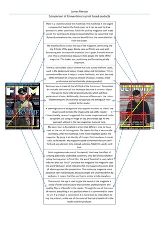
- 1. James Reeson Comparison of Conventions in print based products There is a coverline above the masthead. The masthead is the largest component of text on the front cover, so it can be used to draw attention to other coverlines. Total Film and my magazine both make use of this technique to bring increased attention to a coverline that if placed somewhere else, may not benefit from the same attention from the reader. The masthead runs across the top of the magazine, dominating the top 3 thirds of the page. Blocky sans serif fonts are used with formatting that increases the attention that it grabs from the human eye. This is conventional because it tells people the name of the magazine. This makes size, positioning and formatting vitally important. There is a consistent colour scheme that runs across the front cover, used in the background colour, image colour and font colour. This is conventional because it helps to create familiarity, and also, because of the limitation of a massive amount of colour, creates a more professional and aesthetically pleasing product. Dominant use is made of the left third of the front cover. Convention dictates the utilisation of this technique because it creates a layout that seems more ordered and structured, which aids how professional it looks. Additionally, there are differences in the colour of different parts of coverlines to separate and distinguish their content to the reader. A seemingly neutral background that opposes in colour to that of the image is used to make the image jump out at the reader. Conventionally, research suggested that movie magazines tend to shy away from just using an image on set, and instead opt for the approach utilised in the two magazines featured here. The coverstory is formatted in a font that differs in style to those used on the rest of the magazine. The reason for this is because the coverstory, after the masthead, is the most important part of the magazine. By giving it an identity of its own, the importance is made clear to the reader. My magazine opted to maintain the sans-serif font and use a broken style instead, whereas Total Film used a serif font. Both magazines make use of ‘buzzwords’ that have the effect of enticing potentially undecided customers, who don’t know whether to buy the magazine. In Total Film, the word ‘Essential’ is used, which indicates that you ‘MUST’ purchase this magazine. My magazine uses the word ‘Exclusive’ which indicates that my magazine has some kind of advantage over the competition. This makes my magazine more attractive over rival products, because people will understand that by exclusive, it means that they can’t get a similar article elsewhere. The route of the eye is used to give the layout of the magazine a sense of order and structure that connotes professionalism and quality. This is of benefit to the reader. Through the use of the route of the eye, everything is in a position where it is convenient for them to see. If a product is convenient, it is more likely to entice them to buy the product, so the use of the route of the eye is beneficial to the reader and the producer.