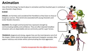
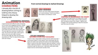
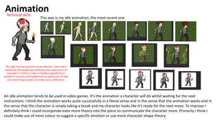
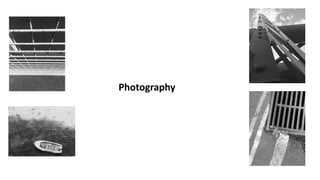
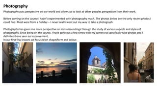
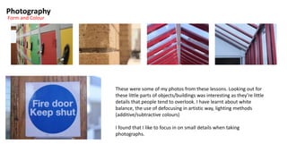
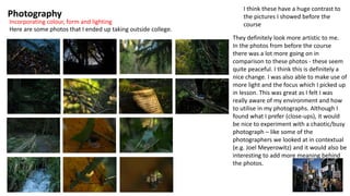
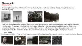
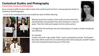
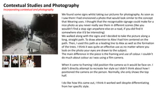
SlideShare a Scribd company logo
Cerys’s Presentation
“Evaluate the contexts that have been impacted on your own creative outputs”
Since coming to UCM I have developed a lot of new skills and
techniques as well as developing my understanding of the media
around me. As a whole this has impacted my creative outputs.
Animation
One of the first things I’ve learnt about in animation and then touched upon in contextual
was character shape theory
In brief:
CIRCLES: are harmless and considered the friendliest as they have no sharp or
dangerous corners. They tend to be associated with young characters and
evoke likeable characters.
SQUARES: the straight and horizontal lines represent strength by
communicating stability and confidence. They are often depicted steadfast
characters who are dependable and are commonly used for super heroes.
TRIANGLES: diagonal and strong, angular lines are the most dynamic out of all
the shapes. Villains tend to be based upon dominant triangular concepts, they
appear malicious and sinister whilst communicating the most aggression.
I tried to incorporate this into different characters.
CHARACTERS
Animation
I already did a tiny bit of
drawing before coming to
UCM but this theory
helped to develop the
drawing style
EARLY DRAWINGS
EARLY DRAWINGS
Looking back through books the change starts to get
noticeable. The first image I tried to make someone
who’s young by using circular shapes. I slightly used
triangles in the second drawing to make the character
seem like more of a villain
From normal drawings to stylised drawings
STARTING TO INCORPORATE THE THEORY
EARLY DRAWINGS
There’s not much shape theory that goes
on in early drawings. I tried to just draw a
face shape as accurately as I could
EXPERIMENTAL DRAWINGS
ACKNOWLEDGING THE THE THEORY
I experimented with different styles of drawing
to try create more engaging characters. Design
aspect are increasingly noticeable. The girl is
rounded to have a younger look. The right
hand sided characters have sharp looking hair.
The very right has a sharp ear to add to this
look. The second to the right I tried to give a
pointy chin to try and make it sharper.
The very left image was after the previously
described and I tried. To make the face sharp
look even sharper.
STYLISED DRAWINGS
NOTHING IS EVER FULLY DEVELOPED
I tried to make a dependable looking character (left-hand side). I
used square shapes in most aspects. Even small details like the
boots are made to be chunky and sturdy to show dependability.
When it comes to the other character It got very stylised, I tried to
make a villainous character. I made the face shape very sharp and
unnatural to get this idea across. I definitely could stylise body
shapes more to communicate my ideas more.
AnimationTechnical skills
Before animation I had no idea how to use adobe animate or photoshop to make my own animations.
In my animation lessons I learn more and more as I progressed and I can definitely see the improvements.
The first few animations
These were done without
looking at existing animations.
Animation
When it came to the next projects in animation we researched into existing animations, I think this was very helpful when
making these animations as it allowed for a sort of example – I had an idea what the outcomes would look like and how the
movement would look.
Research of existing pixel art We were also shown videos of walk cycles, idle animations and
character turn arounds, these showed us examples of these
animations and some of the videos gave us information about how
to go about creating them.
This definitely helped to develop my animation skills,.
Animation
This was is my idle animation, the most recent one.
Technical skills
An idle animation tends to be used in video games. It’s the animation a character will do whilst waiting for the next
instructions. I think the animation works quite successfully in a literal sense and in the sense that the animation works and in
the sense that the character is simply taking a break and my character looks like it’s ready for the next move. To improve I
definitely think I could incorporate even more theory into the piece to communicate the character more. Primarily I think I
could make use of more colour to suggest a specific emotion or use more character shape theory.
The right foot was pointed out as effective, I was told it
looked like the weight was shifting by the subtraction of
one pixel in a frame. It was a mistake originally but it
worked in my favor and heightened my awareness of how
one small thing (a pixel) can make such a difference.
Photography
Photography
Photography puts perspective on our world and allows us to look at other peoples perspective from their work.
Before coming on the course I hadn’t experimented with photography much. The photos below are the only recent photos I
could find. Most were from a holiday – I never really went out my way to take a photograph.
Photography has given me more perspective on my surroundings through the study of various aspects and styles of
photography. Since being on the course, I have gone out a few times with my camera to specifically take photos and I
definitely have seen an improvement.
In our first few lessons we focused on shape/form and colour.
Photography
Form and Colour
These were some of my photos from these lessons. Looking out for
these little parts of objects/buildings was interesting as they’re little
details that people tend to overlook. I have learnt about white
balance, the use of defocusing in artistic way, lighting methods
(additive/subtractive colours)
I found that I like to focus in on small details when taking
photographs.
Photography
Incorporating colour, form and lighting
Here are some photos that I ended up taking outside college.
I think these have a huge contrast to
the pictures I showed before the
course
They definitely look more artistic to me.
In the photos from before the course
there was a lot more going on in
comparison to these photos - these seem
quite peaceful. I think this is definitely a
nice change. I was also able to make use of
more light and the focus which I picked up
in lesson. This was great as I felt I was
really aware of my environment and how
to utilise in my photographs. Although I
found what I prefer (close-ups), it would
be nice to experiment with a chaotic/busy
photograph – like some of the
photographers we looked at in contextual
(e.g. Joel Meyerowitz) and it would also be
interesting to add more meaning behind
the photos.
Photography
Developing Film
Developing film is another skill I have learnt in photography, I tried to take a variety of shots (portrait, landscape and
shots of subjects)
These two photos I wanted to get some depth in the piece like the work of Beate Gütschow. I tried to get face-on images as
I wanted to see if I could get a similar effect. I think it worked well as a first attempt but could be improved. If the areas
where the photos were taken were more desolate and the camera was further away I think it would relate more to her
photographic style. The contrast is also too dark but I could easily change this by altering the filter on the enlarger.
Extra Photos
With these photos I didn’t try to go for a look. I experimented with different angles and framing which made for an interesting collection of photos
Contextual Studies and Photography
Since coming to UCM I’ve been able to look at the world around me from a new perspective thanks to
Contextual and Photography.
Incorporating contextual and photography
In one of our contextual lessons we studied the work of Gillian Wearing.
Wearing would ask members of the public to write what they
wanted people to know/what they were thinking on a piece of
paper. They then held up the paper and she took a picture.
I thought that this technique was very interesting as it’s quite a simple concept yet
very effective
For Example,
A police man with a sign saying “help” is quite a juxtaposed concept. You’d expect
the police officer to be the one to help those who need saving (you wouldn’t expect
they need saving themselves because of their job)
Contextual Studies and Photography
Incorporating contextual and photography
We found some signs whilst taking our pictures for photography. As soon as
I saw them I had envisioned a photo that would look similar to the concept
that Wearing uses. I thought that the recognisable signage could make for a
nice photo as you never really see them in different scenes (like you
wouldn’t find a stop sign anywhere else on a road, if you did find it
somewhere else it’d be interesting)
We walked along with the signs and I decided to take the picture along a
long, straight path. To draw attention to Alex I had him centered on the
path. Then, I used this path as a leading line to Alex as well as the formation
of the trees. I think it was quite an effective use as no matter where you
look on the photo your eyes are drawn to the subject.
The main difference in the piece is the framing and use of colour. I couldn’t
do much about colour as I was using a film camera.
When it came to framing I did position the camera so it would be face-on. I
didn’t directly attempt to recreate her style so I didn’t think about how I
positioned the camera on the person. Normally, she only shows the top
half.
I do like how this came out, I think it worked well despite differentiating
from her specific style.
Thank you for listening!

More Related Content

What's hot (18)

Final proposal
Final proposalFinal proposal
Final proposal
 
Final powerpoint
Final powerpointFinal powerpoint
Final powerpoint
 
Evaluation Activity 1
Evaluation Activity 1Evaluation Activity 1
Evaluation Activity 1
 
On going evaluation to complete
On going evaluation to completeOn going evaluation to complete
On going evaluation to complete
 
Experiments evidence template
Experiments evidence templateExperiments evidence template
Experiments evidence template
 
1. fmp initial plans final
1. fmp initial plans final1. fmp initial plans final
1. fmp initial plans final
 
Photography portfolio original Abi Crooke
Photography portfolio original   Abi CrookePhotography portfolio original   Abi Crooke
Photography portfolio original Abi Crooke
 
Review
ReviewReview
Review
 
Question 2
Question 2Question 2
Question 2
 
Rf final-mag
Rf final-magRf final-mag
Rf final-mag
 
Photography Applications Task 1
Photography Applications Task 1Photography Applications Task 1
Photography Applications Task 1
 
Photos for our_contents_page[1]
Photos for our_contents_page[1]Photos for our_contents_page[1]
Photos for our_contents_page[1]
 
Task 1 work sheet 2 dimitris theocharis (done)
Task 1 work sheet 2 dimitris theocharis (done)Task 1 work sheet 2 dimitris theocharis (done)
Task 1 work sheet 2 dimitris theocharis (done)
 
Digital Ethnography Final
Digital Ethnography FinalDigital Ethnography Final
Digital Ethnography Final
 
Question 1 - Conventions of teen films
Question 1 - Conventions of teen filmsQuestion 1 - Conventions of teen films
Question 1 - Conventions of teen films
 
Photos for our contents page
Photos for our contents pagePhotos for our contents page
Photos for our contents page
 
Photos
PhotosPhotos
Photos
 
Portrait photographers
Portrait photographersPortrait photographers
Portrait photographers
 

Similar to College Presentation - Contextual Parameters Influence (20)

Development pro forma
Development pro formaDevelopment pro forma
Development pro forma
 
Question 4 part_2
Question 4 part_2Question 4 part_2
Question 4 part_2
 
On going evaluations
On going evaluationsOn going evaluations
On going evaluations
 
On going evaluations
On going evaluationsOn going evaluations
On going evaluations
 
Experiments evidence template
Experiments evidence templateExperiments evidence template
Experiments evidence template
 
Experiments evidence template
Experiments evidence templateExperiments evidence template
Experiments evidence template
 
On going evaluations.pptx2.
On going evaluations.pptx2.On going evaluations.pptx2.
On going evaluations.pptx2.
 
Development
DevelopmentDevelopment
Development
 
Task 6!
Task 6!Task 6!
Task 6!
 
Task 6.pptx!!
Task 6.pptx!!Task 6.pptx!!
Task 6.pptx!!
 
Task 6
Task 6Task 6
Task 6
 
Task 6.pptx!!
Task 6.pptx!!Task 6.pptx!!
Task 6.pptx!!
 
Task 6.pptx!!
Task 6.pptx!!Task 6.pptx!!
Task 6.pptx!!
 
Task 6.pptx!!
Task 6.pptx!!Task 6.pptx!!
Task 6.pptx!!
 
Development Pro-Forma Finished
Development Pro-Forma Finished Development Pro-Forma Finished
Development Pro-Forma Finished
 
Evaluation
EvaluationEvaluation
Evaluation
 
Development Pro-Forma finished Hannah Woollaston
Development Pro-Forma finished Hannah WoollastonDevelopment Pro-Forma finished Hannah Woollaston
Development Pro-Forma finished Hannah Woollaston
 
Task 2
Task 2Task 2
Task 2
 
Development Pro-Forma finished
Development Pro-Forma finished Development Pro-Forma finished
Development Pro-Forma finished
 
Development pro forma
Development pro formaDevelopment pro forma
Development pro forma
 

Recently uploaded

一比一原版NYU毕业证纽约大学毕业证成绩单如何办理
一比一原版NYU毕业证纽约大学毕业证成绩单如何办理一比一原版NYU毕业证纽约大学毕业证成绩单如何办理
一比一原版NYU毕业证纽约大学毕业证成绩单如何办理
beduwt
 
Digital/Computer Paintings as a Modern- day Igbo Artists’ vehicle for creatin...
Digital/Computer Paintings as a Modern- day Igbo Artists’ vehicle for creatin...Digital/Computer Paintings as a Modern- day Igbo Artists’ vehicle for creatin...
Digital/Computer Paintings as a Modern- day Igbo Artists’ vehicle for creatin...
ikennaaghanya
 
一比一原版(DU毕业证)迪肯大学毕业证成绩单
一比一原版(DU毕业证)迪肯大学毕业证成绩单一比一原版(DU毕业证)迪肯大学毕业证成绩单
一比一原版(DU毕业证)迪肯大学毕业证成绩单
zvaywau
 
PHOTO PRESENTATION Z.pdf ...............
PHOTO PRESENTATION Z.pdf ...............PHOTO PRESENTATION Z.pdf ...............
PHOTO PRESENTATION Z.pdf ...............
kahnanews24
 
一比一原版(GU毕业证)格里菲斯大学毕业证成绩单
一比一原版(GU毕业证)格里菲斯大学毕业证成绩单一比一原版(GU毕业证)格里菲斯大学毕业证成绩单
一比一原版(GU毕业证)格里菲斯大学毕业证成绩单
zvaywau
 

Recently uploaded (20)

acting board rough title here lolaaaaaaa
acting board rough title here lolaaaaaaaacting board rough title here lolaaaaaaa
acting board rough title here lolaaaaaaa
 
一比一原版NYU毕业证纽约大学毕业证成绩单如何办理
一比一原版NYU毕业证纽约大学毕业证成绩单如何办理一比一原版NYU毕业证纽约大学毕业证成绩单如何办理
一比一原版NYU毕业证纽约大学毕业证成绩单如何办理
 
Copy of Final Presentation example for portfolio .pdf
Copy of Final Presentation example for portfolio .pdfCopy of Final Presentation example for portfolio .pdf
Copy of Final Presentation example for portfolio .pdf
 
Hat in European paintings .ppsx
Hat    in    European    paintings .ppsxHat    in    European    paintings .ppsx
Hat in European paintings .ppsx
 
Presentation slide deck example for portfolio
Presentation slide deck example for portfolioPresentation slide deck example for portfolio
Presentation slide deck example for portfolio
 
Digital/Computer Paintings as a Modern- day Igbo Artists’ vehicle for creatin...
Digital/Computer Paintings as a Modern- day Igbo Artists’ vehicle for creatin...Digital/Computer Paintings as a Modern- day Igbo Artists’ vehicle for creatin...
Digital/Computer Paintings as a Modern- day Igbo Artists’ vehicle for creatin...
 
Tackling Poverty in Nigeria, by growing Art-based SMEs
Tackling Poverty in Nigeria, by growing Art-based SMEsTackling Poverty in Nigeria, by growing Art-based SMEs
Tackling Poverty in Nigeria, by growing Art-based SMEs
 
Sisters_Bond_storyboard.pdf_____________
Sisters_Bond_storyboard.pdf_____________Sisters_Bond_storyboard.pdf_____________
Sisters_Bond_storyboard.pdf_____________
 
Nagpur_❤️Call Girl Starting Price Rs 12K ( 7737669865 ) Free Home and Hotel D...
Nagpur_❤️Call Girl Starting Price Rs 12K ( 7737669865 ) Free Home and Hotel D...Nagpur_❤️Call Girl Starting Price Rs 12K ( 7737669865 ) Free Home and Hotel D...
Nagpur_❤️Call Girl Starting Price Rs 12K ( 7737669865 ) Free Home and Hotel D...
 
一比一原版(DU毕业证)迪肯大学毕业证成绩单
一比一原版(DU毕业证)迪肯大学毕业证成绩单一比一原版(DU毕业证)迪肯大学毕业证成绩单
一比一原版(DU毕业证)迪肯大学毕业证成绩单
 
The Legacy of Breton In A New Age by Master Terrance Lindall
The Legacy of Breton In A New Age by Master Terrance LindallThe Legacy of Breton In A New Age by Master Terrance Lindall
The Legacy of Breton In A New Age by Master Terrance Lindall
 
LPU infrastructure.pdf uniinfrastructure
LPU infrastructure.pdf uniinfrastructureLPU infrastructure.pdf uniinfrastructure
LPU infrastructure.pdf uniinfrastructure
 
indian folk dances and their significance
indian folk dances and their significanceindian folk dances and their significance
indian folk dances and their significance
 
Sundabet | Slot gacor dan terpercaya mudah menang
Sundabet | Slot gacor dan terpercaya mudah menangSundabet | Slot gacor dan terpercaya mudah menang
Sundabet | Slot gacor dan terpercaya mudah menang
 
PHOTO PRESENTATION Z.pdf ...............
PHOTO PRESENTATION Z.pdf ...............PHOTO PRESENTATION Z.pdf ...............
PHOTO PRESENTATION Z.pdf ...............
 
一比一原版(GU毕业证)格里菲斯大学毕业证成绩单
一比一原版(GU毕业证)格里菲斯大学毕业证成绩单一比一原版(GU毕业证)格里菲斯大学毕业证成绩单
一比一原版(GU毕业证)格里菲斯大学毕业证成绩单
 
European Cybersecurity Skills Framework Role Profiles.pdf
European Cybersecurity Skills Framework Role Profiles.pdfEuropean Cybersecurity Skills Framework Role Profiles.pdf
European Cybersecurity Skills Framework Role Profiles.pdf
 
2137ad - Characters that live in Merindol and are at the center of main stories
2137ad - Characters that live in Merindol and are at the center of main stories2137ad - Characters that live in Merindol and are at the center of main stories
2137ad - Characters that live in Merindol and are at the center of main stories
 
CLASS XII- HISTORY-THEME 4-Thinkers, Bes
CLASS XII- HISTORY-THEME 4-Thinkers, BesCLASS XII- HISTORY-THEME 4-Thinkers, Bes
CLASS XII- HISTORY-THEME 4-Thinkers, Bes
 
Family Group Pottery Sessions in Abu Dhabi
Family Group Pottery Sessions in Abu DhabiFamily Group Pottery Sessions in Abu Dhabi
Family Group Pottery Sessions in Abu Dhabi
 

College Presentation - Contextual Parameters Influence

  • 1. Cerys’s Presentation “Evaluate the contexts that have been impacted on your own creative outputs”
  • 2. Since coming to UCM I have developed a lot of new skills and techniques as well as developing my understanding of the media around me. As a whole this has impacted my creative outputs.
  • 3. Animation One of the first things I’ve learnt about in animation and then touched upon in contextual was character shape theory In brief: CIRCLES: are harmless and considered the friendliest as they have no sharp or dangerous corners. They tend to be associated with young characters and evoke likeable characters. SQUARES: the straight and horizontal lines represent strength by communicating stability and confidence. They are often depicted steadfast characters who are dependable and are commonly used for super heroes. TRIANGLES: diagonal and strong, angular lines are the most dynamic out of all the shapes. Villains tend to be based upon dominant triangular concepts, they appear malicious and sinister whilst communicating the most aggression. I tried to incorporate this into different characters.
  • 4. CHARACTERS Animation I already did a tiny bit of drawing before coming to UCM but this theory helped to develop the drawing style EARLY DRAWINGS EARLY DRAWINGS Looking back through books the change starts to get noticeable. The first image I tried to make someone who’s young by using circular shapes. I slightly used triangles in the second drawing to make the character seem like more of a villain From normal drawings to stylised drawings STARTING TO INCORPORATE THE THEORY EARLY DRAWINGS There’s not much shape theory that goes on in early drawings. I tried to just draw a face shape as accurately as I could EXPERIMENTAL DRAWINGS ACKNOWLEDGING THE THE THEORY I experimented with different styles of drawing to try create more engaging characters. Design aspect are increasingly noticeable. The girl is rounded to have a younger look. The right hand sided characters have sharp looking hair. The very right has a sharp ear to add to this look. The second to the right I tried to give a pointy chin to try and make it sharper. The very left image was after the previously described and I tried. To make the face sharp look even sharper. STYLISED DRAWINGS NOTHING IS EVER FULLY DEVELOPED I tried to make a dependable looking character (left-hand side). I used square shapes in most aspects. Even small details like the boots are made to be chunky and sturdy to show dependability. When it comes to the other character It got very stylised, I tried to make a villainous character. I made the face shape very sharp and unnatural to get this idea across. I definitely could stylise body shapes more to communicate my ideas more.
  • 5. AnimationTechnical skills Before animation I had no idea how to use adobe animate or photoshop to make my own animations. In my animation lessons I learn more and more as I progressed and I can definitely see the improvements. The first few animations These were done without looking at existing animations.
  • 6. Animation When it came to the next projects in animation we researched into existing animations, I think this was very helpful when making these animations as it allowed for a sort of example – I had an idea what the outcomes would look like and how the movement would look. Research of existing pixel art We were also shown videos of walk cycles, idle animations and character turn arounds, these showed us examples of these animations and some of the videos gave us information about how to go about creating them. This definitely helped to develop my animation skills,.
  • 7. Animation This was is my idle animation, the most recent one. Technical skills An idle animation tends to be used in video games. It’s the animation a character will do whilst waiting for the next instructions. I think the animation works quite successfully in a literal sense and in the sense that the animation works and in the sense that the character is simply taking a break and my character looks like it’s ready for the next move. To improve I definitely think I could incorporate even more theory into the piece to communicate the character more. Primarily I think I could make use of more colour to suggest a specific emotion or use more character shape theory. The right foot was pointed out as effective, I was told it looked like the weight was shifting by the subtraction of one pixel in a frame. It was a mistake originally but it worked in my favor and heightened my awareness of how one small thing (a pixel) can make such a difference.
  • 9. Photography Photography puts perspective on our world and allows us to look at other peoples perspective from their work. Before coming on the course I hadn’t experimented with photography much. The photos below are the only recent photos I could find. Most were from a holiday – I never really went out my way to take a photograph. Photography has given me more perspective on my surroundings through the study of various aspects and styles of photography. Since being on the course, I have gone out a few times with my camera to specifically take photos and I definitely have seen an improvement. In our first few lessons we focused on shape/form and colour.
  • 10. Photography Form and Colour These were some of my photos from these lessons. Looking out for these little parts of objects/buildings was interesting as they’re little details that people tend to overlook. I have learnt about white balance, the use of defocusing in artistic way, lighting methods (additive/subtractive colours) I found that I like to focus in on small details when taking photographs.
  • 11. Photography Incorporating colour, form and lighting Here are some photos that I ended up taking outside college. I think these have a huge contrast to the pictures I showed before the course They definitely look more artistic to me. In the photos from before the course there was a lot more going on in comparison to these photos - these seem quite peaceful. I think this is definitely a nice change. I was also able to make use of more light and the focus which I picked up in lesson. This was great as I felt I was really aware of my environment and how to utilise in my photographs. Although I found what I prefer (close-ups), it would be nice to experiment with a chaotic/busy photograph – like some of the photographers we looked at in contextual (e.g. Joel Meyerowitz) and it would also be interesting to add more meaning behind the photos.
  • 12. Photography Developing Film Developing film is another skill I have learnt in photography, I tried to take a variety of shots (portrait, landscape and shots of subjects) These two photos I wanted to get some depth in the piece like the work of Beate Gütschow. I tried to get face-on images as I wanted to see if I could get a similar effect. I think it worked well as a first attempt but could be improved. If the areas where the photos were taken were more desolate and the camera was further away I think it would relate more to her photographic style. The contrast is also too dark but I could easily change this by altering the filter on the enlarger. Extra Photos With these photos I didn’t try to go for a look. I experimented with different angles and framing which made for an interesting collection of photos
  • 13. Contextual Studies and Photography Since coming to UCM I’ve been able to look at the world around me from a new perspective thanks to Contextual and Photography. Incorporating contextual and photography In one of our contextual lessons we studied the work of Gillian Wearing. Wearing would ask members of the public to write what they wanted people to know/what they were thinking on a piece of paper. They then held up the paper and she took a picture. I thought that this technique was very interesting as it’s quite a simple concept yet very effective For Example, A police man with a sign saying “help” is quite a juxtaposed concept. You’d expect the police officer to be the one to help those who need saving (you wouldn’t expect they need saving themselves because of their job)
  • 14. Contextual Studies and Photography Incorporating contextual and photography We found some signs whilst taking our pictures for photography. As soon as I saw them I had envisioned a photo that would look similar to the concept that Wearing uses. I thought that the recognisable signage could make for a nice photo as you never really see them in different scenes (like you wouldn’t find a stop sign anywhere else on a road, if you did find it somewhere else it’d be interesting) We walked along with the signs and I decided to take the picture along a long, straight path. To draw attention to Alex I had him centered on the path. Then, I used this path as a leading line to Alex as well as the formation of the trees. I think it was quite an effective use as no matter where you look on the photo your eyes are drawn to the subject. The main difference in the piece is the framing and use of colour. I couldn’t do much about colour as I was using a film camera. When it came to framing I did position the camera so it would be face-on. I didn’t directly attempt to recreate her style so I didn’t think about how I positioned the camera on the person. Normally, she only shows the top half. I do like how this came out, I think it worked well despite differentiating from her specific style.
  • 15. Thank you for listening!