Download to read offline
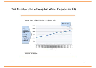
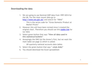
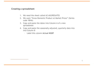
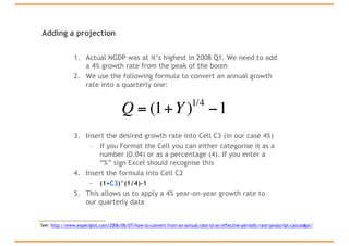
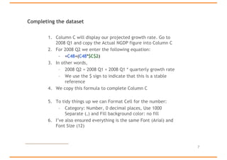
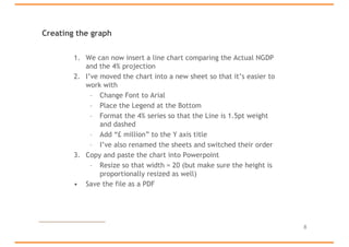
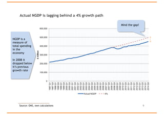
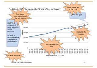

This document provides instructions for collecting and presenting data using Excel and PowerPoint. It guides the reader through downloading GDP data from a government website, cleaning and projecting the data in Excel, and creating a line chart comparing actual GDP to a 4% projected growth rate. The chart is then copied into a PowerPoint presentation. Key steps include downloading GDP tables from the ONS website, adding a column in Excel to project GDP growth at 4% annually, and formatting the line chart in PowerPoint to clearly show actual GDP lagging the projected growth path with a message highlighting this gap.


![7.__Developing_a_Research_Proposal[1].pptx](https://cdn.slidesharecdn.com/ss_thumbnails/7-260131073037-df92dd7d-thumbnail.jpg?width=640&height=640&fit=bounds)


![Hacking-Uncovered-How-People-Get-Hacked-and-How-to-Stay-Safe[1].pptx](https://cdn.slidesharecdn.com/ss_thumbnails/hacking-uncovered-how-people-get-hacked-and-how-to-stay-safe1-260130170011-4883a9c7-thumbnail.jpg?width=640&height=640&fit=bounds)


