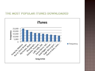
Kimberly Singh
      &
Lianne Ashton
 We  choose this graph because it shows a side
  by side data comparison to individual
  information.
 It shows the amount of occurrence for each
  data set for better understanding.
 This data was about the frequency of the
  songs by artists that were downloaded on
  iTunes.
 We  choose this line graph because it shows
  the changes in the amounts of people who
  attended over a period of time.
 A line graph is used to plot data changes over
  time.
 The data shows the number of people
  attending the X-games over the period of
  1995-2001, which showed a positive
  correlation through 1995-1998, but a
  negative correlation through 1998 to 2001
 We  choose this pie chart because it compares
  how many weeks the songs were at #1 out of
  a whole.
 A pie chat shows a percentage out of 100%. It
  compares values on a percentage scaling
  system.
 The data shows how long people stayed at #1
  and who stayed the longest.
 We  choose this graph because it shows the
  side by side comparison of each data value.
 A bar graph shows amounts or the number of
  times a value occurs and organized it in a
  way that makes it easier to compare data.
 This data shows how much data each comic
  book made over 2006.

Choosing the right graph~

  • 1.
    Kimberly Singh & Lianne Ashton
  • 3.
     We choose this graph because it shows a side by side data comparison to individual information.  It shows the amount of occurrence for each data set for better understanding.  This data was about the frequency of the songs by artists that were downloaded on iTunes.
  • 5.
     We choose this line graph because it shows the changes in the amounts of people who attended over a period of time.  A line graph is used to plot data changes over time.  The data shows the number of people attending the X-games over the period of 1995-2001, which showed a positive correlation through 1995-1998, but a negative correlation through 1998 to 2001
  • 7.
     We choose this pie chart because it compares how many weeks the songs were at #1 out of a whole.  A pie chat shows a percentage out of 100%. It compares values on a percentage scaling system.  The data shows how long people stayed at #1 and who stayed the longest.
  • 9.
     We choose this graph because it shows the side by side comparison of each data value.  A bar graph shows amounts or the number of times a value occurs and organized it in a way that makes it easier to compare data.  This data shows how much data each comic book made over 2006.