Changes for poster final
•Download as DOCX, PDF•
0 likes•197 views
The document describes changes made to a poster. The first change was brightening the color of the word "HOME" in "HOMESICK" as it was too dim. Next, the logos at the bottom were moved further down so the title and text took up less space and the image could be the main focus. Finally, the release date was added back in to follow magazine conventions and include all needed information for the audience.
Report
Share
Report
Share
Recommended
Front cover development
This document summarizes the development process of a magazine front cover design created by Rob Phillips. It describes several iterations where different design elements were added, moved, or modified, such as adding a selling line, pull quote, button, article title, band names, and poster previews with colored backgrounds or glowing effects. The final changes involved moving elements like the main image and teaser text to improve spacing and make the design look more professional overall.
Q7
The document compares the masthead, photos, and cover lines between the student's preliminary school magazine project and their final magazine project. For the final project, the student used a darker, bolder masthead font that better reflected the 1980s rock theme. They also used more focused photos of band equipment and logos that conveyed the theme rather than photos of students. The cover lines and sell lines for the final project also directly summarized the magazine's content about music and bands of the 1980s rather than using the school's generic slogan. Overall, the document outlines many improvements made in the design elements, color scheme, and layout between the two projects to better engage the target audience.
Advert analysis
The document analyzes an advertisement for Nike trainers. It summarizes that the bold, large text and sans serif font in the title grabs attention and promotes the product. The clear image from multiple angles clearly shows the shoe and logo. The logo and slogan are placed at the bottom so they leave a lasting impression. Additional details are provided in a less prominent gray text.
3rd Submission of Final Product
This document summarizes changes made to a final product submission, including making the front cover simpler with less text in a more professional layout, lightening the background of the contents page to make elements stand out more while adding subtle gradients, and lightening the background of the double page spread to make text easier to read while reducing clutter by removing some text and adding new visual elements like a larger mask shot and quote.
How I made my horror film magazine cover and poster
Firstly, I opened Adobe Photoshop and uploaded my chosen image for the horror film poster. I darkened the edges and added a green mood layer to make the image more dramatic. Then I added the film title, release date, and tagline in red to stand out. Finally, I added drop shadows to make the text stand out from the image.
For the horror film magazine cover, I opened Photoshop and added an image of a girl holding a knife, enhancing it with effects. I then added identifying information and cover lines in consistent fonts and colors. Finally, I gave all text drop shadows to make it stand out on the page.
Evaluation
The document discusses the finished recipe cards and how they reflect the initial plans and brief. It notes that the plans were largely followed, with only minor changes such as experimenting with different image layouts on the back of the cards. It also addresses how the finished products match the requirements in the brief, such as including preparation and cooking times, formatting the ingredients and method clearly, and having a cohesive theme of afternoon tea across all the cards. Peer feedback helped in the production process by providing input on design elements like the image presentation.
Evaluation
The student created recipe cards targeting older audiences. They conducted research which found older people prefer simple, sophisticated designs. The cards have a white background for ease of reading, and feature a large main image and additional close-up shots to make the design more creative. Text is in a single column divided into paragraphs. Images on the back continue the theme while changing opacity levels. The design reflects the target audience and theme of afternoon tea.
Front cover
The masthead is prominently displayed in a large, unique font and contrasts with the background to make it easily noticeable. The main image features a popular actor, Leonardo DiCaprio, holding a gun to depict the film genre, and he partially covers the masthead to show this is a well-known magazine. Additional text uses bright colors and fonts to highlight important stories, film titles, and an exclusive offer to incentivize readers to purchase the magazine.
Changes for poster final
The document describes changes made to a poster. The first change was brightening the color of the word "HOME" in "HOMESICK" as it was too faint. Next, the logos at the bottom were moved further down so the title and text took up less space and the image could be the main focus. Finally, the release date was added back in to follow magazine conventions and include all needed information for the audience.
Evaluation question 3
The feedback Leah received helped improve her film marketing materials. Initial feedback on her storyline led her to make changes that improved the plot. Feedback on mock-ups and drafts allowed her to refine elements like layout, colors and images. Overall, feedback indicated her magazine, poster and trailer successfully fit the thriller/mystery genre and worked well together to advertise the film. However, some suggested smaller text sizes could further enhance the materials.
Feedback for mock ups
The document provides feedback on mock ups for a poster and magazine for a film. The feedback indicates that the layout of the poster and magazine fit common conventions and will be familiar and appealing to audiences. Additional elements added to the magazine, like flash pages, were praised for drawing readers in further. The selected shots for the image on the materials were said to clearly convey the film's genre. Finally, the color scheme of red, black and white was noted to be an effective pairing.
Publisher for magazine
The document discusses choosing a publisher for a new film magazine called "Screening". It considers several major magazine publishers - IPC, Emap, and Bauer. Ultimately, Bauer is chosen as the publisher because they already own the successful film magazine "Empire" and have experience targeting the desired film audience. While "Empire" covers all films, "Screening" would focus specifically on thriller and mystery genres, allowing it to appeal to a similar but slightly narrower audience. Bauer's existing experience and audience in the film magazine space makes them the best choice to successfully launch and distribute "Screening".
How did we change our trailer from how we originally planned
We made a few changes to our trailer from the original plan. We took some shots out and replaced them with others that we thought would look better after starting to film. We kept the beginning part of our planning the same as we had thoroughly thought it through and knew it would be effective. We decided not to include giving the animal's heart that was linked to Snow White, and instead just showed the package with it inside to save that for the actual film. Other than that, we kept everything as originally planned and were able to easily film and add a few shots while expanding on our original storyboard, which helped guide the trailer production.
Shooting scedule
Georgia moves out of her family home for the first time to celebrate her 18th birthday. She receives a nasty text from her ex-boyfriend Mark. Over the next year, Mark manipulates and isolates Georgia from her family. He convinces her to help him kidnap her sister Steph in order to get revenge on her family for breaking up with him. Georgia and Mark send threatening messages and packages to Steph's family. Eventually, Georgia realizes the harm she has caused and seeks help from her family.
Print screens for poster how we made it
The document describes the process of making a film poster. First, the title of the film was added in two colors to emphasize the word "HOME" as it foreshadows the main character leaving home. Then the blurred first names of the three main actors were added above the title to give it a mysterious feel. Logos and symbols were added to the bottom to make the poster look realistic. Small print with credits was also added. The main image from the film was then included and adjusted for brightness and contrast to suit the genre. A brief header describing the film was added at the top. Finally, the release date of the film was added in large text in the middle of the small print.
Changes from mock ups
The document compares the original mockups for a film poster and magazine to the final products. For the magazine: the layout and key elements like the main actor's close-up photo were kept the same, but some minor changes were made to positioning of elements based on research of other magazines. For the poster: nearly all elements were kept the same as the mockups based on research done, with only the main image being changed from a medium shot to a close-up. Both the final magazine and poster largely kept to conventions for those mediums seen in research.
What changed from when we first planned our film poster and magazine
For their film magazine and poster, the document discusses what elements were kept the same from initial mockups and what was changed based on further research and planning.
The magazine layout kept the main actor's close-up image and text along the sides as in the mockups. The footer and key information were also kept the same. Some elements like the flash and date/price placement were moved based on researching other magazines. Additional context text was added under the masthead.
The poster largely kept the same elements as the mockups - title at the bottom, actors' names above, small print at the bottom, and release date. The main image was changed from a medium/long shot to a close-up to
What changed from when we first planned our film poster and magazine
For the film poster, they kept most aspects the same as the original mockups, including showing the main actor's face close up to convey emotion, having the actor names above the film title as is conventional, and including the release date and small print at the bottom. The only change was using a closer shot of the actor's face rather than a medium shot to focus on her emotions.
For the magazine, they kept many planned elements the same like the footer describing extra content and layout with text along the sides. Some tweaks included repositioning the flash and date/price based on research of other magazines. Additional text was also added under the masthead to describe the magazine's content.
What changed from when we first planned our film poster and magazine
For the film poster, they kept most aspects the same as the original mockups, including showing the main actor's face close up to convey emotion, having the actor names above the film title as is conventional, and including the release date and small print at the bottom. The only change was using a closer shot of the actor's face rather than a medium shot to focus on her emotion, which is key to the film.
For the magazine, they kept many planned elements the same like the footer describing extra content and layout with text along the sides. Some tweaks included changing the flash location and text content based on research. They also added a text description under the masthead for context.
Overall, minor adjustments
Print scrreens for how we made trailer
The document summarizes the steps taken to create a film trailer using Adobe Premiere. First, video clips were filmed and imported into Premiere for editing. Scenes were selected and arranged in the desired sequence. Text was added using title tools to introduce scene changes and provide credits. Transitions between clips were added using dip to black effects. Sound and music were layered, fading the music in and out and lowering it during dialogue portions. The finished trailer was exported and uploaded to YouTube.
Transcript
The document appears to be a transcript for a film titled "Homesick". It provides intertitles that establish the main character Laura Ward had a caring community and exciting future until change came with new surroundings and one man who manipulated her. This manipulation had several consequences and seemingly devastating endings for Laura Ward and others, making up the thriller of the year from the director of "The Reality Run".
Film trailer problems
The filmmakers encountered several problems when creating their trailer, including difficulties filming on schedule, crashes when using the new editing software, correctly adding and removing audio, and properly placing intertitles. Through perseverance and help from others, they were able to overcome these challenges, learn to use the software, and complete an effective trailer.
changes to mag
The document summarizes changes made to a final film magazine based on feedback. The size of the website and some other elements were increased to make past issues and details more visible to audiences. The size of the main headline was adjusted to not cover the main image and appear clearer. Finally, the color of text below the magazine title was altered so it did not all look the same at the top and brought more attention to the main image.
Changes to poster and mag
We made changes to our film poster based on feedback. The original poster did not clearly convey the plot or tone of the film. After receiving comments, we redesigned the poster to more plainly show what the movie is about and to capture the feeling of the story in a way that will attract audiences.
Print screens for magazine......................................
The document describes the process of designing a film magazine mockup. First, an image was chosen and placed on a black background to set the mystery/thriller genre. Boxes and additional photos from other films were added to showcase multiple movies. A barcode, footer with other film titles, and large main film title were incorporated to resemble a real magazine. Straps with consistent colors were put down the sides. The magazine title is in red font to stand out, along with the website, date, and price. Lines separate the straps to make the text readable. More straps were added to fill space and provide information. A circular shape was included to highlight a competition and entice readers to learn more inside.
Analysis of trailers
The three trailers for Oblivion, Iron Man 3, and After Earth are all action adventure genre based on their depictions of weapons, violence, and tense music. Both the male and female characters are represented similarly across the trailers, with males portrayed as dominant and using violence while women are shown as companions or assistants. Special effects play a major role in the trailers, conforming to the action adventure genre by enhancing things not otherwise possible for audience enjoyment.
Shot plan
This document contains a shot list for a film with 56 shots. It details the action, props needed, and actors for each shot. Many of the shots are of characters Georgia, Steph, and Mark and involve them at a party, Georgia moving into a new flat, Mark screaming at Georgia and pretending to be nice, Steph being attacked at a bus stop, Georgia's parents receiving a disturbing package, Georgia screaming and looking sad while holding a lighter, and two black screens with text titles. The shot list follows the scenes and interactions between the three main characters.
Final equipment for blog
This document outlines the digital equipment needed for a film project, including a video camera, digital camera, microphone, tripod, and lighting. It explains that the video camera will be used to film all shots, while the microphone will capture dialogue. A tripod will stabilize shots from a distance or during panning shots. Lights will provide dramatic or supplemental lighting for effects in video and still photos. A digital camera will take portraits, action shots, and location photos for marketing materials.
What is Digital Literacy? A guest blog from Andy McLaughlin, University of Ab...
What is Digital Literacy? A guest blog from Andy McLaughlin, University of Aberdeen
More Related Content
More from leahwatts
Changes for poster final
The document describes changes made to a poster. The first change was brightening the color of the word "HOME" in "HOMESICK" as it was too faint. Next, the logos at the bottom were moved further down so the title and text took up less space and the image could be the main focus. Finally, the release date was added back in to follow magazine conventions and include all needed information for the audience.
Evaluation question 3
The feedback Leah received helped improve her film marketing materials. Initial feedback on her storyline led her to make changes that improved the plot. Feedback on mock-ups and drafts allowed her to refine elements like layout, colors and images. Overall, feedback indicated her magazine, poster and trailer successfully fit the thriller/mystery genre and worked well together to advertise the film. However, some suggested smaller text sizes could further enhance the materials.
Feedback for mock ups
The document provides feedback on mock ups for a poster and magazine for a film. The feedback indicates that the layout of the poster and magazine fit common conventions and will be familiar and appealing to audiences. Additional elements added to the magazine, like flash pages, were praised for drawing readers in further. The selected shots for the image on the materials were said to clearly convey the film's genre. Finally, the color scheme of red, black and white was noted to be an effective pairing.
Publisher for magazine
The document discusses choosing a publisher for a new film magazine called "Screening". It considers several major magazine publishers - IPC, Emap, and Bauer. Ultimately, Bauer is chosen as the publisher because they already own the successful film magazine "Empire" and have experience targeting the desired film audience. While "Empire" covers all films, "Screening" would focus specifically on thriller and mystery genres, allowing it to appeal to a similar but slightly narrower audience. Bauer's existing experience and audience in the film magazine space makes them the best choice to successfully launch and distribute "Screening".
How did we change our trailer from how we originally planned
We made a few changes to our trailer from the original plan. We took some shots out and replaced them with others that we thought would look better after starting to film. We kept the beginning part of our planning the same as we had thoroughly thought it through and knew it would be effective. We decided not to include giving the animal's heart that was linked to Snow White, and instead just showed the package with it inside to save that for the actual film. Other than that, we kept everything as originally planned and were able to easily film and add a few shots while expanding on our original storyboard, which helped guide the trailer production.
Shooting scedule
Georgia moves out of her family home for the first time to celebrate her 18th birthday. She receives a nasty text from her ex-boyfriend Mark. Over the next year, Mark manipulates and isolates Georgia from her family. He convinces her to help him kidnap her sister Steph in order to get revenge on her family for breaking up with him. Georgia and Mark send threatening messages and packages to Steph's family. Eventually, Georgia realizes the harm she has caused and seeks help from her family.
Print screens for poster how we made it
The document describes the process of making a film poster. First, the title of the film was added in two colors to emphasize the word "HOME" as it foreshadows the main character leaving home. Then the blurred first names of the three main actors were added above the title to give it a mysterious feel. Logos and symbols were added to the bottom to make the poster look realistic. Small print with credits was also added. The main image from the film was then included and adjusted for brightness and contrast to suit the genre. A brief header describing the film was added at the top. Finally, the release date of the film was added in large text in the middle of the small print.
Changes from mock ups
The document compares the original mockups for a film poster and magazine to the final products. For the magazine: the layout and key elements like the main actor's close-up photo were kept the same, but some minor changes were made to positioning of elements based on research of other magazines. For the poster: nearly all elements were kept the same as the mockups based on research done, with only the main image being changed from a medium shot to a close-up. Both the final magazine and poster largely kept to conventions for those mediums seen in research.
What changed from when we first planned our film poster and magazine
For their film magazine and poster, the document discusses what elements were kept the same from initial mockups and what was changed based on further research and planning.
The magazine layout kept the main actor's close-up image and text along the sides as in the mockups. The footer and key information were also kept the same. Some elements like the flash and date/price placement were moved based on researching other magazines. Additional context text was added under the masthead.
The poster largely kept the same elements as the mockups - title at the bottom, actors' names above, small print at the bottom, and release date. The main image was changed from a medium/long shot to a close-up to
What changed from when we first planned our film poster and magazine
For the film poster, they kept most aspects the same as the original mockups, including showing the main actor's face close up to convey emotion, having the actor names above the film title as is conventional, and including the release date and small print at the bottom. The only change was using a closer shot of the actor's face rather than a medium shot to focus on her emotions.
For the magazine, they kept many planned elements the same like the footer describing extra content and layout with text along the sides. Some tweaks included repositioning the flash and date/price based on research of other magazines. Additional text was also added under the masthead to describe the magazine's content.
What changed from when we first planned our film poster and magazine
For the film poster, they kept most aspects the same as the original mockups, including showing the main actor's face close up to convey emotion, having the actor names above the film title as is conventional, and including the release date and small print at the bottom. The only change was using a closer shot of the actor's face rather than a medium shot to focus on her emotion, which is key to the film.
For the magazine, they kept many planned elements the same like the footer describing extra content and layout with text along the sides. Some tweaks included changing the flash location and text content based on research. They also added a text description under the masthead for context.
Overall, minor adjustments
Print scrreens for how we made trailer
The document summarizes the steps taken to create a film trailer using Adobe Premiere. First, video clips were filmed and imported into Premiere for editing. Scenes were selected and arranged in the desired sequence. Text was added using title tools to introduce scene changes and provide credits. Transitions between clips were added using dip to black effects. Sound and music were layered, fading the music in and out and lowering it during dialogue portions. The finished trailer was exported and uploaded to YouTube.
Transcript
The document appears to be a transcript for a film titled "Homesick". It provides intertitles that establish the main character Laura Ward had a caring community and exciting future until change came with new surroundings and one man who manipulated her. This manipulation had several consequences and seemingly devastating endings for Laura Ward and others, making up the thriller of the year from the director of "The Reality Run".
Film trailer problems
The filmmakers encountered several problems when creating their trailer, including difficulties filming on schedule, crashes when using the new editing software, correctly adding and removing audio, and properly placing intertitles. Through perseverance and help from others, they were able to overcome these challenges, learn to use the software, and complete an effective trailer.
changes to mag
The document summarizes changes made to a final film magazine based on feedback. The size of the website and some other elements were increased to make past issues and details more visible to audiences. The size of the main headline was adjusted to not cover the main image and appear clearer. Finally, the color of text below the magazine title was altered so it did not all look the same at the top and brought more attention to the main image.
Changes to poster and mag
We made changes to our film poster based on feedback. The original poster did not clearly convey the plot or tone of the film. After receiving comments, we redesigned the poster to more plainly show what the movie is about and to capture the feeling of the story in a way that will attract audiences.
Print screens for magazine......................................
The document describes the process of designing a film magazine mockup. First, an image was chosen and placed on a black background to set the mystery/thriller genre. Boxes and additional photos from other films were added to showcase multiple movies. A barcode, footer with other film titles, and large main film title were incorporated to resemble a real magazine. Straps with consistent colors were put down the sides. The magazine title is in red font to stand out, along with the website, date, and price. Lines separate the straps to make the text readable. More straps were added to fill space and provide information. A circular shape was included to highlight a competition and entice readers to learn more inside.
Analysis of trailers
The three trailers for Oblivion, Iron Man 3, and After Earth are all action adventure genre based on their depictions of weapons, violence, and tense music. Both the male and female characters are represented similarly across the trailers, with males portrayed as dominant and using violence while women are shown as companions or assistants. Special effects play a major role in the trailers, conforming to the action adventure genre by enhancing things not otherwise possible for audience enjoyment.
Shot plan
This document contains a shot list for a film with 56 shots. It details the action, props needed, and actors for each shot. Many of the shots are of characters Georgia, Steph, and Mark and involve them at a party, Georgia moving into a new flat, Mark screaming at Georgia and pretending to be nice, Steph being attacked at a bus stop, Georgia's parents receiving a disturbing package, Georgia screaming and looking sad while holding a lighter, and two black screens with text titles. The shot list follows the scenes and interactions between the three main characters.
Final equipment for blog
This document outlines the digital equipment needed for a film project, including a video camera, digital camera, microphone, tripod, and lighting. It explains that the video camera will be used to film all shots, while the microphone will capture dialogue. A tripod will stabilize shots from a distance or during panning shots. Lights will provide dramatic or supplemental lighting for effects in video and still photos. A digital camera will take portraits, action shots, and location photos for marketing materials.
More from leahwatts (20)
How did we change our trailer from how we originally planned
How did we change our trailer from how we originally planned
What changed from when we first planned our film poster and magazine
What changed from when we first planned our film poster and magazine
What changed from when we first planned our film poster and magazine
What changed from when we first planned our film poster and magazine
What changed from when we first planned our film poster and magazine
What changed from when we first planned our film poster and magazine
Print screens for magazine......................................
Print screens for magazine......................................
Recently uploaded
What is Digital Literacy? A guest blog from Andy McLaughlin, University of Ab...
What is Digital Literacy? A guest blog from Andy McLaughlin, University of Aberdeen
Chapter 4 - Islamic Financial Institutions in Malaysia.pptx
Chapter 4 - Islamic Financial Institutions in Malaysia.pptxMohd Adib Abd Muin, Senior Lecturer at Universiti Utara Malaysia
This slide is special for master students (MIBS & MIFB) in UUM. Also useful for readers who are interested in the topic of contemporary Islamic banking.
Natural birth techniques - Mrs.Akanksha Trivedi Rama University
Natural birth techniques - Mrs.Akanksha Trivedi Rama UniversityAkanksha trivedi rama nursing college kanpur.
Natural birth techniques are various type such as/ water birth , alexender method, hypnosis, bradley method, lamaze method etcDRUGS AND ITS classification slide share
Any substance (other than food) that is used to prevent, diagnose, treat, or relieve symptoms of a
disease or abnormal condition
Exploiting Artificial Intelligence for Empowering Researchers and Faculty, In...
Exploiting Artificial Intelligence for Empowering Researchers and Faculty, In...Dr. Vinod Kumar Kanvaria
Exploiting Artificial Intelligence for Empowering Researchers and Faculty,
International FDP on Fundamentals of Research in Social Sciences
at Integral University, Lucknow, 06.06.2024
By Dr. Vinod Kumar KanvariaPengantar Penggunaan Flutter - Dart programming language1.pptx
Pengantar Penggunaan Flutter - Dart programming language1.pptx
Digital Artifact 1 - 10VCD Environments Unit
Digital Artifact 1 - 10VCD Environments Unit - NGV Pavilion Concept Design
How to Build a Module in Odoo 17 Using the Scaffold Method
Odoo provides an option for creating a module by using a single line command. By using this command the user can make a whole structure of a module. It is very easy for a beginner to make a module. There is no need to make each file manually. This slide will show how to create a module using the scaffold method.
Main Java[All of the Base Concepts}.docx
This is part 1 of my Java Learning Journey. This Contains Custom methods, classes, constructors, packages, multithreading , try- catch block, finally block and more.
How to Add Chatter in the odoo 17 ERP Module
In Odoo, the chatter is like a chat tool that helps you work together on records. You can leave notes and track things, making it easier to talk with your team and partners. Inside chatter, all communication history, activity, and changes will be displayed.
How to Fix the Import Error in the Odoo 17
An import error occurs when a program fails to import a module or library, disrupting its execution. In languages like Python, this issue arises when the specified module cannot be found or accessed, hindering the program's functionality. Resolving import errors is crucial for maintaining smooth software operation and uninterrupted development processes.
BÀI TẬP BỔ TRỢ TIẾNG ANH 8 CẢ NĂM - GLOBAL SUCCESS - NĂM HỌC 2023-2024 (CÓ FI...
BÀI TẬP BỔ TRỢ TIẾNG ANH 8 CẢ NĂM - GLOBAL SUCCESS - NĂM HỌC 2023-2024 (CÓ FI...Nguyen Thanh Tu Collection
https://app.box.com/s/y977uz6bpd3af4qsebv7r9b7s21935vdThe simplified electron and muon model, Oscillating Spacetime: The Foundation...
Discover the Simplified Electron and Muon Model: A New Wave-Based Approach to Understanding Particles delves into a groundbreaking theory that presents electrons and muons as rotating soliton waves within oscillating spacetime. Geared towards students, researchers, and science buffs, this book breaks down complex ideas into simple explanations. It covers topics such as electron waves, temporal dynamics, and the implications of this model on particle physics. With clear illustrations and easy-to-follow explanations, readers will gain a new outlook on the universe's fundamental nature.
বাংলাদেশ অর্থনৈতিক সমীক্ষা (Economic Review) ২০২৪ UJS App.pdf
বাংলাদেশের অর্থনৈতিক সমীক্ষা ২০২৪ [Bangladesh Economic Review 2024 Bangla.pdf] কম্পিউটার , ট্যাব ও স্মার্ট ফোন ভার্সন সহ সম্পূর্ণ বাংলা ই-বুক বা pdf বই " সুচিপত্র ...বুকমার্ক মেনু 🔖 ও হাইপার লিংক মেনু 📝👆 যুক্ত ..
আমাদের সবার জন্য খুব খুব গুরুত্বপূর্ণ একটি বই ..বিসিএস, ব্যাংক, ইউনিভার্সিটি ভর্তি ও যে কোন প্রতিযোগিতা মূলক পরীক্ষার জন্য এর খুব ইম্পরট্যান্ট একটি বিষয় ...তাছাড়া বাংলাদেশের সাম্প্রতিক যে কোন ডাটা বা তথ্য এই বইতে পাবেন ...
তাই একজন নাগরিক হিসাবে এই তথ্য গুলো আপনার জানা প্রয়োজন ...।
বিসিএস ও ব্যাংক এর লিখিত পরীক্ষা ...+এছাড়া মাধ্যমিক ও উচ্চমাধ্যমিকের স্টুডেন্টদের জন্য অনেক কাজে আসবে ...
Recently uploaded (20)
What is Digital Literacy? A guest blog from Andy McLaughlin, University of Ab...
What is Digital Literacy? A guest blog from Andy McLaughlin, University of Ab...
Chapter 4 - Islamic Financial Institutions in Malaysia.pptx
Chapter 4 - Islamic Financial Institutions in Malaysia.pptx
Natural birth techniques - Mrs.Akanksha Trivedi Rama University
Natural birth techniques - Mrs.Akanksha Trivedi Rama University
Exploiting Artificial Intelligence for Empowering Researchers and Faculty, In...
Exploiting Artificial Intelligence for Empowering Researchers and Faculty, In...
Pengantar Penggunaan Flutter - Dart programming language1.pptx
Pengantar Penggunaan Flutter - Dart programming language1.pptx
How to Build a Module in Odoo 17 Using the Scaffold Method
How to Build a Module in Odoo 17 Using the Scaffold Method
Digital Artefact 1 - Tiny Home Environmental Design
Digital Artefact 1 - Tiny Home Environmental Design
BÀI TẬP BỔ TRỢ TIẾNG ANH 8 CẢ NĂM - GLOBAL SUCCESS - NĂM HỌC 2023-2024 (CÓ FI...
BÀI TẬP BỔ TRỢ TIẾNG ANH 8 CẢ NĂM - GLOBAL SUCCESS - NĂM HỌC 2023-2024 (CÓ FI...
The simplified electron and muon model, Oscillating Spacetime: The Foundation...
The simplified electron and muon model, Oscillating Spacetime: The Foundation...
বাংলাদেশ অর্থনৈতিক সমীক্ষা (Economic Review) ২০২৪ UJS App.pdf
বাংলাদেশ অর্থনৈতিক সমীক্ষা (Economic Review) ২০২৪ UJS App.pdf
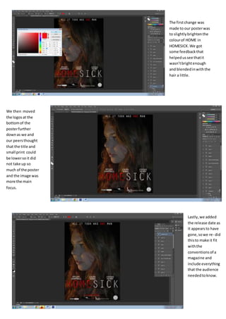
Changes for poster final
- 1. The firstchange was made to our posterwas to slightlybrightenthe colourof HOME in HOMESICK. We got some feedbackthat helpedussee thatit wasn’tbrightenough and blendedinwiththe hair a little. We then moved the logosat the bottomof the posterfurther downas we and our peersthought that the title and small print could be lowersoit did not take up so much of the poster and the image was more the main focus. Lastly,we added the release date as it appearsto have gone,sowe re- did thisto make it fit withthe conventionsof a magazine and include everything that the audience neededtoknow.