Download to read offline

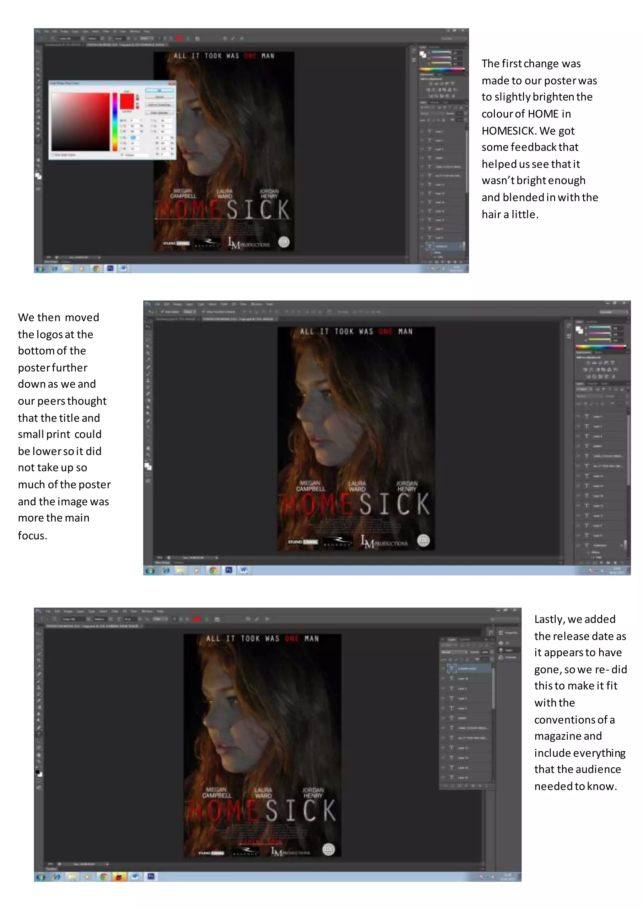
The document describes changes made to a poster. The first change was brightening the color of the word "HOME" in "HOMESICK" as it was too faint. Next, the logos at the bottom were moved further down so the title and text took up less space and the image could be the main focus. Finally, the release date was added back in to follow magazine conventions and include all needed information for the audience.


