
Recommended
More Related Content
Viewers also liked
Viewers also liked (14)
Similar to Changes after feedback - magazine cover
Similar to Changes after feedback - magazine cover (20)
More from a2mn
More from a2mn (20)
Recently uploaded
Recently uploaded (20)
Changes after feedback - magazine cover
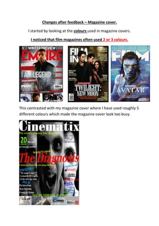
- 1. Changes after feedback – Magazine cover. I started by looking at the colours used in magazine covers. I noticed that film magazines often used 2 or 3 colours. This contrasted with my magazine cover where I have used roughly 5 different colours which made the magazine cover look too busy.
- 2. To start with I started changing the colour of the text on my magazine so that they were similar. I tried to keep to using – black, white, yellow and red. I used the colour fill to change the colour of the banner to a darker grey than the original. I then dragged the text ‘Sneak peek behind scenes – the settings’ into the banner so that it seemed ‘merged’ with the banner.
- 3. I then noticed that I had spelt ‘peek’ wrong in ‘sneak peak’ which I had to change. I have now started working on the fonts.
- 4. I have changed most of the information on the cover lines to ‘Casablanca SF’ and ‘Tennessee SF’. Tennessee SF. Casablanca SF. Tennessee SF. Casablanca SF. Casablanca SF.
- 5. I then adjusted the images on the banner so that there was an even space in between each one. I then inserted a print screen of a barcode that I got from the internet. I had to change my barcode as my teacher said that the original one looked unprofessional. Tennessee SF.
- 6. I used the crop tool to get rid of the areas that I didn’t want visible and then made it smaller and placed it onto my magazine cover. I then changed the text of the film title to ‘Colonial Light SF’ so that it linked in with the other products.
- 7. This is what my magazine cover looked like after all the changes were made that I mentioned above.