Download as PDF, PPTX
![Advance Copy
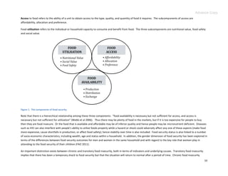
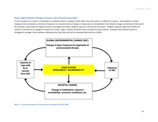
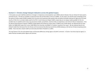
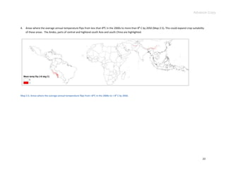
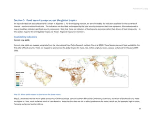
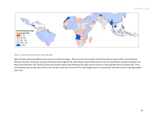
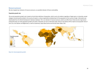
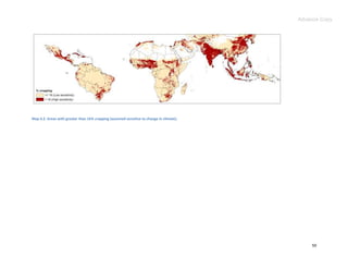
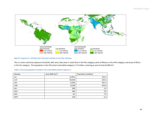
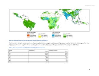
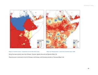
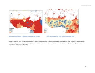
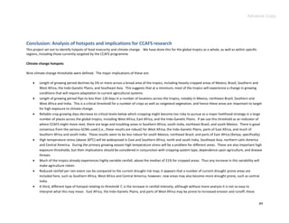
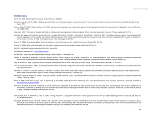
The agricultural land area for regions of interest to CCAFS (between 35 :S and 45 :N, masking out Europe, the US, Argentina, Chile, Australia and New Zealand)
are shown in Map 2.1. For our purposes, agricultural land area was defined as places in which the length of growing period (LGP) is greater than or equal to 60
days (i.e. agriculture is possible), plus areas identified as pasturelands and irrigated croplands from satellite imagery (see Ramankutty et al, 2008). The
different categories, including overlap, are mapped below.
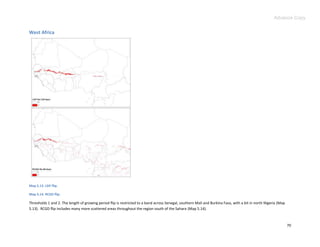
Map 2.1 The agricultural land area for regions of interest to CCAFS. Pa = pasture, Cr = irrigated cropping, Lg = length of growing period >= 60 days.
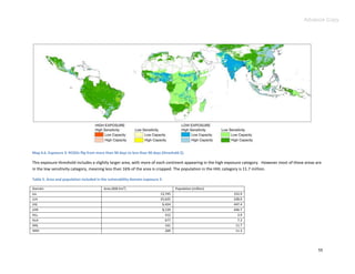
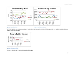
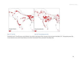
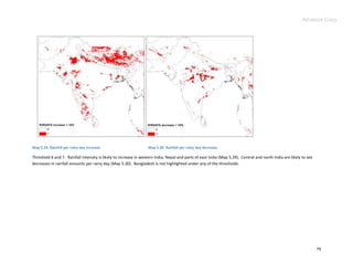
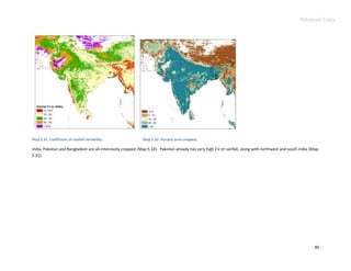
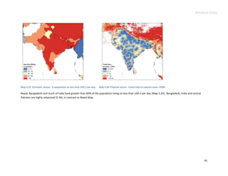
Threshold maps
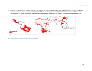
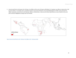
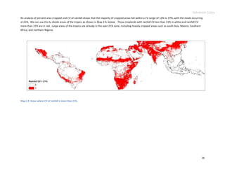
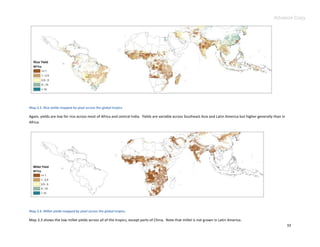
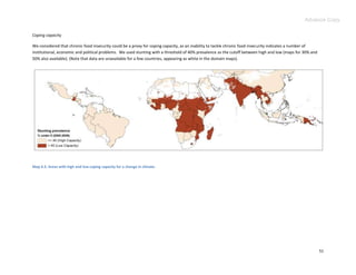
We then defined nine types of climate change hotspots using thresholds for 2050. We used thresholds rather than continuous variables to define discrete
areas. The climate change hotspot indicators across the global tropics described and mapped here were derived from the mean outputs of four climate
models. There are many uncertainties associated with these indicators, not least the fact that different climate models give different results. These
differences may be quite large, particularly for projected changes in rainfall patterns and amounts. The essential reason for this is that there are still many
unknowns about the details of how climate may change in the future due to anthropogenic forcings. The climate models are still rather imperfect
representations of reality, and as different teams of scientists build these models, these imperfect representations can differ substantially. In Appendix 2, we
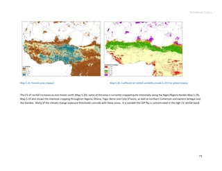
present probability maps of the eight thresholds derived from GCMs (thus coefficient of variability [CV] rainfall is not included).
18](https://image.slidesharecdn.com/ccafsreportclimatehotspotsadvance-may2011-110724094803-phpapp01/85/CCAFS-Report-Climate-Hotspots-Advance-May2011-18-320.jpg)
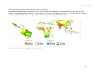


This report identifies areas vulnerable to future climate change and food insecurity in the global tropics. It analyzes maps of climate change exposure thresholds and food security indicators to identify hotspots. Nine vulnerability domains are established based on exposure, sensitivity, and coping capacity. The most vulnerable domain has high exposure, high sensitivity, and low coping capacity. This analysis finds large areas of Africa, South Asia, and parts of Central and South America fall into this highly vulnerable category for several climate change exposures. The choice of exposure indicator influences the size and location of vulnerable populations.


![11.[21 29]the implications of climate change on food security and rural livel...](https://cdn.slidesharecdn.com/ss_thumbnails/11-21-29theimplicationsofclimatechangeonfoodsecurityandrurallivelihoods-120512235612-phpapp01-thumbnail.jpg?width=640&height=640&fit=bounds)


