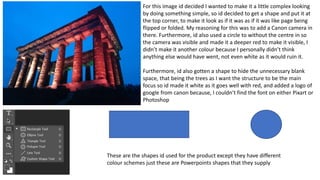
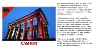
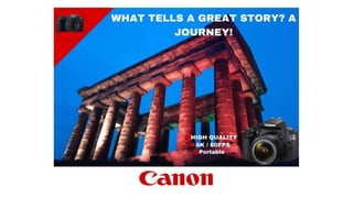
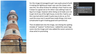
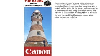
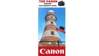
Production Edits for my Canon project
For this image id decided I wanted to make it a little complex looking
by doing something simple, so id decided to get a shape and put it at
the top corner, to make it look as if it was as if it was like page being
flipped or folded. My reasoning for this was to add a Canon camera in
there. Furthermore, id also used a circle to without the centre in so
the camera was visible and made it a deeper red to make it visible, I
didn’t make it another colour because I personally didn’t think
anything else would have went, not even white as it would ruin it.
Furthermore, id also gotten a shape to hide the unnecessary blank
space, that being the trees as I want the structure to be the main
focus so id made it white as it goes well with red, and added a logo of
google from canon because, I couldn’t find the font on either Pixart or
Photoshop
These are the shapes id used for the product except they have different
colour schemes just these are Powerpoints shapes that they supply
With the edits id shown id done this what I came
out with however, with the previous reviews
people had mentioned I then wanted to add
more to it, so originally this would have been final
however, I ended up finishing up with something
that had more detail.
I then had gotten another stock image of the
internet of canons camera to use in the product,
then id also used inspiration what I'd seen in past
posters, so I added what the camera includes. I
added text with what the camera has so it's easy
to understand and made the text white because
any other colour wouldn't have been visible then
id also added red circles next to them with ticks
showing that its valid they have them.
Furthermore, id added a quote that I believe
catches the attention of people for them to
possibly buy a canon camera and furthermore, go
out and take pictures and explore
For this image id managed to get I was quite proud of with
it making the lighthouse tower over you the viewer who
sees this. For what id done for editing is that I had to crop
it down to a good size as for when I was editing it was to
big of an image, however when doing so id made sure not
to get rid of any of the light house, to do this I had to use
the crop tool which made It quite easy to do so, as if id
used the erase tool it would have made things a lot more
complicated to get it looking good and symmetrical.
Then id added text into the image, not relising the spelling
mistake of "explore" furthermore, I added the canon logo
name into the image and I also added the canon camera to
show what im promoting
This was quick fix for what I'd try to do and then showed my
peers and they had said it was lazy and quite bad, I took that
criticism and reflected and knew it was bad and I definetly
needed to make improvements
So, what I'd done was, I erased all of the things currently on
here, then remade it but better. I had added a white
rectangle at the top of the image so it would look like a
magazine cover / poster (my goal of end result) and made
sure that it didn’t overlap the structure. Furthermore, I'd
gotten insparation of past magazines and decided to title it
something similar to their past products, id also added black
circle in the top right corner without it being filled so I could
add an image of a camera in to make it look cool
I'd also added a big red rectangle to hide the blank space
and the railing to emphasize the light house then, id found a
white title for canon with the colour contrast between them
look appealing
This what I finally came out with however, I thought
before I publish it, I could have done something extra to
make it slightly better like the posters and magazines, so
id gotten another stock image of a canon camera, and
added it on the center on the far-right side as it looked
the best there and then I had added a quote about
taking pictures and exploring
CANON - Production and process.pptx

CANON - Production and process.pptx

  • 1.
    Production Edits formy Canon project
  • 2.
    For this imageid decided I wanted to make it a little complex looking by doing something simple, so id decided to get a shape and put it at the top corner, to make it look as if it was as if it was like page being flipped or folded. My reasoning for this was to add a Canon camera in there. Furthermore, id also used a circle to without the centre in so the camera was visible and made it a deeper red to make it visible, I didn’t make it another colour because I personally didn’t think anything else would have went, not even white as it would ruin it. Furthermore, id also gotten a shape to hide the unnecessary blank space, that being the trees as I want the structure to be the main focus so id made it white as it goes well with red, and added a logo of google from canon because, I couldn’t find the font on either Pixart or Photoshop These are the shapes id used for the product except they have different colour schemes just these are Powerpoints shapes that they supply
  • 3.
    With the editsid shown id done this what I came out with however, with the previous reviews people had mentioned I then wanted to add more to it, so originally this would have been final however, I ended up finishing up with something that had more detail. I then had gotten another stock image of the internet of canons camera to use in the product, then id also used inspiration what I'd seen in past posters, so I added what the camera includes. I added text with what the camera has so it's easy to understand and made the text white because any other colour wouldn't have been visible then id also added red circles next to them with ticks showing that its valid they have them. Furthermore, id added a quote that I believe catches the attention of people for them to possibly buy a canon camera and furthermore, go out and take pictures and explore
  • 5.
    For this imageid managed to get I was quite proud of with it making the lighthouse tower over you the viewer who sees this. For what id done for editing is that I had to crop it down to a good size as for when I was editing it was to big of an image, however when doing so id made sure not to get rid of any of the light house, to do this I had to use the crop tool which made It quite easy to do so, as if id used the erase tool it would have made things a lot more complicated to get it looking good and symmetrical. Then id added text into the image, not relising the spelling mistake of "explore" furthermore, I added the canon logo name into the image and I also added the canon camera to show what im promoting
  • 6.
    This was quickfix for what I'd try to do and then showed my peers and they had said it was lazy and quite bad, I took that criticism and reflected and knew it was bad and I definetly needed to make improvements So, what I'd done was, I erased all of the things currently on here, then remade it but better. I had added a white rectangle at the top of the image so it would look like a magazine cover / poster (my goal of end result) and made sure that it didn’t overlap the structure. Furthermore, I'd gotten insparation of past magazines and decided to title it something similar to their past products, id also added black circle in the top right corner without it being filled so I could add an image of a camera in to make it look cool I'd also added a big red rectangle to hide the blank space and the railing to emphasize the light house then, id found a white title for canon with the colour contrast between them look appealing
  • 7.
    This what Ifinally came out with however, I thought before I publish it, I could have done something extra to make it slightly better like the posters and magazines, so id gotten another stock image of a canon camera, and added it on the center on the far-right side as it looked the best there and then I had added a quote about taking pictures and exploring