Downloaded 15 times
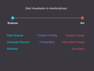
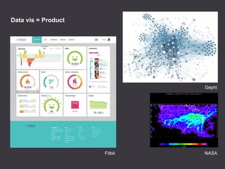
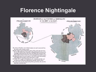
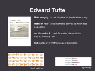

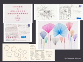


Data visualization is used to communicate data to people graphically and make complex data accessible. The main goal is to clearly convey information. Data visualization draws from many disciplines including graphic design, information design, journalism, data science, computer science, and statistics. Effective data visualization maintains data integrity, has a high data-to-ink ratio to convey as much data as possible clearly, and avoids non-informative elements that distract from the data. It can be done through both hand-crafted and generated tools.


![[DSC 2016] 系列活動:李宏毅 / 一天搞懂深度學習](https://cdn.slidesharecdn.com/ss_thumbnails/1-160521014039-thumbnail.jpg?width=640&height=640&fit=bounds)


