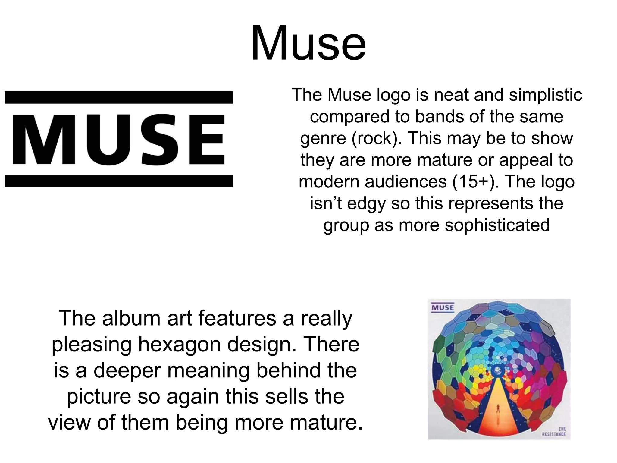
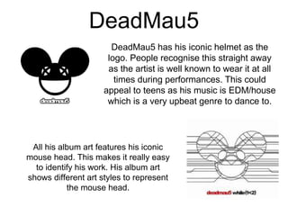
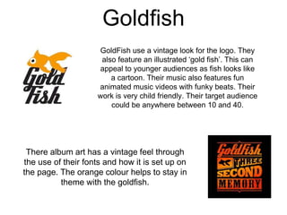
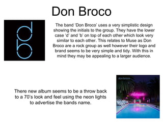
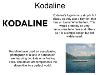
Muse
The Muse logo is neat and simplistic
compared to bands of the same
genre (rock). This may be to show
they are more mature or appeal to
modern audiences (15+). The logo
isn’t edgy so this represents the
group as more sophisticated
The album art features a really
pleasing hexagon design. There
is a deeper meaning behind the
picture so again this sells the
view of them being more mature.
DeadMau5
DeadMau5 has his iconic helmet as the
logo. People recognise this straight away
as the artist is well known to wear it at all
times during performances. This could
appeal to teens as his music is EDM/house
which is a very upbeat genre to dance to.
All his album art features his iconic
mouse head. This makes it really easy
to identify his work. His album art
shows different art styles to represent
the mouse head.
Goldfish
GoldFish use a vintage look for the logo. They
also feature an illustrated ‘gold fish’. This can
appeal to younger audiences as fish looks like
a cartoon. Their music also features fun
animated music videos with funky beats. Their
work is very child friendly. Their target audience
could be anywhere between 10 and 40.
There album art has a vintage feel through
the use of their fonts and how it is set up on
the page. The orange colour helps to stay in
theme with the goldfish.
Don Broco
The band ‘Don Broco’ uses a very simplistic design
showing the initials to the group. They have the lower
case ‘d’ and ‘b’ on top of each other which look very
similar to each other. This relates to Muse as Don
Broco are a rock group as well however their logo and
brand seems to be very simple and tidy. With this in
mind they may be appealing to a larger audience.
There new album seems to be a throw back
to a 70’s look and feel using the neon lights
to advertise the bands name.
Kodaline
Kodaline’s logo is very simple but
classy as they use a tidy font that
has an iconic ‘A’ in the font. This
would probably be very
recognisable to fans and others
as it is a simple design but not
widely used.
Kodaline have used an eye pleasing
photograph of a lake in a mountain
are featuring two kids on a floating
dock. The album art compliments the
album title ‘in a perfect world’.

Branding task

  • 1.
    Muse The Muse logois neat and simplistic compared to bands of the same genre (rock). This may be to show they are more mature or appeal to modern audiences (15+). The logo isn’t edgy so this represents the group as more sophisticated The album art features a really pleasing hexagon design. There is a deeper meaning behind the picture so again this sells the view of them being more mature.
  • 2.
    DeadMau5 DeadMau5 has hisiconic helmet as the logo. People recognise this straight away as the artist is well known to wear it at all times during performances. This could appeal to teens as his music is EDM/house which is a very upbeat genre to dance to. All his album art features his iconic mouse head. This makes it really easy to identify his work. His album art shows different art styles to represent the mouse head.
  • 3.
    Goldfish GoldFish use avintage look for the logo. They also feature an illustrated ‘gold fish’. This can appeal to younger audiences as fish looks like a cartoon. Their music also features fun animated music videos with funky beats. Their work is very child friendly. Their target audience could be anywhere between 10 and 40. There album art has a vintage feel through the use of their fonts and how it is set up on the page. The orange colour helps to stay in theme with the goldfish.
  • 4.
    Don Broco The band‘Don Broco’ uses a very simplistic design showing the initials to the group. They have the lower case ‘d’ and ‘b’ on top of each other which look very similar to each other. This relates to Muse as Don Broco are a rock group as well however their logo and brand seems to be very simple and tidy. With this in mind they may be appealing to a larger audience. There new album seems to be a throw back to a 70’s look and feel using the neon lights to advertise the bands name.
  • 5.
    Kodaline Kodaline’s logo isvery simple but classy as they use a tidy font that has an iconic ‘A’ in the font. This would probably be very recognisable to fans and others as it is a simple design but not widely used. Kodaline have used an eye pleasing photograph of a lake in a mountain are featuring two kids on a floating dock. The album art compliments the album title ‘in a perfect world’.