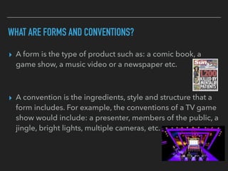
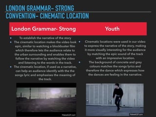
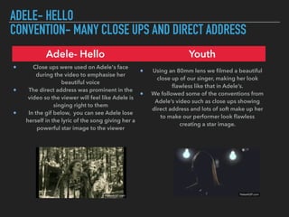
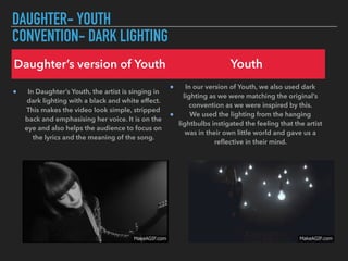
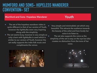
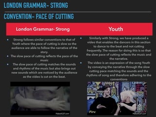
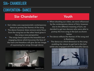
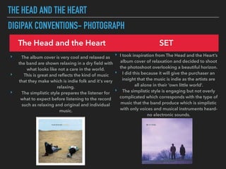
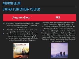
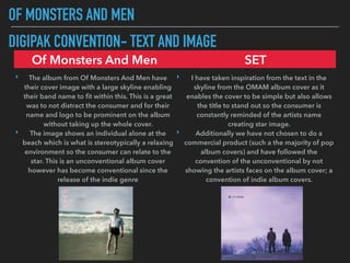
IN WHAT WAY DOES YOUR MEDIA PRODUCT
USE, DEVELOP OR CHALLENGE FORMS AND
CONVENTIONS OF REAL MEDIA PRODUCTS?
EVALUATION TASK 1
WHAT ARE FORMS AND CONVENTIONS?
▸ A form is the type of product such as: a comic book, a
game show, a music video or a newspaper etc.
▸ A convention is the ingredients, style and structure that a
form includes. For example, the conventions of a TV game
show would include: a presenter, members of the public, a
jingle, bright lights, multiple cameras, etc.
LONDON GRAMMAR- STRONG
CONVENTION- CINEMATIC LOCATION
London Grammar- Strong Youth
To establish the narrative of the story
The cinematic location makes the video look
epic, similar to watching a blockbuster film
which therefore lets the audience relate to
the urban surrounding and enables them to
follow the narrative by watching the video
and listening to the words in the track.
The cinematic location, if used as a narrative,
can help an audience identify with the the
songs lyric and emphasises the meaning of
the track.
Cinematic locations were used in our video
to express the narrative of the story, making
it more visually interesting for the audience
by matching the epic sound of the track
with an impressive location.
The background of concrete and grey
colours matches the songs lyrics and
therefore the dance which expresses how
the dances are feeling in the narrative.
ADELE- HELLO
CONVENTION- MANY CLOSE UPS AND DIRECT ADDRESS
Adele- Hello Youth
Close ups were used on Adele's face
during the video to emphasise her
beautiful voice
The direct address was prominent in the
video so the viewer will feel like Adele is
singing right to them
In the gif below, you can see Adele lose
herself in the lyric of the song giving her a
powerful star image to the viewer
Using an 80mm lens we filmed a beautiful
close up of our singer, making her look
flawless like that in Adele’s.
We followed some of the conventions from
Adele’s video such as close ups showing
direct address and lots of soft make up her
to make our performer look flawless
creating a star image.
DAUGHTER- YOUTH
CONVENTION- DARK LIGHTING
Daughter’s version of Youth Youth
In Daughter’s Youth, the artist is singing in
dark lighting with a black and white effect.
This makes the video look simple, stripped
back and emphasising her voice. It is on the
eye and also helps the audience to focus on
the lyrics and the meaning of the song.
In our version of Youth, we also used dark
lighting as we were matching the original’s
convention as we were inspired by this.
We used the lighting from the hanging
lightbulbs instigated the feeling that the artist
was in their own little world and gave us a
reflective in their mind.
MUMFORD AND SONS- HOPELESS WANDERER
CONVENTION- SET
Mumford and Sons- Hopeless Wanderer Youth
The set of the hopeless wanderer video is
quite different to that of our version of Youth,
however the lightbulbs were very inspiring
along with the simplicity.
The set seems busy, however is very simple as
only a barn with lightbulbs is used which is
similar to our version of Youth, however the
set really supports the indie folk music and
compliments the voices.
Very simple and minimalistic set which very
beautiful. This attracts the audience towards
the beauty of the artist and how lovely her
voice is to listen to.
The set also supports the voice as the
simplicity of the set is easy on the eye but also
creates no distraction from the tone of her
voice.
LONDON GRAMMAR- STRONG
CONVENTION- PACE OF CUTTING
London Grammar- Strong Youth
Strong follows similar conventions to that of
Youth where the pace of cutting is slow so the
audience are able to follow the narrative of the
story.
The slow pace of cutting reflects the pace of the
music
The slow pace of cutting matches the sounds
and rhythms of the music but also brings out
new sounds which are noticed by the audience
as the video is cut on the beat.
Similarly with Strong, we have produced a
video that enables the dancers in this section
to dance to the beat and not cutting
frequently. The reason for doing this is so that
the slow pace of cutting reflects the music and
the narrative.
The video is an expression of the song Youth
by conveying the narrative through the slow
cutting pace matching the sounds and the
rhythms of song and therefore adhering to the
conventions
SIA- CHANDELIER
CONVENTION- DANCE
Sia- Chandelier Youth
Sia’s video uses expressionistic contemporary
dance to portray the themes of the song
The dance however does remove some focus
from the song but on the other hand gives it
the song a new perspective
The songs beat supports the beautiful and
engaging dance which becomes the face of
the track and therefore will give Sia her image
of expressing her songs through dance
When shooting our video, we were influenced
by the contemporary dance of Sia’s, however
due to the different meaning of lyric, we
decided to get two dancers who were able to
portray the love song in the lyric as shown
below
The dance reflects the themes of the song and
is illustrative
The dance as a third dimension to the song
enabling the viewer to get lost in the lyric
whilst also engaged wit h the beautiful dance.
THE HEAD AND THE HEART
DIGIPAK CONVENTIONS- PHOTOGRAPH
The Head and the Heart SET
‣ The album cover is very cool and relaxed as
the band are shown relaxing in a dry field with
what looks like not a care in the world.
‣ This is great and reflects the kind of music
that they make which is indie folk and it's very
relaxing.
‣ The simplistic style prepares the listener for
what to expect before listening to the record
such as relaxing and original and individual
music.
‣ I took inspiration from The Head and the Heart’s
album cover of relaxation and decided to shoot
the photoshoot overlooking a beautiful horizon.
‣ I did this because it will give the purchaser an
insight that the music is indie as the artists are
all alone in their ‘own little world’.
‣ The simplistic style is engaging but not overly
complicated which corresponds with the type of
music that the band produce which is simplistic
with only voices and musical instruments heard-
no electronic sounds.
AUTUMN GLOW
DIGIPAK CONVENTION- COLOUR
Autumn Glow SET
‣ The Autumn Glow album cover features a varied
and indie cover scheme which I have been
influenced by.
‣ The after effects that have been used have
given the cover an individual style
‣ The trees and surroundings of colours used
such as browns and yellows are typical
conventions used when creating a folk album
which Autumn Glow have followed.
‣ We have tried to follow similar conventions
when creating the digipak by creating a
supernatural indie folk colour scheme with the
band surrounded in a rural environment.
‣ The band are facing the horizon as they want
their consumer to focus on the beautiful scenery
and to think of this environment when listening
to the indie folk music they create rather than
their faces which is what most artists who are in
the pop genre do.
OF MONSTERS AND MEN
DIGIPAK CONVENTION- TEXT AND IMAGE
Of Monsters And Men SET
‣ The album from Of Monsters And Men have
their cover image with a large skyline enabling
their band name to fit within this. This is a great
was to not distract the consumer and for their
name and logo to be prominent on the album
without taking up the whole cover.
‣ The image shows an individual alone at the
beach which is what is stereotypically a relaxing
environment so the consumer can relate to the
star. This is an unconventional album cover
however has become conventional since the
release of the indie genre
‣ I have taken inspiration from the text in the
skyline from the OMAM album cover as it
enables the cover to be simple but also allows
the title to stand out so the consumer is
constantly reminded of the artists name
creating star image.
‣ Additionally we have not chosen to do a
commercial product (such a the majority of pop
album covers) and have followed the
convention of the unconventional by not
showing the artists faces on the album cover; a
convention of indie album covers.

Evaluation task 1 pdf- max b

  • 1.
    IN WHAT WAYDOES YOUR MEDIA PRODUCT USE, DEVELOP OR CHALLENGE FORMS AND CONVENTIONS OF REAL MEDIA PRODUCTS? EVALUATION TASK 1
  • 2.
    WHAT ARE FORMSAND CONVENTIONS? ▸ A form is the type of product such as: a comic book, a game show, a music video or a newspaper etc. ▸ A convention is the ingredients, style and structure that a form includes. For example, the conventions of a TV game show would include: a presenter, members of the public, a jingle, bright lights, multiple cameras, etc.
  • 3.
    LONDON GRAMMAR- STRONG CONVENTION-CINEMATIC LOCATION London Grammar- Strong Youth To establish the narrative of the story The cinematic location makes the video look epic, similar to watching a blockbuster film which therefore lets the audience relate to the urban surrounding and enables them to follow the narrative by watching the video and listening to the words in the track. The cinematic location, if used as a narrative, can help an audience identify with the the songs lyric and emphasises the meaning of the track. Cinematic locations were used in our video to express the narrative of the story, making it more visually interesting for the audience by matching the epic sound of the track with an impressive location. The background of concrete and grey colours matches the songs lyrics and therefore the dance which expresses how the dances are feeling in the narrative.
  • 4.
    ADELE- HELLO CONVENTION- MANYCLOSE UPS AND DIRECT ADDRESS Adele- Hello Youth Close ups were used on Adele's face during the video to emphasise her beautiful voice The direct address was prominent in the video so the viewer will feel like Adele is singing right to them In the gif below, you can see Adele lose herself in the lyric of the song giving her a powerful star image to the viewer Using an 80mm lens we filmed a beautiful close up of our singer, making her look flawless like that in Adele’s. We followed some of the conventions from Adele’s video such as close ups showing direct address and lots of soft make up her to make our performer look flawless creating a star image.
  • 5.
    DAUGHTER- YOUTH CONVENTION- DARKLIGHTING Daughter’s version of Youth Youth In Daughter’s Youth, the artist is singing in dark lighting with a black and white effect. This makes the video look simple, stripped back and emphasising her voice. It is on the eye and also helps the audience to focus on the lyrics and the meaning of the song. In our version of Youth, we also used dark lighting as we were matching the original’s convention as we were inspired by this. We used the lighting from the hanging lightbulbs instigated the feeling that the artist was in their own little world and gave us a reflective in their mind.
  • 6.
    MUMFORD AND SONS-HOPELESS WANDERER CONVENTION- SET Mumford and Sons- Hopeless Wanderer Youth The set of the hopeless wanderer video is quite different to that of our version of Youth, however the lightbulbs were very inspiring along with the simplicity. The set seems busy, however is very simple as only a barn with lightbulbs is used which is similar to our version of Youth, however the set really supports the indie folk music and compliments the voices. Very simple and minimalistic set which very beautiful. This attracts the audience towards the beauty of the artist and how lovely her voice is to listen to. The set also supports the voice as the simplicity of the set is easy on the eye but also creates no distraction from the tone of her voice.
  • 7.
    LONDON GRAMMAR- STRONG CONVENTION-PACE OF CUTTING London Grammar- Strong Youth Strong follows similar conventions to that of Youth where the pace of cutting is slow so the audience are able to follow the narrative of the story. The slow pace of cutting reflects the pace of the music The slow pace of cutting matches the sounds and rhythms of the music but also brings out new sounds which are noticed by the audience as the video is cut on the beat. Similarly with Strong, we have produced a video that enables the dancers in this section to dance to the beat and not cutting frequently. The reason for doing this is so that the slow pace of cutting reflects the music and the narrative. The video is an expression of the song Youth by conveying the narrative through the slow cutting pace matching the sounds and the rhythms of song and therefore adhering to the conventions
  • 8.
    SIA- CHANDELIER CONVENTION- DANCE Sia-Chandelier Youth Sia’s video uses expressionistic contemporary dance to portray the themes of the song The dance however does remove some focus from the song but on the other hand gives it the song a new perspective The songs beat supports the beautiful and engaging dance which becomes the face of the track and therefore will give Sia her image of expressing her songs through dance When shooting our video, we were influenced by the contemporary dance of Sia’s, however due to the different meaning of lyric, we decided to get two dancers who were able to portray the love song in the lyric as shown below The dance reflects the themes of the song and is illustrative The dance as a third dimension to the song enabling the viewer to get lost in the lyric whilst also engaged wit h the beautiful dance.
  • 9.
    THE HEAD ANDTHE HEART DIGIPAK CONVENTIONS- PHOTOGRAPH The Head and the Heart SET ‣ The album cover is very cool and relaxed as the band are shown relaxing in a dry field with what looks like not a care in the world. ‣ This is great and reflects the kind of music that they make which is indie folk and it's very relaxing. ‣ The simplistic style prepares the listener for what to expect before listening to the record such as relaxing and original and individual music. ‣ I took inspiration from The Head and the Heart’s album cover of relaxation and decided to shoot the photoshoot overlooking a beautiful horizon. ‣ I did this because it will give the purchaser an insight that the music is indie as the artists are all alone in their ‘own little world’. ‣ The simplistic style is engaging but not overly complicated which corresponds with the type of music that the band produce which is simplistic with only voices and musical instruments heard- no electronic sounds.
  • 10.
    AUTUMN GLOW DIGIPAK CONVENTION-COLOUR Autumn Glow SET ‣ The Autumn Glow album cover features a varied and indie cover scheme which I have been influenced by. ‣ The after effects that have been used have given the cover an individual style ‣ The trees and surroundings of colours used such as browns and yellows are typical conventions used when creating a folk album which Autumn Glow have followed. ‣ We have tried to follow similar conventions when creating the digipak by creating a supernatural indie folk colour scheme with the band surrounded in a rural environment. ‣ The band are facing the horizon as they want their consumer to focus on the beautiful scenery and to think of this environment when listening to the indie folk music they create rather than their faces which is what most artists who are in the pop genre do.
  • 11.
    OF MONSTERS ANDMEN DIGIPAK CONVENTION- TEXT AND IMAGE Of Monsters And Men SET ‣ The album from Of Monsters And Men have their cover image with a large skyline enabling their band name to fit within this. This is a great was to not distract the consumer and for their name and logo to be prominent on the album without taking up the whole cover. ‣ The image shows an individual alone at the beach which is what is stereotypically a relaxing environment so the consumer can relate to the star. This is an unconventional album cover however has become conventional since the release of the indie genre ‣ I have taken inspiration from the text in the skyline from the OMAM album cover as it enables the cover to be simple but also allows the title to stand out so the consumer is constantly reminded of the artists name creating star image. ‣ Additionally we have not chosen to do a commercial product (such a the majority of pop album covers) and have followed the convention of the unconventional by not showing the artists faces on the album cover; a convention of indie album covers.