2. Many music videos show a number of links between
the music video, and associated digipak and
magazine adverts, eg clothing, hair, etc.
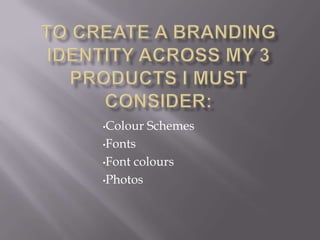
I did this by using the same (or similar) fonts
throughout the three products. The mise en scene is
similar in my three products. Also, the shot types and
editing techniques are also similar between the three
products. However, I did not feel that these aspects
were particularly essential because there is one
obvious link between all three products...(ME!)the
artist. And as Mrs Fearnley said in her review of my
products, it is suprising how many people dont even
do that! Personally, I would think that to be abit
obvious? Some poeople hey?? haha
3.
4.
5. However! I did purposely choose some aspects
to be a continual theme, such as the colour
schemes of images (black and white on digipak
cover, and magazine advert, colour inside
digipak), colour scheme of background (grey or
white), and font (black and white primarily).
This shows continuity between the three
products and creates a sense of house style.