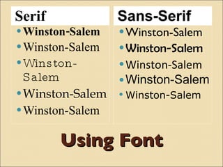
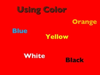
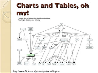
AVOIDING THE CHICKEN… Creating Effective Presentations
 
Think about presentations that you have seen: What did you like about the presentation? What did you dislike about the presentation?
 
KEEPING UP APPEARANCES
Using Font Serif Sans-Serif Winston-Salem Winston-Salem Winston-Salem Winston-Salem Winston-Salem Winston-Salem Winston-Salem Winston-Salem Winston-Salem Winston-Salem
Using Color Blue Yellow White Orange Black
Using Background
Death by Bullet Blah blah blah blah blah blah blah blah blah Blah blah blah blah blah blah blah blah blah Blah blah blah blah blah blah blah blah blah Blah blah blah blah blah blah blah blah blah Blah blah blah blah blah blah blah blah blah Blah blah blah blah blah blah blah blah blah Blah blah blah blah blah blah blah blah blah Blah blah blah blah blah blah blah blah blah
Charts and Tables, oh my! http://www.flickr.com/photos/paulworthington
Reading the presentation It is amazing how many people try to fit as much text as they can on a PowerPoint slide. People who write complete sentences or paragraphs need to understand that people stop listening to you as soon as you put all that text up there. What are you doing now? You are reading the slide and not listening to me. The only thing worse…someone who reads the slide out loud for the audience.
Watch the Animations Just because you can Does not mean you should Because we do not talk  In bullets Or when graphics enter Is your head spinning or is mine?
My recommendation: http://www.flickr.com/photos/ifindkarma
Keep it Simple, Stupid… Font: 28 or higher, Sans-Serif Color: light background with dark text, contrast 5 bullet limit Avoid complexity
MAKING CHANGE
Alternatives Google Docs Slideshare Prezi Vuvox
Consider… Adding video Using images to communicate not decorate Adding humor Being personal

Avoiding The Chicken

  • 1.
    AVOIDING THE CHICKEN…Creating Effective Presentations
  • 2.
  • 3.
    Think about presentationsthat you have seen: What did you like about the presentation? What did you dislike about the presentation?
  • 4.
  • 5.
  • 6.
    Using Font SerifSans-Serif Winston-Salem Winston-Salem Winston-Salem Winston-Salem Winston-Salem Winston-Salem Winston-Salem Winston-Salem Winston-Salem Winston-Salem
  • 7.
    Using Color BlueYellow White Orange Black
  • 8.
  • 9.
    Death by BulletBlah blah blah blah blah blah blah blah blah Blah blah blah blah blah blah blah blah blah Blah blah blah blah blah blah blah blah blah Blah blah blah blah blah blah blah blah blah Blah blah blah blah blah blah blah blah blah Blah blah blah blah blah blah blah blah blah Blah blah blah blah blah blah blah blah blah Blah blah blah blah blah blah blah blah blah
  • 10.
    Charts and Tables,oh my! http://www.flickr.com/photos/paulworthington
  • 11.
    Reading the presentationIt is amazing how many people try to fit as much text as they can on a PowerPoint slide. People who write complete sentences or paragraphs need to understand that people stop listening to you as soon as you put all that text up there. What are you doing now? You are reading the slide and not listening to me. The only thing worse…someone who reads the slide out loud for the audience.
  • 12.
    Watch the AnimationsJust because you can Does not mean you should Because we do not talk In bullets Or when graphics enter Is your head spinning or is mine?
  • 13.
  • 14.
    Keep it Simple,Stupid… Font: 28 or higher, Sans-Serif Color: light background with dark text, contrast 5 bullet limit Avoid complexity
  • 15.
  • 16.
    Alternatives Google DocsSlideshare Prezi Vuvox
  • 17.
    Consider… Adding videoUsing images to communicate not decorate Adding humor Being personal