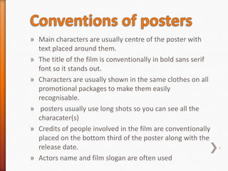
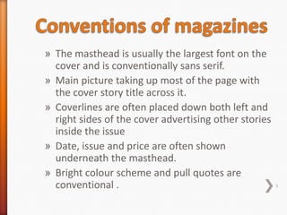
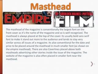
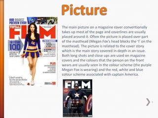
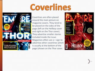
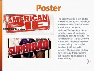
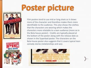
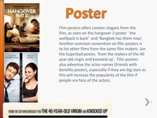
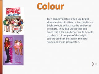
Summary of poster and magazine analysis
» Main characters are usually centre of the poster with
  text placed around them.
» The title of the film is conventionally in bold sans serif
  font so it stands out.
» Characters are usually shown in the same clothes on all
  promotional packages to make them easily
  recognisable.
» posters usually use long shots so you can see all the
  characater(s)
» Credits of people involved in the film are conventionally
  placed on the bottom third of the poster along with the
  release date.                                                2

» Actors name and film slogan are often used
» The masthead is usually the largest font on the
  cover and is conventionally sans serif.
» Main picture taking up most of the page with
  the cover story title across it.
» Coverlines are often placed down both left and
  right sides of the cover advertising other stories
  inside the issue
» Date, issue and price are often shown
  underneath the masthead.
» Bright colour scheme and pull quotes are
  conventional .                                       3
The masthead of the magazine is conventionally the largest font on the
front cover as it’s the name of the magazine and so is well recognised. The
masthead is always placed at the top of the cover. Its usually bold sans serif
font to make it stand out more to the audience and tends to stay very
similar across all issues of a magazine. Its also conventional for the date and
price to be placed around the masthead in much smaller font (as shown on
the empire masthead). There are also Coverlines placed above both
mastheads advertising other stories inside the issue of the magazine. The
website of the magazine is also often placed in smaller font near the
masthead.
                                                                                  4
The main picture on a magazine cover conventionally
takes up most of the page and coverlines are usually
placed around it. Often the picture is placed over part
of the masthead (Megan Fox’s head blocks the ‘I’ on the
masthead). The picture is related to the cover story
which is the main story covered in depth in an issue.
Both long shots and close ups are used on magazine
covers and the colours that the person on the front
wears are usually seen in the colour scheme (the purple
Megan Fox is wearing) and the red, white and blue
colour scheme associated with captain America.


                                                          5
Coverlines are often placed
around the main picture on
magazine covers. They tend to
be placed on the sides of the
page (left on the Hellboy cover
and right on the Thor cover).
They advertise smaller stories
included inside the issue.
Magazines often use a + sign to
advertise other coverlines which
is usually at the bottom of the
page (shown on the Thor cover.


                                   6
The largest font on a film poster
tends to be the logo of the film, it
tends to be sans serif and bold to
make it stand out to the
audience. The logo tends to be
consistent over all posters to
help create a brand identity. This
can be placed at the top , bottom
or middle of the poster. Its often
an eye catching colour to help
stand out (both are red in
pictures). The American pie logo
stays the same through all the
film franchise to help create a
brand identity
                                       7
Film posters tend to use mid or long shots as it shows
more of the character and therefore makes them more
identifiable to the audience. This also shows the clothes
that the characters are wearing which makes the
characters more relatable to a teen audience (more so in
the Beta house poster). Credits are typically placed at
the bottom of the poster along with the release date as
shown in the Superbad poster. The characters on the
Beta house poster also suggests that it covers typical teen
comedy stories (relationships and sex).


                                                              8
Film posters often contain slogans from the
film, as seen on the hangover 2 poster ‘ the
wolfpack is back’ and ‘Bangkok has them now’.
Another common convention on film posters is
to list other films from the same film makers. (on
the Superbad poster, ‘from the makers of the 40
year old virgin and knocked up’. Film posters
also advertise the actor names (friends with
benefits poster), especially if they are big stars as
this will increase the popularity of the film if
people are fans of the actors.


                                                        9
Teen comedy posters often use bright
vibrant colours to attract a teen audience.
Bright colours will attract the audiences
eye more. They also use clothes and
props that a teen audience would be able
to relate to. Examples of the bright
colours used can be seen in the Beta
house and mean girls posters.


                                              10

Ancillary task summary

  • 1.
    Summary of posterand magazine analysis
  • 2.
    » Main charactersare usually centre of the poster with text placed around them. » The title of the film is conventionally in bold sans serif font so it stands out. » Characters are usually shown in the same clothes on all promotional packages to make them easily recognisable. » posters usually use long shots so you can see all the characater(s) » Credits of people involved in the film are conventionally placed on the bottom third of the poster along with the release date. 2 » Actors name and film slogan are often used
  • 3.
    » The mastheadis usually the largest font on the cover and is conventionally sans serif. » Main picture taking up most of the page with the cover story title across it. » Coverlines are often placed down both left and right sides of the cover advertising other stories inside the issue » Date, issue and price are often shown underneath the masthead. » Bright colour scheme and pull quotes are conventional . 3
  • 4.
    The masthead ofthe magazine is conventionally the largest font on the front cover as it’s the name of the magazine and so is well recognised. The masthead is always placed at the top of the cover. Its usually bold sans serif font to make it stand out more to the audience and tends to stay very similar across all issues of a magazine. Its also conventional for the date and price to be placed around the masthead in much smaller font (as shown on the empire masthead). There are also Coverlines placed above both mastheads advertising other stories inside the issue of the magazine. The website of the magazine is also often placed in smaller font near the masthead. 4
  • 5.
    The main pictureon a magazine cover conventionally takes up most of the page and coverlines are usually placed around it. Often the picture is placed over part of the masthead (Megan Fox’s head blocks the ‘I’ on the masthead). The picture is related to the cover story which is the main story covered in depth in an issue. Both long shots and close ups are used on magazine covers and the colours that the person on the front wears are usually seen in the colour scheme (the purple Megan Fox is wearing) and the red, white and blue colour scheme associated with captain America. 5
  • 6.
    Coverlines are oftenplaced around the main picture on magazine covers. They tend to be placed on the sides of the page (left on the Hellboy cover and right on the Thor cover). They advertise smaller stories included inside the issue. Magazines often use a + sign to advertise other coverlines which is usually at the bottom of the page (shown on the Thor cover. 6
  • 7.
    The largest fonton a film poster tends to be the logo of the film, it tends to be sans serif and bold to make it stand out to the audience. The logo tends to be consistent over all posters to help create a brand identity. This can be placed at the top , bottom or middle of the poster. Its often an eye catching colour to help stand out (both are red in pictures). The American pie logo stays the same through all the film franchise to help create a brand identity 7
  • 8.
    Film posters tendto use mid or long shots as it shows more of the character and therefore makes them more identifiable to the audience. This also shows the clothes that the characters are wearing which makes the characters more relatable to a teen audience (more so in the Beta house poster). Credits are typically placed at the bottom of the poster along with the release date as shown in the Superbad poster. The characters on the Beta house poster also suggests that it covers typical teen comedy stories (relationships and sex). 8
  • 9.
    Film posters oftencontain slogans from the film, as seen on the hangover 2 poster ‘ the wolfpack is back’ and ‘Bangkok has them now’. Another common convention on film posters is to list other films from the same film makers. (on the Superbad poster, ‘from the makers of the 40 year old virgin and knocked up’. Film posters also advertise the actor names (friends with benefits poster), especially if they are big stars as this will increase the popularity of the film if people are fans of the actors. 9
  • 10.
    Teen comedy postersoften use bright vibrant colours to attract a teen audience. Bright colours will attract the audiences eye more. They also use clothes and props that a teen audience would be able to relate to. Examples of the bright colours used can be seen in the Beta house and mean girls posters. 10