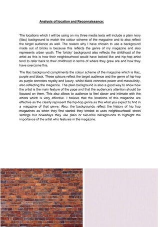
1. Analysis of location and Reconnaissance:
The locations which I will be using on my three media texts will include a plain ivory
(lilac) background to match the colour scheme of the magazine and to also reflect
the target audience as well. The reason why I have chosen to use a background
made out of bricks is because this reflects the genre of my magazine and also
represents urban youth. The ‘bricky’ background also reflects the childhood of the
artist as this is how their neighbourhood would have looked like and hip-hop artist
tend to refer back to their childhood in terms of where they grew are and how they
have overcome this.
The lilac background compliments the colour scheme of the magazine which is lilac,
purple and black. These colours reflect the target audience and the genre of hip-hop
as purple connotes royalty and luxury, whilst black connotes power and masculinity,
also reflecting the magazine. The plain background is also a good way to show how
the artist is the main feature of the page and that the audience’s attention should be
focused on them. This also allows to audience to feel closer and intimate with the
artists which is very effective. I believe that the locations of this magazine are
effective as the clearly represent the hip-hop genre as this what you expect to find in
a magazine of that genre. Also, the backgrounds reflect the history of hip hop
magazines as when they first started they tended to uses neighbourhood/ street
settings but nowadays they use plain or two-tone backgrounds to highlight the
importance of the artist who features in the magazine.