Downloaded 22 times


![Adobe Experience Manager https://www.slideshare.net/GabrielWalt/aem-responsive
0. Enable the Responsive Emulator
Register page components for simulation
➔ List the sling:resourceType of your pages in an OSGi config for
com.day.cq.wcm.mobile.core.impl.MobileEmulatorProvider
Specify the device groups
➔ On jcr:content node of the site root, add the following property:
jcr:content[nt:unstructured]
@cq:deviceGroups=["/etc/mobile/groups/responsive"]](https://image.slidesharecdn.com/connectcon-responsivewebsitesgabriel-150624121218-lva1-app6891/85/AEM-responsive-14-320.jpg)
![Adobe Experience Manager https://www.slideshare.net/GabrielWalt/aem-responsive
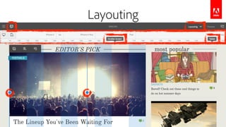
1. Enable the Layouting Mode
Specify the breakpoints
➔ On jcr:content node of the site root, add following node structure:
jcr:content[nt:unstructured]
cq:responsive[nt:unstructured]
breakpoints[nt:unstructured]
phone[nt:unstructured]
@title="Smaller Screen"
@width=650
tablet[nt:unstructured]
@title="Tablet"
@width=1200](https://image.slidesharecdn.com/connectcon-responsivewebsitesgabriel-150624121218-lva1-app6891/85/AEM-responsive-15-320.jpg)


![Adobe Experience Manager https://www.slideshare.net/GabrielWalt/aem-responsive
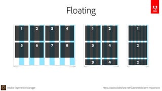
Persistence in JCR Content
The component size is saved on the resource node
jcr:content[nt:unstructured]
parsys[nt:unstructured]
image[cq:Component]
@sling:resourceType="wcm/foundation/components/image"
cq:responsive[nt:unstructured]
default[nt:unstructured]
@width=4
phone[nt:unstructured]
@width=12](https://image.slidesharecdn.com/connectcon-responsivewebsitesgabriel-150624121218-lva1-app6891/85/AEM-responsive-20-320.jpg)


The document discusses Adobe Experience Manager's capabilities for responsive web design. It provides an overview of responsive vs adaptive design and outlines AEM's features for editing responsive layouts through a grid system. The presentation covers how to enable responsive editing in AEM, including setting up breakpoints and using the responsive paragraph system. It also provides examples of how to leverage the grid for layouting, floating, breaking, nesting and hiding content across breakpoints.