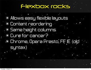
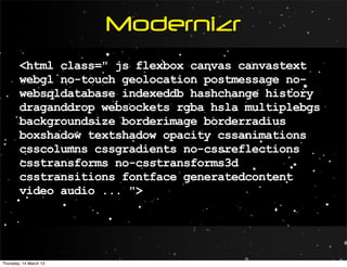
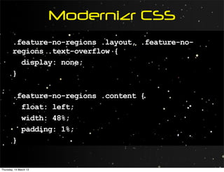
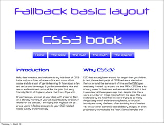
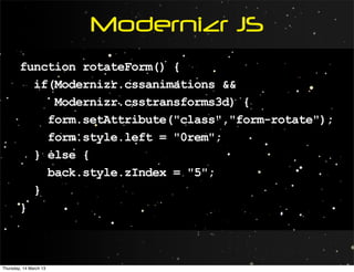
Future
                        Layouts


Thursday, 14 March 13
Find me...
         ✴ cmills@opera.com/cmills@w3.org
         ✴ @chrisdavidmills
         ✴ slideshare.net/chrisdavidmills


Thursday, 14 March 13
In the early days
         ✴ We thought the Web was print
         ✴ Limited device landscape meant
           limited outlook
         ✴ Limited toolset


Thursday, 14 March 13
Print means
         ✴ Designer has full control
         ✴ Technologies will be supported
         ✴ Canvases are fixed


Thursday, 14 March 13
Web means
         ✴ Designer has less control
         ✴ Technologies won’t necessarily be
           supported
         ✴ Canvases are variable


Thursday, 14 March 13
Limited devices...
         ✴ We had desktops and laptops
         ✴ Of around 480 x 320, 640 x 480...
         ✴ ...or 800 x 600 if you were really
           posh
         ✴ (We’ve come a long way since
           then)


Thursday, 14 March 13
...means limited outlook
         ✴ Designing for the page
         ✴ Fixed, inflexible designs
         ✴ Mobile needed a separate site?
         ✴ WAP was a good idea?


Thursday, 14 March 13
Limited toolset
         ✴ We didn’t have a good toolset for
           layout
         ✴ CSS came along soon after  ...
         ✴ ..but CSS support didn’t
         ✴ So we got into HTML tables and
           spacer GIFs


Thursday, 14 March 13
Consistent CSS support
         ✴ Was very welcome...
         ✴ Still didn’t give us much in the way
           of layout


Thursday, 14 March 13
CSS2 gave us
         ✴ floats: limiting, and kind of abused.
         ✴ positioning: feh.
         ✴ margins, padding: pfffff.
         ✴ borders.
         ✴ meh.


Thursday, 14 March 13
We still have problems
        At this point, there was still a raft of
        design problems that were absurdly
        difficult to solve on the web.


Thursday, 14 March 13
What about
         ✴ Centering stuff?
         ✴ Same height columns?
         ✴ Flexible multiple columns?
         ✴ Complex floats?
         ✴ Shrinkwrapping contents?
         ✴ etc.


Thursday, 14 March 13
Centering stuff™
        <figure>
          <div>
            <img src="../base-styles/grim-
        north.jpg" alt="A map of the North of
        England">
            <figcaption>Figure 1.1: It's grim up
        North.</figcaption>
          </div>
        </figure>


Thursday, 14 March 13
Centering stuff™
        figure {
          text-align: center;
        }

        figure div {
          display: inline-block;
          ...
        }


Thursday, 14 March 13
Same height columns


Thursday, 14 March 13
Same height columns
         ✴ We can fix this with faux columns
         ✴ Or JavaScript
         ✴ But really? Should we need to?


Thursday, 14 March 13
Fortunately we have


                        A New Hope


Thursday, 14 March 13
New tools on the horizon
         ✴ CSS WG + browser vendors
         ✴ Hard at work


Thursday, 14 March 13
Media queries


Thursday, 14 March 13
Media queries
         ✴ Same content, different layouts
         ✴ Polyfills/fixed layouts for old IE


Thursday, 14 March 13
Media queries
        media="screen and (max-width: 480px)"

        @media screen and (max-width: 480px) {
          /* do amazing stuff for
             narrow screens */
        }


Thursday, 14 March 13
Media queries
        /* Mobile first - make your mobile layout
        the default... */

        @media screen and (min-width: 481px) {
          /* ...then do amazing stuff for
             wider screens */
        }


Thursday, 14 March 13
Media queries


Thursday, 14 March 13
matchMedia
         ✴ matchMedia = media queries inside
           script
         ✴ For IE<10 and Opera Presto, polyfill
           github.com/paulirish/matchMedia.js/


Thursday, 14 March 13
matchMedia example
        if (window.matchMedia("(min-width:
        480px)").matches) {
          /* Do stuff for wider screens */
        } else {
          /* Do stuff for narrow screens */
        }


Thursday, 14 March 13
More on Media queries
        http://dev.opera.com/articles/view/
        love-your -devices-adaptive-web-
        design-with-media-queries-viewport-
        and-more/


Thursday, 14 March 13
viewport/CSS
                           device
                         adaptation

Thursday, 14 March 13
Mobile browsers lie
         ✴ About viewport width
         ✴ Some also lie about the resolution
         ✴ So media queries alone don’t cut it


Thursday, 14 March 13
Mobile misbehavior


Thursday, 14 March 13
Viewport
        <meta name="viewport"
        content="width=device-width">


Thursday, 14 March 13
Better


Thursday, 14 March 13
@viewport

         ✴ Because viewport is more of a
           style thing
         ✴ Specify viewport inside the
           @viewport rule
         ✴ Opera Presto, IE10, WebKit


Thursday, 14 March 13
Viewport
        @viewport {
          width: device-width;
        }


Thursday, 14 March 13
More on viewport
                         and @ viewport
        http://dev.opera.com/articles/view/an-
        introduction-to-meta-viewport-and-
        viewport/


Thursday, 14 March 13
Flexbox


Thursday, 14 March 13
Flexbox rocks
         ✴ Allows easy flexible layouts
         ✴ Content reordering
         ✴ Same height columns
         ✴ Cure for cancer?
         ✴ Chrome, Opera Presto, FF IE (old
                                     ,
           syntax)


Thursday, 14 March 13
An example
        <section>
          <nav> ... </nav>
          <article> ... </article>
          <article> ... </article>
        </section>


Thursday, 14 March 13
An example
        section {
          display: flex;
        }


Thursday, 14 March 13
Gives you


Thursday, 14 March 13
Rows and columns
        section {
          display: flex;
          flex-direction: row;
          flex-wrap: nowrap;
        }

        /* flex-flow is shorthand for flex-direction/
           wrap   */


Thursday, 14 March 13
Main and cross axis


Thursday, 14 March 13
align items on main axis
        section {
          justify-content: center;
        }

        /* can take other values such as flex-start,
        flex-end, space-between and space-around */


Thursday, 14 March 13
align items on cross axis
        section {
          align-items: stretch;
        }

        /* can take other values such as flex-start,
        flex-end, and center; */


Thursday, 14 March 13
Ordering elements
         ✴ Reorder child elements easily and
           quickly
         ✴ Without screwing with the DOM


Thursday, 14 March 13
Ordinal groups
        nav {
          order: 1;
        }


Thursday, 14 March 13
Gives you


Thursday, 14 March 13
Flexing our muscle
         ✴ The flex property
         ✴ Set what proportion of available
           space child elements occupy
         ✴ Unit-less proportion values


Thursday, 14 March 13
Flex property
        nav {
          flex: 1;
        }

        article {
          flex: 3;
        }


Thursday, 14 March 13
Gives you


Thursday, 14 March 13
But there’s more
        article {
          flex: 3 2 400px;
        }

        /* flex-grow shares out positive space
        flex-shrink shares out overflow reduction
        flex-basis initially applied
        = CAN GET BLOODY COMPLICATED */


Thursday, 14 March 13
A case study


Thursday, 14 March 13
Placing the nav
        section {
          display: flex;
          flex-flow: row wrap;
        }

        nav {
          flex: 1 100%;
        }


Thursday, 14 March 13
Flexible awesome nav!


Thursday, 14 March 13
Making awesome
        nav {
          display: flex;
          justify-content: center;
        }

        nav ul {
          display: flex;
          flex-flow: row wrap;
          justify-content: center;
          width: 80%;
        }
Thursday, 14 March 13
Making awesome
        nav ul li {
          flex: auto;
          min-width: 5rem;
        }


Thursday, 14 March 13
More on Flexbox
        http://dev.opera.com/articles/view/
        flexbox-basics/


Thursday, 14 March 13
Multi-column


Thursday, 14 March 13
Multi-col layouts
         ✴ Break content into multi-col
         ✴ Cut down on markup cruft
         ✴ Specify column breaks, column
           rules and heading span
         ✴ Most modern browsers have this


Thursday, 14 March 13
Great at some things
        <article>...</article>

        article {
          column-count: 2;
          column-gap: 1rem;
          column-rule: 2px solid rgba(0,0,255,0.25);
        }


Thursday, 14 March 13
Gives you


Thursday, 14 March 13
Controlling column
                             breaks
        article h2 {
          break-before: column;
          break-after: avoid-column;
        }


Thursday, 14 March 13
Gives you


Thursday, 14 March 13
Column-spanning
                            headings
        article h2 {
          break-after: avoid-column;
          column-span: all;
        }


Thursday, 14 March 13
Gives you


Thursday, 14 March 13
Can also specify
                         column width
        article {
          column-width: 20rem;
          column-gap: 2rem;
        }


Thursday, 14 March 13
Gives you
Thursday, 14 March 13
Not so great at other
                      things
         ✴ No proper multi-column layouts
         ✴ break properties are fiddly
         ✴ Only works for simple layouts


Thursday, 14 March 13
More on Multi-col
        http://dev.opera.com/articles/view/
        css3-multi-column-layout/


Thursday, 14 March 13
Grids


Thursday, 14 March 13
CSS grid layout
         ✴ A proper grid system for the web
         ✴ Completely remove content from
           any layout concern
         ✴ IE10 only at the moment
         ✴ Spec in flux


Thursday, 14 March 13
Define your grid
        body {
          display: grid;
          grid-columns: 4% 20% 20% 12% 20% 20% 4%;
          grid-rows: 300px 450px 450px 450px 300px;
        }


Thursday, 14 March 13
Define your grid
                           contents
        header {
          grid-column-position: 1;
          grid-row-position: 1;
          grid-column-span: 7;
        }


Thursday, 14 March 13
More on grids
        http://24ways.org/2012/css3-grid-
        layout/ (out of date syntax, but gives
        good overview)


Thursday, 14 March 13
Regions


Thursday, 14 March 13
CSS regions
         ✴ Turn containers into vessels to
           flow content into
         ✴ Flexible complex layouts
         ✴ IE10 and Chrome Canary only at the
           moment


Thursday, 14 March 13
Put your content in a
                separate block
        <article class="content">
          <h2>Introduction</h2>
          <p>Hello, dear readers...
        </article>


Thursday, 14 March 13
Then create your layout
            blocks
        <div class="layout">
          <div class="text-container"></div>
          <div class="text-container"></div>
          <div class="image-container">
            ...
          </div>
          <div class="text-container"></div>
        </div>
        <div class="text-overflow"></div>


Thursday, 14 March 13
Specify where to
                           flow it into
        .content {
          -webkit-flow-into: article;
        }

        .text-container, .text-overflow {
          -webkit-flow-from: article;
        }


Thursday, 14 March 13
A little something I
                             cooked up


Thursday, 14 March 13
Exclusions and
               shapes


Thursday, 14 March 13
CSS exclusions
         ✴ Create really complex floats
         ✴ Flow content around (and inside)
           complex shapes
         ✴ Chrome Canary/IE only at the
           moment


Thursday, 14 March 13
Position your exclusion
        <article class="content">
          <header>
            ...
          </header>
          ...
        </article>

        header {
          position: absolute;
          etc.
        }
Thursday, 14 March 13
Then exclude it!
        header {
          position: absolute;
          etc.
          wrap-flow: both;
          /* Can also take values of start, end,
        minimum, maximum, clear */
        }


Thursday, 14 March 13
Different effects
                        both     start    end


                                 Text
                 minimum        maximum   clear


Thursday, 14 March 13
Shape your exclusion
        shape-inside: rectangle(0, 0, 100%, 100%,
        25%, 25%);

        shape-inside: polygon( ... )

        shape-outside: polygon( ... )


Thursday, 14 March 13
shape inside/outside


Thursday, 14 March 13
My examples...
         ✴ ...didn’t work
         ✴ Apparently wrap-flow is in IE10
         ✴ and shape-inside/outside in
           Chrome Canary...


Thursday, 14 March 13
A note on
                         CSS units


Thursday, 14 March 13
rems
         ✴ rem units used throughout my
           examples
         ✴ size relative to the root (html) font-
           size, not the parent font size.
         ✴ Much easier maths


Thursday, 14 March 13
vh, vw, and vmin
         ✴ Percentage of viewport size
         ✴ 1vw = 1% of viewport width
         ✴ 1vh = 1% of viewport height
         ✴ 1vmin = 1vw or 1vh, whatever is
           smallest


Thursday, 14 March 13
vh, vw, and vmin
         ✴ Supported in IE10, FF Chrome, iOS,
                                ,
           Blackberry?
         ✴ text-size relative to viewport =
           accessibility problem?


Thursday, 14 March 13
New responsive
                          capabilities


Thursday, 14 March 13
Fallbacks and
              alternatives


Thursday, 14 March 13
In truth
         ✴ A lot of this stuff doesn’t degrade
           very gracefully
         ✴ Not a surprise, as layout is a
           pretty big deal


Thursday, 14 March 13
So do we just wait until support is
          everywhere and IE6-9 is destroyed?


Thursday, 14 March 13
Hell no!
         ✴ Intelligent alternatives via feature
           detection
         ✴ @supports: native feature
           detection
         ✴ Modernizr is still an excellent
           solution


Thursday, 14 March 13
@supports
        /* Provide basic layout, e.g. with floats */

        @supports (display:flex) {
          /* Provide Flexbox layout for supporting
             browsers */
        }


Thursday, 14 March 13
Modernizr

        <html lang="en-US" class="no-js">
        <head>
          <script src="modernizr.js"></script>
        </head>


Thursday, 14 March 13
Modernizr
        <html class=" js flexbox canvas canvastext
        webgl no-touch geolocation postmessage no-
        websqldatabase indexeddb hashchange history
        draganddrop websockets rgba hsla multiplebgs
        backgroundsize borderimage borderradius
        boxshadow textshadow opacity cssanimations
        csscolumns cssgradients no-cssreflections
        csstransforms no-csstransforms3d
        csstransitions fontface generatedcontent
        video audio ... ">


Thursday, 14 March 13
Modernizr CSS
        .feature-no-regions .layout, .feature-no-
        regions .text-overflow {
          display: none;
        }

        .feature-no-regions .content {
          float: left;
          width: 48%;
          padding: 1%;
        }


Thursday, 14 March 13
Fallback basic layout


Thursday, 14 March 13
Modernizr JS
        function rotateForm() {
          if(Modernizr.cssanimations &&
             Modernizr.csstransforms3d) {
            form.setAttribute("class","form-rotate");
            form.style.left = "0rem";
          } else {
            back.style.zIndex = "5";
          }
        }


Thursday, 14 March 13
“Subtle” advertisement
           Buy my book
Thursday, 14 March 13
Thanks!


Thursday, 14 March 13
Find me...
         ✴ cmills@opera.com/cmills@w3.org
         ✴ @chrisdavidmills
         ✴ slideshare.net/chrisdavidmills


Thursday, 14 March 13
Photo credits
         ✴ Star wars adidas posters by
           Dorothy Tang: http://
           www.flickr
                    .com/photos/adifans/
           4265441265/


Thursday, 14 March 13

Future layouts

  • 1.
    Future Layouts Thursday, 14 March 13
  • 2.
    Find me... ✴ cmills@opera.com/cmills@w3.org ✴ @chrisdavidmills ✴ slideshare.net/chrisdavidmills Thursday, 14 March 13
  • 3.
    In the earlydays ✴ We thought the Web was print ✴ Limited device landscape meant limited outlook ✴ Limited toolset Thursday, 14 March 13
  • 4.
    Print means ✴ Designer has full control ✴ Technologies will be supported ✴ Canvases are fixed Thursday, 14 March 13
  • 5.
    Web means ✴ Designer has less control ✴ Technologies won’t necessarily be supported ✴ Canvases are variable Thursday, 14 March 13
  • 6.
    Limited devices... ✴ We had desktops and laptops ✴ Of around 480 x 320, 640 x 480... ✴ ...or 800 x 600 if you were really posh ✴ (We’ve come a long way since then) Thursday, 14 March 13
  • 7.
    ...means limited outlook ✴ Designing for the page ✴ Fixed, inflexible designs ✴ Mobile needed a separate site? ✴ WAP was a good idea? Thursday, 14 March 13
  • 8.
    Limited toolset ✴ We didn’t have a good toolset for layout ✴ CSS came along soon after ... ✴ ..but CSS support didn’t ✴ So we got into HTML tables and spacer GIFs Thursday, 14 March 13
  • 9.
    Consistent CSS support ✴ Was very welcome... ✴ Still didn’t give us much in the way of layout Thursday, 14 March 13
  • 10.
    CSS2 gave us ✴ floats: limiting, and kind of abused. ✴ positioning: feh. ✴ margins, padding: pfffff. ✴ borders. ✴ meh. Thursday, 14 March 13
  • 11.
    We still haveproblems At this point, there was still a raft of design problems that were absurdly difficult to solve on the web. Thursday, 14 March 13
  • 12.
    What about ✴ Centering stuff? ✴ Same height columns? ✴ Flexible multiple columns? ✴ Complex floats? ✴ Shrinkwrapping contents? ✴ etc. Thursday, 14 March 13
  • 13.
    Centering stuff™ <figure> <div> <img src="../base-styles/grim- north.jpg" alt="A map of the North of England"> <figcaption>Figure 1.1: It's grim up North.</figcaption> </div> </figure> Thursday, 14 March 13
  • 14.
    Centering stuff™ figure { text-align: center; } figure div { display: inline-block; ... } Thursday, 14 March 13
  • 15.
  • 16.
    Same height columns ✴ We can fix this with faux columns ✴ Or JavaScript ✴ But really? Should we need to? Thursday, 14 March 13
  • 17.
    Fortunately we have A New Hope Thursday, 14 March 13
  • 18.
    New tools onthe horizon ✴ CSS WG + browser vendors ✴ Hard at work Thursday, 14 March 13
  • 19.
  • 20.
    Media queries ✴ Same content, different layouts ✴ Polyfills/fixed layouts for old IE Thursday, 14 March 13
  • 21.
    Media queries media="screen and (max-width: 480px)" @media screen and (max-width: 480px) { /* do amazing stuff for narrow screens */ } Thursday, 14 March 13
  • 22.
    Media queries /* Mobile first - make your mobile layout the default... */ @media screen and (min-width: 481px) { /* ...then do amazing stuff for wider screens */ } Thursday, 14 March 13
  • 23.
  • 24.
    matchMedia ✴ matchMedia = media queries inside script ✴ For IE<10 and Opera Presto, polyfill github.com/paulirish/matchMedia.js/ Thursday, 14 March 13
  • 25.
    matchMedia example if (window.matchMedia("(min-width: 480px)").matches) { /* Do stuff for wider screens */ } else { /* Do stuff for narrow screens */ } Thursday, 14 March 13
  • 26.
    More on Mediaqueries http://dev.opera.com/articles/view/ love-your -devices-adaptive-web- design-with-media-queries-viewport- and-more/ Thursday, 14 March 13
  • 27.
    viewport/CSS device adaptation Thursday, 14 March 13
  • 28.
    Mobile browsers lie ✴ About viewport width ✴ Some also lie about the resolution ✴ So media queries alone don’t cut it Thursday, 14 March 13
  • 29.
  • 30.
    Viewport <meta name="viewport" content="width=device-width"> Thursday, 14 March 13
  • 31.
  • 32.
    @viewport ✴ Because viewport is more of a style thing ✴ Specify viewport inside the @viewport rule ✴ Opera Presto, IE10, WebKit Thursday, 14 March 13
  • 33.
    Viewport @viewport { width: device-width; } Thursday, 14 March 13
  • 34.
    More on viewport and @ viewport http://dev.opera.com/articles/view/an- introduction-to-meta-viewport-and- viewport/ Thursday, 14 March 13
  • 35.
  • 36.
    Flexbox rocks ✴ Allows easy flexible layouts ✴ Content reordering ✴ Same height columns ✴ Cure for cancer? ✴ Chrome, Opera Presto, FF IE (old , syntax) Thursday, 14 March 13
  • 37.
    An example <section> <nav> ... </nav> <article> ... </article> <article> ... </article> </section> Thursday, 14 March 13
  • 38.
    An example section { display: flex; } Thursday, 14 March 13
  • 39.
  • 40.
    Rows and columns section { display: flex; flex-direction: row; flex-wrap: nowrap; } /* flex-flow is shorthand for flex-direction/ wrap */ Thursday, 14 March 13
  • 41.
    Main and crossaxis Thursday, 14 March 13
  • 42.
    align items onmain axis section { justify-content: center; } /* can take other values such as flex-start, flex-end, space-between and space-around */ Thursday, 14 March 13
  • 43.
  • 44.
    align items oncross axis section { align-items: stretch; } /* can take other values such as flex-start, flex-end, and center; */ Thursday, 14 March 13
  • 45.
  • 46.
    Ordering elements ✴ Reorder child elements easily and quickly ✴ Without screwing with the DOM Thursday, 14 March 13
  • 47.
    Ordinal groups nav { order: 1; } Thursday, 14 March 13
  • 48.
  • 49.
    Flexing our muscle ✴ The flex property ✴ Set what proportion of available space child elements occupy ✴ Unit-less proportion values Thursday, 14 March 13
  • 50.
    Flex property nav { flex: 1; } article { flex: 3; } Thursday, 14 March 13
  • 51.
  • 52.
    But there’s more article { flex: 3 2 400px; } /* flex-grow shares out positive space flex-shrink shares out overflow reduction flex-basis initially applied = CAN GET BLOODY COMPLICATED */ Thursday, 14 March 13
  • 53.
  • 54.
    Placing the nav section { display: flex; flex-flow: row wrap; } nav { flex: 1 100%; } Thursday, 14 March 13
  • 55.
  • 56.
    Making awesome nav { display: flex; justify-content: center; } nav ul { display: flex; flex-flow: row wrap; justify-content: center; width: 80%; } Thursday, 14 March 13
  • 57.
    Making awesome nav ul li { flex: auto; min-width: 5rem; } Thursday, 14 March 13
  • 58.
    More on Flexbox http://dev.opera.com/articles/view/ flexbox-basics/ Thursday, 14 March 13
  • 59.
  • 60.
    Multi-col layouts ✴ Break content into multi-col ✴ Cut down on markup cruft ✴ Specify column breaks, column rules and heading span ✴ Most modern browsers have this Thursday, 14 March 13
  • 61.
    Great at somethings <article>...</article> article { column-count: 2; column-gap: 1rem; column-rule: 2px solid rgba(0,0,255,0.25); } Thursday, 14 March 13
  • 62.
  • 63.
    Controlling column breaks article h2 { break-before: column; break-after: avoid-column; } Thursday, 14 March 13
  • 64.
  • 65.
    Column-spanning headings article h2 { break-after: avoid-column; column-span: all; } Thursday, 14 March 13
  • 66.
  • 67.
    Can also specify column width article { column-width: 20rem; column-gap: 2rem; } Thursday, 14 March 13
  • 68.
  • 69.
    Not so greatat other things ✴ No proper multi-column layouts ✴ break properties are fiddly ✴ Only works for simple layouts Thursday, 14 March 13
  • 70.
    More on Multi-col http://dev.opera.com/articles/view/ css3-multi-column-layout/ Thursday, 14 March 13
  • 71.
  • 72.
    CSS grid layout ✴ A proper grid system for the web ✴ Completely remove content from any layout concern ✴ IE10 only at the moment ✴ Spec in flux Thursday, 14 March 13
  • 73.
    Define your grid body { display: grid; grid-columns: 4% 20% 20% 12% 20% 20% 4%; grid-rows: 300px 450px 450px 450px 300px; } Thursday, 14 March 13
  • 74.
    Define your grid contents header { grid-column-position: 1; grid-row-position: 1; grid-column-span: 7; } Thursday, 14 March 13
  • 75.
  • 76.
    More on grids http://24ways.org/2012/css3-grid- layout/ (out of date syntax, but gives good overview) Thursday, 14 March 13
  • 77.
  • 78.
    CSS regions ✴ Turn containers into vessels to flow content into ✴ Flexible complex layouts ✴ IE10 and Chrome Canary only at the moment Thursday, 14 March 13
  • 79.
    Put your contentin a separate block <article class="content"> <h2>Introduction</h2> <p>Hello, dear readers... </article> Thursday, 14 March 13
  • 80.
    Then create yourlayout blocks <div class="layout"> <div class="text-container"></div> <div class="text-container"></div> <div class="image-container"> ... </div> <div class="text-container"></div> </div> <div class="text-overflow"></div> Thursday, 14 March 13
  • 81.
    Specify where to flow it into .content { -webkit-flow-into: article; } .text-container, .text-overflow { -webkit-flow-from: article; } Thursday, 14 March 13
  • 82.
    A little somethingI cooked up Thursday, 14 March 13
  • 83.
    Exclusions and shapes Thursday, 14 March 13
  • 84.
    CSS exclusions ✴ Create really complex floats ✴ Flow content around (and inside) complex shapes ✴ Chrome Canary/IE only at the moment Thursday, 14 March 13
  • 85.
  • 86.
    Position your exclusion <article class="content"> <header> ... </header> ... </article> header { position: absolute; etc. } Thursday, 14 March 13
  • 87.
    Then exclude it! header { position: absolute; etc. wrap-flow: both; /* Can also take values of start, end, minimum, maximum, clear */ } Thursday, 14 March 13
  • 88.
    Different effects both start end Text minimum maximum clear Thursday, 14 March 13
  • 89.
    Shape your exclusion shape-inside: rectangle(0, 0, 100%, 100%, 25%, 25%); shape-inside: polygon( ... ) shape-outside: polygon( ... ) Thursday, 14 March 13
  • 90.
  • 91.
    My examples... ✴ ...didn’t work ✴ Apparently wrap-flow is in IE10 ✴ and shape-inside/outside in Chrome Canary... Thursday, 14 March 13
  • 92.
    A note on CSS units Thursday, 14 March 13
  • 93.
    rems ✴ rem units used throughout my examples ✴ size relative to the root (html) font- size, not the parent font size. ✴ Much easier maths Thursday, 14 March 13
  • 94.
    vh, vw, andvmin ✴ Percentage of viewport size ✴ 1vw = 1% of viewport width ✴ 1vh = 1% of viewport height ✴ 1vmin = 1vw or 1vh, whatever is smallest Thursday, 14 March 13
  • 95.
    vh, vw, andvmin ✴ Supported in IE10, FF Chrome, iOS, , Blackberry? ✴ text-size relative to viewport = accessibility problem? Thursday, 14 March 13
  • 96.
    New responsive capabilities Thursday, 14 March 13
  • 97.
    Fallbacks and alternatives Thursday, 14 March 13
  • 98.
    In truth ✴ A lot of this stuff doesn’t degrade very gracefully ✴ Not a surprise, as layout is a pretty big deal Thursday, 14 March 13
  • 99.
    So do wejust wait until support is everywhere and IE6-9 is destroyed? Thursday, 14 March 13
  • 100.
    Hell no! ✴ Intelligent alternatives via feature detection ✴ @supports: native feature detection ✴ Modernizr is still an excellent solution Thursday, 14 March 13
  • 101.
    @supports /* Provide basic layout, e.g. with floats */ @supports (display:flex) { /* Provide Flexbox layout for supporting browsers */ } Thursday, 14 March 13
  • 102.
    Modernizr <html lang="en-US" class="no-js"> <head> <script src="modernizr.js"></script> </head> Thursday, 14 March 13
  • 103.
    Modernizr <html class=" js flexbox canvas canvastext webgl no-touch geolocation postmessage no- websqldatabase indexeddb hashchange history draganddrop websockets rgba hsla multiplebgs backgroundsize borderimage borderradius boxshadow textshadow opacity cssanimations csscolumns cssgradients no-cssreflections csstransforms no-csstransforms3d csstransitions fontface generatedcontent video audio ... "> Thursday, 14 March 13
  • 104.
    Modernizr CSS .feature-no-regions .layout, .feature-no- regions .text-overflow { display: none; } .feature-no-regions .content { float: left; width: 48%; padding: 1%; } Thursday, 14 March 13
  • 105.
  • 106.
    Modernizr JS function rotateForm() { if(Modernizr.cssanimations && Modernizr.csstransforms3d) { form.setAttribute("class","form-rotate"); form.style.left = "0rem"; } else { back.style.zIndex = "5"; } } Thursday, 14 March 13
  • 107.
    “Subtle” advertisement Buy my book Thursday, 14 March 13
  • 108.
  • 109.
    Find me... ✴ cmills@opera.com/cmills@w3.org ✴ @chrisdavidmills ✴ slideshare.net/chrisdavidmills Thursday, 14 March 13
  • 110.
    Photo credits ✴ Star wars adidas posters by Dorothy Tang: http:// www.flickr .com/photos/adifans/ 4265441265/ Thursday, 14 March 13