Downloaded 36 times

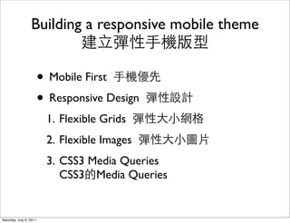
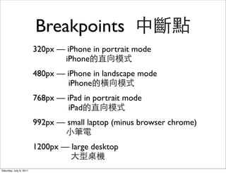
![How do we target
different screen sizes?
• With CSS2 media types we could target different
classes of devices:
CSS2 media types class:
print, screen, handheld, all
• With CSS3 media queries we target device
capabilities.
CSS3 media queries
• [type] and ([query])
• all and (max-width: 768px)
Saturday, July 9, 2011](https://image.slidesharecdn.com/mobile-drupal-110709035619-phpapp02/85/Mobile-drupal-building-a-mobile-theme-8-320.jpg)
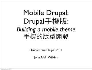
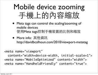
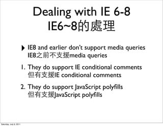
![3 ways to query
query
1. <link rel="stylesheet" href="wide.css" media="screen
and (min-width: 992px)">
2. @import url(wide.css) screen and (min-width:
992px);
theme.info:
stylesheets[screen][] = file.css
stylesheets[screen and (min-width: 992px)][] = file.css
3. @media screen and (min-width: 992px) {
.selector { property: value; }
}
Saturday, July 9, 2011](https://image.slidesharecdn.com/mobile-drupal-110709035619-phpapp02/85/Mobile-drupal-building-a-mobile-theme-9-320.jpg)
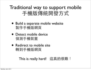
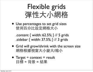
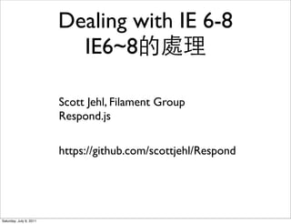
![Dealing with IE 6-8
IE6~8
Conditional Stylesheets module:
http://drupal.org/project/conditional_styles
<!--[if lte IE 8]>
<link src="/css/layout/desktop.css">
<![endif]-->
Saturday, July 9, 2011](https://image.slidesharecdn.com/mobile-drupal-110709035619-phpapp02/85/Mobile-drupal-building-a-mobile-theme-12-320.jpg)

The document discusses building a mobile theme using Drupal for responsive design, emphasizing a mobile-first approach with flexible grids, images, and CSS3 media queries. It covers the challenges of traditional mobile support and the importance of using meta tags for device zooming. Additionally, it addresses targeting different screen sizes and the compatibility issues with older Internet Explorer versions.