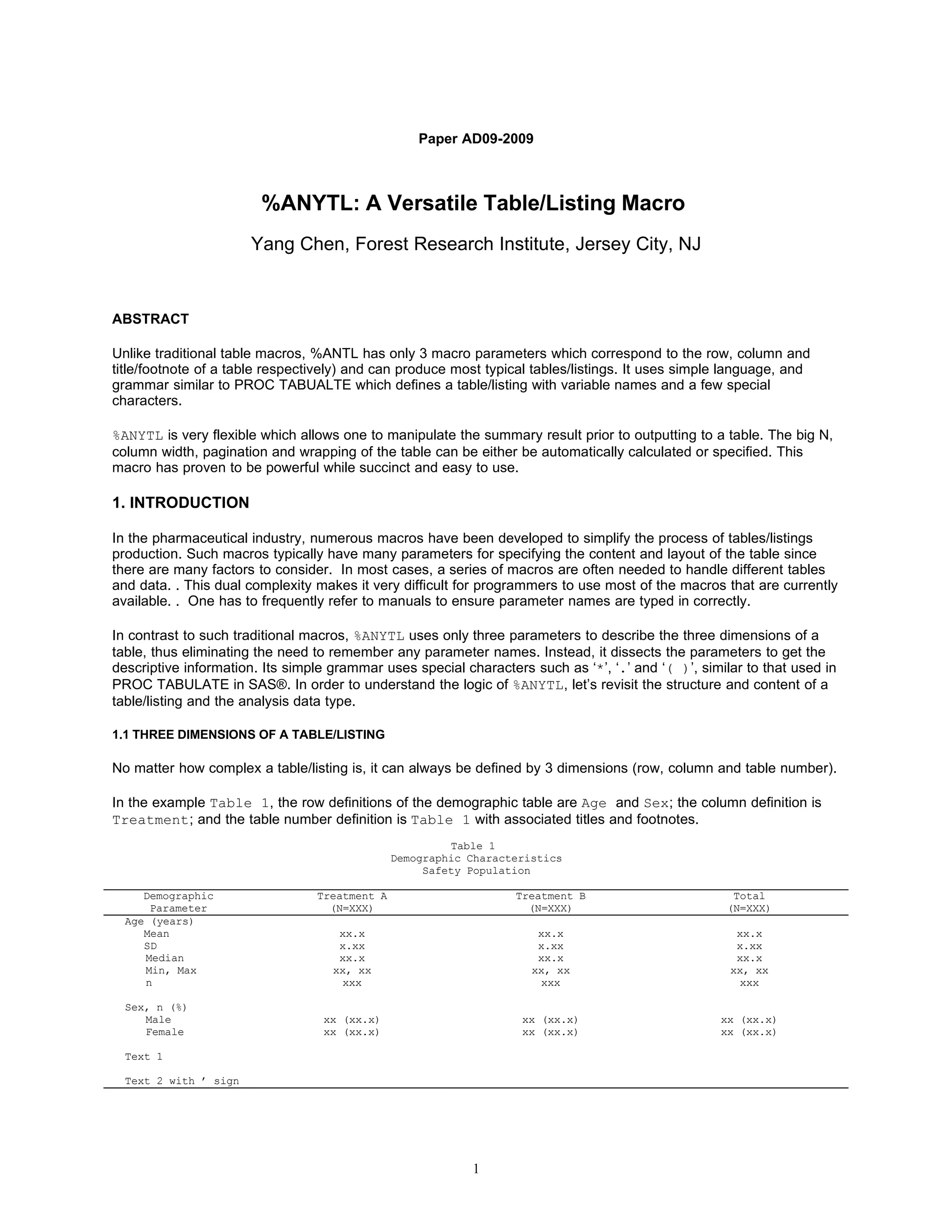
This document describes a versatile table/listing macro called %ANYTL. %ANYTL can produce typical tables and listings using only 3 macro parameters that correspond to the row, column, and title/footnote definitions. It uses a simple language similar to PROC TABULATE to define tables and listings. %ANYTL is flexible in that it allows modifying the summary results before outputting to a table. Examples are provided demonstrating how %ANYTL can quickly produce common table types such as demographic tables, hierarchical tables, and adverse event tables with only a few lines of code.
![Table 3
Abnormal Physical Examination
Safety Population
Treatmnet A Treatmnet B
Visit (N=XXX) (N=XXX)
Body System n/N1 (%) n/N1 (%)
Baseline
Cardiovascular x/xxx (x.xx) x/xxx (x.xx)
Respiratory x/xxx (x.xx) x/xxx (x.xx)
Gastrointesinal x/xxx (x.xx) x/xxx (x.xx)
Skin x/xxx (x.xx) x/xxx (x.xx)
Visit 1
.... x/xxx (x.xx) x/xxx (x.xx)
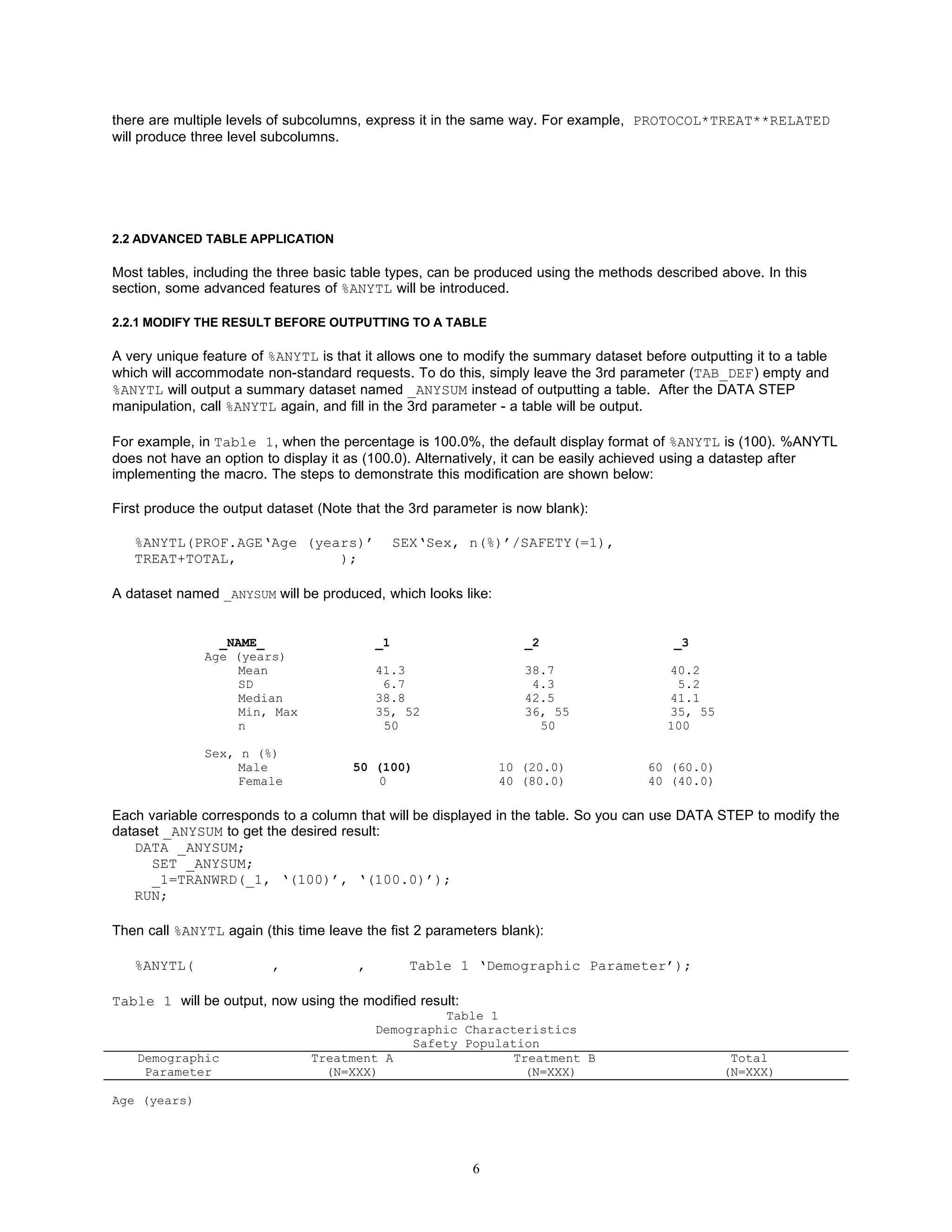
To do this, simply put the class variable VISIT* in both numerator part and denominator portion:
%ANYTL(PE.VISIT*PETERM///VISIT*SAFETY(=1)#,
TREAT,
Table 3 ‘Visit Body System’);
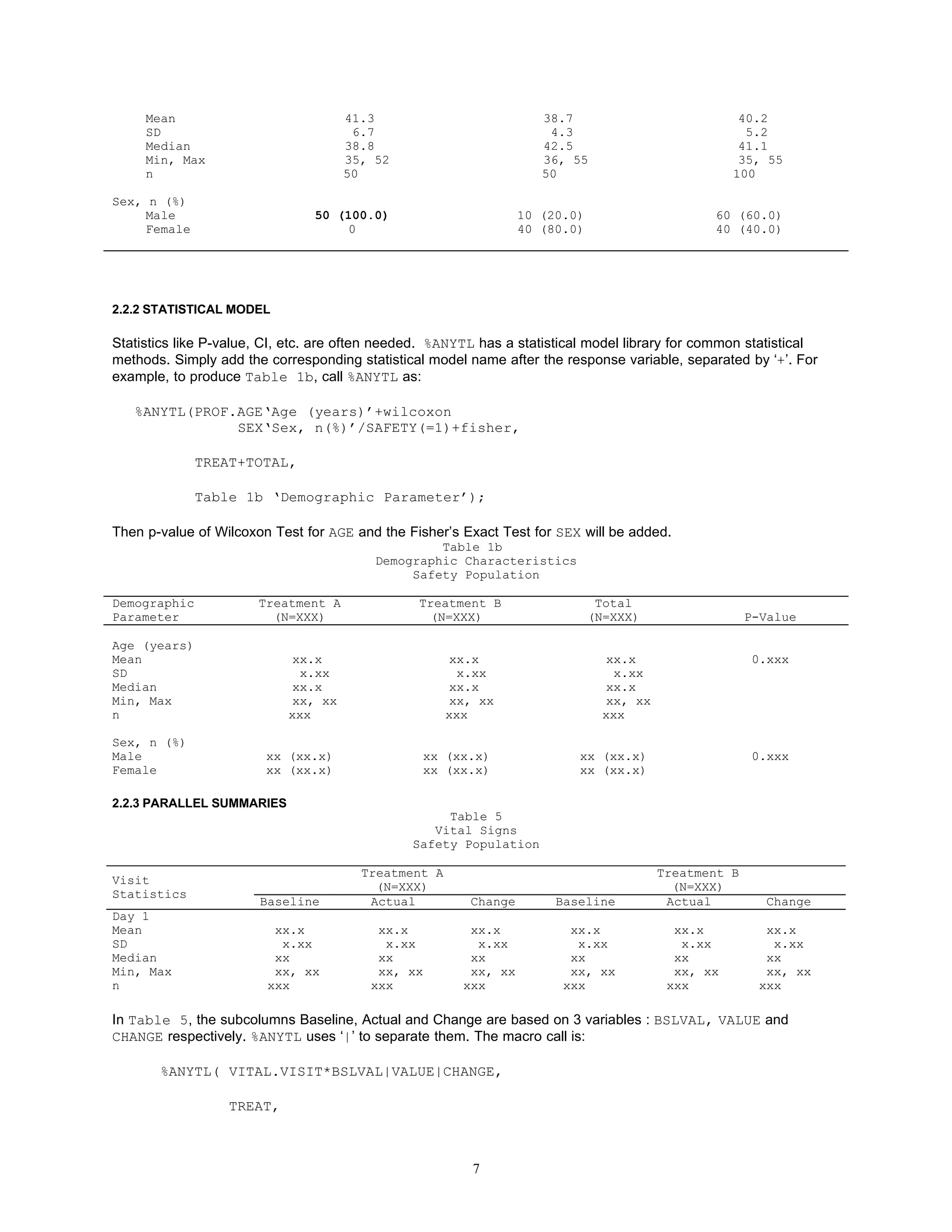
• ADVERSE EVENT (AE) TABLE
An AE table is a special type of hierarchical table (see Table 4) in that:
(1) The percentages will be calculated for every term level.
(2) Under each treatment column, there could be sub-columns for relationship or severity. If one subject has
multiple degrees of relationship (or severity), only the most related (or severe) AE incidence will be used in the
calculation..
Table 4
Incidence of Treatment Emergent Adverse Events
by Treatment Group, System Organ Class, Preferred Term, and Relationship to Study Drug
Safety Population
System Organ Class/ Treatment A Treatment B
Preferred Term (N=XXX) (N=XXX)
Unrelated Related Unrelated Related
n (%) n (%) n (%) n (%)
System Organ Class1 [bodsys] xx (xx.x) xx (xx.x) xx (xx.x) xx (xx.x)
Preferred Term1 [prefterm] xx (xx.x) xx (xx.x) xx (xx.x) xx (xx.x)
Preferred Term2 xx (xx.x) xx (xx.x) xx (xx.x) xx (xx.x)
System Organ Class2 xx (xx.x) xx (xx.x) xx (xx.x) xx (xx.x)
..........
In %ANYTL, , ‘**’ is used to distinguish AE tables from regular hierarchical tables. Here, the call will be:
%ANYTL(TEAE(WHERE=(SAFETY=1 and TEAE=1)).BODSYS**PRETERM/PROF.SAFETY(=1)#,
TREAT**RELATED,
Table 4 ‘System Organ Class/Preferred Term’);
The ** in ‘BODSYS**PRETERM’ in the 1st parameter commands %ANYTL to produce the TEAE count by both
system organ class (BODSYS) and Preferred Term (PREFTERM) for the safety population. ‘/SAFETY(=1)’ tells
%ANYTL that the denominator of the percentage is number of subjects in the safety population from PROF dataset.
TREAT**RELATED in the 2nd parameter indicates that there are subcolumns for relationship under each treatment
column, and only most related incidence will be counted if there are multiple incidences of a AE for a subject. If
5](https://image.slidesharecdn.com/ad09anytl-12586492381364-phpapp02/75/Ad09-Anytl-5-2048.jpg)
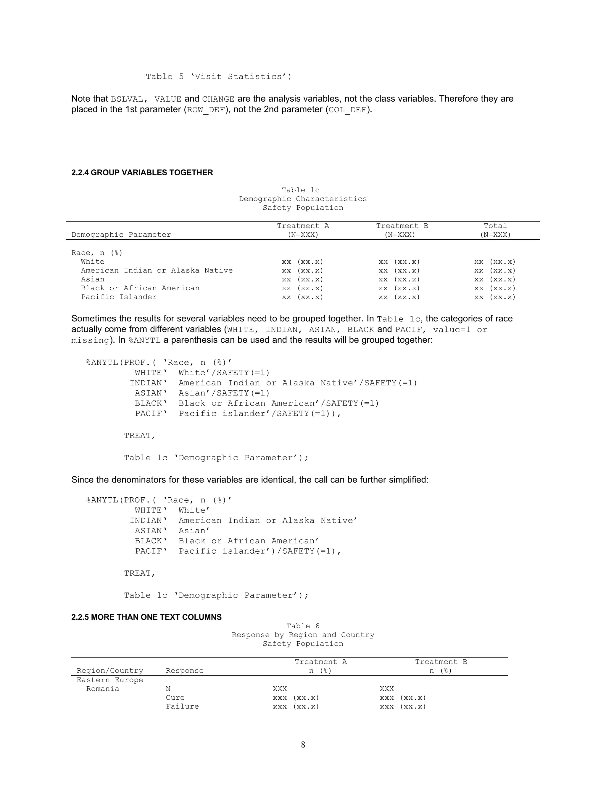
![Indeterminate xxx (xx.x) xxx (xx.x)
Russia
...
In hierarchical Table 6, there are 2 header columns. The first column are the class variables (REGION and
COUNTRY) and the second column is for the n and the response categories under each country. To create 2
columns, insert ‘-‘ after the class variable(s) in the first column. Parentheses are used to group the statistics by
region and country. Correspondingly, the header texts (‘Region/Country’,‘ Response’) for the two columns
are separated by ‘-’ in the 3rd parameter. Call below:
%ANYTL(CLIN.REGION*COUNTRY-*(SAFETY‘N’(=1)/1
RESP/REGION*COUNTRY*SAFETY(=1)#),
TREAT,
Table 6 ‘Region/Country’-‘ Response’)
2.2.6 SPECIFY THE COLUMN WIDTH
%ANYTL will automatically calculate the width of each column in the table and flow the text if needed. However, you
can choose to specify the width of the header columns after the corresponding column header text in the 3rd
parameter. For example, to limit the width of the first column to be 20 characters and the second column to be 25 in
Table 6, call the following:
%ANYTL(CLIN.REGION*COUNTRY-*(SAFETY‘N’(=1)/1
RESP/REGION*COUNTRY*SAFETY(=1)#),
TREAT,
Table 6 ‘Region/Country’/20-‘ Response’/25);
2.2.7 SORTING AE TABLE
You can specify how each AE term level should be sorted in after each term level name. There are 4 options:
AC: ascending alphabetically, can be omitted since it is the default
DC: decending alphabetically
AN: ascending by count(s) of specified column(s)
DN: decending by count(s) of specified column(s)
For example, you can create a AE table, in which every AE term is sorted differently.
%ANYTL( TEAE.TERM1[dc]**TERM2[an(=2)]**TERM3[dn(=2)**(=2=3)]/PROF.SAFETY(=1)#,
TREAT**SEVERITY,
Table xx);
TERM1[dc] means TERM1 will be sorted descending alphabetically.
TERM2[an(=2)] means TERM2 will be sorted by the sum of the counts of the columns under TERM =2.
TERM3[dn(=2)**(=2=3)] means TERM3 will be sorted by the sum of the counts of the columns of TERM =2 and
SEVERITY in (2, 3).
2.2.8 MULTIPLE PAGES
9](https://image.slidesharecdn.com/ad09anytl-12586492381364-phpapp02/75/Ad09-Anytl-9-2048.jpg)


![Coded Agents – with UiPath SDK + LangGraph [Virtual Hands-on Workshop]](https://cdn.slidesharecdn.com/ss_thumbnails/codedagentsdeck-251215155422-5497c599-thumbnail.jpg?width=640&height=640&fit=bounds)


