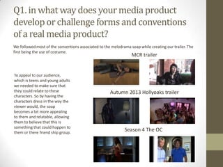
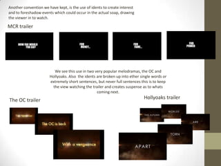
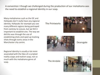
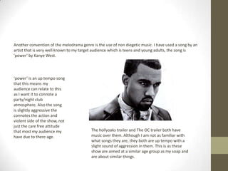
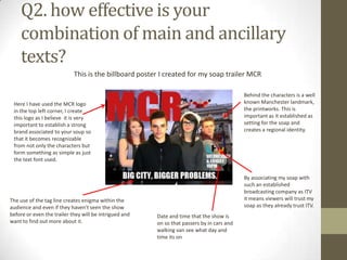
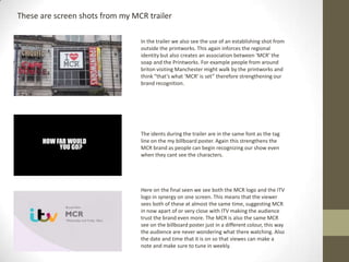
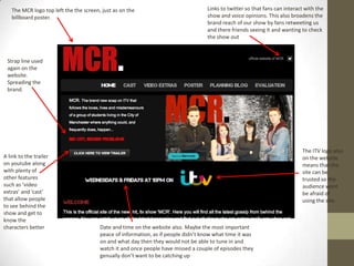
Liam Denton evaluated his media production project of creating a trailer for a soap opera called MCR. He followed many conventions of the melodrama soap genre including using costumes the target audience could relate to, using idents to foreshadow events, and incorporating non-diegetic music. He also challenged some conventions by establishing a strong regional identity set in Manchester. Liam analyzed how effective the combination of his main trailer text and ancillary materials like a billboard poster and website were at reinforcing the MCR brand. He learned from audience feedback that his editing was good but some clips needed trimming to increase pace. Liam utilized various technologies in his research, planning, production and evaluation including DSLR cameras, i
CREATIVE CRITICAL REFLECTION by MARIAM HAMIDMariam Hamid
The document summarizes Mariam Hamid's film project for a class. It is a drama genre film that portrays the struggles of daily life and poverty. Mariam chose this genre because she enjoys emotional movies as a woman. She used conventions of the drama genre like realistic struggles but also added elements of tragedy. The film represents social issues like poverty. It would appeal to audiences of all ages. Mariam hopes to distribute the film through Warner Bros. due to their successful drama films and marketing strategies. Her production skills improved through learning camera angles while filming and overcoming editing challenges. She used a Canon camera, Windows Movie Maker software, and the internet for music, sounds effects, and editing help.
The document provides an evaluation of a stop motion animation film advert created by the author for Film4. It discusses how the advert adheres to the brief requirements such as being under 20 seconds and featuring the Film4 logo. Areas for potential improvement are also outlined, such as replacing soundtrack music and improving shot framing. While the brief requirements were followed, the author notes the shots could have been more technically advanced through additional animation effects.
The student was assigned two production briefs for their AS and A2 media studies assignments. For AS, they created a music magazine cover, contents page, and magazine spread. For A2, they worked in a group to create a film magazine cover, film poster, and teaser trailer. They conducted research on similar media products and target audiences to inform their work.
The document discusses how the media product (a film trailer, magazine cover, and poster) uses conventions of real media.
It analyzes the typical codes and conventions used in each type of media, such as using a positive opening scene in the trailer, masthead and cover lines on the magazine, and including the film title and release date on the poster.
The document also discusses how audience feedback was invaluable during the production process, as it helped shape decisions around the genre, trailer synopsis, magazine cover design, and ensured the promotional materials would appeal to and attract audiences.
This document outlines initial plans for creating YouTube content, including a vlog using footage from MCM Comic Con and finishing a horror movie started in October. The target audience is identified as teenagers aged 15-24. Various video ideas are mapped out, such as creating a behind-the-scenes montage and self-vlogging footage with color correction. Merchandise ideas like an online store selling branded clothing are also proposed. Reference images provide examples of shots that could work well for a vlog. The final product will be a 7-10 minute YouTube video sharing the comic con experience.
This document discusses various purposes and design elements of television channel idents. It examines how idents are used for branding, packaging content, segmenting scheduling, and marketing channels. It also explores how idents establish identity, and discusses elements like logo, font, and imagery that viewers associate with a particular channel. Scheduling of programs and consideration of watershed periods and prime viewing times are also covered. The document provides analysis of several channel idents as examples to illustrate these different design purposes and strategies.
The document discusses strategies for producing and distributing a low-budget independent horror film. It notes that films like The Evil Dead (1981) used unknown actors and improvised equipment to keep costs low. It suggests distributing the film through film festivals to attract a distributor, and marketing it online and through select art house cinemas. Overall distribution would emulate that of other independent UK films like Monsters (2010) through a platform release targeting niche audiences.
- The document discusses a soap opera trailer, magazine cover, and poster created for the soap opera "Black and White".
- The trailer used a non-linear narrative structure and symbolism like a chess game to represent the relationships between characters. It also included a cliffhanger ending.
- The products were aimed at teenagers aged 16-24. Cross-media promotion and convergence between the trailer, magazine, and social media were used to more efficiently promote the products.
- Feedback showed the trailer was most effective at portraying a storyline involving teenage pregnancy and included an air of mystery. The music choice was well-received.
This document provides an analysis of the movie poster for the film Justice League. It examines various elements of the poster's design and how they appeal to audiences. In three sentences:
The poster depicts the Justice League characters standing together at dawn with the movie's title displayed. By including iconic costumes and references from the comics and animated series, the poster aims to appeal to fans familiar with those works. The lighting and backdrop also symbolize the film continuing the storyline from Batman v Superman: Dawn of Justice in a way that would interest fans of that previous movie.
Audience feedback was vital to improving the creator's music video. Feedback was gathered from classmates, teachers, and through an online survey completed by the target audience of 15-35 year olds. The feedback helped identify needed changes such as strengthening the narrative, improving editing techniques, and adjusting colors. Additional filming was done based on feedback to add more shots of the male performer and build his character. Overall, the feedback process allowed the creator to better understand what parts of the video worked and which needed further development and editing to appeal to the target audience.
Lewis Bancroft created a promo, DVD cover, and magazine advert for a hip-hop track. The promo uses dark visuals and fast editing to match the song's tone. While conforming to conventions like establishing shots, it challenges norms by using antagonists' POV. The DVD cover depicts the rural setting, challenging hip-hop's urban focus. Feedback praised the promo's quality and narrative. Lewis learned the importance of conventions, effects, and simplicity. He gained skills in filming, editing with Final Cut Pro, and design with Photoshop.
Q2) how effective is the combination ofKateSutton04
The document discusses research conducted to create an effective horror film trailer and magazine cover for a target audience aged 15-20. Primary research in the form of questionnaires was used to understand what the audience wants from a horror experience. Typical horror conventions like dark lighting and close-ups were employed to build suspense. Elements like sound, editing, and cinematography work together to create the right tone. The magazine cover and film poster both feature conventions seen in other horror marketing, like using red coloring and gory titles, to make the materials feel realistic and entice the target audience.
The document discusses the effectiveness of combining a main music video product with two ancillary tasks of an advertisement and digipak.
The creator ensured all three products shared a common visual aesthetic through consistent tones, fonts, and overall style to clearly connect them. They established a theme around a music video they produced first, then based the two ancillary tasks around it.
Feedback indicated the advertisement draft's main image was highly effective at displaying the video and connecting the performers, so it remained unchanged. Consistent themes, tones, fonts and image types were used across all products to clearly link them and form a unified brand identity.
Real media products and institutions evaluation (1)joshua__anthony
The document discusses various elements of media production including production logos, titles, enigma codes, action codes, binary oppositions, genre conventions, and potential media institutions for distribution. For the production logo, the author animated their logo in Sony Vegas to improve professionalism. Titles were designed to be simple, effective and sophisticated to inform audiences. Enigma codes were used to intrigue audiences about characters without revealing the full storyline. Action codes and tension building music were employed to hook audiences. Binary oppositions between characters and time eras were utilized to challenge comedy conventions. The author believes independent production companies Film4 or Big Talk Productions would be suitable to produce and distribute the film in the UK market through theaters, social media, YouTube
The document discusses conventions in sponsorship sequences, radio ads, and television ads for fashion brands. It analyzes how the productions followed conventions such as upbeat soundtracks, showing outfits, and using different camera shots. Some conventions were broken, such as not including voiceovers or jingles in radio ads. Overall, following and breaking conventions made the productions unique and effective.
The document discusses the shift from impression-based advertising metrics like cost per mille (CPM) to involvement-based and relationship-based metrics. It describes an experiment where a publisher allowed users to opt-in to watching a 2 minute and 20 second commercial. Over 6 days, 1,542 unique users streamed the commercial, spending an average of 1 minute and 50 seconds with it, for a total of 169,620 seconds or 47 hours of time spent with the brand. This resulted in much higher involvement than typical broadcast advertising, at a cost to the advertiser of just $3,000.
The document discusses the use of fonts, colors, and other stylistic elements across a film poster, magazine cover, and teaser trailer for a film called "Reverie." There is consistency in using a red font for the film title across all pieces, while other fonts vary stylistically depending on the needs of each ancillary task. Character expressions also differ slightly between the poster and magazine to suit the tone and audience of each medium. Overall, the combination of main product and ancillary tasks effectively promotes the film through clear visual links tied to its mystery genre themes.
This document discusses various aspects of television channel idents and branding, including design, tempo, use of space and time, information vs entertainment focus, interaction with viewers, density of information, branding, packaging and repackaging, segmentation within scheduling, marketing, identity, and scheduling. Examples are provided for each topic to illustrate effective and ineffective approaches.
This newspaper advertisement uses conventions common to ITV and Channel 4 ads. For ITV, the logo is prominently displayed and the name of the show is in large, contrasting typography to stand out. Key information like date, time and channel are clearly listed. For Channel 4, the iconic logo is used and the image takes up most of the space, focusing on characters to depict the genre. Both follow conventions of clear branding, focal images, and vital show information to effectively promote programs.
This document summarizes Liam Barnes' media production evaluating his soap opera trailer and ancillary texts. It discusses how the trailer uses conventions of real soap operas through its parallel storylines, enigma, and point of view narrative. It also analyzes how the trailer, magazine cover, and billboard maintain consistency through codes, genres, demographics, and reality representation. Audience feedback supported the effective soundtrack but suggested improving institutional representation. Media technologies like Adobe Photoshop, Premiere, YouTube and digital storyboarding supported production, research and evaluation stages.
The document discusses the production of a film trailer for a psychological thriller genre film. It summarizes that the group analyzed real film trailers to understand conventions like three-act structure. They applied conventions of the psychological thriller genre such as darkness and confusion. The trailer incorporated structure, text, and music as key conventions. Feedback was gathered through audience comments on a blog.
The document contains an analysis of audience feedback on a student's media production project consisting of a soap opera trailer, magazine, and poster. Feedback indicated that the trailer, magazine, and poster effectively used conventions of their real counterparts in their storylines, camerawork, layouts, and visuals. However, some aspects like music choice, advertising of the soap, and consistency between ancillary texts needed improvement. The student learned that key elements like drama and design were successful, while audio, branding, and casting alignment presented opportunities for strengthening the project.
The document discusses the media technologies used during the construction, research, planning, and evaluation of a soap opera trailer and ancillary products. During construction, the group used Adobe Premiere Pro to edit footage and add effects to the trailer. Research involved analyzing real soap opera magazines and trailers online. Planning consisted of storyboards, shot lists, permission letters, and meeting notes to organize filming.
The document discusses a student's action film trailer project. The student feels they successfully incorporated conventions of the action genre such as length, fast pacing, and intense mise-en-scene. Audience feedback was positive and suggested minor improvements like additional music and sound editing. The student also created accompanying promotional materials like a website and magazine cover that maintained consistency with the trailer and received good feedback. Overall, the student learned from the audience feedback and successfully used various media technologies throughout the project.
The film "Hoodz" portrays two groups of teenage boys from rival gangs. It was inspired by films like Kidulthood and Adulthood that depict urban youth culture. The film uses conventions like stereotypical costumes, locations, and behaviors to represent this culture. Through filming in dark areas at night and including intimidating and rebellious actions, the film aims to feel realistic while challenging some conventions by including a musical score. The filmmakers learned about technologies like cameras, editing software, and creating a musical score through making this film.
- Photoshop allowed me to edit photos by removing backgrounds, adjusting colors/exposure, and layering images to create composite shots for the cover and spreads. This gave me more creative control over the visual design.
- Different tools like the magic wand, vibrance, and levels helped me isolate and modify specific elements of photos to achieve the desired aesthetic.
- Layering images and text boxes gave the pages depth and allowed elements to interact visually through placement and overlap.
- Basic design principles like alignment, spacing, and consistency of fonts and colors across pages were important for cohesion and branding of the magazine.
The document provides information about the audience for a proposed hip hop magazine. The target audience is described as teenagers and young adults aged 16-25, mostly male, who listen to radio stations like Radio 1Xtra and are active on social media. Most would have part-time jobs and limited budgets, so the proposed £1.99 price point is identified as affordable.
Pritisudha Samantara is seeking entry-level positions in IT or marketing. She has a MCA degree from Khalikote College and BCA from Bhubaneswar College of Computer Science and Technology. She has certifications in Oracle PL/SQL and Qlikview Reporting. Her projects include an e-shopping portal built in Java, HTML, and Oracle and an e-seva portal providing government services built in J2EE, JSP, and Oracle. She is proficient in languages like C, C++, Java, HTML, and tools like MS Office.
This document does not contain any meaningful information to summarize in 3 sentences or less. The document only repeats the phrase "sprint-ink" multiple times without any other context.
Risk analysis involves comparing the risks and benefits of a situation. Individuals are more averse to risks they cannot control. When evaluating future risk, there are real, statistical, projected, and perceived risks.
Risk communication aims to inform people about risks but faces challenges as people are often apathetic. Effective risk communication is multi-directional rather than one-way.
Risk management considers social, economic, and political factors in risk decision making. Risk managers integrate risk assessments with other available information, though the line between assessment and management can be blurred.
This document discusses how the media product uses and develops conventions of real film trailers, posters, and magazines. It analyzes the conventions used in a teaser trailer, film poster, and magazine cover for the film Warm Bodies. It then explains how the conventions from Warm Bodies and other zombie films were used and developed for the teaser trailer, poster, and magazine cover created for the media product T.O.D. Settings, lighting, props, costumes, and makeup are discussed in developing the realistic elements of a zombie horror genre.
Risk analysis involves comparing the risks and benefits of a situation. Individuals are more averse to risks they cannot control. When evaluating future risk, there are real, statistical, projected, and perceived risks.
Risk communication aims to inform people about risks but faces challenges as people are often apathetic. Effective risk communication is multi-directional rather than one-way.
Risk management considers social, economic, and political factors in risk decision making. Risk managers integrate risk assessments with other available information, though the line between assessment and management can be blurred.
This document discusses how the media product uses and develops conventions of real film trailers, posters, and magazines. It analyzes the conventions used in a teaser trailer, film poster, and magazine cover for the film Warm Bodies. It then explains how the media product incorporates similar conventions for the teaser trailer, poster, and magazine cover created to promote the fictional film T.O.D. Key elements borrowed include using the bold film title at the end of the trailer, central image and title on the poster, and reviews/other films on the magazine cover. Settings and props/costumes are also discussed, explaining how they aimed to make the zombie scenes and characters more realistic by drawing from other zombie films.
Podrum is an enterprise social network developed in Croatia. Find out why is Podrum great solution for communication and collaboration problems in your organization.
This document summarizes the rules and values of the Extreme Programming (XP) software development methodology. It outlines the core practices of XP which include planning with user stories, managing through daily stand-up meetings, designing for simplicity, coding with pair programming and unit testing, and testing all code through automated unit tests and acceptance tests. The values that XP is based on are also summarized as simplicity, communication, feedback, respect, and courage.
The document discusses 9 shots from the opening scene of a student film and how each shot establishes important elements of the film. Shot 1 introduces the isolated setting of a family home. Shot 2 shows the main character Darcy to seem normal at first, important for a psychological thriller genre. Shot 3 reveals Darcy's change in behavior, sparking the audience's curiosity. Subsequent shots showcase the title design, costume, hints the genre is psychological thriller, the film title "Silence" and its meaning, camera angles including a close-up of Darcy's face, and special lighting effects to convey darkness and isolation. Overall, the opening scene orients the audience and sets up expectations for a psychological thriller through these visual elements.
This document summarizes the rules and values of the Extreme Programming (XP) software development methodology. It outlines the core practices of XP which include planning with user stories, managing through daily stand-up meetings, designing for simplicity, coding with pair programming and unit testing, and testing all code through unit and acceptance tests. The values that XP is based on are also presented as simplicity, communication, feedback, respect, and courage.
Ever wondered how your Toner cartridge or Printer Ink Cartridge works? Or need help with installing your ink cartridges? Find helpful tips and instructions on everything about printers and printer cartridges in our help guides.
This guide shows you how your laser printer works
The document provides a personal evaluation of a media project. It summarizes the key points:
1) The music video combined elements of a typical party music video with a small love story narrative to develop the genre.
2) Filming used conventions of indie/urban styles with locations like Kings Cross to challenge expectations.
3) Audience feedback helped improve the narrative structure and address technical quality issues in some shots.
4) Various media technologies like Photoshop, InDesign, and Final Cut Pro were used at different stages for construction, planning, and editing. Location filming incorporated cameras like the Canon XF100 and Canon 7D.
The document provides feedback on a media project involving a music video. It discusses how feedback was used to improve the narrative structure and address technical issues like video quality. Audience feedback suggested shortening some clips and addressing quality issues for one or two shots. Various media technologies were used, including Photoshop, InDesign, and Final Cut for video editing. Planning was loosely based on a storyboard but experimentation occurred during shooting and editing.
The document discusses the media productions that inspired the creator's trailer and ancillary texts, how they used conventions from real media, and how they effectively linked the pieces together. It also outlines the media technologies used in researching, planning, constructing, and evaluating the project, including cameras, editing software, websites for design work, and tools for gathering and presenting audience feedback.
The document summarizes Abdullahi Mohammed's work creating a film trailer for an A2 course. It discusses the roles of group members, how the trailer used and challenged conventions, the effectiveness of combining the trailer with ancillary materials like a poster and magazine cover, learning from audience feedback, and the use of software and technologies in the process.
The document discusses the production of a teaser trailer and ancillary tasks for a media project. Conventions like cultural codes and symbolic codes were used in the teaser trailer. Challenges included using contrasting soundtracks and focusing on female characters. Audience feedback was positive and confirmed the project effectively targeted the intended demographic. Lessons were learned about camerawork. A variety of new media technologies were used in the production process, including digital cameras, video editing software, and online conversion tools.
This document summarizes feedback received on a student's media trailer project for a soap opera. The feedback praised the effective soundtrack choice, noting that the instrumental Arctic Monkeys song fit well with the conflict depicted and would appeal to the target demographic. However, the feedback also pointed out that the student should aim for a more inclusive audience and cast by incorporating female characters. Overall, the feedback suggested the trailer was strong in conveying conflict through sound and visuals but could improve on representation.
Evaluation powerpoint both together initguestbfbdf32
This document summarizes the use of conventions and techniques in the construction of a film trailer. It discusses how the trailer follows conventions like building tension through changing editing speeds from slow to fast. It establishes a hero/villain distinction through clothing. It builds tension in editing by starting slow and becoming faster as the "equilibrium breaks." Music and selective shots are used to create an atmospheric and tense feeling. While most thriller trailers are mysterious, this one reveals more of the plot to explain it. New media like digital cameras, editing software, blogs, and photo manipulation were used in planning, research, and presenting the project.
This document describes and analyzes a student's media production project creating a soap opera brand called "Friends and Foes". It discusses the trailer, magazine cover, and billboard created for the brand and how they establish genre, represent the target demographic of teenagers, maintain visual and tonal consistency, and follow conventions of real media. The student emphasizes conflict, trouble, and serious facial expressions throughout the ancillary texts and trailer to clearly position it as a soap opera and engage the intended audience.
The document summarizes how a student used various media technologies at different stages of creating a horror movie trailer for a class project. It discusses researching real horror movie trailers on YouTube and magazines to understand conventions. Planning involved using Word for a shooting schedule and online research for filming locations. Filming used Canon cameras and Photoshop to create Polaroid images. Editing the trailer used Final Cut Pro to cut footage and add effects. Photoshop was also used to design ancillary materials like a movie poster and magazine cover that complemented the trailer. Feedback on a draft led to changes like altering tone cards and adding dialogue and voiceovers.
The document is a media evaluation submitted by Jade Parsley. It consists of 7 paragraphs summarizing how their media product used or challenged conventions of real media, represented social groups, might be distributed, targeted audiences, attracted audiences, technologies learned from the process, and progression from their preliminary task. The media product was influenced by the films Strangers on a Train and Sky Captain and the World of Tomorrow. It could be distributed as a 3 part thriller drama series on ITV targeting middle-aged audiences. The evaluation reflects on technical challenges encountered and skills developed in angles, effects, and setting since the preliminary task.
In what ways does your media product use, develop or challenge forms and conv...KathrynXo
This document is a media evaluation by Kathryn Hoverd of various media products she created for her A2 media work. It includes an evaluation of her final teaser trailer, magazine front cover, film poster, and early animation. She analyzes how her products used, developed or challenged conventions of real media. For her teaser trailer, she researched conventions of successful trailers, particularly romantic comedies, to inform her creation. Her evaluation identifies several key conventions her trailer adhered to including opening graphics, company logos, captions, varied shots, fast edits, and including the film title.
A2 Coursework Final Production Evaluation Question Onerooparora16
This document summarizes the media used in a student's media production project. It discusses:
1) Using YouTube to release the skateboarding music video due to its large audience size.
2) Creating a web pop-up advertisement using Adobe Illustrator and placing it on the BBC homepage.
3) Filming a product sponsorship video for drumsticks using an iPhone and presenting it on YouTube.
4) Choosing unconventional filming techniques like slow motion shots to make the videos more visually interesting compared to typical drumming advertisements.
The document summarizes an A2 media evaluation for a short teaser trailer created by the author. The teaser trailer featured an all-male cast, challenging the typical damsel-in-distress trope in horror films. Storyboards and viral marketing on Facebook were used to plan shots and gather audience feedback. Based on feedback, additional shots were added to make the teaser more tense. Editing software and camera equipment allowed the trailer to be professionally edited in HD quality.
The document discusses a teaser trailer that challenges conventions by using continuous editing to build the story and engage audiences. It received positive feedback for its suspenseful soundtrack and fast-paced shots. However, audiences felt it was too short and got confused thinking it was a music video rather than a trailer due to its hip-hop soundtrack. The combination of the teaser trailer and accompanying posters is effective as they complement each other's dark, urban style and theme of betrayal and divided friendship between characters.
The feedback received on the trailer, billboard, and magazine for the scripted reality soap provided useful insights. Respondents correctly identified the target audience as teens aged 16-25 and the genre as a scripted reality or soap. However, some did not fully understand what the show was about from just the promotional materials. Suggestions to make the soap more appealing included showing more characters, storylines, and using multiple songs in the trailer rather than just one. Overall, the promotional products linked well together and achieved some of their goals, but could be improved by providing more clarity on the show's content and characters.
The feedback received on the trailer, billboard, and magazine for the scripted reality soap provided useful insights for the creator:
- Viewers correctly identified the target audience as teens aged 16-25 and the genre as a scripted reality/soap, showing the products achieved their purpose.
- However, some said they didn't fully understand what the show was about from just the products.
- Aspects that appealed included how similar it was to MTV shows, the editing of the trailer, and how the products linked together.
- Suggestions to make it more appealing included adding more characters, using multiple songs in the trailer, including shorter clips, and showing more storylines.
Tanaka Tiriboyi evaluated their media products including a film poster, magazine, and trailer. For the poster, Tanaka followed conventions such as including the film title, character image, slogan, and cast/crew information to make it look professional. Some conventions were developed, such as placing the character image in front of the title to emphasize their importance. For the magazine, conventions like the masthead, promotional text, and thumbnail images were used. Developing conventions included overlapping the main image and tagline. The trailer included disclaimers, production logos, camerawork to convey emotion, and mood music as conventions. Developing conventions in the trailer included changing the upbeat soundtrack in the second half for irony. Feedback
The document discusses how the student used various media technologies at different stages of creating an advanced media portfolio project. During the research and planning stage, the student created a blog to organize work and used YouTube to analyze existing horror movie trailers. Footage was filmed using a digital camcorder and tripod. iMovie was used to edit the trailer and Adobe Photoshop Elements was used to create promotional materials like a movie poster. Feedback from test audiences was positive overall, praising the editing, effects, and music. The student learned about the role of technology in media production and how skills develop with experience using various technologies.
The document discusses a student's media production of a teaser trailer for an action film called "Conspiracies". The student conducted extensive research on conventions of action film trailers in order to include all necessary forms and conventions in their teaser trailer. They created several ancillary texts including a website, magazine cover, and DVD cover to promote the film. The student gathered feedback on their work and found it was generally positive, with some suggestions for minor improvements. The student learned about their audience and how to improve through gathering this feedback.
The document summarizes an A2 media evaluation for a teaser trailer project. The teaser trailer used an all-male cast to challenge conventions of typically featuring female characters. Storyboards and viral marketing on Facebook were used to plan shooting and gather feedback. Audience feedback suggested adding more shots and a point-of-view shot of a victim to increase tension. Advanced editing software and HD cameras were used to professionally construct and edit the teaser trailer.
2. Q1. in what way does yourmediaproduct
developor challenge forms and conventions
ofa real mediaproduct?
We followed most of the conventions associated to the melodrama soap while creating our trailer. The
first being the use of costume.
To appeal to our audience,
which is teens and young adults
we needed to make sure that
they could relate to these
characters. So by having the
characters dress in the way the
viewer would, the soap
becomes a lot more appealing
to them and relatable, allowing
them to believe that this is
something that could happen to
them or there friend ship group.
MCR trailer
Autumn 2013 Hollyoaks trailer
Season 4 The OC
3. Another convention we have kept, is the use of idents to create interest
and to foreshadow events which could occur in the actual soap, drawing
the viewer in to watch.
The OC trailer Hollyoaks trailer
MCR trailer
We see this use in two very popular melodramas, the OC and
Hollyoaks. Also the idents are broken up into ether single words or
extremely short sentences, but never full sentences this is to keep
the view watching the trailer and creates suspense as to whats
coming next.
4. A convention I though we challenged during the production of our melodrama was
the need to establish a regional identity in our soap.
Many melodramas such as the OC and
Hollyoaks don’t really have any regional
identity. Hollyoaks for example you see
many different regions being portrayed
from cockney to scouse, but we felt it
important to establish one. The way we
did this was through the use of
establishing shots and sped up tracking
shots through iconic areas in the
Manchester city centre.
The Printworks
Deansgate
The Arndale
Regional identity is usually a lot more
associated with the likes of a scripted
reality soaps and realism soap, not so
much with the melodrama genre of
soap.
5. Another convention of the melodrama genre is the use of non diegetic music. I have used a song by an
artist that is very well known to my target audience which is teens and young adults, the song is
‘power’ by Kanye West.
‘power’ is an up tempo song
that this means my
audience can relate to this
as I want it to connote a
party/night club
atmosphere. Also the song
is slightly aggressive the
connotes the action and
violent side of the show, not
just the care free attitude
that most my audience my
have due to there age.
The hollyoaks trailer and The OC trailer both have
music over them. Although I am not as familiar with
what songs they are, they both are up tempo with a
slight sound of aggression in them. This is as these
show are aimed at a similar age group as my soap and
are about similar things.
6. Q2. how effective is your
combination of main and ancillary
texts?
This is the billboard poster I created for my soap trailer MCR
Here I have used the MCR logo
in the top left corner, I create
this logo as I believe it is very
important to establish a strong
brand associated to your soup so
that it becomes recognizable
from not only the characters but
form something as simple as just
the text font used.
The use of the tag line creates enigma within the
audience and even if they haven't seen the show
before or even the trailer they will be intrigued and
want to find out more about it.
By associating my soap with
such an established
broadcasting company as ITV
it means viewers will trust my
soap as they already trust ITV.
Behind the characters is a well
known Manchester landmark,
the printworks. This is
important as it established as
setting for the soap and
creates a regional identity.
Date and time that the show is
on so that passers by in cars and
walking van see what day and
time its on
7. In the trailer we also see the use of an establishing shot from
outside the printworks. This again inforces the regional
identity but also creates an association between ‘MCR’ the
soap and the Printworks. For example people from around
briton visiting Manchester might walk by the printworks and
think “that’s what ‘MCR’ is set” therefore strengthening our
brand recognition.
These are screen shots from my MCR trailer
The idents during the trailer are in the same font as the tag
line on the my billboard poster. Again this strengthens the
MCR brand as people can begin recognizing our show even
when they cant see the characters.
Here on the final seen we see both the MCR logo and the ITV
logo in synergy on one screen. This means that the viewer
sees both of these at almost the same time, suggesting MCR
in now apart of or very close with ITV making the audience
trust the brand even more. The MCR is also the same MCR
see on the billboard poster just in a different colour, this way
the audience are never wondering what there watching. Also
the date and time that it is on so that viewes can make a
note and make sure to tune in weekly.
8. The MCR logo top left the the screen, just as on the
billboard poster.
The ITV logo also
on the website
means that the
site can be
trusted so the
audience wont
be afraid of
using the site.
Links to twitter so that fans can interact with the
show and voice opinions. This also broadens the
brand reach of our show by fans retweeting us
and there friends seeing it and wanting to check
the show out
A link to the trailer
on youtube along
with plenty of
other features
such as ‘video
extras’ and ‘cast’
that allow people
to see behind the
show and get to
know the
characters better
Strap line used
again on the
website.
Spreading the
brand.
Date and time on the website also. Maybe the most important
peace of information, as if people didn’t know what time it was
on and what day then they would not be able to tune in and
watch it and once people have missed a couple of episodes they
genually don’t want to be catching up
9. Q3. what have you learnt from
your audience feedback?
pros
good use of quick straight cuts
I like the use of editing techniques
good montage
Good use of sound effects
cons
cut some of the clips down to make it snappier
over all really good
the sound on some of the scenes needs altering as
you cant hear what some of the characters are
saying
From this feed back from my draft trailer I found that they like the use of my straight cuts as this made my
trailer look sharp and fast paces. They also liked the sped up tracking shots that what called a ‘montage’,
which again gave my trailer pace but also was a good use of editing. Finally they liked the sound effect of
rolling thunder when the gun is fired.
The cons of my trailer where that they though that some of the clips where to long, so cut the clips down
to make my trailer snappier and look more action packed and exciting. Also some of the clip had poor
sound which needed altering, this was probibaly to do with the fact that we were filming in the city with a
lot of back ground noise, so I had to reduce the backgroud sound I many of the clip except for one, which
sound was so poor I had to rerecord the sound on a Dictaphone and edit it back over the clip.
10. Another problem we had was the
stability of the camera. Most of our
early scenes were shot with
handheld, but this made them shaky
and were not very pleasant to watch.
We corrected this by borrowing a
tripod and reshooting most of the
shots. This worked great and mad the
footage look a lot more professional.
We still had this problem though on
the scenes we wanted to be hand
held but it didn’t really affect us after
we had sped them up
Finally there wasn’t enough use of
editing transitions. Although this
was the case I didn’t go mad with
the transitions and begin adding
fades and wipes in everywhere as
this would lose its professional
look and feel. Instead I used them
only to intensify the drama in the
action scenes
11. Q4. how did you use technologies in
the research and planning
construction and evaluation stages?
I used many different media technologies such as, DSLR cameras for taking my pictures for
my billboard posters ect and for the actual filming of my trailer. Another technology I used
was imovie, this was used to put my trailer together. Other technologies ive used are,
publisher, word and powerpoint. These were used to type up work and power point is what
I have used to do this evaluation as it give you a professional looking presentation. Green
screens and Photoshop was also used in the production of the billboard poster. Finally
social network sites such as twitter were used, as well as youtube.
12. Imovie
Probably the most important piece of tecnology I used was imovie. This is where I actually constructed
my trailer. By using this program I learnt how to take the raw footage that I had shot, from the camera
and produce a professional looking trailer through cutting down clips, adding effect to the clips such as
transitions, colour differences and also adding my chosen music over the top of it while still being able to
hear the actors speak.
13. In order to place my chosen track over
my trailer I had to use a website called
‘youtube converter’ this converts your
youtube video into an MP3 file which
you can then download and place over
your trailer.
I went onto youtube and found
the song that I was looking for,
which was ‘power’ by Kanye
West. I then copied its URL into
youtube converter and clicked
‘convert video’. Then all I had to
do was download and save the
song to my desk top so that I
could just grab the MP3 file and
drag it onto imovie.
Once the clip was on it could be
moved to where you wanted it on
the clip and also cut down and
chopped in places if I wanted.
14. Microsoft word and publisher
Microsoft word and publisher were some of the most important
programs when creating my trailer, particular during the ancillary tasks
and the planning stages. Without these we would not have been able
to create digital versions of our shooting script, proposal, story boards
and draft versions of our billboard posters ect. Without these things we
would have struggled to have any organization and therefore the
quality of our trailer would have suffered.
Thinks such as this moodboard
were created on Microsoft word
and publisher along with many
more
15. Photoshop and green screen
Photoshop was pivotal in the production of my ancillary products. Without photoshop I
would have struggled to create a professional looking logo, billboard poster ect. Most
every graphic or edited picture you see on my website would have been created in
photoshop.
Not only was photoshot a big part but aslo so was the use of the green screen. The
green screen made it easy to remove the background and allowed me to place
whatever picture I wanted behind.
16. Youtube
In an attempt to broaden the brand reach of our media product, I up loaded the trailer
up to youtube as this is a platform with millions of views and subscribers, which allows
you to upload videos freely, no charge.
To upload a video I had to create an account and from there it was easy, it was just a case
of exporting it from imovie then posting it onto my account.