Download to read offline
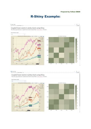

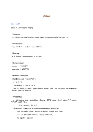
![paper_bgcolor = papercolor,
yaxis2 = list(title = "SP500", side = "right", overlaying = "y"))
p
})
# Coupled hover event
output$correlation <- renderPlotly({
# Read in hover data
eventdata <- event_data("plotly_hover", source = "source")
validate(need(!is.null(eventdata), "Hover over the time series chart to populate this heatmap"))
# Get point number
datapoint <- as.numeric(eventdata$pointNumber)[1]
# Get window length
window <- as.numeric(input$window)
# Show correlation heatmap
rng <- (datapoint - window):(datapoint + window)
cormat <- round(cor(stockdata[rng, 1:5]),2)
plot_ly(x = rownames(cormat), y = colnames(cormat), z = cormat, type = "heatmap",
colorscale=list(c(0, 'rgb(227, 223, 200)'), c(1, 'rgb(128, 140, 108)')))%>%
layout(title = "Correlation heatmap",
xaxis = list(title = ""),
yaxis = list(title = ""))
})
}](https://image.slidesharecdn.com/shiny-volkanoban-160805193842/85/A-Shiny-Example-R-3-320.jpg)


This document provides a Shiny app example that utilizes Plotly to create interactive time series and correlation charts for stock data. It includes data reading, reshaping, and plotting functionalities with features for hover events to dynamically update a correlation heatmap based on user input. The UI is designed with themes and selectors to enhance user interaction.


![Some R Examples[R table and Graphics] -Advanced Data Visualization in R (Some...](https://cdn.slidesharecdn.com/ss_thumbnails/exampless-160922204223-thumbnail.jpg?width=640&height=640&fit=bounds)