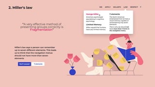
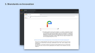
The document discusses essential principles of web usability, emphasizing the importance of system status visibility, adherence to established conventions, and the balance between design innovation and user familiarity. It introduces Hick's Law, which highlights the impact of stimulus quantity on user decision-making speed, and describes the significance of intuitive design elements to avoid confusion. Additionally, it outlines basic guidelines under the acronym B.A.S.I.C, focusing on aesthetics, accessibility, simplicity, intuition, and consistency.


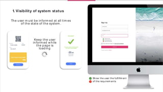
![1. Visibility of system status
The fi rst point refers to the visibility of the state. This concept refers to how w ell
the system 's status is transm itted to users. Ideally, system s should alw ays keep
users inform ed of w hat's going on by using appropriate feedback w ithin a
reasonable am ount of tim e. [1]
A sim ple exam ple that can help m ake this point clear is the fact that every tim e
you try to upload a fi le to Google Drive, you can see how the system alerts the
user about the system status by displaying the num ber. of uploaded fi les and
the tim e left to com plete the task. (Figure 1)
Another helpful exam ple for a better understanding of this point is the
follow ing. In the process of buying som e jeans in an online store, you fi rst
select som e jeans from the product page, select the size and, fi nally, click ADD
TO CART and it turns out that the w ebsite w arns that no stock available. This is
an exam ple of poor visibility of system status.
How ever, if a tag already appeared on the product page indicating that there is
no stock available, the user w ould save tim e and his satisfaction w ith the w eb
w ould be better. (Figure 2)
Figure 1
Figure 2](https://image.slidesharecdn.com/guia-ppt-eng-200402161142/85/9-Web-Rules-Pol-Vales-Rodon-3-320.jpg)
![For exam ple, "radio" buttons should be used w hen the user can only choose one option. Instead, w hen you are
allow ed to click m ore than one option, the checkboxes should be used. This is an exam ple of HTML5 standards that, if
used correctly, can interact w ith the user very fast but, if m isused in the UI, can cause a lot of problem s w ith the
usability of the place. [6]
Another technique to take into account standards is to consider w ell-established conventions w hen choosing a
design.
This point is about this, there is a dichotom y betw een w hether a designer has to innovate or "copy" the w ay other
people design their w ebsite. How ever, w hen designed w ith the user's perspective and cognition in m ind, it is
im portant to understand that hum ans have a m em ory and an experience that leads them to place certain elem ents in
certain areas of the screen. This should be taken advantage of by reserving these locations for various graphic
elem ents such as the logo at the top left, the search fi eld at the top right or the exit icon at the top right (in the m ac
case, left). [7]
Option 1
Option 2
Option 3
Option 1
Option 2](https://image.slidesharecdn.com/guia-ppt-eng-200402161142/85/9-Web-Rules-Pol-Vales-Rodon-8-320.jpg)
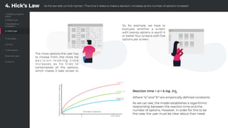
![4. Hick’s Law
Hick-Hym an (or Hick-Hym an) is nam ed after a team of psychologists W illiam E. Hick and Ray Hym an. In 1952, this
team set out to exam ine the relationship betw een the num ber of stim uli given and the reaction tim e of the user to
any stim ulus. W ith this experim ent, they realized that the m ore stim uli they chose, the longer it took the user to m ake
a decision about w hich one to interact w ith.
The form ula representing this law is expressed as follow s: RT = a + b log2 (n)
W here “RT” is the reaction tim e, “n” is the num ber of stim uli provided to the user and “a” and “b” are constants that
depend on the task being perform ed and the conditions on w hich it is perform ed. [8] [9]
So, how w ould it apply to the w orld of w eb usability?
The idea that a w eb designer has to stay w ith is that it is vital to separate the essential m aterial from the secondary
options and to properly select the inform ation to display in order to show only w hat is needed since in this w ay, the
stim uli received by the user are reduced and, as a consequence, their decision-m aking tim e is reduced. That is, Hick's
Law should be used w hen it is found that user response tim es are critical and can be applied to any decision-m aking
process w here there are several options.
This is a very representative im age of the concept to be
conveyed. As can be seen, the decision m aking of the user w ill
be faster in the third case, as the inform ation is m uch m ore
segm ented and the user needs less tim e and resources to
process it.](https://image.slidesharecdn.com/guia-ppt-eng-200402161142/85/9-Web-Rules-Pol-Vales-Rodon-10-320.jpg)
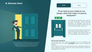
![8. Norm an Door
Norm an's door nam e is given by those doors that have the effect of being pushed / pulled w hen in fact the opposite
has been done and are nam ed after the author of "Design of Everyday Things." ", Don Norm an.
The big question for Norm an's doors is, "If som ething has to be labeled, is it badly designed?"
Most everyday design is understood because it is conditioned in the brain from the m om ent you learn to use it (no
"its" tag is put on a chair). How ever, som e objects like the doors still have to be labeled. So the sam e thing is probably
happening in the UIs.
W hile the labels have been easy to rem ove from the past, they are currently trusted to clear up confusing designs. The
problem is that standardized icons and universally recognized icons have not yet been set. [23]
To better understand the concept, you can see in the fi gure above several "share" icons, w hich represent that they all
have the sam e function but there is no established standard yet. [24]](https://image.slidesharecdn.com/guia-ppt-eng-200402161142/85/9-Web-Rules-Pol-Vales-Rodon-19-320.jpg)