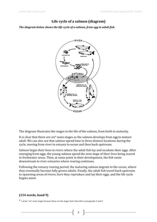
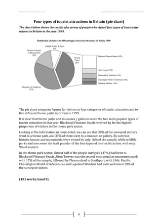
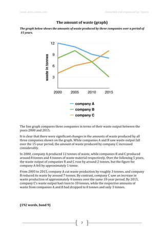
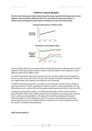
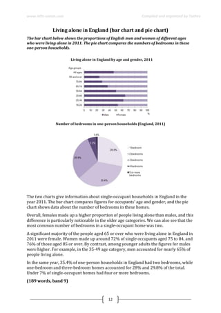
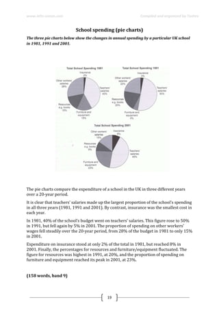
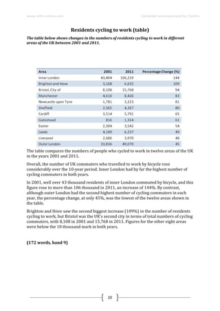
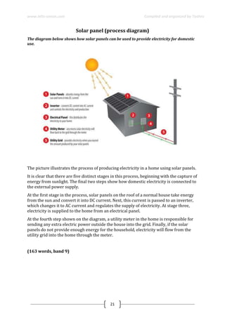
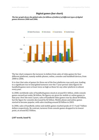
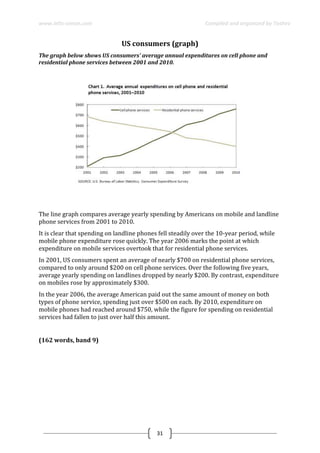
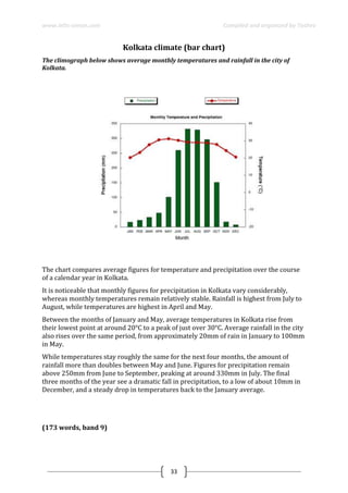
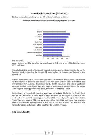
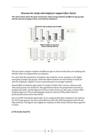
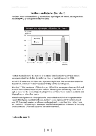
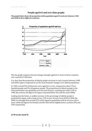
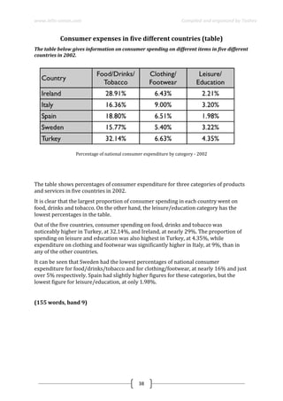
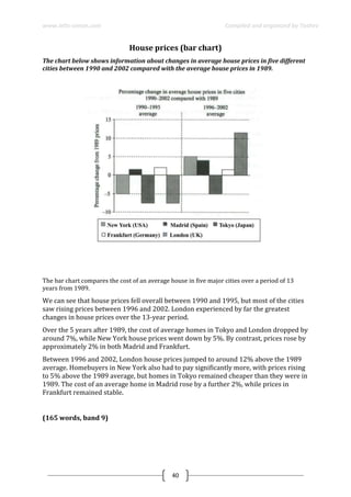
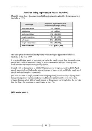
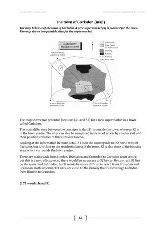
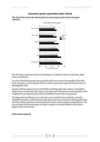
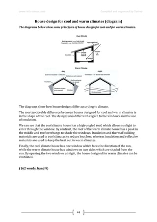
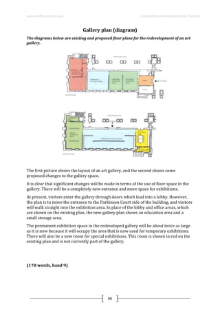
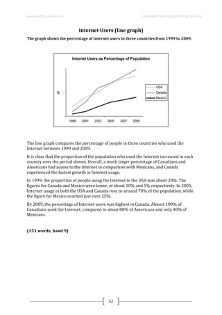
SlideShare a Scribd company logo
1 of 53
Download to read offline
Simon Corcoran is an ex-IELTS examiner and a native
speaker of English. He runs IELTS preparation
courses in Manchester, UK. The purpose of this
booklet is to help test takers to improve their writing
skills from IELTS Writing Task-1 questions.
SAMPLE ANSWERS
TASK 1
Prepared by Asror Toshev
www.ielts-simon.com
www.ielts-simon.com Compiled and organized by Toshev
1
Life cycle of the silkworm (diagram)
The diagrams below show the life cycle of the silkworm and the stages in the production of
silk cloth.
The diagrams illustrate the stages in the life of a silkworm and the process of producing
silk cloth.
There are four main stages in the life cycle of the silkworm, from eggs to adult moth. The
process of silk cloth production involves six steps, from silkworm cocoon to silk
material.
At the first stage in the life cycle of a silkworm, the moth lays its eggs. Around ten days
later, silkworm larvae hatch from the eggs; these larvae feed on mulberry leaves. Then,
after four to six weeks, the larvae become covered in silk thread, and it takes between
three and eight days for a full cocoon to be produced.
For silk cloth production, a cocoon is first selected and then boiled in water. After
boiling, the silk thread that makes up the cocoon is unwound, and then several strands
of thread are twisted together. At the fifth and sixth stages in the process, the thread can
either be dyed and then woven into silk fabric, or it can be woven first and then dyed
subsequently.
(176 words, band 9)
www.ielts-simon.com Compiled and organized by Toshev
2
Reasons for travel and the main issues (bar chart and pie chart)
The charts below show reasons for travel and the main issues for the travelling public in
the US in 2009.
The bar chart and pie chart give information about why US residents travelled and what
travel problems they experienced in the year 2009.
It is clear that the principal reason why Americans travelled in 2009 was to commute to
and from work. In the same year, the primary concern of Americans, with regard to the
trips they made, was the cost of travelling.
Looking more closely at the bar chart, we can see that 49% of the trips made by
Americans in 2009 were for the purpose of commuting. By contrast, only 6% of trips
were visits to friends or relatives, and one in ten trips were for social or recreation
reasons. Shopping was cited as the reason for 16% of all travel, while unspecific
‘personal reasons’ accounted for the remaining 19%.
According to the pie chart, price was the key consideration for 36% of American
travellers. Almost one in five people cited safety as their foremost travel concern, while
aggressive driving and highway congestion were the main issues for 17% and 14% of
the travelling public. Finally, a total of 14% of those surveyed thought that access to
public transport or space for pedestrians were the most important travel issues.
(201 words, band 9)
www.ielts-simon.com Compiled and organized by Toshev
3
Educational problems (table)
The table below gives information about the problems faced by children in two primary sch
ools in 2005 and 2015
The table compares two primary schools in terms of the proportions of their pupils who
experienced seven different educational problems in the years 2005 and 2015.
It is noticeable that school A had higher proportions of children with all seven
educational difficulties in both years. However, while school A managed to reduce the
incidence of most of the problems between 2005 and 2015, school B saw an overall rise
in the percentage of children who were struggling.
In 2005, 42% of school A’s pupils found it difficult to follow instructions, whereas only
6% of pupils in school B experienced this problem. Similarly, between 30 and 40 per
cent of children attending school A had problems in the areas of spelling, listening,
verbal expression and concentration in lessons, while the equivalent figures for school B
stood at between 5 and 15 per cent.
In 2015, the difference between the two schools was less pronounced. Notably, the
proportion of children who struggled to follow instructions fell by 24% in school A, and
this school also saw falls of 22%, 15%, 14% and 5% in the figures for children who had
problems with concentration, listening, verbal expression and spelling. In school B,
however, the proportion of children who struggled with spelling and following
instructions doubled, to 10% and 12% respectively, and there was almost no change in
the incidence of listening, verbal or concentration problems.
(232 words, band 9)
www.ielts-simon.com Compiled and organized by Toshev
4
Global food and oil prices (line graph)
The graph below shows changes in global food and oil prices between 2000 and 2011.
The line graph compares the average price of a barrel of oil with the food price index
over a period of 11 years.
It is clear that average global prices of both oil and food rose considerably between
2000 and 2011. Furthermore, the trends for both commodities were very similar, and so
a strong correlation (93.6%) is suggested.
In the year 2000, the average global oil price was close to $25 per barrel, and the food
price index stood at just under 90 points. Over the following four years both prices
remained relatively stable, before rising steadily between 2004 and 2007. By 2007, the
average oil price had more than doubled, to nearly $60 per barrel, and food prices had
risen by around 50 points.
A dramatic increase in both commodity prices was seen from 2007 to 2008, with oil
prices reaching a peak of approximately $130 per barrel and the food price index rising
to 220 points. However, by the beginning of 2009 the price of oil had dropped by
roughly $90, and the food price index was down by about 80 points. Finally, in 2011, the
average oil price rose once again, to nearly $100 per barrel, while the food price index
reached its peak, at almost 240 points.
(211 words, band 9)
www.ielts-simon.com Compiled and organized by Toshev
5
Life cycle of a salmon (diagram)
The diagram below shows the life cycle of a salmon, from egg to adult fish.
The diagram illustrates the stages in the life of the salmon, from birth to maturity.
It is clear that there are six* main stages as the salmon develops from egg to mature
adult. We can also see that salmon spend time in three distinct locations during the
cycle, moving from river to estuary to ocean and then back upstream.
Salmon begin their lives in rivers where the adult fish lay and incubate their eggs. After
emerging from eggs, the young salmon spend the next stage of their lives being reared
in freshwater areas. Then, at some point in their development, the fish swim
downstream to river estuaries where rearing continues.
Following the estuary rearing period, the maturing salmon migrate to the ocean, where
they eventually become fully grown adults. Finally, the adult fish travel back upstream
to spawning areas of rivers; here they reproduce and lay their eggs, and the life cycle
begins anew.
(154 words, band 9)
* I wrote "six" main stages because these are the stages that I describe in paragraphs 3 and 4.
www.ielts-simon.com Compiled and organized by Toshev
6
Four types of tourist attractions in Britain (pie chart)
The chart below shows the results of a survey of people who visited four types of tourist attr
actions in Britain in the year 1999.
The pie chart compares figures for visitors to four categories of tourist attraction and to
five different theme parks in Britain in 1999.
It is clear that theme parks and museums / galleries were the two most popular types of
tourist attraction in that year. Blackpool Pleasure Beach received by far the highest
proportion of visitors in the theme park sector.
Looking at the information in more detail, we can see that 38% of the surveyed visitors
went to a theme park, and 37% of them went to a museum or gallery. By contrast,
historic houses and monuments were visited by only 16% of the sample, while wildlife
parks and zoos were the least popular of the four types of tourist attraction, with only
9% of visitors.
In the theme park sector, almost half of the people surveyed (47%) had been to
Blackpool Pleasure Beach. Alton Towers was the second most popular amusement park,
with 17% of the sample, followed by Pleasureland in Southport, with 16%. Finally,
Chessington World of Adventures and Legoland Windsor had each welcomed 10% of
the surveyed visitors.
(181 words, band 9)
www.ielts-simon.com Compiled and organized by Toshev
7
The amount of waste (graph)
The graph below shows the amounts of waste produced by three companies over a period of
15 years.
The line graph compares three companies in terms of their waste output between the
years 2000 and 2015.
It is clear that there were significant changes in the amounts of waste produced by all
three companies shown on the graph. While companies A and B saw waste output fall
over the 15-year period, the amount of waste produced by company C increased
considerably.
In 2000, company A produced 12 tonnes of waste, while companies B and C produced
around 8 tonnes and 4 tonnes of waste material respectively. Over the following 5 years,
the waste output of companies B and C rose by around 2 tonnes, but the figure for
company A fell by approximately 1 tonne.
From 2005 to 2015, company A cut waste production by roughly 3 tonnes, and company
B reduced its waste by around 7 tonnes. By contrast, company C saw an increase in
waste production of approximately 4 tonnes over the same 10-year period. By 2015,
company C’s waste output had risen to 10 tonnes, while the respective amounts of
waste from companies A and B had dropped to 8 tonnes and only 3 tonnes.
(192 words, band 9)
www.ielts-simon.com Compiled and organized by Toshev
8
Children’s sports (graph)
The first chart below gives information about the money spent by British parents on their
children’s sports between 2008 and 2014. The second chart shows the number of
children who participated in three sports in Britain over the same time period.
The line graphs show the average monthly amount that parents in Britain spent on their
children’s sporting activities and the number of British children who took part in three
different sports from 2008 to 2014.
It is clear that parents spent more money each year on their children’s participation in
sports over the six-year period. In terms of the number of children taking part, football
was significantly more popular than athletics and swimming.
In 2008, British parents spent an average of around £20 per month on their children’s
sporting activities. Parents’ spending on children’s sports increased gradually over the
following six years, and by 2014 the average monthly amount had risen to just over £30.
Looking at participation numbers, in 2008 approximately 8 million British children
played football, while only 2 million children were enrolled in swimming clubs and less
than 1 million practised athletics. The figures for football participation remained
relatively stable over the following 6 years. By contrast, participation in swimming
almost doubled, to nearly 4 million children, and there was a near fivefold increase in
the number of children doing athletics.
(185 words, band 9)
www.ielts-simon.com Compiled and organized by Toshev
9
Parkway hotel customer service (pie charts)
The charts below show the results of a questionnaire that asked visitors to the Parkway
Hotel how they rated the hotel's customer service. The same questionnaire was given to 100
guests in the years 2005 and 2010.
The pie charts compare visitors’ responses to a survey about customer service at the
Parkway Hotel in 2005 and in 2010.
It is clear that overall customer satisfaction increased considerably from 2005 to 2010.
While most hotel guests rated customer service as satisfactory or poor in 2005, a clear
majority described the hotel’s service as good or excellent in 2010.
Looking at the positive responses first, in 2005 only 5% of the hotel’s visitors rated its
customer service as excellent, but this figure rose to 28% in 2010. Furthermore, while
only 14% of guests described customer service in the hotel as good in 2005, almost
three times as many people gave this rating five years later.
With regard to negative feedback, the proportion of guests who considered the hotel’s
customer service to be poor fell from 21% in 2005 to only 12% in 2010. Similarly, the
proportion of people who thought customer service was very poor dropped from 15%
to only 4% over the 5-year period. Finally, a fall in the number of ‘satisfactory’ ratings in
2010 reflects the fact that more people gave positive responses to the survey in that
year.
(193 words, band 9)
www.ielts-simon.com Compiled and organized by Toshev
10
Water usage in San Diego (pie charts)
The pie charts below compare water usage in San Diego, California and the rest of the
world.
The pie charts give information about the water used for residential, industrial and
agricultural purposes in San Diego County, California, and the world as a whole.
It is noticeable that more water is consumed by homes than by industry or agriculture
in the two American regions. By contrast, agriculture accounts for the vast majority of
water used worldwide.
In San Diego County and California State, residential water consumption accounts for
60% and 39% of total water usage. By contrast, a mere 8% of the water used globally
goes to homes. The opposite trend can be seen when we look at water consumption for
agriculture. This accounts for a massive 69% of global water use, but only 17% and 28%
of water usage in San Diego and California respectively.
Such dramatic differences are not seen when we compare the figures for industrial
water use. The same proportion of water (23%) is used by industry in San Diego and
worldwide, while the figure for California is 10% higher, at 33%.
(168 words, band 9)
www.ielts-simon.com Compiled and organized by Toshev
11
UK telephone calls (bar chart)
The chart below shows the total number of minutes (in billions) of telephone calls in the UK,
divided into three categories, from 1995-2002.
The bar chart compares the amount of time spent by people in the UK on three different
types of phone call between 1995 and 2002.
It is clear that calls made via local, fixed lines were the most popular type, in terms of
overall usage, throughout the period shown. The lowest figures on the chart are for
mobile calls, but this category also saw the most dramatic increase in user minutes.
In 1995, people in the UK used fixed lines for a total of just over 70 billion minutes for
local calls, and about half of that amount of time for national or international calls. By
contrast, mobile phones were only used for around 4 billion minutes. Over the following
four years, the figures for all three types of phone call increased steadily.
By 1999, the amount of time spent on local calls using landlines had reached a peak at
90 billion minutes. Subsequently, the figure for this category fell, but the rise in the
other two types of phone call continued. In 2002, the number of minutes of national /
international landline calls passed 60 billion, while the figure for mobiles rose to around
45 billion minutes.
(197 words, band 9)
www.ielts-simon.com Compiled and organized by Toshev
12
Living alone in England (bar chart and pie chart)
The bar chart below shows the proportions of English men and women of different ages
who were living alone in 2011. The pie chart compares the numbers of bedrooms in these
one-person households.
...Living alone in England by age and gender, 2011
Number of bedrooms in one-person households (England, 2011)
The two charts give information about single-occupant households in England in the
year 2011. The bar chart compares figures for occupants' age and gender, and the pie
chart shows data about the number of bedrooms in these homes.
Overall, females made up a higher proportion of people living alone than males, and this
difference is particularly noticeable in the older age categories. We can also see that the
most common number of bedrooms in a single-occupant home was two.
A significant majority of the people aged 65 or over who were living alone in England in
2011 were female. Women made up around 72% of single occupants aged 75 to 84, and
76% of those aged 85 or over. By contrast, among younger adults the figures for males
were higher. For example, in the 35-49 age category, men accounted for nearly 65% of
people living alone.
In the same year, 35.4% of one-person households in England had two bedrooms, while
one-bedroom and three-bedroom homes accounted for 28% and 29.8% of the total.
Under 7% of single-occupant homes had four or more bedrooms.
(189 words, band 9)
www.ielts-simon.com Compiled and organized by Toshev
13
Coffee and banana (table)
The tables below give information about sales of Fairtrade*-labelled coffee and bananas in
1999 and 2004 in five European countries.
The tables show the amount of money spent on Fairtrade coffee and bananas in two
separate years in the UK, Switzerland, Denmark, Belgium and Sweden.
It is clear that sales of Fairtrade coffee rose in all five European countries from 1999 to
2004, but sales of Fairtrade bananas only went up in three out of the five countries.
Overall, the UK saw by far the highest levels of spending on the two products.
In 1999, Switzerland had the highest sales of Fairtrade coffee, at €3 million, while
revenue from Fairtrade bananas was highest in the UK, at €15 million. By 2004,
however, sales of Fairtrade coffee in the UK had risen to €20 million, and this was over
three times higher than Switzerland’s sales figure for Fairtrade coffee in that year. The
year 2004 also saw dramatic increases in the money spent on Fairtrade bananas in the
UK and Switzerland, with revenues rising by €32 million and €4.5 million respectively.
Sales of the two Fairtrade products were far lower in Denmark, Belgium and Sweden.
Small increases in sales of Fairtrade coffee can be seen, but revenue remained at €2
million or below in all three countries in both years. Finally, it is noticeable that the
money spent on Fairtrade bananas actually fell in Belgium and Sweden.
(216 words, band 9)
www.ielts-simon.com Compiled and organized by Toshev
14
School buildings (diagram)
The diagrams below show the site of a school in 2004 and the plan for changes to the school
site in 2024.
(Source: Official IELTS Practice Materials 2)
The two pictures compare the layout of a school as it was in the year 2004 with a
proposed site design for the year 2024.
It is clear that the main change for 2024 involves the addition of a new school building.
The school will then be able to accommodate a considerably larger number of students.
In 2004, there were 600 pupils attending the school, and the two school buildings were
separated by a path running from the main entrance to the sports field. By 2024, it is
expected that there will be 1000 pupils, and a third building will have been constructed.
Furthermore, the plan is to join the two original buildings together, creating a shorter
path that links the buildings only.
As the third building and a second car park will be built on the site of the original sports
field, a new, smaller sports field will need to be laid. A new road will also be built from
the main entrance to the second car park. Finally, no changes will be made to the main
entrance and original car park.
(183 words, band 9)
www.ielts-simon.com Compiled and organized by Toshev
15
Age distribution (bar chart)
The charts below compare the age structure of the populations of France and India in 1984.
The two charts compare the populations of France and India in terms of age distribution
by gender in the year 1984.
It is clear that the population of India was younger than that of France in 1984, with a
noticeably larger proportion of people aged under 20. France, on the other hand, had a
significantly larger percentage of elderly inhabitants.
In India, close to 14% of people were aged 5 or under, and each five-year age bracket
above this contained an increasingly smaller proportion of the population. France’s
population, by contrast, was more evenly distributed across the age ranges, with similar
figures (around 7% to 8% of all people) for each five-year cohort between the ages of 0
and 40. Somewhere between 10% and 15% of all French people were aged 70 or older,
but the equivalent figure for India was only 2%.
Looking more closely at gender, there was a noticeably higher proportion of French
women than men in every cohort from age 50 upwards. For example, almost 3% of
French 70- to 75-year-olds were women, while just under 2% were men. No significant
gender differences can be seen on the Indian population chart.
(199 words, band 9)
www.ielts-simon.com Compiled and organized by Toshev
16
The dangerous waste (pie charts)
The pie charts below show how dangerous waste products are dealt with in three countries.
The charts compare Korea, Sweden and the UK in terms of the methods used in each
country to dispose of harmful waste.
It is clear that in both the UK and Sweden, the majority of dangerous waste products are
buried underground. By contrast, most hazardous materials in the Republic of Korea are
recycled.
Looking at the information in more detail, we can see that 82% of the UK’s dangerous
waste is put into landfill sites. This disposal technique is used for 55% of the harmful
waste in Sweden and only 22% of similar waste in Korea. The latter country recycles
69% of hazardous materials, which is far more than the other two nations.
While 25% of Sweden's dangerous waste is recycled, the UK does not recycle at all.
Instead, it dumps waste at sea or treats it chemically. These two methods are not
employed in Korea or Sweden, which favour incineration for 9% and 20% of dangerous
waste respectively.
(159 words, band 9)
www.ielts-simon.com Compiled and organized by Toshev
17
Flooding (diagram)
The diagrams below show how houses can be protected in areas which are prone to
flooding.
...
The diagrams compare two different methods of defence for homes which are at risk of
being flooded.
The key difference between the diagrams is that they show flood protection with and
without a stopbank. In either case, the at-risk home is raised on stilts above ground
level.
The first diagram shows how a stopbank acts as a flood barrier to stop river water from
flooding homes. The stopbank is a small mound of land next to the river that is higher
than the 100-year flood level, and prevents the river from bursting its banks. Nearby
houses can be built on stilts to prevent flooding from rainwater, and a floodgate beneath
the stopbank can be opened to allow this ‘ponding’ to drain off into the river.
When there is no stopbank, as shown in the second diagram, there will be nothing to
stop the river from flooding. In this case, the solution is to put buildings on stilts. The
height of the stilts is measured so that the floor of the house is 300mm above the 100-
year flood level. This measurement is called the ‘freeboard’.
(184 words, band 9)
www.ielts-simon.com Compiled and organized by Toshev
18
Waste production (table)
The table below shows the amount of waste production (in millions of tonnes) in six
different countries over a twenty-year period.
The chart compares the amounts of waste that were produced in six countries in the
years 1980, 1990 and 2000.
In each of these years, the US produced more waste than Ireland, Japan, Korea, Poland
and Portugal combined. It is also noticeable that Korea was the only country that
managed to reduce its waste output by the year 2000.
Between 1980 and 2000, waste production in the US rose from 131 to 192 million
tonnes, and rising trends were also seen in Japan, Poland and Portugal. Japan’s waste
output increased from 28 to 53 million tonnes, while Poland and Portugal saw waste
totals increase from 4 to 6.6 and from 2 to 5 million tonnes respectively.
The trends for Ireland and Korea were noticeably different from those described above.
In Ireland, waste production increased more than eightfold, from only 0.6 million
tonnes in 1980 to 5 million tonnes in 2000. Korea, by contrast, cut its waste output by
12 million tonnes between 1990 and 2000.
(165 words, band 9)
www.ielts-simon.com Compiled and organized by Toshev
19
School spending (pie charts)
The three pie charts below show the changes in annual spending by a particular UK school
in 1981, 1991 and 2001.
The pie charts compare the expenditure of a school in the UK in three different years
over a 20-year period.
It is clear that teachers’ salaries made up the largest proportion of the school’s spending
in all three years (1981, 1991 and 2001). By contrast, insurance was the smallest cost in
each year.
In 1981, 40% of the school’s budget went on teachers’ salaries. This figure rose to 50%
in 1991, but fell again by 5% in 2001. The proportion of spending on other workers’
wages fell steadily over the 20-year period, from 28% of the budget in 1981 to only 15%
in 2001.
Expenditure on insurance stood at only 2% of the total in 1981, but reached 8% in
2001. Finally, the percentages for resources and furniture/equipment fluctuated. The
figure for resources was highest in 1991, at 20%, and the proportion of spending on
furniture and equipment reached its peak in 2001, at 23%.
(158 words, band 9)
www.ielts-simon.com Compiled and organized by Toshev
20
Residents cycling to work (table)
The table below shows changes in the numbers of residents cycling to work in different
areas of the UK between 2001 and 2011.
The table compares the numbers of people who cycled to work in twelve areas of the UK
in the years 2001 and 2011.
Overall, the number of UK commuters who travelled to work by bicycle rose
considerably over the 10-year period. Inner London had by far the highest number of
cycling commuters in both years.
In 2001, well over 43 thousand residents of inner London commuted by bicycle, and this
figure rose to more than 106 thousand in 2011, an increase of 144%. By contrast,
although outer London had the second highest number of cycling commuters in each
year, the percentage change, at only 45%, was the lowest of the twelve areas shown in
the table.
Brighton and Hove saw the second biggest increase (109%) in the number of residents
cycling to work, but Bristol was the UK’s second city in terms of total numbers of cycling
commuters, with 8,108 in 2001 and 15,768 in 2011. Figures for the other eight areas
were below the 10 thousand mark in both years.
(172 words, band 9)
www.ielts-simon.com Compiled and organized by Toshev
21
Solar panel (process diagram)
The diagram below shows how solar panels can be used to provide electricity for domestic
use.
The picture illustrates the process of producing electricity in a home using solar panels.
It is clear that there are five distinct stages in this process, beginning with the capture of
energy from sunlight. The final two steps show how domestic electricity is connected to
the external power supply.
At the first stage in the process, solar panels on the roof of a normal house take energy
from the sun and convert it into DC current. Next, this current is passed to an inverter,
which changes it to AC current and regulates the supply of electricity. At stage three,
electricity is supplied to the home from an electrical panel.
At the fourth step shown on the diagram, a utility meter in the home is responsible for
sending any extra electric power outside the house into the grid. Finally, if the solar
panels do not provide enough energy for the household, electricity will flow from the
utility grid into the home through the meter.
(163 words, band 9)
www.ielts-simon.com Compiled and organized by Toshev
22
Digital games (bar chart)
The bar graph shows the global sales (in billions of dollars) of different types of digital
games between 2000 and 2006.
The bar chart compares the turnover in dollars from sales of video games for four
different platforms, namely mobile phones, online, consoles and handheld devices, from
2000 to 2006.
It is clear that sales of games for three out of the four platforms rose each year, leading
to a significant rise in total global turnover over the 7-year period. Sales figures for
handheld games were at least twice as high as those for any other platform in almost
every year.
In 2000, worldwide sales of handheld games stood at around $11 billion, while console
games earned just under $6 billion. No figures are given for mobile or online games in
that year. Over the next 3 years, sales of handheld video games rose by about $4 billion,
but the figure for consoles decreased by $2 billion. Mobile phone and online games
started to become popular, with sales reaching around $3 billion in 2003.
In 2006, sales of handheld, online and mobile games reached peaks of 17, 9 and 7 billion
dollars respectively. By contrast, turnover from console games dropped to its lowest
point, at around $2.5 billion.
(187 words, band 9)
www.ielts-simon.com Compiled and organized by Toshev
23
Chorleywood village (map)
Chorleywood is a village near London whose population has increased steadily since the
middle of the nineteenth century. The map below shows the development of the village.
Write a report for a university lecturer describing the development of the village.
The map shows the growth of a village called Chorleywood between 1868 and 1994.
It is clear that the village grew as the transport infrastructure was improved. Four
periods of development are shown on the map, and each of the populated areas is near
to the main roads, the railway or the motorway.
From 1868 to 1883, Chorleywood covered a small area next to one of the main roads.
Chorleywood Park and Golf Course is now located next to this original village area. The
village grew along the main road to the south between 1883 and 1922, and in 1909 a
railway line was built crossing this area from west to east. Chorleywood station is in this
part of the village.
The expansion of Chorleywood continued to the east and west alongside the railway
line until 1970. At that time, a motorway was built to the east of the village, and from
1970 to 1994, further development of the village took place around motorway
intersections with the railway and one of the main roads.
(174 words, band 9)
www.ielts-simon.com Compiled and organized by Toshev
24
Nathan’s Hot Dog Eating Contest (bar chart, fun topic)
The bar chart shows the number of hot dogs and buns eaten in 15 minutes by the
winners of ‘Nathan’s Hot Dog Eating Contest’ in Brooklyn, USA between 1980 and 2010.
It is noticeable that the number of hot dogs and buns eaten by winners of the contest
increased dramatically over the period shown. The majority of winners were American
or Japanese, and only one woman had ever won the contest.
Americans dominated the contest from 1980 to 1996, and the winning number of hot
dogs and buns consumed rose from only 8 to around 21 during that time. 1983 and
1984 were notable exceptions to the trend for American winners. In 1983 a Mexican
won the contest after eating 19.5 hot dogs, almost double the amount that any previous
winner had eaten, and 1984 saw the only female winner, Birgit Felden from Germany.
A Japanese contestant, Takeru Kobayashi, reigned as hot dog eating championfor six
years from 2001 to 2006. Kobayashi’s winning totals of around 50 hot dogs were
roughly double the amount that any previous winner had managed. However, the
current champion, American Joey Chestnut, took hot dog eating to new heights in 2009
when he consumed an incredible 68 hot dogs and buns in the allotted 15 minutes.
(211 words)
www.ielts-simon.com Compiled and organized by Toshev
25
U.S. meat and poultry consumption (graph)
The graph below shows trends in US meat and poultry consumption.
The line graph shows changes in the per capita consumption of beef, pork, broilers and
turkey in the United States between 1955 and 2012.
It is noticeable that beef was by far the most popular of the four types of meat for the
majority of the 57-year period. However, a considerable rise can be seen in the
consumption of broilers, with figures eventually surpassing those for beef.
Between 1955 and 1976, US beef consumption rose from around 60 to a peak of 90
pounds per person per year. During the same period, consumption of broilers also rose,
to nearly 30 pounds per person, while the figures for pork fluctuated between 50 and
40 pounds per person. Turkey was by far the least popular meat, with figures below 10
pounds per capita each year.
By 2012, the amount of beef consumed by the average American had plummeted to
around 50 pounds, but the consumption of broilers had doubled since the 1970s, to
approximately 55 pounds per capita. By contrast, there were no significant changes in
the trends for pork and turkey consumption over the period as a whole.
(187 words, band 9)
www.ielts-simon.com Compiled and organized by Toshev
26
Waste paper recycling (Flow Chart)
The chart below shows the process of waste paper recycling.
The flow chart shows how waste paper is recycled. It is clear that there are six distinct
stages in this process, from the initial collection of waste paper to the eventual
production of usable paper.
At the first stage in the paper recycling process, waste paper is collected either from
paper banks, where members of the public leave their used paper, or directly from
businesses. This paper is then sorted by hand and separated according to its grade, with
any paper that is not suitable for recycling being removed. Next, the graded paper is
transported to a paper mill.
Stages four and five of the process both involve cleaning. The paper is cleaned and
pulped, and foreign objects such as staples are taken out. Following this, all remnants of
ink and glue are removed from the paper at the de-inking stage. Finally, the pulp can be
processed in a paper making machine, which makes the end product: usable paper.
(160 words, band 9)
www.ielts-simon.com Compiled and organized by Toshev
27
Olympic medals (bar chart)
The chart below shows the total number of Olympic medals won by twelve different
countries.
The bar chart compares twelve countries in terms of the overall number of medals that
they have won at the Olympic Games.
It is clear that the USA is by far the most successful Olympic medal winning nation. It is
also noticeable that the figures for gold, silver and bronze medals won by any particular
country tend to be fairly similar.
The USA has won a total of around 2,300 Olympic medals, including approximately 900
gold medals, 750 silver and 650 bronze. In second place on the all-time medals chart is
the Soviet Union, with just over 1,000 medals. Again, the number of gold medals won by
this country is slightly higher than the number of silver or bronze medals.
Only four other countries - the UK, France, Germany and Italy - have won more than 500
Olympic medals, all with similar proportions of each medal colour. Apart from the USA
and the Soviet Union, China is the only other country with a noticeably higher
proportion of gold medals (about 200) compared to silver and bronze (about 100 each).
(178 words, band 9)
www.ielts-simon.com Compiled and organized by Toshev
28
Mobile phone owners (table)
The table shows the percentage of people with mobile phones who use various features on
their phone.
The table compares the percentages of people using different functions of their mobile
phones between 2006 and 2010.

Throughout the period shown, the main reason why people used their mobile phones
was to make calls. However, there was a marked increase in the popularity of other
mobile phone features, particularly the Internet search feature.
In 2006, 100% of mobile phone owners used their phones to make calls, while the next
most popular functions were text messaging (73%) and taking photos (66%). By
contrast, less than 20% of owners played games or music on their phones, and there
were no figures for users doing Internet searches or recording video.
Over the following 4 years, there was relatively little change in the figures for the top
three mobile phone features. However, the percentage of people using their phones to
access the Internet jumped to 41% in 2008 and then to 73% in 2010. There was also a
significant rise in the use of mobiles to play games and to record video, with figures
reaching 41% and 35% respectively in 2010.
(178 words, band 9)
www.ielts-simon.com Compiled and organized by Toshev
29
A small island (diagrams/maps)
The two maps below show an island, before and after the construction of some tourist
facilities.
The diagrams illustrate some changes to a small island which has been developed for
tourism.
It is clear that the island has changed considerably with the introduction of tourism, and
six new features can be seen in the second diagram. The main developments are that the
island is accessible and visitors have somewhere to stay.
Looking at the maps in more detail, we can see that small huts have been built to
accommodate visitors to the island. The other physical structures that have been added
are a reception building, in the middle of the island, and a restaurant to the north of the
reception. Before these developments, the island was completely bare apart from a few
trees.
As well as the buildings mentioned above, the new facilities on the island include a pier,
where boats can dock. There is also a short road linking the pier with the reception and
restaurant, and footpaths connect the huts. Finally, there is a designated swimming area
for tourists off a beach on the western tip of the island.
(175 words, band 9)
www.ielts-simon.com Compiled and organized by Toshev
30
UK commuters (line graph)
The graph below shows the average number of UK commuters travelling each day by car,
bus or train between 1970 and 2030.
The line graph compares figures for daily travel by workers in the UK using three
different forms of transport over a period of 60 years.
It is clear that the car is by far the most popular means of transport for UK commuters
throughout the period shown. Also, while the numbers of people who use the car and
train increase gradually, the number of bus users falls steadily.
In 1970, around 5 million UK commuters travelled by car on a daily basis, while the bus
and train were used by about 4 million and 2 million people respectively. In the year
2000, the number of those driving to work rose to 7 million and the number of
commuting rail passengers reached 3 million. However, there was a small drop of
approximately 0.5 million in the number of bus users.
By 2030, the number of people who commute by car is expected to reach almost 9
million, and the number of train users is also predicted to rise, to nearly 5 million. By
contrast, buses are predicted to become a less popular choice, with only 3 million daily
users.
(188 words, band 9)
www.ielts-simon.com Compiled and organized by Toshev
31
US consumers (graph)
The graph below shows US consumers' average annual expenditures on cell phone and
residential phone services between 2001 and 2010.
The line graph compares average yearly spending by Americans on mobile and landline
phone services from 2001 to 2010.
It is clear that spending on landline phones fell steadily over the 10-year period, while
mobile phone expenditure rose quickly. The year 2006 marks the point at which
expenditure on mobile services overtook that for residential phone services.
In 2001, US consumers spent an average of nearly $700 on residential phone services,
compared to only around $200 on cell phone services. Over the following five years,
average yearly spending on landlines dropped by nearly $200. By contrast, expenditure
on mobiles rose by approximately $300.
In the year 2006, the average American paid out the same amount of money on both
types of phone service, spending just over $500 on each. By 2010, expenditure on
mobile phones had reached around $750, while the figure for spending on residential
services had fallen to just over half this amount.
(162 words, band 9)
www.ielts-simon.com Compiled and organized by Toshev
32
Life cycles of the honeybee (process diagram)
The diagram shows the life cycle of the honey bee.
...
...
nymph = immature form of an insect
moult = shed or lose old feathers, hair or skin to allow for new growth
The diagram illustrates the various stages in the life of a honey bee. We can see that the
complete life cycle lasts between 34 and 36 days. It is also noticeable that there are five
main stages in the development of the honey bee, from egg to mature adult insect.
The life cycle of the honey bee begins when the female adult lays an egg; the female
typically lays one or two eggs every 3 days. Between 9 and 10 days later, each egg
hatches and the immature insect, or nymph, appears.
During the third stage of the life cycle, the nymph grows in size and sheds its skin three
times. This moulting first takes place 5 days after the egg hatches, then 7 days later, and
again another 9 days later. After a total of 30 to 31 days from the start of the cycle, the
young adult honey bee emerges from its final moulting stage, and in the space of only 4
days it reaches full maturity.
(169 words, band 9)
www.ielts-simon.com Compiled and organized by Toshev
33
Kolkata climate (bar chart)
The climograph below shows average monthly temperatures and rainfall in the city of
Kolkata.
The chart compares average figures for temperature and precipitation over the course
of a calendar year in Kolkata.
It is noticeable that monthly figures for precipitation in Kolkata vary considerably,
whereas monthly temperatures remain relatively stable. Rainfall is highest from July to
August, while temperatures are highest in April and May.
Between the months of January and May, average temperatures in Kolkata rise from
their lowest point at around 20°C to a peak of just over 30°C. Average rainfall in the city
also rises over the same period, from approximately 20mm of rain in January to 100mm
in May.
While temperatures stay roughly the same for the next four months, the amount of
rainfall more than doubles between May and June. Figures for precipitation remain
above 250mm from June to September, peaking at around 330mm in July. The final
three months of the year see a dramatic fall in precipitation, to a low of about 10mm in
December, and a steady drop in temperatures back to the January average.
(173 words, band 9)
www.ielts-simon.com Compiled and organized by Toshev
34
Household expenditure (bar chart)
The bar chart below is taken from the UK national statistics website .
Average weekly household expenditure, by region, 2007-09
The bar chart
shows average weekly spending by households in different areas of England between
2007 and 2009.
Households in the south of the country spent more on average than those in the north.
Average weekly spending by households was highest in London and lowest in the
North East.
English households spent on average around £470 per week. The average expenditure
for households in London was about £560 per week, almost £100 more than the
overall figure for England. Households in the South East, East and South West also
spent more than the national average. Weekly household spending figures for those
three regions were approximately £520, £490 and £480 respectively.
Similar levels of household spending were seen in the West Midlands, the North West
and the East Midlands, at about £430 to £450 per week. In the region of Yorkshire and
the Humber, households spent approximately £400 per week, while expenditure in the
North East was around £10 per week lower than this. It is noticeable that average
weekly expenditure by households in the North East was around £80 less than the
national average, and around £170 less than the London average.
(192 words, band 9)
www.ielts-simon.com Compiled and organized by Toshev
35
Reasons for study and employer support (bar chart)
The charts below show the main reasons for study among students of different age groups
and the amount of support they received from employers.
The bar charts compare students of different ages in terms of why they are studying and
whether they are supported by an employer.
It is clear that the proportion of students who study for career purposes is far higher
among the younger age groups, while the oldest students are more likely to study for
interest. Employer support is more commonly given to younger students.
Around 80% of students aged under 26 study to further their careers, whereas only
10% study purely out of interest. The gap between these two proportions narrows as
students get older, and the figures for those in their forties are the same, at about 40%.
Students aged over 49 overwhelmingly study for interest (70%) rather than for
professional reasons (less than 20%).
Just over 60% of students aged under 26 are supported by their employers. By contrast,
the 30-39 age group is the most self-sufficient, with only 30% being given time off and
help with fees. The figures rise slightly for students in their forties and for those aged 50
or more.
(178 words, band 9)
www.ielts-simon.com Compiled and organized by Toshev
36
Incidents and injuries (bar chart)
The chart below shows numbers of incidents and injuries per 100 million passenger miles
travelled (PMT) by transportation type in 2002.
The bar chart compares the number of incidents and injuries for every 100 million
passenger miles travelled on five different types of public transport in 2002.
It is clear that the most incidents and injuries took place on demand-response vehicles.
By contrast, commuter rail services recorded by far the lowest figures.
A total of 225 incidents and 173 injuries, per 100 million passenger miles travelled, took
place on demand-response transport services. These figures were nearly three times as
high as those for the second highest category, bus services. There were 76 incidents and
66 people were injured on buses.
Rail services experienced fewer problems. The number of incidents on light rail trains
equalled the figure recorded for buses, but there were significantly fewer injuries, at
only 39. Heavy rail services saw lower numbers of such events than light rail services,
but commuter rail passengers were even less likely to experience problems. In fact, only
20 incidents and 17 injuries occurred on commuter trains.
(165 words, band 9)
www.ielts-simon.com Compiled and organized by Toshev
37
People aged 65 and over (line graph)
The graph below shows the proportion of the population aged 65 and over between 1940
and 2040 in three different countries.
The line graph compares the percentage of people aged 65 or more in three countries
over a period of 100 years.
It is clear that the proportion of elderly people increases in each country between 1940
and 2040. Japan is expected to see the most dramatic changes in its elderly population.
In 1940, around 9% of Americans were aged 65 or over, compared to about 7% of
Swedish people and 5% of Japanese people. The proportions of elderly people in the
USA and Sweden rose gradually over the next 50 years, reaching just under 15% in
1990. By contrast, the figures for Japan remained below 5% until the early 2000s.
Looking into the future, a sudden increase in the percentage of elderly people is
predicted for Japan, with a jump of over 15% in just 10 years from 2030 to 2040. By
2040, it is thought that around 27% of the Japanese population will be 65 years old or
more, while the figures for Sweden and the USA will be slightly lower, at about 25% and
23% respectively.
(178 words, band 9)
www.ielts-simon.com Compiled and organized by Toshev
38
Consumer expenses in five different countries (table)
The table below gives information on consumer spending on different items in five different
countries in 2002.
Percentage of national consumer expenditure by category - 2002
The table shows percentages of consumer expenditure for three categories of products
and services in five countries in 2002.
It is clear that the largest proportion of consumer spending in each country went on
food, drinks and tobacco. On the other hand, the leisure/education category has the
lowest percentages in the table.
Out of the five countries, consumer spending on food, drinks and tobacco was
noticeably higher in Turkey, at 32.14%, and Ireland, at nearly 29%. The proportion of
spending on leisure and education was also highest in Turkey, at 4.35%, while
expenditure on clothing and footwear was significantly higher in Italy, at 9%, than in
any of the other countries.
It can be seen that Sweden had the lowest percentages of national consumer
expenditure for food/drinks/tobacco and for clothing/footwear, at nearly 16% and just
over 5% respectively. Spain had slightly higher figures for these categories, but the
lowest figure for leisure/education, at only 1.98%.
(155 words, band 9)
www.ielts-simon.com Compiled and organized by Toshev
39
Global water usage (graph)
The graph and table below give information about water use worldwide and water
consumption in two different countries.
The charts compare the amount of water used for agriculture, industry and homes
around the world, and water use in Brazil and the Democratic Republic of Congo.
It is clear that global water needs rose significantly between 1900 and 2000, and that
agriculture accounted for the largest proportion of water used. We can also see that
water consumption was considerably higher in Brazil than in the Congo.
In 1900, around 500km³ of water was used by the agriculture sector worldwide. The
figures for industrial and domestic water consumption stood at around one fifth of that
amount. By 2000, global water use for agriculture had increased to around 3000km³,
industrial water use had risen to just under half that amount, and domestic
consumption had reached approximately 500km³.
In the year 2000, the populations of Brazil and the Congo were 176 million and 5.2
million respectively. Water consumption per person in Brazil, at 359m³, was much
higher than that in the Congo, at only 8m³, and this could be explained by the fact that
Brazil had 265 times more irrigated land.
(184 words, band 9)
www.ielts-simon.com Compiled and organized by Toshev
40
House prices (bar chart)
The chart below shows information about changes in average house prices in five different
cities between 1990 and 2002 compared with the average house prices in 1989.
The bar chart compares the cost of an average house in five major cities over a period of 13
years from 1989.
We can see that house prices fell overall between 1990 and 1995, but most of the cities
saw rising prices between 1996 and 2002. London experienced by far the greatest
changes in house prices over the 13-year period.
Over the 5 years after 1989, the cost of average homes in Tokyo and London dropped by
around 7%, while New York house prices went down by 5%. By contrast, prices rose by
approximately 2% in both Madrid and Frankfurt.
Between 1996 and 2002, London house prices jumped to around 12% above the 1989
average. Homebuyers in New York also had to pay significantly more, with prices rising
to 5% above the 1989 average, but homes in Tokyo remained cheaper than they were in
1989. The cost of an average home in Madrid rose by a further 2%, while prices in
Frankfurt remained stable.
(165 words, band 9)
www.ielts-simon.com Compiled and organized by Toshev
41
Families living in poverty in Australia (table)
The table below shows the proportion of different categories of families living in poverty in
Australia in 1999.
The table gives information about poverty rates among six types of household in
Australia in the year 1999.
It is noticeable that levels of poverty were higher for single people than for couples, and
people with children were more likely to be poor than those without. Poverty rates
were considerably lower among elderly people.
Overall, 11% of Australians, or 1,837,000 people, were living in poverty in 1999. Aged
people were the least likely to be poor, with poverty levels of 6% and 4% for single aged
people and aged couples respectively.
Just over one fifth of single parents were living in poverty, whereas only 12% of parents
living with a partner were classed as poor. The same pattern can be seen for people
with no children: while 19% of single people in this group were living below the poverty
line, the figure for couples was much lower, at only 7%.
(150 words, band 9)
www.ielts-simon.com Compiled and organized by Toshev
42
The town of Garlsdon (map)
The map below is of the town of Garlsdon. A new supermarket (S) is planned for the town.
The map shows two possible sites for the supermarket.
The map shows two potential locations (S1 and S2) for a new supermarket in a town
called Garlsdon.
The main difference between the two sites is that S1 is outside the town, whereas S2 is
in the town centre. The sites can also be compared in terms of access by road or rail, and
their positions relative to three smaller towns.
Looking at the information in more detail, S1 is in the countryside to the north west of
Garlsdon, but it is close to the residential area of the town. S2 is also close to the housing
area, which surrounds the town centre.
There are main roads from Hindon, Bransdon and Cransdon to Garlsdon town centre,
but this is a no traffic zone, so there would be no access to S2 by car. By contrast, S1 lies
on the main road to Hindon, but it would be more difficult to reach from Bransdon and
Cransdon. Both supermarket sites are close to the railway that runs through Garlsdon
from Hindon to Cransdon.
(171 words, band 9)
www.ielts-simon.com Compiled and organized by Toshev
43
Consumer goods expenditure (bar chart)
The chart below shows the amount spent on six consumer goods in four European
countries.
The bar chart compares consumer spending on six different items in Germany, Italy,
France and Britain.
It is clear that British people spent significantly more money than people in the other
three countries on all six goods. Of the six items, consumers spent the most money on
photographic film.
People in Britain spent just over £170,000 on photographic film, which is the highest
figure shown on the chart. By contrast, Germans were the lowest overall spenders, with
roughly the same figures (just under £150,000) for each of the six products.
The figures for spending on toys were the same in both France and Italy, at nearly
£160,000. However, while French people spent more than Italians on photographic film
and CDs, Italians paid out more for personal stereos, tennis racquets and perfumes. The
amount spent by French people on tennis racquets, around £145,000, is the lowest
figure shown on the chart.
(154 words, band 9)
www.ielts-simon.com Compiled and organized by Toshev
44
House design for cool and warm climates (diagram)
The diagrams below show some principles of house design for cool and for warm climates.
The diagrams show how house designs differ according to climate.
The most noticeable difference between houses designed for cool and warm climates is
in the shape of the roof. The designs also differ with regard to the windows and the use
of insulation.
We can see that the cool climate house has a high-angled roof, which allows sunlight to
enter through the window. By contrast, the roof of the warm climate house has a peak in
the middle and roof overhangs to shade the windows. Insulation and thermal building
materials are used in cool climates to reduce heat loss, whereas insulation and reflective
materials are used to keep the heat out in warm climates.
Finally, the cool climate house has one window which faces the direction of the sun,
while the warm climate house has windows on two sides which are shaded from the
sun. By opening the two windows at night, the house designed for warm climates can be
ventilated.
(162 words, band 9)
www.ielts-simon.com Compiled and organized by Toshev
45
Water cycle (diagram)
The diagram below shows the water cycle, which is the continuous movement of water on,
above and below the surface of the Earth.
The picture illustrates the way in which water passes from ocean to air to land during
the natural process known as the water cycle.
Three main stages are shown on the diagram. Ocean water evaporates, falls as rain, and
eventually runs back into the oceans again.
Beginning at the evaporation stage, we can see that 80% of water vapour in the air
comes from the oceans. Heat from the sun causes water to evaporate, and water vapour
condenses to form clouds. At the second stage, labelled ‘precipitation’ on the diagram,
water falls as rain or snow.
At the third stage in the cycle, rainwater may take various paths. Some of it may fall into
lakes or return to the oceans via ‘surface runoff’. Otherwise, rainwater may filter
through the ground, reaching the impervious layer of the earth. Salt water intrusion is
shown to take place just before groundwater passes into the oceans to complete the
cycle.
(156 words, band 9)
www.ielts-simon.com Compiled and organized by Toshev
46
Gallery plan (diagram)
The diagrams below are existing and proposed floor plans for the redevelopment of an art
gallery.
The first picture shows the layout of an art gallery, and the second shows some
proposed changes to the gallery space.
It is clear that significant changes will be made in terms of the use of floor space in the
gallery. There will be a completely new entrance and more space for exhibitions.
At present, visitors enter the gallery through doors which lead into a lobby. However,
the plan is to move the entrance to the Parkinson Court side of the building, and visitors
will walk straight into the exhibition area. In place of the lobby and office areas, which
are shown on the existing plan, the new gallery plan shows an education area and a
small storage area.
The permanent exhibition space in the redeveloped gallery will be about twice as large
as it is now because it will occupy the area that is now used for temporary exhibitions.
There will also be a new room for special exhibitions. This room is shown in red on the
existing plan and is not currently part of the gallery.
(178 words, band 9)
www.ielts-simon.com Compiled and organized by Toshev
47
Underground railway system (table)
The table below gives information about the underground railway systems in six cities.
The table shows data about the underground rail networks in six major cities.
The table compares the six networks in terms of their age, size and the number of
people who use them each year. It is clear that the three oldest underground systems
are larger and serve significantly more passengers than the newer systems.
The London underground is the oldest system, having opened in 1863. It is also the
largest system, with 394 kilometres of route. The second largest system, in Paris, is only
about half the size of the London underground, with 199 kilometres of route. However,
it serves more people per year. While only third in terms of size, the Tokyo system is
easily the most used, with 1927 million passengers per year.
Of the three newer networks, the Washington DC underground is the most extensive,
with 126 kilometres of route, compared to only 11 kilometres and 28 kilometres for the
Kyoto and Los Angeles systems. The Los Angeles network is the newest, having opened
in 2001, while the Kyoto network is the smallest and serves only 45 million passengers
per year.
(185 words, band 9)
www.ielts-simon.com Compiled and organized by Toshev
48
Electricity production in Australia and France (pie charts)
The pie charts below show units of electricity production by fuel source in Australia and
France in 1980 and 2000.
The pie charts compare the amount of electricity produced using five different sources
of fuel in two countries over two separate years.
Total electricity production increased dramatically from 1980 to 2000 in both Australia
and France. While the totals for both countries were similar, there were big differences
in the fuel sources used.
Coal was used to produce 50 of the total 100 units of electricity in Australia in 1980,
rising to 130 out of 170 units in 2000. By contrast, nuclear power became the most
important fuel source in France in 2000, producing almost 75% of the country’s
electricity.
Australia depended on hydro power for just under 25% of its electricity in both years,
but the amount of electricity produced using this type of power fell from 5 to only 2
units in France. Oil, on the other hand, remained a relatively important fuel source in
France, but its use declined in Australia. Both countries relied on natural gas for
electricity production significantly more in 1980 than in 2000.
(170 words, band 9)
www.ielts-simon.com Compiled and organized by Toshev
49
Long-Term International Migration (chart)
The graph below shows Long-Term International Migration in UK, 1999-2008.
The chart gives information about UK immigration, emigration and net migration
between 1999 and 2008.
Both immigration and emigration rates rose over the period shown, but the figures for
immigration were significantly higher. Net migration peaked in 2004 and 2007.
In 1999, over 450,000 people came to live in the UK, while the number of people who
emigrated stood at just under 300,000. The figure for net migration was around
160,000, and it remained at a similar level until 2003. From 1999 to 2004, the
immigration rate rose by nearly 150,000 people, but there was a much smaller rise in
emigration. Net migration peaked at almost 250,000 people in 2004.
After 2004, the rate of immigration remained high, but the number of people emigrating
fluctuated. Emigration fell suddenly in 2007, before peaking at about 420,000 people in
2008. As a result, the net migration figure rose to around 240,000 in 2007, but fell back
to around 160,000 in 2008.
(159 words, band 9)
www.ielts-simon.com Compiled and organized by Toshev
50
Participation in education and science (bar chart)
The charts below show the levels of participation in education and science in
developing and industrialised countries in 1980 and 1990.
The three bar charts show
average years of schooling, numbers of scientists and technicians, and research and
development spending in developing and developed countries. Figures are given for
1980 and 1990.
It is clear from the charts that the figures for developed countries are much higher than
those for developing nations. Also, the charts show an overall increase in participation
in education and science from 1980 to 1990.
People in developing nations attended school for an average of around 3 years, with
only a slight increase in years of schooling from 1980 to 1990. On the other hand, the
figure for industrialised countries rose from nearly 9 years of schooling in 1980 to
nearly 11 years in 1990.
From 1980 to 1990, the number of scientists and technicians in industrialised countries
almost doubled to about 70 per 1000 people. Spending on research and development
also saw rapid growth in these countries, reaching $350 billion in 1990. By contrast, the
number of science workers in developing countries remained below 20 per 1000
people, and research spending fell from about $50 billion to only $25 billion.
(187 words, band 9)
www.ielts-simon.com Compiled and organized by Toshev
51
Australian Bureau of Meteorology (diagram)
The diagram below shows how the Australian Bureau of Meteorology collects up-to-
the-minute information on the weather in order to produce reliable forecasts.
The figure illustrates the process used by the Australian Bureau of Meteorology to
forecast the weather.
There are four stages in the process, beginning with the collection of information about
the weather. This information is then analysed, prepared for presentation, and finally
broadcast to the public.
Looking at the first and second stages of the process, there are three ways of collecting
weather data and three ways of analysing it. Firstly, incoming information can be
received by satellite and presented for analysis as a satellite photo. The same data can
also be passed to a radar station and presented on a radar screen or synoptic chart.
Secondly, incoming information may be collected directly by radar and analysed on a
radar screen or synoptic chart. Finally, drifting buoys also receive data which can be
shown on a synoptic chart.
At the third stage of the process, the weather broadcast is prepared on computers.
Finally, it is delivered to the public on television, on the radio, or as a recorded
telephone announcement.
(170 words, band 9)
www.ielts-simon.com Compiled and organized by Toshev
52
Internet Users (line graph)
The graph shows the percentage of internet users in three countries from 1999 to 2009.
The line graph compares the percentage of people in three countries who used the
Internet between 1999 and 2009.
It is clear that the proportion of the population who used the Internet increased in each
country over the period shown. Overall, a much larger percentage of Canadians and
Americans had access to the Internet in comparison with Mexicans, and Canada
experienced the fastest growth in Internet usage.
In 1999, the proportion of people using the Internet in the USA was about 20%. The
figures for Canada and Mexico were lower, at about 10% and 5% respectively. In 2005,
Internet usage in both the USA and Canada rose to around 70% of the population, while
the figure for Mexico reached just over 25%.
By 2009, the percentage of Internet users was highest in Canada. Almost 100% of
Canadians used the Internet, compared to about 80% of Americans and only 40% of
Mexicans.
(151 words, band 9)

More Related Content

What's hot

IELTS Writing Task 1 Academic bar graphs sample questions
IELTS Writing Task 1 Academic bar graphs sample questionsIELTS Writing Task 1 Academic bar graphs sample questions
IELTS Writing Task 1 Academic bar graphs sample questionsBen Worthington
 
Ielts writing task 1 chart
Ielts writing task 1 chartIelts writing task 1 chart
Ielts writing task 1 chartAshak Hossan
 
Ielts writing task 1 - graph sample 20
Ielts writing task 1 - graph sample 20Ielts writing task 1 - graph sample 20
Ielts writing task 1 - graph sample 20ieltsboxcom
 
Academic skills lever 3 student's book richard harison
Academic skills lever 3 student's book richard harisonAcademic skills lever 3 student's book richard harison
Academic skills lever 3 student's book richard harisonNana Lost
 
Teachers guide final version
Teachers guide   final versionTeachers guide   final version
Teachers guide final versionMai Anh Tran
 
IELTS Writing Task 1Line graph samples
IELTS Writing Task 1Line graph samplesIELTS Writing Task 1Line graph samples
IELTS Writing Task 1Line graph samplesLord Robin
 
Writing task 1
Writing task 1Writing task 1
Writing task 1Thanh Thuy
 
IELTS Academic Writing Task 1 By Emel Ortac
IELTS Academic Writing Task 1 By Emel OrtacIELTS Academic Writing Task 1 By Emel Ortac
IELTS Academic Writing Task 1 By Emel OrtacEmel Ortac
 
Ielts writing task 1 sample line graph
Ielts writing task 1 sample line graphIelts writing task 1 sample line graph
Ielts writing task 1 sample line graphimadhawamdeh
 
BSL 860-English Manual
BSL 860-English ManualBSL 860-English Manual
BSL 860-English Manualvlnkhn
 
Top 6 hardest languages to learn
Top 6 hardest languages to learnTop 6 hardest languages to learn
Top 6 hardest languages to learnsathyan s
 
IELTS WRITING Task 2 vocabulary
IELTS WRITING Task 2 vocabularyIELTS WRITING Task 2 vocabulary
IELTS WRITING Task 2 vocabularyAshak Hossan
 
IELTS Writing Task 1 - Prepositions for IELTS Writing Task 1 Graphs
IELTS Writing Task 1 - Prepositions for IELTS Writing Task 1 GraphsIELTS Writing Task 1 - Prepositions for IELTS Writing Task 1 Graphs
IELTS Writing Task 1 - Prepositions for IELTS Writing Task 1 GraphsIELTSBackup
 
Ielts speaking part 1
Ielts speaking part 1Ielts speaking part 1
Ielts speaking part 1st0rmchazer
 
WRITING TASK 2 BAND 9.0 Collection from www.ielts-simon.com
WRITING TASK 2 BAND 9.0 Collection from www.ielts-simon.comWRITING TASK 2 BAND 9.0 Collection from www.ielts-simon.com
WRITING TASK 2 BAND 9.0 Collection from www.ielts-simon.comLinh Pham
 
Doc Thu IELTSMIKE Writting Step By Step
Doc Thu IELTSMIKE  Writting Step By StepDoc Thu IELTSMIKE  Writting Step By Step
Doc Thu IELTSMIKE Writting Step By StepLê Thảo
 
Istanbul A1 Ders Kitabi English 2
Istanbul A1 Ders Kitabi English 2Istanbul A1 Ders Kitabi English 2
Istanbul A1 Ders Kitabi English 2Mustansiriyahnet
 
Ielts writing task 1 academic
Ielts writing task 1 academicIelts writing task 1 academic
Ielts writing task 1 academicmike wattie
 
Ielts writing task 1 - graph sample 22
Ielts writing task 1 - graph sample 22Ielts writing task 1 - graph sample 22
Ielts writing task 1 - graph sample 22IELTSbox.com
 

What's hot (20)

IELTS Writing Task 1 Academic bar graphs sample questions
IELTS Writing Task 1 Academic bar graphs sample questionsIELTS Writing Task 1 Academic bar graphs sample questions
IELTS Writing Task 1 Academic bar graphs sample questions
 
Ielts writing task 1 chart
Ielts writing task 1 chartIelts writing task 1 chart
Ielts writing task 1 chart
 
Ielts writing task 1 - graph sample 20
Ielts writing task 1 - graph sample 20Ielts writing task 1 - graph sample 20
Ielts writing task 1 - graph sample 20
 
Academic skills lever 3 student's book richard harison
Academic skills lever 3 student's book richard harisonAcademic skills lever 3 student's book richard harison
Academic skills lever 3 student's book richard harison
 
Teachers guide final version
Teachers guide   final versionTeachers guide   final version
Teachers guide final version
 
IELTS Writing Task 1Line graph samples
IELTS Writing Task 1Line graph samplesIELTS Writing Task 1Line graph samples
IELTS Writing Task 1Line graph samples
 
Writing task 1
Writing task 1Writing task 1
Writing task 1
 
IELTS Academic Writing Task 1 By Emel Ortac
IELTS Academic Writing Task 1 By Emel OrtacIELTS Academic Writing Task 1 By Emel Ortac
IELTS Academic Writing Task 1 By Emel Ortac
 
Ielts writing task 1 sample line graph
Ielts writing task 1 sample line graphIelts writing task 1 sample line graph
Ielts writing task 1 sample line graph
 
BSL 860-English Manual
BSL 860-English ManualBSL 860-English Manual
BSL 860-English Manual
 
Top 6 hardest languages to learn
Top 6 hardest languages to learnTop 6 hardest languages to learn
Top 6 hardest languages to learn
 
IELTS WRITING Task 2 vocabulary
IELTS WRITING Task 2 vocabularyIELTS WRITING Task 2 vocabulary
IELTS WRITING Task 2 vocabulary
 
IELTS Writing Task 1 - Prepositions for IELTS Writing Task 1 Graphs
IELTS Writing Task 1 - Prepositions for IELTS Writing Task 1 GraphsIELTS Writing Task 1 - Prepositions for IELTS Writing Task 1 Graphs
IELTS Writing Task 1 - Prepositions for IELTS Writing Task 1 Graphs
 
Ielts speaking part 1
Ielts speaking part 1Ielts speaking part 1
Ielts speaking part 1
 
WRITING TASK 2 BAND 9.0 Collection from www.ielts-simon.com
WRITING TASK 2 BAND 9.0 Collection from www.ielts-simon.comWRITING TASK 2 BAND 9.0 Collection from www.ielts-simon.com
WRITING TASK 2 BAND 9.0 Collection from www.ielts-simon.com
 
Doc Thu IELTSMIKE Writting Step By Step
Doc Thu IELTSMIKE  Writting Step By StepDoc Thu IELTSMIKE  Writting Step By Step
Doc Thu IELTSMIKE Writting Step By Step
 
Istanbul A1 Ders Kitabi English 2
Istanbul A1 Ders Kitabi English 2Istanbul A1 Ders Kitabi English 2
Istanbul A1 Ders Kitabi English 2
 
Ielts writing task 1 academic
Ielts writing task 1 academicIelts writing task 1 academic
Ielts writing task 1 academic
 
Ielts writing task 1 - graph sample 22
Ielts writing task 1 - graph sample 22Ielts writing task 1 - graph sample 22
Ielts writing task 1 - graph sample 22
 
Translating Relative Clauses from English into Vietnamese in “The Old Man And...
Translating Relative Clauses from English into Vietnamese in “The Old Man And...Translating Relative Clauses from English into Vietnamese in “The Old Man And...
Translating Relative Clauses from English into Vietnamese in “The Old Man And...
 

Similar to IELTS Writing: Life Cycles and Production Processes

IELTS Writing Task 1 Task 2 (Simon Braveman) (z-lib.org).pdf
IELTS Writing Task 1  Task 2 (Simon Braveman) (z-lib.org).pdfIELTS Writing Task 1  Task 2 (Simon Braveman) (z-lib.org).pdf
IELTS Writing Task 1 Task 2 (Simon Braveman) (z-lib.org).pdfSaidIsaq
 
10 IELTS Academic 1 Answers / essays.
10 IELTS Academic 1 Answers / essays. 10 IELTS Academic 1 Answers / essays.
10 IELTS Academic 1 Answers / essays. Ben Worthington
 
Bar Chart Samples.pdf
Bar Chart Samples.pdfBar Chart Samples.pdf
Bar Chart Samples.pdfZoay7I6
 
IELTS Writing Task 1 - Useful sentence structures
IELTS Writing Task 1 - Useful sentence structuresIELTS Writing Task 1 - Useful sentence structures
IELTS Writing Task 1 - Useful sentence structuresIELTSBackup
 
Simon's task 1 samples
Simon's task 1 samplesSimon's task 1 samples
Simon's task 1 samplesKhoa Đăng
 
Persuasive Essay Speeches.pdf
Persuasive Essay Speeches.pdfPersuasive Essay Speeches.pdf
Persuasive Essay Speeches.pdfBreanne Brooks
 
Essay On Death Of A Salesman.pdf
Essay On Death Of A Salesman.pdfEssay On Death Of A Salesman.pdf
Essay On Death Of A Salesman.pdfKathleen Harvey
 
Essay On Death Of A Salesman.pdfEssay On Death Of A Salesman
Essay On Death Of A Salesman.pdfEssay On Death Of A SalesmanEssay On Death Of A Salesman.pdfEssay On Death Of A Salesman
Essay On Death Of A Salesman.pdfEssay On Death Of A SalesmanJessica Baker
 
My Common App Essay How To Choose A Commo
My Common App Essay  How To Choose A CommoMy Common App Essay  How To Choose A Commo
My Common App Essay How To Choose A CommoStacy Vasquez
 
Catholic Church Visit Essay. Online assignment writing service.
Catholic Church Visit Essay. Online assignment writing service.Catholic Church Visit Essay. Online assignment writing service.
Catholic Church Visit Essay. Online assignment writing service.Diana Hole
 
Informative Essay Topics College.pdf
Informative Essay Topics College.pdfInformative Essay Topics College.pdf
Informative Essay Topics College.pdfMary Ballek
 
Dr. Fred C. Lunenburg[1]. environmental hazards in america's schools focus v4...
Dr. Fred C. Lunenburg[1]. environmental hazards in america's schools focus v4...Dr. Fred C. Lunenburg[1]. environmental hazards in america's schools focus v4...
Dr. Fred C. Lunenburg[1]. environmental hazards in america's schools focus v4...William Kritsonis
 
Writing task 2 band 8 9
Writing task 2 band 8   9Writing task 2 band 8   9
Writing task 2 band 8 9Linh Pham
 
Argumentative Essay -The School Uniform Question (2)
Argumentative Essay -The School Uniform Question (2)Argumentative Essay -The School Uniform Question (2)
Argumentative Essay -The School Uniform Question (2)Stephanie Rivas
 
IELTS Writing Task 1 - Describing Numbers in Task 1
IELTS Writing Task 1 - Describing Numbers in Task 1IELTS Writing Task 1 - Describing Numbers in Task 1
IELTS Writing Task 1 - Describing Numbers in Task 1IELTSBackup
 
What Do Colleges Look For In Essays 11 Tips For Crafting Standout
What Do Colleges Look For In Essays 11 Tips For Crafting StandoutWhat Do Colleges Look For In Essays 11 Tips For Crafting Standout
What Do Colleges Look For In Essays 11 Tips For Crafting StandoutJulie Moore
 
Guide To Common Brochure Paper Sizes A4, A5, A3, DL,
Guide To Common Brochure Paper Sizes A4, A5, A3, DL,Guide To Common Brochure Paper Sizes A4, A5, A3, DL,
Guide To Common Brochure Paper Sizes A4, A5, A3, DL,Sandra Willey
 
Econ 202 Principles of Microeconomics Spring 2022 Ins
Econ 202 Principles of Microeconomics Spring 2022 InsEcon 202 Principles of Microeconomics Spring 2022 Ins
Econ 202 Principles of Microeconomics Spring 2022 InsEvonCanales257
 
Writing Dissertation Rationale - How To Write A
Writing Dissertation Rationale - How To Write AWriting Dissertation Rationale - How To Write A
Writing Dissertation Rationale - How To Write ALakeisha Jones
 

Similar to IELTS Writing: Life Cycles and Production Processes (20)

IELTS Writing Task 1 Task 2 (Simon Braveman) (z-lib.org).pdf
IELTS Writing Task 1  Task 2 (Simon Braveman) (z-lib.org).pdfIELTS Writing Task 1  Task 2 (Simon Braveman) (z-lib.org).pdf
IELTS Writing Task 1 Task 2 (Simon Braveman) (z-lib.org).pdf
 
10 IELTS Academic 1 Answers / essays.
10 IELTS Academic 1 Answers / essays. 10 IELTS Academic 1 Answers / essays.
10 IELTS Academic 1 Answers / essays.
 
Bar Chart Samples.pdf
Bar Chart Samples.pdfBar Chart Samples.pdf
Bar Chart Samples.pdf
 
IELTS Writing Task 1 - Useful sentence structures
IELTS Writing Task 1 - Useful sentence structuresIELTS Writing Task 1 - Useful sentence structures
IELTS Writing Task 1 - Useful sentence structures
 
Simon's task 1 samples
Simon's task 1 samplesSimon's task 1 samples
Simon's task 1 samples
 
Persuasive Essay Speeches.pdf
Persuasive Essay Speeches.pdfPersuasive Essay Speeches.pdf
Persuasive Essay Speeches.pdf
 
Essay On Death Of A Salesman.pdf
Essay On Death Of A Salesman.pdfEssay On Death Of A Salesman.pdf
Essay On Death Of A Salesman.pdf
 
Essay On Death Of A Salesman.pdfEssay On Death Of A Salesman
Essay On Death Of A Salesman.pdfEssay On Death Of A SalesmanEssay On Death Of A Salesman.pdfEssay On Death Of A Salesman
Essay On Death Of A Salesman.pdfEssay On Death Of A Salesman
 
My Common App Essay How To Choose A Commo
My Common App Essay  How To Choose A CommoMy Common App Essay  How To Choose A Commo
My Common App Essay How To Choose A Commo
 
Catholic Church Visit Essay. Online assignment writing service.
Catholic Church Visit Essay. Online assignment writing service.Catholic Church Visit Essay. Online assignment writing service.
Catholic Church Visit Essay. Online assignment writing service.
 
Informative Essay Topics College.pdf
Informative Essay Topics College.pdfInformative Essay Topics College.pdf
Informative Essay Topics College.pdf
 
Dr. Fred C. Lunenburg[1]. environmental hazards in america's schools focus v4...
Dr. Fred C. Lunenburg[1]. environmental hazards in america's schools focus v4...Dr. Fred C. Lunenburg[1]. environmental hazards in america's schools focus v4...
Dr. Fred C. Lunenburg[1]. environmental hazards in america's schools focus v4...
 
Writing task 2 band 8 9
Writing task 2 band 8   9Writing task 2 band 8   9
Writing task 2 band 8 9
 
Argumentative Essay -The School Uniform Question (2)
Argumentative Essay -The School Uniform Question (2)Argumentative Essay -The School Uniform Question (2)
Argumentative Essay -The School Uniform Question (2)
 
IELTS Writing Task 1 - Describing Numbers in Task 1
IELTS Writing Task 1 - Describing Numbers in Task 1IELTS Writing Task 1 - Describing Numbers in Task 1
IELTS Writing Task 1 - Describing Numbers in Task 1
 
What Do Colleges Look For In Essays 11 Tips For Crafting Standout
What Do Colleges Look For In Essays 11 Tips For Crafting StandoutWhat Do Colleges Look For In Essays 11 Tips For Crafting Standout
What Do Colleges Look For In Essays 11 Tips For Crafting Standout
 
Guide To Common Brochure Paper Sizes A4, A5, A3, DL,
Guide To Common Brochure Paper Sizes A4, A5, A3, DL,Guide To Common Brochure Paper Sizes A4, A5, A3, DL,
Guide To Common Brochure Paper Sizes A4, A5, A3, DL,
 
Econ 202 Principles of Microeconomics Spring 2022 Ins
Econ 202 Principles of Microeconomics Spring 2022 InsEcon 202 Principles of Microeconomics Spring 2022 Ins
Econ 202 Principles of Microeconomics Spring 2022 Ins
 
SociologyExchange.co.uk Shared Resource
SociologyExchange.co.uk Shared ResourceSociologyExchange.co.uk Shared Resource
SociologyExchange.co.uk Shared Resource
 
Writing Dissertation Rationale - How To Write A
Writing Dissertation Rationale - How To Write AWriting Dissertation Rationale - How To Write A
Writing Dissertation Rationale - How To Write A
 

Recently uploaded

How to Make a Pirate ship Primary Education.pptx
How to Make a Pirate ship Primary Education.pptxHow to Make a Pirate ship Primary Education.pptx
How to Make a Pirate ship Primary Education.pptxmanuelaromero2013
 
Organic Name Reactions for the students and aspirants of Chemistry12th.pptx
Organic Name Reactions  for the students and aspirants of Chemistry12th.pptxOrganic Name Reactions  for the students and aspirants of Chemistry12th.pptx
Organic Name Reactions for the students and aspirants of Chemistry12th.pptxVS Mahajan Coaching Centre
 
Employee wellbeing at the workplace.pptx
Employee wellbeing at the workplace.pptxEmployee wellbeing at the workplace.pptx
Employee wellbeing at the workplace.pptxNirmalaLoungPoorunde1
 
_Math 4-Q4 Week 5.pptx Steps in Collecting Data
_Math 4-Q4 Week 5.pptx Steps in Collecting Data_Math 4-Q4 Week 5.pptx Steps in Collecting Data
_Math 4-Q4 Week 5.pptx Steps in Collecting DataJhengPantaleon
 
How to Configure Email Server in Odoo 17
How to Configure Email Server in Odoo 17How to Configure Email Server in Odoo 17
How to Configure Email Server in Odoo 17Celine George
 
“Oh GOSH! Reflecting on Hackteria's Collaborative Practices in a Global Do-It...
“Oh GOSH! Reflecting on Hackteria's Collaborative Practices in a Global Do-It...“Oh GOSH! Reflecting on Hackteria's Collaborative Practices in a Global Do-It...
“Oh GOSH! Reflecting on Hackteria's Collaborative Practices in a Global Do-It...Marc Dusseiller Dusjagr
 
18-04-UA_REPORT_MEDIALITERAСY_INDEX-DM_23-1-final-eng.pdf
18-04-UA_REPORT_MEDIALITERAСY_INDEX-DM_23-1-final-eng.pdf18-04-UA_REPORT_MEDIALITERAСY_INDEX-DM_23-1-final-eng.pdf
18-04-UA_REPORT_MEDIALITERAСY_INDEX-DM_23-1-final-eng.pdfssuser54595a
 
Science lesson Moon for 4th quarter lesson
Science lesson Moon for 4th quarter lessonScience lesson Moon for 4th quarter lesson
Science lesson Moon for 4th quarter lessonJericReyAuditor
 
Sanyam Choudhary Chemistry practical.pdf
Sanyam Choudhary Chemistry practical.pdfSanyam Choudhary Chemistry practical.pdf
Sanyam Choudhary Chemistry practical.pdfsanyamsingh5019
 
Hybridoma Technology ( Production , Purification , and Application )
Hybridoma Technology  ( Production , Purification , and Application  ) Hybridoma Technology  ( Production , Purification , and Application  )
Hybridoma Technology ( Production , Purification , and Application ) Sakshi Ghasle
 
POINT- BIOCHEMISTRY SEM 2 ENZYMES UNIT 5.pptx
POINT- BIOCHEMISTRY SEM 2 ENZYMES UNIT 5.pptxPOINT- BIOCHEMISTRY SEM 2 ENZYMES UNIT 5.pptx
POINT- BIOCHEMISTRY SEM 2 ENZYMES UNIT 5.pptxSayali Powar
 
भारत-रोम व्यापार.pptx, Indo-Roman Trade,
भारत-रोम व्यापार.pptx, Indo-Roman Trade,भारत-रोम व्यापार.pptx, Indo-Roman Trade,
भारत-रोम व्यापार.pptx, Indo-Roman Trade,Virag Sontakke
 
CARE OF CHILD IN INCUBATOR..........pptx
CARE OF CHILD IN INCUBATOR..........pptxCARE OF CHILD IN INCUBATOR..........pptx
CARE OF CHILD IN INCUBATOR..........pptxGaneshChakor2
 
ECONOMIC CONTEXT - LONG FORM TV DRAMA - PPT
ECONOMIC CONTEXT - LONG FORM TV DRAMA - PPTECONOMIC CONTEXT - LONG FORM TV DRAMA - PPT
ECONOMIC CONTEXT - LONG FORM TV DRAMA - PPTiammrhaywood
 
Introduction to AI in Higher Education_draft.pptx
Introduction to AI in Higher Education_draft.pptxIntroduction to AI in Higher Education_draft.pptx
Introduction to AI in Higher Education_draft.pptxpboyjonauth
 
Alper Gobel In Media Res Media Component
Alper Gobel In Media Res Media ComponentAlper Gobel In Media Res Media Component
Alper Gobel In Media Res Media ComponentInMediaRes1
 
Biting mechanism of poisonous snakes.pdf
Biting mechanism of poisonous snakes.pdfBiting mechanism of poisonous snakes.pdf
Biting mechanism of poisonous snakes.pdfadityarao40181
 
BASLIQ CURRENT LOOKBOOK LOOKBOOK(1) (1).pdf
BASLIQ CURRENT LOOKBOOK  LOOKBOOK(1) (1).pdfBASLIQ CURRENT LOOKBOOK  LOOKBOOK(1) (1).pdf
BASLIQ CURRENT LOOKBOOK LOOKBOOK(1) (1).pdfSoniaTolstoy
 

Recently uploaded (20)

How to Make a Pirate ship Primary Education.pptx
How to Make a Pirate ship Primary Education.pptxHow to Make a Pirate ship Primary Education.pptx
How to Make a Pirate ship Primary Education.pptx
 
Organic Name Reactions for the students and aspirants of Chemistry12th.pptx
Organic Name Reactions  for the students and aspirants of Chemistry12th.pptxOrganic Name Reactions  for the students and aspirants of Chemistry12th.pptx
Organic Name Reactions for the students and aspirants of Chemistry12th.pptx
 
Employee wellbeing at the workplace.pptx
Employee wellbeing at the workplace.pptxEmployee wellbeing at the workplace.pptx
Employee wellbeing at the workplace.pptx
 
_Math 4-Q4 Week 5.pptx Steps in Collecting Data
_Math 4-Q4 Week 5.pptx Steps in Collecting Data_Math 4-Q4 Week 5.pptx Steps in Collecting Data
_Math 4-Q4 Week 5.pptx Steps in Collecting Data
 
How to Configure Email Server in Odoo 17
How to Configure Email Server in Odoo 17How to Configure Email Server in Odoo 17
How to Configure Email Server in Odoo 17
 
“Oh GOSH! Reflecting on Hackteria's Collaborative Practices in a Global Do-It...
“Oh GOSH! Reflecting on Hackteria's Collaborative Practices in a Global Do-It...“Oh GOSH! Reflecting on Hackteria's Collaborative Practices in a Global Do-It...
“Oh GOSH! Reflecting on Hackteria's Collaborative Practices in a Global Do-It...
 
18-04-UA_REPORT_MEDIALITERAСY_INDEX-DM_23-1-final-eng.pdf
18-04-UA_REPORT_MEDIALITERAСY_INDEX-DM_23-1-final-eng.pdf18-04-UA_REPORT_MEDIALITERAСY_INDEX-DM_23-1-final-eng.pdf
18-04-UA_REPORT_MEDIALITERAСY_INDEX-DM_23-1-final-eng.pdf
 
Science lesson Moon for 4th quarter lesson
Science lesson Moon for 4th quarter lessonScience lesson Moon for 4th quarter lesson
Science lesson Moon for 4th quarter lesson
 
Sanyam Choudhary Chemistry practical.pdf
Sanyam Choudhary Chemistry practical.pdfSanyam Choudhary Chemistry practical.pdf
Sanyam Choudhary Chemistry practical.pdf
 
Hybridoma Technology ( Production , Purification , and Application )
Hybridoma Technology  ( Production , Purification , and Application  ) Hybridoma Technology  ( Production , Purification , and Application  )
Hybridoma Technology ( Production , Purification , and Application )
 
9953330565 Low Rate Call Girls In Rohini Delhi NCR
9953330565 Low Rate Call Girls In Rohini  Delhi NCR9953330565 Low Rate Call Girls In Rohini  Delhi NCR
9953330565 Low Rate Call Girls In Rohini Delhi NCR
 
POINT- BIOCHEMISTRY SEM 2 ENZYMES UNIT 5.pptx
POINT- BIOCHEMISTRY SEM 2 ENZYMES UNIT 5.pptxPOINT- BIOCHEMISTRY SEM 2 ENZYMES UNIT 5.pptx
POINT- BIOCHEMISTRY SEM 2 ENZYMES UNIT 5.pptx
 
Model Call Girl in Bikash Puri Delhi reach out to us at 🔝9953056974🔝
Model Call Girl in Bikash Puri  Delhi reach out to us at 🔝9953056974🔝Model Call Girl in Bikash Puri  Delhi reach out to us at 🔝9953056974🔝
Model Call Girl in Bikash Puri Delhi reach out to us at 🔝9953056974🔝
 
भारत-रोम व्यापार.pptx, Indo-Roman Trade,
भारत-रोम व्यापार.pptx, Indo-Roman Trade,भारत-रोम व्यापार.pptx, Indo-Roman Trade,
भारत-रोम व्यापार.pptx, Indo-Roman Trade,
 
CARE OF CHILD IN INCUBATOR..........pptx
CARE OF CHILD IN INCUBATOR..........pptxCARE OF CHILD IN INCUBATOR..........pptx
CARE OF CHILD IN INCUBATOR..........pptx
 
ECONOMIC CONTEXT - LONG FORM TV DRAMA - PPT
ECONOMIC CONTEXT - LONG FORM TV DRAMA - PPTECONOMIC CONTEXT - LONG FORM TV DRAMA - PPT
ECONOMIC CONTEXT - LONG FORM TV DRAMA - PPT
 
Introduction to AI in Higher Education_draft.pptx
Introduction to AI in Higher Education_draft.pptxIntroduction to AI in Higher Education_draft.pptx
Introduction to AI in Higher Education_draft.pptx
 
Alper Gobel In Media Res Media Component
Alper Gobel In Media Res Media ComponentAlper Gobel In Media Res Media Component
Alper Gobel In Media Res Media Component
 
Biting mechanism of poisonous snakes.pdf
Biting mechanism of poisonous snakes.pdfBiting mechanism of poisonous snakes.pdf
Biting mechanism of poisonous snakes.pdf
 
BASLIQ CURRENT LOOKBOOK LOOKBOOK(1) (1).pdf
BASLIQ CURRENT LOOKBOOK  LOOKBOOK(1) (1).pdfBASLIQ CURRENT LOOKBOOK  LOOKBOOK(1) (1).pdf
BASLIQ CURRENT LOOKBOOK LOOKBOOK(1) (1).pdf
 

IELTS Writing: Life Cycles and Production Processes

  • 1. Simon Corcoran is an ex-IELTS examiner and a native speaker of English. He runs IELTS preparation courses in Manchester, UK. The purpose of this booklet is to help test takers to improve their writing skills from IELTS Writing Task-1 questions. SAMPLE ANSWERS TASK 1 Prepared by Asror Toshev www.ielts-simon.com
  • 2. www.ielts-simon.com Compiled and organized by Toshev 1 Life cycle of the silkworm (diagram) The diagrams below show the life cycle of the silkworm and the stages in the production of silk cloth. The diagrams illustrate the stages in the life of a silkworm and the process of producing silk cloth. There are four main stages in the life cycle of the silkworm, from eggs to adult moth. The process of silk cloth production involves six steps, from silkworm cocoon to silk material. At the first stage in the life cycle of a silkworm, the moth lays its eggs. Around ten days later, silkworm larvae hatch from the eggs; these larvae feed on mulberry leaves. Then, after four to six weeks, the larvae become covered in silk thread, and it takes between three and eight days for a full cocoon to be produced. For silk cloth production, a cocoon is first selected and then boiled in water. After boiling, the silk thread that makes up the cocoon is unwound, and then several strands of thread are twisted together. At the fifth and sixth stages in the process, the thread can either be dyed and then woven into silk fabric, or it can be woven first and then dyed subsequently. (176 words, band 9)
  • 3. www.ielts-simon.com Compiled and organized by Toshev 2 Reasons for travel and the main issues (bar chart and pie chart) The charts below show reasons for travel and the main issues for the travelling public in the US in 2009. The bar chart and pie chart give information about why US residents travelled and what travel problems they experienced in the year 2009. It is clear that the principal reason why Americans travelled in 2009 was to commute to and from work. In the same year, the primary concern of Americans, with regard to the trips they made, was the cost of travelling. Looking more closely at the bar chart, we can see that 49% of the trips made by Americans in 2009 were for the purpose of commuting. By contrast, only 6% of trips were visits to friends or relatives, and one in ten trips were for social or recreation reasons. Shopping was cited as the reason for 16% of all travel, while unspecific ‘personal reasons’ accounted for the remaining 19%. According to the pie chart, price was the key consideration for 36% of American travellers. Almost one in five people cited safety as their foremost travel concern, while aggressive driving and highway congestion were the main issues for 17% and 14% of the travelling public. Finally, a total of 14% of those surveyed thought that access to public transport or space for pedestrians were the most important travel issues. (201 words, band 9)
  • 4. www.ielts-simon.com Compiled and organized by Toshev 3 Educational problems (table) The table below gives information about the problems faced by children in two primary sch ools in 2005 and 2015 The table compares two primary schools in terms of the proportions of their pupils who experienced seven different educational problems in the years 2005 and 2015. It is noticeable that school A had higher proportions of children with all seven educational difficulties in both years. However, while school A managed to reduce the incidence of most of the problems between 2005 and 2015, school B saw an overall rise in the percentage of children who were struggling. In 2005, 42% of school A’s pupils found it difficult to follow instructions, whereas only 6% of pupils in school B experienced this problem. Similarly, between 30 and 40 per cent of children attending school A had problems in the areas of spelling, listening, verbal expression and concentration in lessons, while the equivalent figures for school B stood at between 5 and 15 per cent. In 2015, the difference between the two schools was less pronounced. Notably, the proportion of children who struggled to follow instructions fell by 24% in school A, and this school also saw falls of 22%, 15%, 14% and 5% in the figures for children who had problems with concentration, listening, verbal expression and spelling. In school B, however, the proportion of children who struggled with spelling and following instructions doubled, to 10% and 12% respectively, and there was almost no change in the incidence of listening, verbal or concentration problems. (232 words, band 9)
  • 5. www.ielts-simon.com Compiled and organized by Toshev 4 Global food and oil prices (line graph) The graph below shows changes in global food and oil prices between 2000 and 2011. The line graph compares the average price of a barrel of oil with the food price index over a period of 11 years. It is clear that average global prices of both oil and food rose considerably between 2000 and 2011. Furthermore, the trends for both commodities were very similar, and so a strong correlation (93.6%) is suggested. In the year 2000, the average global oil price was close to $25 per barrel, and the food price index stood at just under 90 points. Over the following four years both prices remained relatively stable, before rising steadily between 2004 and 2007. By 2007, the average oil price had more than doubled, to nearly $60 per barrel, and food prices had risen by around 50 points. A dramatic increase in both commodity prices was seen from 2007 to 2008, with oil prices reaching a peak of approximately $130 per barrel and the food price index rising to 220 points. However, by the beginning of 2009 the price of oil had dropped by roughly $90, and the food price index was down by about 80 points. Finally, in 2011, the average oil price rose once again, to nearly $100 per barrel, while the food price index reached its peak, at almost 240 points. (211 words, band 9)
  • 6. www.ielts-simon.com Compiled and organized by Toshev 5 Life cycle of a salmon (diagram) The diagram below shows the life cycle of a salmon, from egg to adult fish. The diagram illustrates the stages in the life of the salmon, from birth to maturity. It is clear that there are six* main stages as the salmon develops from egg to mature adult. We can also see that salmon spend time in three distinct locations during the cycle, moving from river to estuary to ocean and then back upstream. Salmon begin their lives in rivers where the adult fish lay and incubate their eggs. After emerging from eggs, the young salmon spend the next stage of their lives being reared in freshwater areas. Then, at some point in their development, the fish swim downstream to river estuaries where rearing continues. Following the estuary rearing period, the maturing salmon migrate to the ocean, where they eventually become fully grown adults. Finally, the adult fish travel back upstream to spawning areas of rivers; here they reproduce and lay their eggs, and the life cycle begins anew. (154 words, band 9) * I wrote "six" main stages because these are the stages that I describe in paragraphs 3 and 4.
  • 7. www.ielts-simon.com Compiled and organized by Toshev 6 Four types of tourist attractions in Britain (pie chart) The chart below shows the results of a survey of people who visited four types of tourist attr actions in Britain in the year 1999. The pie chart compares figures for visitors to four categories of tourist attraction and to five different theme parks in Britain in 1999. It is clear that theme parks and museums / galleries were the two most popular types of tourist attraction in that year. Blackpool Pleasure Beach received by far the highest proportion of visitors in the theme park sector. Looking at the information in more detail, we can see that 38% of the surveyed visitors went to a theme park, and 37% of them went to a museum or gallery. By contrast, historic houses and monuments were visited by only 16% of the sample, while wildlife parks and zoos were the least popular of the four types of tourist attraction, with only 9% of visitors. In the theme park sector, almost half of the people surveyed (47%) had been to Blackpool Pleasure Beach. Alton Towers was the second most popular amusement park, with 17% of the sample, followed by Pleasureland in Southport, with 16%. Finally, Chessington World of Adventures and Legoland Windsor had each welcomed 10% of the surveyed visitors. (181 words, band 9)
  • 8. www.ielts-simon.com Compiled and organized by Toshev 7 The amount of waste (graph) The graph below shows the amounts of waste produced by three companies over a period of 15 years. The line graph compares three companies in terms of their waste output between the years 2000 and 2015. It is clear that there were significant changes in the amounts of waste produced by all three companies shown on the graph. While companies A and B saw waste output fall over the 15-year period, the amount of waste produced by company C increased considerably. In 2000, company A produced 12 tonnes of waste, while companies B and C produced around 8 tonnes and 4 tonnes of waste material respectively. Over the following 5 years, the waste output of companies B and C rose by around 2 tonnes, but the figure for company A fell by approximately 1 tonne. From 2005 to 2015, company A cut waste production by roughly 3 tonnes, and company B reduced its waste by around 7 tonnes. By contrast, company C saw an increase in waste production of approximately 4 tonnes over the same 10-year period. By 2015, company C’s waste output had risen to 10 tonnes, while the respective amounts of waste from companies A and B had dropped to 8 tonnes and only 3 tonnes. (192 words, band 9)
  • 9. www.ielts-simon.com Compiled and organized by Toshev 8 Children’s sports (graph) The first chart below gives information about the money spent by British parents on their children’s sports between 2008 and 2014. The second chart shows the number of children who participated in three sports in Britain over the same time period. The line graphs show the average monthly amount that parents in Britain spent on their children’s sporting activities and the number of British children who took part in three different sports from 2008 to 2014. It is clear that parents spent more money each year on their children’s participation in sports over the six-year period. In terms of the number of children taking part, football was significantly more popular than athletics and swimming. In 2008, British parents spent an average of around £20 per month on their children’s sporting activities. Parents’ spending on children’s sports increased gradually over the following six years, and by 2014 the average monthly amount had risen to just over £30. Looking at participation numbers, in 2008 approximately 8 million British children played football, while only 2 million children were enrolled in swimming clubs and less than 1 million practised athletics. The figures for football participation remained relatively stable over the following 6 years. By contrast, participation in swimming almost doubled, to nearly 4 million children, and there was a near fivefold increase in the number of children doing athletics. (185 words, band 9)
  • 10. www.ielts-simon.com Compiled and organized by Toshev 9 Parkway hotel customer service (pie charts) The charts below show the results of a questionnaire that asked visitors to the Parkway Hotel how they rated the hotel's customer service. The same questionnaire was given to 100 guests in the years 2005 and 2010. The pie charts compare visitors’ responses to a survey about customer service at the Parkway Hotel in 2005 and in 2010. It is clear that overall customer satisfaction increased considerably from 2005 to 2010. While most hotel guests rated customer service as satisfactory or poor in 2005, a clear majority described the hotel’s service as good or excellent in 2010. Looking at the positive responses first, in 2005 only 5% of the hotel’s visitors rated its customer service as excellent, but this figure rose to 28% in 2010. Furthermore, while only 14% of guests described customer service in the hotel as good in 2005, almost three times as many people gave this rating five years later. With regard to negative feedback, the proportion of guests who considered the hotel’s customer service to be poor fell from 21% in 2005 to only 12% in 2010. Similarly, the proportion of people who thought customer service was very poor dropped from 15% to only 4% over the 5-year period. Finally, a fall in the number of ‘satisfactory’ ratings in 2010 reflects the fact that more people gave positive responses to the survey in that year. (193 words, band 9)
  • 11. www.ielts-simon.com Compiled and organized by Toshev 10 Water usage in San Diego (pie charts) The pie charts below compare water usage in San Diego, California and the rest of the world. The pie charts give information about the water used for residential, industrial and agricultural purposes in San Diego County, California, and the world as a whole. It is noticeable that more water is consumed by homes than by industry or agriculture in the two American regions. By contrast, agriculture accounts for the vast majority of water used worldwide. In San Diego County and California State, residential water consumption accounts for 60% and 39% of total water usage. By contrast, a mere 8% of the water used globally goes to homes. The opposite trend can be seen when we look at water consumption for agriculture. This accounts for a massive 69% of global water use, but only 17% and 28% of water usage in San Diego and California respectively. Such dramatic differences are not seen when we compare the figures for industrial water use. The same proportion of water (23%) is used by industry in San Diego and worldwide, while the figure for California is 10% higher, at 33%. (168 words, band 9)
  • 12. www.ielts-simon.com Compiled and organized by Toshev 11 UK telephone calls (bar chart) The chart below shows the total number of minutes (in billions) of telephone calls in the UK, divided into three categories, from 1995-2002. The bar chart compares the amount of time spent by people in the UK on three different types of phone call between 1995 and 2002. It is clear that calls made via local, fixed lines were the most popular type, in terms of overall usage, throughout the period shown. The lowest figures on the chart are for mobile calls, but this category also saw the most dramatic increase in user minutes. In 1995, people in the UK used fixed lines for a total of just over 70 billion minutes for local calls, and about half of that amount of time for national or international calls. By contrast, mobile phones were only used for around 4 billion minutes. Over the following four years, the figures for all three types of phone call increased steadily. By 1999, the amount of time spent on local calls using landlines had reached a peak at 90 billion minutes. Subsequently, the figure for this category fell, but the rise in the other two types of phone call continued. In 2002, the number of minutes of national / international landline calls passed 60 billion, while the figure for mobiles rose to around 45 billion minutes. (197 words, band 9)
  • 13. www.ielts-simon.com Compiled and organized by Toshev 12 Living alone in England (bar chart and pie chart) The bar chart below shows the proportions of English men and women of different ages who were living alone in 2011. The pie chart compares the numbers of bedrooms in these one-person households. ...Living alone in England by age and gender, 2011 Number of bedrooms in one-person households (England, 2011) The two charts give information about single-occupant households in England in the year 2011. The bar chart compares figures for occupants' age and gender, and the pie chart shows data about the number of bedrooms in these homes. Overall, females made up a higher proportion of people living alone than males, and this difference is particularly noticeable in the older age categories. We can also see that the most common number of bedrooms in a single-occupant home was two. A significant majority of the people aged 65 or over who were living alone in England in 2011 were female. Women made up around 72% of single occupants aged 75 to 84, and 76% of those aged 85 or over. By contrast, among younger adults the figures for males were higher. For example, in the 35-49 age category, men accounted for nearly 65% of people living alone. In the same year, 35.4% of one-person households in England had two bedrooms, while one-bedroom and three-bedroom homes accounted for 28% and 29.8% of the total. Under 7% of single-occupant homes had four or more bedrooms. (189 words, band 9)
  • 14. www.ielts-simon.com Compiled and organized by Toshev 13 Coffee and banana (table) The tables below give information about sales of Fairtrade*-labelled coffee and bananas in 1999 and 2004 in five European countries. The tables show the amount of money spent on Fairtrade coffee and bananas in two separate years in the UK, Switzerland, Denmark, Belgium and Sweden. It is clear that sales of Fairtrade coffee rose in all five European countries from 1999 to 2004, but sales of Fairtrade bananas only went up in three out of the five countries. Overall, the UK saw by far the highest levels of spending on the two products. In 1999, Switzerland had the highest sales of Fairtrade coffee, at €3 million, while revenue from Fairtrade bananas was highest in the UK, at €15 million. By 2004, however, sales of Fairtrade coffee in the UK had risen to €20 million, and this was over three times higher than Switzerland’s sales figure for Fairtrade coffee in that year. The year 2004 also saw dramatic increases in the money spent on Fairtrade bananas in the UK and Switzerland, with revenues rising by €32 million and €4.5 million respectively. Sales of the two Fairtrade products were far lower in Denmark, Belgium and Sweden. Small increases in sales of Fairtrade coffee can be seen, but revenue remained at €2 million or below in all three countries in both years. Finally, it is noticeable that the money spent on Fairtrade bananas actually fell in Belgium and Sweden. (216 words, band 9)
  • 15. www.ielts-simon.com Compiled and organized by Toshev 14 School buildings (diagram) The diagrams below show the site of a school in 2004 and the plan for changes to the school site in 2024. (Source: Official IELTS Practice Materials 2) The two pictures compare the layout of a school as it was in the year 2004 with a proposed site design for the year 2024. It is clear that the main change for 2024 involves the addition of a new school building. The school will then be able to accommodate a considerably larger number of students. In 2004, there were 600 pupils attending the school, and the two school buildings were separated by a path running from the main entrance to the sports field. By 2024, it is expected that there will be 1000 pupils, and a third building will have been constructed. Furthermore, the plan is to join the two original buildings together, creating a shorter path that links the buildings only. As the third building and a second car park will be built on the site of the original sports field, a new, smaller sports field will need to be laid. A new road will also be built from the main entrance to the second car park. Finally, no changes will be made to the main entrance and original car park. (183 words, band 9)
  • 16. www.ielts-simon.com Compiled and organized by Toshev 15 Age distribution (bar chart) The charts below compare the age structure of the populations of France and India in 1984. The two charts compare the populations of France and India in terms of age distribution by gender in the year 1984. It is clear that the population of India was younger than that of France in 1984, with a noticeably larger proportion of people aged under 20. France, on the other hand, had a significantly larger percentage of elderly inhabitants. In India, close to 14% of people were aged 5 or under, and each five-year age bracket above this contained an increasingly smaller proportion of the population. France’s population, by contrast, was more evenly distributed across the age ranges, with similar figures (around 7% to 8% of all people) for each five-year cohort between the ages of 0 and 40. Somewhere between 10% and 15% of all French people were aged 70 or older, but the equivalent figure for India was only 2%. Looking more closely at gender, there was a noticeably higher proportion of French women than men in every cohort from age 50 upwards. For example, almost 3% of French 70- to 75-year-olds were women, while just under 2% were men. No significant gender differences can be seen on the Indian population chart. (199 words, band 9)
  • 17. www.ielts-simon.com Compiled and organized by Toshev 16 The dangerous waste (pie charts) The pie charts below show how dangerous waste products are dealt with in three countries. The charts compare Korea, Sweden and the UK in terms of the methods used in each country to dispose of harmful waste. It is clear that in both the UK and Sweden, the majority of dangerous waste products are buried underground. By contrast, most hazardous materials in the Republic of Korea are recycled. Looking at the information in more detail, we can see that 82% of the UK’s dangerous waste is put into landfill sites. This disposal technique is used for 55% of the harmful waste in Sweden and only 22% of similar waste in Korea. The latter country recycles 69% of hazardous materials, which is far more than the other two nations. While 25% of Sweden's dangerous waste is recycled, the UK does not recycle at all. Instead, it dumps waste at sea or treats it chemically. These two methods are not employed in Korea or Sweden, which favour incineration for 9% and 20% of dangerous waste respectively. (159 words, band 9)
  • 18. www.ielts-simon.com Compiled and organized by Toshev 17 Flooding (diagram) The diagrams below show how houses can be protected in areas which are prone to flooding. ... The diagrams compare two different methods of defence for homes which are at risk of being flooded. The key difference between the diagrams is that they show flood protection with and without a stopbank. In either case, the at-risk home is raised on stilts above ground level. The first diagram shows how a stopbank acts as a flood barrier to stop river water from flooding homes. The stopbank is a small mound of land next to the river that is higher than the 100-year flood level, and prevents the river from bursting its banks. Nearby houses can be built on stilts to prevent flooding from rainwater, and a floodgate beneath the stopbank can be opened to allow this ‘ponding’ to drain off into the river. When there is no stopbank, as shown in the second diagram, there will be nothing to stop the river from flooding. In this case, the solution is to put buildings on stilts. The height of the stilts is measured so that the floor of the house is 300mm above the 100- year flood level. This measurement is called the ‘freeboard’. (184 words, band 9)
  • 19. www.ielts-simon.com Compiled and organized by Toshev 18 Waste production (table) The table below shows the amount of waste production (in millions of tonnes) in six different countries over a twenty-year period. The chart compares the amounts of waste that were produced in six countries in the years 1980, 1990 and 2000. In each of these years, the US produced more waste than Ireland, Japan, Korea, Poland and Portugal combined. It is also noticeable that Korea was the only country that managed to reduce its waste output by the year 2000. Between 1980 and 2000, waste production in the US rose from 131 to 192 million tonnes, and rising trends were also seen in Japan, Poland and Portugal. Japan’s waste output increased from 28 to 53 million tonnes, while Poland and Portugal saw waste totals increase from 4 to 6.6 and from 2 to 5 million tonnes respectively. The trends for Ireland and Korea were noticeably different from those described above. In Ireland, waste production increased more than eightfold, from only 0.6 million tonnes in 1980 to 5 million tonnes in 2000. Korea, by contrast, cut its waste output by 12 million tonnes between 1990 and 2000. (165 words, band 9)
  • 20. www.ielts-simon.com Compiled and organized by Toshev 19 School spending (pie charts) The three pie charts below show the changes in annual spending by a particular UK school in 1981, 1991 and 2001. The pie charts compare the expenditure of a school in the UK in three different years over a 20-year period. It is clear that teachers’ salaries made up the largest proportion of the school’s spending in all three years (1981, 1991 and 2001). By contrast, insurance was the smallest cost in each year. In 1981, 40% of the school’s budget went on teachers’ salaries. This figure rose to 50% in 1991, but fell again by 5% in 2001. The proportion of spending on other workers’ wages fell steadily over the 20-year period, from 28% of the budget in 1981 to only 15% in 2001. Expenditure on insurance stood at only 2% of the total in 1981, but reached 8% in 2001. Finally, the percentages for resources and furniture/equipment fluctuated. The figure for resources was highest in 1991, at 20%, and the proportion of spending on furniture and equipment reached its peak in 2001, at 23%. (158 words, band 9)
  • 21. www.ielts-simon.com Compiled and organized by Toshev 20 Residents cycling to work (table) The table below shows changes in the numbers of residents cycling to work in different areas of the UK between 2001 and 2011. The table compares the numbers of people who cycled to work in twelve areas of the UK in the years 2001 and 2011. Overall, the number of UK commuters who travelled to work by bicycle rose considerably over the 10-year period. Inner London had by far the highest number of cycling commuters in both years. In 2001, well over 43 thousand residents of inner London commuted by bicycle, and this figure rose to more than 106 thousand in 2011, an increase of 144%. By contrast, although outer London had the second highest number of cycling commuters in each year, the percentage change, at only 45%, was the lowest of the twelve areas shown in the table. Brighton and Hove saw the second biggest increase (109%) in the number of residents cycling to work, but Bristol was the UK’s second city in terms of total numbers of cycling commuters, with 8,108 in 2001 and 15,768 in 2011. Figures for the other eight areas were below the 10 thousand mark in both years. (172 words, band 9)
  • 22. www.ielts-simon.com Compiled and organized by Toshev 21 Solar panel (process diagram) The diagram below shows how solar panels can be used to provide electricity for domestic use. The picture illustrates the process of producing electricity in a home using solar panels. It is clear that there are five distinct stages in this process, beginning with the capture of energy from sunlight. The final two steps show how domestic electricity is connected to the external power supply. At the first stage in the process, solar panels on the roof of a normal house take energy from the sun and convert it into DC current. Next, this current is passed to an inverter, which changes it to AC current and regulates the supply of electricity. At stage three, electricity is supplied to the home from an electrical panel. At the fourth step shown on the diagram, a utility meter in the home is responsible for sending any extra electric power outside the house into the grid. Finally, if the solar panels do not provide enough energy for the household, electricity will flow from the utility grid into the home through the meter. (163 words, band 9)
  • 23. www.ielts-simon.com Compiled and organized by Toshev 22 Digital games (bar chart) The bar graph shows the global sales (in billions of dollars) of different types of digital games between 2000 and 2006. The bar chart compares the turnover in dollars from sales of video games for four different platforms, namely mobile phones, online, consoles and handheld devices, from 2000 to 2006. It is clear that sales of games for three out of the four platforms rose each year, leading to a significant rise in total global turnover over the 7-year period. Sales figures for handheld games were at least twice as high as those for any other platform in almost every year. In 2000, worldwide sales of handheld games stood at around $11 billion, while console games earned just under $6 billion. No figures are given for mobile or online games in that year. Over the next 3 years, sales of handheld video games rose by about $4 billion, but the figure for consoles decreased by $2 billion. Mobile phone and online games started to become popular, with sales reaching around $3 billion in 2003. In 2006, sales of handheld, online and mobile games reached peaks of 17, 9 and 7 billion dollars respectively. By contrast, turnover from console games dropped to its lowest point, at around $2.5 billion. (187 words, band 9)
  • 24. www.ielts-simon.com Compiled and organized by Toshev 23 Chorleywood village (map) Chorleywood is a village near London whose population has increased steadily since the middle of the nineteenth century. The map below shows the development of the village. Write a report for a university lecturer describing the development of the village. The map shows the growth of a village called Chorleywood between 1868 and 1994. It is clear that the village grew as the transport infrastructure was improved. Four periods of development are shown on the map, and each of the populated areas is near to the main roads, the railway or the motorway. From 1868 to 1883, Chorleywood covered a small area next to one of the main roads. Chorleywood Park and Golf Course is now located next to this original village area. The village grew along the main road to the south between 1883 and 1922, and in 1909 a railway line was built crossing this area from west to east. Chorleywood station is in this part of the village. The expansion of Chorleywood continued to the east and west alongside the railway line until 1970. At that time, a motorway was built to the east of the village, and from 1970 to 1994, further development of the village took place around motorway intersections with the railway and one of the main roads. (174 words, band 9)
  • 25. www.ielts-simon.com Compiled and organized by Toshev 24 Nathan’s Hot Dog Eating Contest (bar chart, fun topic) The bar chart shows the number of hot dogs and buns eaten in 15 minutes by the winners of ‘Nathan’s Hot Dog Eating Contest’ in Brooklyn, USA between 1980 and 2010. It is noticeable that the number of hot dogs and buns eaten by winners of the contest increased dramatically over the period shown. The majority of winners were American or Japanese, and only one woman had ever won the contest. Americans dominated the contest from 1980 to 1996, and the winning number of hot dogs and buns consumed rose from only 8 to around 21 during that time. 1983 and 1984 were notable exceptions to the trend for American winners. In 1983 a Mexican won the contest after eating 19.5 hot dogs, almost double the amount that any previous winner had eaten, and 1984 saw the only female winner, Birgit Felden from Germany. A Japanese contestant, Takeru Kobayashi, reigned as hot dog eating championfor six years from 2001 to 2006. Kobayashi’s winning totals of around 50 hot dogs were roughly double the amount that any previous winner had managed. However, the current champion, American Joey Chestnut, took hot dog eating to new heights in 2009 when he consumed an incredible 68 hot dogs and buns in the allotted 15 minutes. (211 words)
  • 26. www.ielts-simon.com Compiled and organized by Toshev 25 U.S. meat and poultry consumption (graph) The graph below shows trends in US meat and poultry consumption. The line graph shows changes in the per capita consumption of beef, pork, broilers and turkey in the United States between 1955 and 2012. It is noticeable that beef was by far the most popular of the four types of meat for the majority of the 57-year period. However, a considerable rise can be seen in the consumption of broilers, with figures eventually surpassing those for beef. Between 1955 and 1976, US beef consumption rose from around 60 to a peak of 90 pounds per person per year. During the same period, consumption of broilers also rose, to nearly 30 pounds per person, while the figures for pork fluctuated between 50 and 40 pounds per person. Turkey was by far the least popular meat, with figures below 10 pounds per capita each year. By 2012, the amount of beef consumed by the average American had plummeted to around 50 pounds, but the consumption of broilers had doubled since the 1970s, to approximately 55 pounds per capita. By contrast, there were no significant changes in the trends for pork and turkey consumption over the period as a whole. (187 words, band 9)
  • 27. www.ielts-simon.com Compiled and organized by Toshev 26 Waste paper recycling (Flow Chart) The chart below shows the process of waste paper recycling. The flow chart shows how waste paper is recycled. It is clear that there are six distinct stages in this process, from the initial collection of waste paper to the eventual production of usable paper. At the first stage in the paper recycling process, waste paper is collected either from paper banks, where members of the public leave their used paper, or directly from businesses. This paper is then sorted by hand and separated according to its grade, with any paper that is not suitable for recycling being removed. Next, the graded paper is transported to a paper mill. Stages four and five of the process both involve cleaning. The paper is cleaned and pulped, and foreign objects such as staples are taken out. Following this, all remnants of ink and glue are removed from the paper at the de-inking stage. Finally, the pulp can be processed in a paper making machine, which makes the end product: usable paper. (160 words, band 9)
  • 28. www.ielts-simon.com Compiled and organized by Toshev 27 Olympic medals (bar chart) The chart below shows the total number of Olympic medals won by twelve different countries. The bar chart compares twelve countries in terms of the overall number of medals that they have won at the Olympic Games. It is clear that the USA is by far the most successful Olympic medal winning nation. It is also noticeable that the figures for gold, silver and bronze medals won by any particular country tend to be fairly similar. The USA has won a total of around 2,300 Olympic medals, including approximately 900 gold medals, 750 silver and 650 bronze. In second place on the all-time medals chart is the Soviet Union, with just over 1,000 medals. Again, the number of gold medals won by this country is slightly higher than the number of silver or bronze medals. Only four other countries - the UK, France, Germany and Italy - have won more than 500 Olympic medals, all with similar proportions of each medal colour. Apart from the USA and the Soviet Union, China is the only other country with a noticeably higher proportion of gold medals (about 200) compared to silver and bronze (about 100 each). (178 words, band 9)
  • 29. www.ielts-simon.com Compiled and organized by Toshev 28 Mobile phone owners (table) The table shows the percentage of people with mobile phones who use various features on their phone. The table compares the percentages of people using different functions of their mobile phones between 2006 and 2010.
 Throughout the period shown, the main reason why people used their mobile phones was to make calls. However, there was a marked increase in the popularity of other mobile phone features, particularly the Internet search feature. In 2006, 100% of mobile phone owners used their phones to make calls, while the next most popular functions were text messaging (73%) and taking photos (66%). By contrast, less than 20% of owners played games or music on their phones, and there were no figures for users doing Internet searches or recording video. Over the following 4 years, there was relatively little change in the figures for the top three mobile phone features. However, the percentage of people using their phones to access the Internet jumped to 41% in 2008 and then to 73% in 2010. There was also a significant rise in the use of mobiles to play games and to record video, with figures reaching 41% and 35% respectively in 2010. (178 words, band 9)
  • 30. www.ielts-simon.com Compiled and organized by Toshev 29 A small island (diagrams/maps) The two maps below show an island, before and after the construction of some tourist facilities. The diagrams illustrate some changes to a small island which has been developed for tourism. It is clear that the island has changed considerably with the introduction of tourism, and six new features can be seen in the second diagram. The main developments are that the island is accessible and visitors have somewhere to stay. Looking at the maps in more detail, we can see that small huts have been built to accommodate visitors to the island. The other physical structures that have been added are a reception building, in the middle of the island, and a restaurant to the north of the reception. Before these developments, the island was completely bare apart from a few trees. As well as the buildings mentioned above, the new facilities on the island include a pier, where boats can dock. There is also a short road linking the pier with the reception and restaurant, and footpaths connect the huts. Finally, there is a designated swimming area for tourists off a beach on the western tip of the island. (175 words, band 9)
  • 31. www.ielts-simon.com Compiled and organized by Toshev 30 UK commuters (line graph) The graph below shows the average number of UK commuters travelling each day by car, bus or train between 1970 and 2030. The line graph compares figures for daily travel by workers in the UK using three different forms of transport over a period of 60 years. It is clear that the car is by far the most popular means of transport for UK commuters throughout the period shown. Also, while the numbers of people who use the car and train increase gradually, the number of bus users falls steadily. In 1970, around 5 million UK commuters travelled by car on a daily basis, while the bus and train were used by about 4 million and 2 million people respectively. In the year 2000, the number of those driving to work rose to 7 million and the number of commuting rail passengers reached 3 million. However, there was a small drop of approximately 0.5 million in the number of bus users. By 2030, the number of people who commute by car is expected to reach almost 9 million, and the number of train users is also predicted to rise, to nearly 5 million. By contrast, buses are predicted to become a less popular choice, with only 3 million daily users. (188 words, band 9)
  • 32. www.ielts-simon.com Compiled and organized by Toshev 31 US consumers (graph) The graph below shows US consumers' average annual expenditures on cell phone and residential phone services between 2001 and 2010. The line graph compares average yearly spending by Americans on mobile and landline phone services from 2001 to 2010. It is clear that spending on landline phones fell steadily over the 10-year period, while mobile phone expenditure rose quickly. The year 2006 marks the point at which expenditure on mobile services overtook that for residential phone services. In 2001, US consumers spent an average of nearly $700 on residential phone services, compared to only around $200 on cell phone services. Over the following five years, average yearly spending on landlines dropped by nearly $200. By contrast, expenditure on mobiles rose by approximately $300. In the year 2006, the average American paid out the same amount of money on both types of phone service, spending just over $500 on each. By 2010, expenditure on mobile phones had reached around $750, while the figure for spending on residential services had fallen to just over half this amount. (162 words, band 9)
  • 33. www.ielts-simon.com Compiled and organized by Toshev 32 Life cycles of the honeybee (process diagram) The diagram shows the life cycle of the honey bee. ... ... nymph = immature form of an insect moult = shed or lose old feathers, hair or skin to allow for new growth The diagram illustrates the various stages in the life of a honey bee. We can see that the complete life cycle lasts between 34 and 36 days. It is also noticeable that there are five main stages in the development of the honey bee, from egg to mature adult insect. The life cycle of the honey bee begins when the female adult lays an egg; the female typically lays one or two eggs every 3 days. Between 9 and 10 days later, each egg hatches and the immature insect, or nymph, appears. During the third stage of the life cycle, the nymph grows in size and sheds its skin three times. This moulting first takes place 5 days after the egg hatches, then 7 days later, and again another 9 days later. After a total of 30 to 31 days from the start of the cycle, the young adult honey bee emerges from its final moulting stage, and in the space of only 4 days it reaches full maturity. (169 words, band 9)
  • 34. www.ielts-simon.com Compiled and organized by Toshev 33 Kolkata climate (bar chart) The climograph below shows average monthly temperatures and rainfall in the city of Kolkata. The chart compares average figures for temperature and precipitation over the course of a calendar year in Kolkata. It is noticeable that monthly figures for precipitation in Kolkata vary considerably, whereas monthly temperatures remain relatively stable. Rainfall is highest from July to August, while temperatures are highest in April and May. Between the months of January and May, average temperatures in Kolkata rise from their lowest point at around 20°C to a peak of just over 30°C. Average rainfall in the city also rises over the same period, from approximately 20mm of rain in January to 100mm in May. While temperatures stay roughly the same for the next four months, the amount of rainfall more than doubles between May and June. Figures for precipitation remain above 250mm from June to September, peaking at around 330mm in July. The final three months of the year see a dramatic fall in precipitation, to a low of about 10mm in December, and a steady drop in temperatures back to the January average. (173 words, band 9)
  • 35. www.ielts-simon.com Compiled and organized by Toshev 34 Household expenditure (bar chart) The bar chart below is taken from the UK national statistics website . Average weekly household expenditure, by region, 2007-09 The bar chart shows average weekly spending by households in different areas of England between 2007 and 2009. Households in the south of the country spent more on average than those in the north. Average weekly spending by households was highest in London and lowest in the North East. English households spent on average around £470 per week. The average expenditure for households in London was about £560 per week, almost £100 more than the overall figure for England. Households in the South East, East and South West also spent more than the national average. Weekly household spending figures for those three regions were approximately £520, £490 and £480 respectively. Similar levels of household spending were seen in the West Midlands, the North West and the East Midlands, at about £430 to £450 per week. In the region of Yorkshire and the Humber, households spent approximately £400 per week, while expenditure in the North East was around £10 per week lower than this. It is noticeable that average weekly expenditure by households in the North East was around £80 less than the national average, and around £170 less than the London average. (192 words, band 9)
  • 36. www.ielts-simon.com Compiled and organized by Toshev 35 Reasons for study and employer support (bar chart) The charts below show the main reasons for study among students of different age groups and the amount of support they received from employers. The bar charts compare students of different ages in terms of why they are studying and whether they are supported by an employer. It is clear that the proportion of students who study for career purposes is far higher among the younger age groups, while the oldest students are more likely to study for interest. Employer support is more commonly given to younger students. Around 80% of students aged under 26 study to further their careers, whereas only 10% study purely out of interest. The gap between these two proportions narrows as students get older, and the figures for those in their forties are the same, at about 40%. Students aged over 49 overwhelmingly study for interest (70%) rather than for professional reasons (less than 20%). Just over 60% of students aged under 26 are supported by their employers. By contrast, the 30-39 age group is the most self-sufficient, with only 30% being given time off and help with fees. The figures rise slightly for students in their forties and for those aged 50 or more. (178 words, band 9)
  • 37. www.ielts-simon.com Compiled and organized by Toshev 36 Incidents and injuries (bar chart) The chart below shows numbers of incidents and injuries per 100 million passenger miles travelled (PMT) by transportation type in 2002. The bar chart compares the number of incidents and injuries for every 100 million passenger miles travelled on five different types of public transport in 2002. It is clear that the most incidents and injuries took place on demand-response vehicles. By contrast, commuter rail services recorded by far the lowest figures. A total of 225 incidents and 173 injuries, per 100 million passenger miles travelled, took place on demand-response transport services. These figures were nearly three times as high as those for the second highest category, bus services. There were 76 incidents and 66 people were injured on buses. Rail services experienced fewer problems. The number of incidents on light rail trains equalled the figure recorded for buses, but there were significantly fewer injuries, at only 39. Heavy rail services saw lower numbers of such events than light rail services, but commuter rail passengers were even less likely to experience problems. In fact, only 20 incidents and 17 injuries occurred on commuter trains. (165 words, band 9)
  • 38. www.ielts-simon.com Compiled and organized by Toshev 37 People aged 65 and over (line graph) The graph below shows the proportion of the population aged 65 and over between 1940 and 2040 in three different countries. The line graph compares the percentage of people aged 65 or more in three countries over a period of 100 years. It is clear that the proportion of elderly people increases in each country between 1940 and 2040. Japan is expected to see the most dramatic changes in its elderly population. In 1940, around 9% of Americans were aged 65 or over, compared to about 7% of Swedish people and 5% of Japanese people. The proportions of elderly people in the USA and Sweden rose gradually over the next 50 years, reaching just under 15% in 1990. By contrast, the figures for Japan remained below 5% until the early 2000s. Looking into the future, a sudden increase in the percentage of elderly people is predicted for Japan, with a jump of over 15% in just 10 years from 2030 to 2040. By 2040, it is thought that around 27% of the Japanese population will be 65 years old or more, while the figures for Sweden and the USA will be slightly lower, at about 25% and 23% respectively. (178 words, band 9)
  • 39. www.ielts-simon.com Compiled and organized by Toshev 38 Consumer expenses in five different countries (table) The table below gives information on consumer spending on different items in five different countries in 2002. Percentage of national consumer expenditure by category - 2002 The table shows percentages of consumer expenditure for three categories of products and services in five countries in 2002. It is clear that the largest proportion of consumer spending in each country went on food, drinks and tobacco. On the other hand, the leisure/education category has the lowest percentages in the table. Out of the five countries, consumer spending on food, drinks and tobacco was noticeably higher in Turkey, at 32.14%, and Ireland, at nearly 29%. The proportion of spending on leisure and education was also highest in Turkey, at 4.35%, while expenditure on clothing and footwear was significantly higher in Italy, at 9%, than in any of the other countries. It can be seen that Sweden had the lowest percentages of national consumer expenditure for food/drinks/tobacco and for clothing/footwear, at nearly 16% and just over 5% respectively. Spain had slightly higher figures for these categories, but the lowest figure for leisure/education, at only 1.98%. (155 words, band 9)
  • 40. www.ielts-simon.com Compiled and organized by Toshev 39 Global water usage (graph) The graph and table below give information about water use worldwide and water consumption in two different countries. The charts compare the amount of water used for agriculture, industry and homes around the world, and water use in Brazil and the Democratic Republic of Congo. It is clear that global water needs rose significantly between 1900 and 2000, and that agriculture accounted for the largest proportion of water used. We can also see that water consumption was considerably higher in Brazil than in the Congo. In 1900, around 500km³ of water was used by the agriculture sector worldwide. The figures for industrial and domestic water consumption stood at around one fifth of that amount. By 2000, global water use for agriculture had increased to around 3000km³, industrial water use had risen to just under half that amount, and domestic consumption had reached approximately 500km³. In the year 2000, the populations of Brazil and the Congo were 176 million and 5.2 million respectively. Water consumption per person in Brazil, at 359m³, was much higher than that in the Congo, at only 8m³, and this could be explained by the fact that Brazil had 265 times more irrigated land. (184 words, band 9)
  • 41. www.ielts-simon.com Compiled and organized by Toshev 40 House prices (bar chart) The chart below shows information about changes in average house prices in five different cities between 1990 and 2002 compared with the average house prices in 1989. The bar chart compares the cost of an average house in five major cities over a period of 13 years from 1989. We can see that house prices fell overall between 1990 and 1995, but most of the cities saw rising prices between 1996 and 2002. London experienced by far the greatest changes in house prices over the 13-year period. Over the 5 years after 1989, the cost of average homes in Tokyo and London dropped by around 7%, while New York house prices went down by 5%. By contrast, prices rose by approximately 2% in both Madrid and Frankfurt. Between 1996 and 2002, London house prices jumped to around 12% above the 1989 average. Homebuyers in New York also had to pay significantly more, with prices rising to 5% above the 1989 average, but homes in Tokyo remained cheaper than they were in 1989. The cost of an average home in Madrid rose by a further 2%, while prices in Frankfurt remained stable. (165 words, band 9)
  • 42. www.ielts-simon.com Compiled and organized by Toshev 41 Families living in poverty in Australia (table) The table below shows the proportion of different categories of families living in poverty in Australia in 1999. The table gives information about poverty rates among six types of household in Australia in the year 1999. It is noticeable that levels of poverty were higher for single people than for couples, and people with children were more likely to be poor than those without. Poverty rates were considerably lower among elderly people. Overall, 11% of Australians, or 1,837,000 people, were living in poverty in 1999. Aged people were the least likely to be poor, with poverty levels of 6% and 4% for single aged people and aged couples respectively. Just over one fifth of single parents were living in poverty, whereas only 12% of parents living with a partner were classed as poor. The same pattern can be seen for people with no children: while 19% of single people in this group were living below the poverty line, the figure for couples was much lower, at only 7%. (150 words, band 9)
  • 43. www.ielts-simon.com Compiled and organized by Toshev 42 The town of Garlsdon (map) The map below is of the town of Garlsdon. A new supermarket (S) is planned for the town. The map shows two possible sites for the supermarket. The map shows two potential locations (S1 and S2) for a new supermarket in a town called Garlsdon. The main difference between the two sites is that S1 is outside the town, whereas S2 is in the town centre. The sites can also be compared in terms of access by road or rail, and their positions relative to three smaller towns. Looking at the information in more detail, S1 is in the countryside to the north west of Garlsdon, but it is close to the residential area of the town. S2 is also close to the housing area, which surrounds the town centre. There are main roads from Hindon, Bransdon and Cransdon to Garlsdon town centre, but this is a no traffic zone, so there would be no access to S2 by car. By contrast, S1 lies on the main road to Hindon, but it would be more difficult to reach from Bransdon and Cransdon. Both supermarket sites are close to the railway that runs through Garlsdon from Hindon to Cransdon. (171 words, band 9)
  • 44. www.ielts-simon.com Compiled and organized by Toshev 43 Consumer goods expenditure (bar chart) The chart below shows the amount spent on six consumer goods in four European countries. The bar chart compares consumer spending on six different items in Germany, Italy, France and Britain. It is clear that British people spent significantly more money than people in the other three countries on all six goods. Of the six items, consumers spent the most money on photographic film. People in Britain spent just over £170,000 on photographic film, which is the highest figure shown on the chart. By contrast, Germans were the lowest overall spenders, with roughly the same figures (just under £150,000) for each of the six products. The figures for spending on toys were the same in both France and Italy, at nearly £160,000. However, while French people spent more than Italians on photographic film and CDs, Italians paid out more for personal stereos, tennis racquets and perfumes. The amount spent by French people on tennis racquets, around £145,000, is the lowest figure shown on the chart. (154 words, band 9)
  • 45. www.ielts-simon.com Compiled and organized by Toshev 44 House design for cool and warm climates (diagram) The diagrams below show some principles of house design for cool and for warm climates. The diagrams show how house designs differ according to climate. The most noticeable difference between houses designed for cool and warm climates is in the shape of the roof. The designs also differ with regard to the windows and the use of insulation. We can see that the cool climate house has a high-angled roof, which allows sunlight to enter through the window. By contrast, the roof of the warm climate house has a peak in the middle and roof overhangs to shade the windows. Insulation and thermal building materials are used in cool climates to reduce heat loss, whereas insulation and reflective materials are used to keep the heat out in warm climates. Finally, the cool climate house has one window which faces the direction of the sun, while the warm climate house has windows on two sides which are shaded from the sun. By opening the two windows at night, the house designed for warm climates can be ventilated. (162 words, band 9)
  • 46. www.ielts-simon.com Compiled and organized by Toshev 45 Water cycle (diagram) The diagram below shows the water cycle, which is the continuous movement of water on, above and below the surface of the Earth. The picture illustrates the way in which water passes from ocean to air to land during the natural process known as the water cycle. Three main stages are shown on the diagram. Ocean water evaporates, falls as rain, and eventually runs back into the oceans again. Beginning at the evaporation stage, we can see that 80% of water vapour in the air comes from the oceans. Heat from the sun causes water to evaporate, and water vapour condenses to form clouds. At the second stage, labelled ‘precipitation’ on the diagram, water falls as rain or snow. At the third stage in the cycle, rainwater may take various paths. Some of it may fall into lakes or return to the oceans via ‘surface runoff’. Otherwise, rainwater may filter through the ground, reaching the impervious layer of the earth. Salt water intrusion is shown to take place just before groundwater passes into the oceans to complete the cycle. (156 words, band 9)
  • 47. www.ielts-simon.com Compiled and organized by Toshev 46 Gallery plan (diagram) The diagrams below are existing and proposed floor plans for the redevelopment of an art gallery. The first picture shows the layout of an art gallery, and the second shows some proposed changes to the gallery space. It is clear that significant changes will be made in terms of the use of floor space in the gallery. There will be a completely new entrance and more space for exhibitions. At present, visitors enter the gallery through doors which lead into a lobby. However, the plan is to move the entrance to the Parkinson Court side of the building, and visitors will walk straight into the exhibition area. In place of the lobby and office areas, which are shown on the existing plan, the new gallery plan shows an education area and a small storage area. The permanent exhibition space in the redeveloped gallery will be about twice as large as it is now because it will occupy the area that is now used for temporary exhibitions. There will also be a new room for special exhibitions. This room is shown in red on the existing plan and is not currently part of the gallery. (178 words, band 9)
  • 48. www.ielts-simon.com Compiled and organized by Toshev 47 Underground railway system (table) The table below gives information about the underground railway systems in six cities. The table shows data about the underground rail networks in six major cities. The table compares the six networks in terms of their age, size and the number of people who use them each year. It is clear that the three oldest underground systems are larger and serve significantly more passengers than the newer systems. The London underground is the oldest system, having opened in 1863. It is also the largest system, with 394 kilometres of route. The second largest system, in Paris, is only about half the size of the London underground, with 199 kilometres of route. However, it serves more people per year. While only third in terms of size, the Tokyo system is easily the most used, with 1927 million passengers per year. Of the three newer networks, the Washington DC underground is the most extensive, with 126 kilometres of route, compared to only 11 kilometres and 28 kilometres for the Kyoto and Los Angeles systems. The Los Angeles network is the newest, having opened in 2001, while the Kyoto network is the smallest and serves only 45 million passengers per year. (185 words, band 9)
  • 49. www.ielts-simon.com Compiled and organized by Toshev 48 Electricity production in Australia and France (pie charts) The pie charts below show units of electricity production by fuel source in Australia and France in 1980 and 2000. The pie charts compare the amount of electricity produced using five different sources of fuel in two countries over two separate years. Total electricity production increased dramatically from 1980 to 2000 in both Australia and France. While the totals for both countries were similar, there were big differences in the fuel sources used. Coal was used to produce 50 of the total 100 units of electricity in Australia in 1980, rising to 130 out of 170 units in 2000. By contrast, nuclear power became the most important fuel source in France in 2000, producing almost 75% of the country’s electricity. Australia depended on hydro power for just under 25% of its electricity in both years, but the amount of electricity produced using this type of power fell from 5 to only 2 units in France. Oil, on the other hand, remained a relatively important fuel source in France, but its use declined in Australia. Both countries relied on natural gas for electricity production significantly more in 1980 than in 2000. (170 words, band 9)
  • 50. www.ielts-simon.com Compiled and organized by Toshev 49 Long-Term International Migration (chart) The graph below shows Long-Term International Migration in UK, 1999-2008. The chart gives information about UK immigration, emigration and net migration between 1999 and 2008. Both immigration and emigration rates rose over the period shown, but the figures for immigration were significantly higher. Net migration peaked in 2004 and 2007. In 1999, over 450,000 people came to live in the UK, while the number of people who emigrated stood at just under 300,000. The figure for net migration was around 160,000, and it remained at a similar level until 2003. From 1999 to 2004, the immigration rate rose by nearly 150,000 people, but there was a much smaller rise in emigration. Net migration peaked at almost 250,000 people in 2004. After 2004, the rate of immigration remained high, but the number of people emigrating fluctuated. Emigration fell suddenly in 2007, before peaking at about 420,000 people in 2008. As a result, the net migration figure rose to around 240,000 in 2007, but fell back to around 160,000 in 2008. (159 words, band 9)
  • 51. www.ielts-simon.com Compiled and organized by Toshev 50 Participation in education and science (bar chart) The charts below show the levels of participation in education and science in developing and industrialised countries in 1980 and 1990. The three bar charts show average years of schooling, numbers of scientists and technicians, and research and development spending in developing and developed countries. Figures are given for 1980 and 1990. It is clear from the charts that the figures for developed countries are much higher than those for developing nations. Also, the charts show an overall increase in participation in education and science from 1980 to 1990. People in developing nations attended school for an average of around 3 years, with only a slight increase in years of schooling from 1980 to 1990. On the other hand, the figure for industrialised countries rose from nearly 9 years of schooling in 1980 to nearly 11 years in 1990. From 1980 to 1990, the number of scientists and technicians in industrialised countries almost doubled to about 70 per 1000 people. Spending on research and development also saw rapid growth in these countries, reaching $350 billion in 1990. By contrast, the number of science workers in developing countries remained below 20 per 1000 people, and research spending fell from about $50 billion to only $25 billion. (187 words, band 9)
  • 52. www.ielts-simon.com Compiled and organized by Toshev 51 Australian Bureau of Meteorology (diagram) The diagram below shows how the Australian Bureau of Meteorology collects up-to- the-minute information on the weather in order to produce reliable forecasts. The figure illustrates the process used by the Australian Bureau of Meteorology to forecast the weather. There are four stages in the process, beginning with the collection of information about the weather. This information is then analysed, prepared for presentation, and finally broadcast to the public. Looking at the first and second stages of the process, there are three ways of collecting weather data and three ways of analysing it. Firstly, incoming information can be received by satellite and presented for analysis as a satellite photo. The same data can also be passed to a radar station and presented on a radar screen or synoptic chart. Secondly, incoming information may be collected directly by radar and analysed on a radar screen or synoptic chart. Finally, drifting buoys also receive data which can be shown on a synoptic chart. At the third stage of the process, the weather broadcast is prepared on computers. Finally, it is delivered to the public on television, on the radio, or as a recorded telephone announcement. (170 words, band 9)
  • 53. www.ielts-simon.com Compiled and organized by Toshev 52 Internet Users (line graph) The graph shows the percentage of internet users in three countries from 1999 to 2009. The line graph compares the percentage of people in three countries who used the Internet between 1999 and 2009. It is clear that the proportion of the population who used the Internet increased in each country over the period shown. Overall, a much larger percentage of Canadians and Americans had access to the Internet in comparison with Mexicans, and Canada experienced the fastest growth in Internet usage. In 1999, the proportion of people using the Internet in the USA was about 20%. The figures for Canada and Mexico were lower, at about 10% and 5% respectively. In 2005, Internet usage in both the USA and Canada rose to around 70% of the population, while the figure for Mexico reached just over 25%. By 2009, the percentage of Internet users was highest in Canada. Almost 100% of Canadians used the Internet, compared to about 80% of Americans and only 40% of Mexicans. (151 words, band 9)