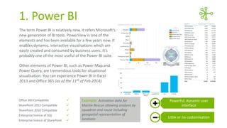
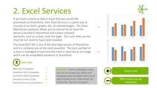
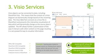
6Ways to Visualise
Data in Office 365
WRITTEN BY:

Dave Paylor
Senior Consultant - OBS
Visualise your business data using Office 365
Data visualisation is the presentation of complex data to a business
audience to provide valuable insight. In this presentation Dave will
discuss 6 tools that can be used to create charts and other visualisations
on Office 365.
He has detailed their strengths, weaknesses, use scenarios and licensing
implications.
Power BI

XSLT

Excel Services

Display Templates

Visio Services

jQuery
1. Power BI
The term Power BI is relatively new, it refers Microsoft‘s
new generation of BI tools. PowerView is one of the
elements and has been available for a few years now. It
enables dynamic, interactive visualisations which are
easily created and consumed by business users. It’s
probably one of the most useful of the Power BI suite.
Other elements of Power BI, such as Power Map and
Power Query, are tremendous tools for situational
visualisation. You can experience Power BI in Excel
2013 and Office 365 (as of the 11th of Feb 2014).

Office 365 Compatible



Example: Activation data for

SharePoint 2013 Compatible



SharePoint 2010 Compatible



Enterprise licence of SQL



Enterprise licence of SharePoint



Marine Rescue allowing analysis by
squadron and cause including
geospatial representation of
locations

Powerful, dynamic user
interface
Little or no customisation
2. Excel Services
If you have content or data in Excel that you would like
presented via SharePoint, then Excel Services is a great way to
visualise it as charts, graphs, etc. on selected pages. The Excel
Web Access web part allows you to connect to an Excel file
which is located in SharePoint and surface selected
elements, such as a chart, onto the page. The users who see the
chart do not need to have Excel installed.
The Excel REST API is one of the best kept secrets of SharePoint
and it is certainly one of the most powerful. The look and feel of
a chart is managed in Excel and the chart is returned as an image
which can be embedded anywhere in SharePoint
Dave’s Fav
Office 365 Compatible



SharePoint 2013 Compatible



SharePoint 2010 Compatible



Enterprise licence of SQL



Enterprise licence of SharePoint



Example: Country Manager using
Excel to set targets for states and
changing chart template with actual
data coming from a SharePoint list
entered by regional managers

Easy to use
REST charts are not
interactive
3. Visio Services
Visio objects can be connected to data, including
SharePoint lists. This means that the content of a Visio
diagram can dynamically change based on the incoming
data. The Visio Web Part connects to a Visio file in
SharePoint and presents this interactive visualisation of
data which will dynamically change as the source data is
updated. The API allows further customisation of the
way it interacts with other content on the page resulting
in a very powerful way to visualise information.

Office 365 Compatible



SharePoint 2013 Compatible



SharePoint 2010 Compatible



Enterprise licence of SQL



Enterprise licence of SharePoint



Example: Seating plan linked to
people search so clicking from search
shows where the person sits and
clicking on the desk shows who is
there

JavaScript API allows for
powerful interaction
Files grow quickly with a lot
of objects
4. XSLT
XSLT is commonly used to present bar charts, but other
visualisations, such as status indicators and colourcoding can also easily be achieved. It’s ability is only
limited to what can be achieved with HTML.
With minimal training, content authors can easily apply
pre-prepared XSLT to their views via the XSL link with
web part settings, although one wouldn’t expect
business users to create their own XSLT.

Office 365 Compatible



SharePoint 2013 Compatible



SharePoint 2010 Compatible



Enterprise licence of SQL



Enterprise licence of SharePoint



Example: Apply an XSL template to
a risk register in a SharePoint list to
represent the content in an ISO
31000 risk matrix

Server-side processing
Needs knowledge to create
XSL templates
5. Display Templates
Display Templates are still relatively new, they were
introduced with the launch SharePoint 2013, but the
possibilities they offer are very exciting. In many cases,
Display Templates have the potential to replace XSLT for
simple visualisation techniques such as indicators and
colour-coding.
Tool with great potential!

Office 365 Compatible



SharePoint 2013 Compatible



SharePoint 2010 Compatible



Enterprise licence of SQL



Enterprise licence of SharePoint



Example: Apply a display template
to a list of projects and convert a
choice field value to a KPI indicator
to produce a simple project
dashboard

Can effect a single field of a
view
Care needed with multiple
views on the same page
6. jQuery
There are a number of jQuery plug-ins that offer some
great visualisation capabilities. A couple of examples are
jqPlot and Amcharts. These require some technical
configuration, but it is all client-side and can produce
some great results for your efforts.
Amcharts is based on jQuery so also offers extensive
animations which may be a little gimmicky but can also
really bring a chart to life.

Office 365 Compatible



SharePoint 2013 Compatible



SharePoint 2010 Compatible



Enterprise licence of SQL



Enterprise licence of SharePoint



Example: Absenteeism summaries
held in a SharePoint list and
presented as a chart using jQuery

JavaScript API allows for
powerful interaction
Files grow quickly with a lot
of objects
Contact Dave if you
have any questions.
WRITTEN BY:

Dave Paylor
Senior Consultant - OBS
E: dave.paylor@obs.com.au
L: http://au.linkedin.com/in/paylord

OBS:

6 Ways To Visualise Data In Office 365

  • 1.
    6Ways to Visualise Datain Office 365 WRITTEN BY: Dave Paylor Senior Consultant - OBS
  • 2.
    Visualise your businessdata using Office 365 Data visualisation is the presentation of complex data to a business audience to provide valuable insight. In this presentation Dave will discuss 6 tools that can be used to create charts and other visualisations on Office 365. He has detailed their strengths, weaknesses, use scenarios and licensing implications. Power BI XSLT Excel Services Display Templates Visio Services jQuery
  • 3.
    1. Power BI Theterm Power BI is relatively new, it refers Microsoft‘s new generation of BI tools. PowerView is one of the elements and has been available for a few years now. It enables dynamic, interactive visualisations which are easily created and consumed by business users. It’s probably one of the most useful of the Power BI suite. Other elements of Power BI, such as Power Map and Power Query, are tremendous tools for situational visualisation. You can experience Power BI in Excel 2013 and Office 365 (as of the 11th of Feb 2014). Office 365 Compatible  Example: Activation data for SharePoint 2013 Compatible  SharePoint 2010 Compatible  Enterprise licence of SQL  Enterprise licence of SharePoint  Marine Rescue allowing analysis by squadron and cause including geospatial representation of locations Powerful, dynamic user interface Little or no customisation
  • 4.
    2. Excel Services Ifyou have content or data in Excel that you would like presented via SharePoint, then Excel Services is a great way to visualise it as charts, graphs, etc. on selected pages. The Excel Web Access web part allows you to connect to an Excel file which is located in SharePoint and surface selected elements, such as a chart, onto the page. The users who see the chart do not need to have Excel installed. The Excel REST API is one of the best kept secrets of SharePoint and it is certainly one of the most powerful. The look and feel of a chart is managed in Excel and the chart is returned as an image which can be embedded anywhere in SharePoint Dave’s Fav Office 365 Compatible  SharePoint 2013 Compatible  SharePoint 2010 Compatible  Enterprise licence of SQL  Enterprise licence of SharePoint  Example: Country Manager using Excel to set targets for states and changing chart template with actual data coming from a SharePoint list entered by regional managers Easy to use REST charts are not interactive
  • 5.
    3. Visio Services Visioobjects can be connected to data, including SharePoint lists. This means that the content of a Visio diagram can dynamically change based on the incoming data. The Visio Web Part connects to a Visio file in SharePoint and presents this interactive visualisation of data which will dynamically change as the source data is updated. The API allows further customisation of the way it interacts with other content on the page resulting in a very powerful way to visualise information. Office 365 Compatible  SharePoint 2013 Compatible  SharePoint 2010 Compatible  Enterprise licence of SQL  Enterprise licence of SharePoint  Example: Seating plan linked to people search so clicking from search shows where the person sits and clicking on the desk shows who is there JavaScript API allows for powerful interaction Files grow quickly with a lot of objects
  • 6.
    4. XSLT XSLT iscommonly used to present bar charts, but other visualisations, such as status indicators and colourcoding can also easily be achieved. It’s ability is only limited to what can be achieved with HTML. With minimal training, content authors can easily apply pre-prepared XSLT to their views via the XSL link with web part settings, although one wouldn’t expect business users to create their own XSLT. Office 365 Compatible  SharePoint 2013 Compatible  SharePoint 2010 Compatible  Enterprise licence of SQL  Enterprise licence of SharePoint  Example: Apply an XSL template to a risk register in a SharePoint list to represent the content in an ISO 31000 risk matrix Server-side processing Needs knowledge to create XSL templates
  • 7.
    5. Display Templates DisplayTemplates are still relatively new, they were introduced with the launch SharePoint 2013, but the possibilities they offer are very exciting. In many cases, Display Templates have the potential to replace XSLT for simple visualisation techniques such as indicators and colour-coding. Tool with great potential! Office 365 Compatible  SharePoint 2013 Compatible  SharePoint 2010 Compatible  Enterprise licence of SQL  Enterprise licence of SharePoint  Example: Apply a display template to a list of projects and convert a choice field value to a KPI indicator to produce a simple project dashboard Can effect a single field of a view Care needed with multiple views on the same page
  • 8.
    6. jQuery There area number of jQuery plug-ins that offer some great visualisation capabilities. A couple of examples are jqPlot and Amcharts. These require some technical configuration, but it is all client-side and can produce some great results for your efforts. Amcharts is based on jQuery so also offers extensive animations which may be a little gimmicky but can also really bring a chart to life. Office 365 Compatible  SharePoint 2013 Compatible  SharePoint 2010 Compatible  Enterprise licence of SQL  Enterprise licence of SharePoint  Example: Absenteeism summaries held in a SharePoint list and presented as a chart using jQuery JavaScript API allows for powerful interaction Files grow quickly with a lot of objects
  • 9.
    Contact Dave ifyou have any questions. WRITTEN BY: Dave Paylor Senior Consultant - OBS E: dave.paylor@obs.com.au L: http://au.linkedin.com/in/paylord OBS: