Download to read offline

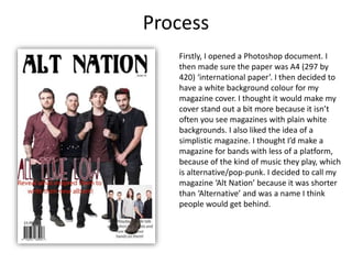
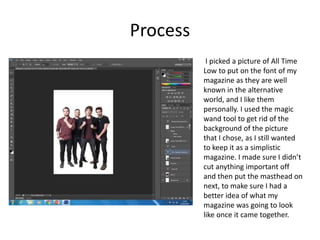
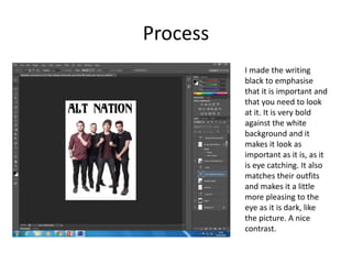
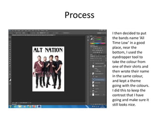
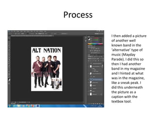
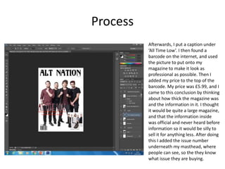
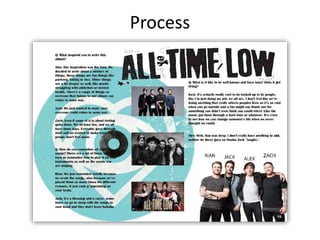

Chelsea Kierans describes the process of designing the cover of her magazine "Alt Nation", which focuses on alternative and pop-punk bands. She chose a simple white background and included a picture of the band All Time Low. She edited out the background of the picture and added the magazine title and issue number. Additional details such as band names, pictures, and a barcode were added to make the cover look professional. Kierans then describes setting up the inside pages in a landscape format and including more pictures and an interview to provide more in-depth content than the cover.


![Screen shots of front cover]](https://cdn.slidesharecdn.com/ss_thumbnails/screenshotsoffrontcover-130307044929-phpapp01-thumbnail.jpg?width=640&height=640&fit=bounds)


](https://cdn.slidesharecdn.com/ss_thumbnails/7-190702152223-thumbnail.jpg?width=640&height=640&fit=bounds)
![6.%20 production%20reflection(4)[1] 2](https://cdn.slidesharecdn.com/ss_thumbnails/6-190702152214-thumbnail.jpg?width=640&height=640&fit=bounds)
![5.%20 script[1]](https://cdn.slidesharecdn.com/ss_thumbnails/5-190702152211-9a79ca-thumbnail.jpg?width=640&height=640&fit=bounds)


