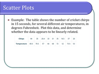
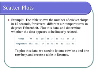
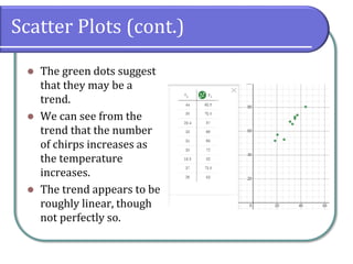
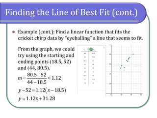
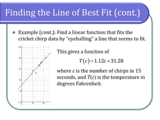
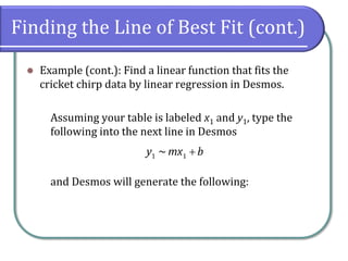
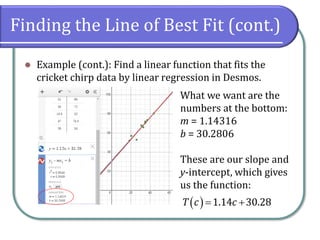
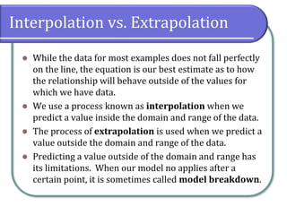
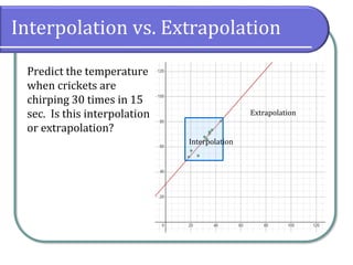
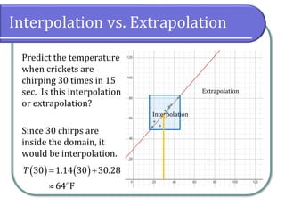
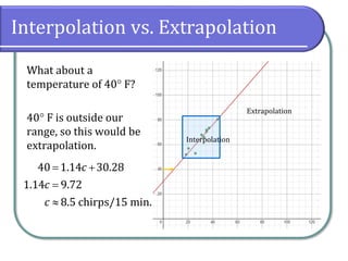
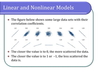
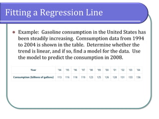
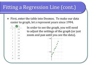
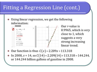
* Draw and interpret scatter diagrams.
* Use a graphing utility to find the line of best fit.
* Distinguish between linear and nonlinear relations.
* Fit a regression line to a set of data and use the linear model to make predictions.
2. Concepts & Objectives
⚫ Objectives for this section are
⚫ Draw and interpret scatter diagrams.
⚫ Use a graphing utility to find the line of best fit.
⚫ Distinguish between linear and nonlinear relations.
⚫ Fit a regression line to a set of data and use the linear
model to make predictions.
3. Scatter Plots
⚫ A scatter plot is a graph of plotted points that may show
a relationship between two sets of data.
⚫ The data may or may not correlate, and the data may or
may not correlate to a linear model, but if it is linear, we
can draw conclusions based on our knowledge of linear
functions.
4. Scatter Plots
⚫ Example: The table shows the number of cricket chirps
in 15 seconds, for several different air temperatures, in
degrees Fahrenheit. Plot this data, and determine
whether the data appears to be linearly related.
5. Scatter Plots
⚫ Example: The table shows the number of cricket chirps
in 15 seconds, for several different air temperatures, in
degrees Fahrenheit. Plot this data, and determine
whether the data appears to be linearly related.
To plot this data, we need to let one row be x and one
row be y, and create a table in Desmos.
6. Scatter Plots (cont.)
⚫ The green dots suggest
that they may be a
trend.
⚫ We can see from the
trend that the number
of chirps increases as
the temperature
increases.
⚫ The trend appears to be
roughly linear, though
not perfectly so.
7. Finding the Line of Best Fit
⚫ Once we recognize a need for a linear function to model
the data, the next question would be “what is that linear
function?”
⚫ One way to approximate our linear function is to sketch
the line that seems to best fit the data. Then we can
extend the line until we can verify the y-intercept.
⚫ We can approximate the slope of the line by extending it
until we can estimate the rise over run.
8. Finding the Line of Best Fit (cont.)
⚫ Example (cont.): Find a linear function that fits the
cricket chirp data by “eyeballing” a line that seems to fit.
9. Finding the Line of Best Fit (cont.)
⚫ Example (cont.): Find a linear function that fits the
cricket chirp data by “eyeballing” a line that seems to fit.
From the graph, we could
try using the starting and
ending points (18.5, 52)
and (44, 80.5).
80.5 52
1.12
44 18.5
m
−
=
−
( )
52 1.12 18.5
y x
− = −
1.12 31.28
y x
= +
10. Finding the Line of Best Fit (cont.)
⚫ Example (cont.): Find a linear function that fits the
cricket chirp data by “eyeballing” a line that seems to fit.
This gives a function of
where c is the number of chirps in 15
seconds, and T(c) is the temperature in
degrees Fahrenheit.
( ) 1.12 31.28
T c c
= +
11. Finding the Line of Best Fit (cont.)
⚫ Example (cont.): Find a linear function that fits the
cricket chirp data by linear regression in Desmos.
Assuming your table is labeled x1 and y1, type the
following into the next line in Desmos
and Desmos will generate the following:
1 1
~
y mx b
+
12. Finding the Line of Best Fit (cont.)
⚫ Example (cont.): Find a linear function that fits the
cricket chirp data by linear regression in Desmos.
What we want are the
numbers at the bottom:
m = 1.14316
b = 30.2806
These are our slope and
y-intercept, which gives
us the function:
( ) 1.14 30.28
T c c
= +
13. Interpolation vs. Extrapolation
⚫ While the data for most examples does not fall perfectly
on the line, the equation is our best estimate as to how
the relationship will behave outside of the values for
which we have data.
⚫ We use a process known as interpolation when we
predict a value inside the domain and range of the data.
⚫ The process of extrapolation is used when we predict a
value outside the domain and range of the data.
⚫ Predicting a value outside of the domain and range has
its limitations. When our model no applies after a
certain point, it is sometimes called model breakdown.
14. Interpolation vs. Extrapolation
Predict the temperature
when crickets are
chirping 30 times in 15
sec. Is this interpolation
or extrapolation?
Interpolation
Extrapolation
15. Interpolation vs. Extrapolation
Predict the temperature
when crickets are
chirping 30 times in 15
sec. Is this interpolation
or extrapolation?
Since 30 chirps are
inside the domain, it
would be interpolation.
Interpolation
Extrapolation
( ) ( )
30 1.14 30 30.28
64 F
T = +
16. Interpolation vs. Extrapolation
What about a
temperature of 40 F?
40 F is outside our
range, so this would be
extrapolation.
Interpolation
Extrapolation
40 1.14 30.28
1.14 9.72
8.5 chirps/15 min.
c
c
c
= +
=
17. Linear and Nonlinear Models
⚫ While the cricket data exhibited a strong linear trend,
other data can be nonlinear. Desmos (and other
calculators that compute linear regressions) can also
provide us with the correlation coefficient, which is a
measure of how closely the line fits the data, which is
conventionally labeled r.
⚫ The correlation coefficient provides an easy way to get
an idea of how close to a line the data falls. In our cricket
example, our r-value was 0.9509 (a straight line has an
r-value of 1).
18. Linear and Nonlinear Models
⚫ The figure below shows some large data sets with their
correlation coefficients.
⚫ The closer the value is to 0, the more scattered the data.
⚫ The closer the value is to 1 or –1, the less scattered the
data is.
19. Fitting a Regression Line
⚫ Example: Gasoline consumption in the United States has
been steadily increasing. Comsumption data from 1994
to 2004 is shown in the table. Determine whether the
trend is linear, and if so, find a model for the data. Use
the model to predict the consumption in 2008.
20. Fitting a Regression Line (cont.)
⚫ First, enter the table into Desmos. To make our data
easier to graph, let x represent years since 1994.
In order to see the graph, you will need
to adjust the settings of the graph (or just
zoom and pan until you see the data).
21. Fitting a Regression Line (cont.)
⚫ Using linear regression, we get the following
information:
⚫ Our function is thus
⚫ In 2008, x = 14, so ,
or 144.244 billion gallons of gasoline in 2008.
Our r-value is
0.9965, which is very
close to 1, which
suggests a very
strong increasing
linear trend.
( ) 2.209 113.318
C x x
= +
( ) ( )
14 2.209 14 113.318 144.244
C = + =