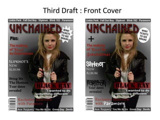
This document summarizes changes made to improve a magazine cover draft. Official logos for Slipknot and Bring Me The Horizon were added and their colors were changed to match feature stories using painting tools. The word "Plus" was changed to a plus sign "+" for a more professional look. The main feature story was moved further right for improved neatness and professional appearance.
Creation Process of Potential New Cover.viva_hasan
This is my step by step creation process of my front cover which i did not use. I explain all the decisions i made and how the effected my target audience.
Creation Process of Potential New Cover.viva_hasan
This is my step by step creation process of my front cover which i did not use. I explain all the decisions i made and how the effected my target audience.
Apresentação com as 10 dicas que formam o manual de empreendedorismo de Guy Kawasaki.
Apresentação feita pela MonkeyBusiness
// MonkeyBusiness is an brazilian agency that is specialized in presentations. All our energy is focused on creating memorable slides, which hold the attention of your audience and express your ideas.
// MonkeyBusiness é uma agência especializada em apresentações. Toda nossa energia é focada em criar slides inesquecíveis, que prendem a atenção do seu público e vendem suas idéias.
Postado aqui por MonkeyBusiness - Nós fazemos a sua apresentação:
www.monkeybusiness.com.br
www.macacosmebloguem.com.br
www.facebook.com/mkbusiness
www.twitter.com/mkbusiness
Curso armado para enviar por e-mail cada una de las clases.
Se envió durante un mes todos los lunes.
Se solicitó un feedback con ejercicios de redacción para ver los resultados.
2. To improve my second draft I changed some of the fonts to match the genre more and I also
used the official logos for the bands Slipknot and Bring Me The Horizon so that they are very
noticeable to the audience as soon as they see the logo. I then changed the colour of these
logos to match the colour of the feature story that goes with it. I did this using the paint bucket
tool and clicked on the parts that I wanted to change the colour of and then I used the magic
wand tool to get rid of the background.
3. Also I changed the word ‘Plus:’ to a plus sign
’+’ as I thought that this would make the
magazine look more professional because I am
using symbols instead of text.
Then I moved the main feature story further
to the right because it looked quite messy
before so doing this makes it look a lot neater
and more professional.