Download as PDF, PPTX


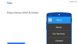


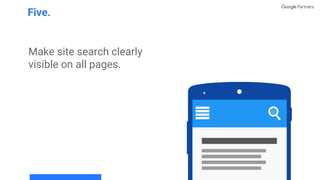


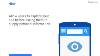
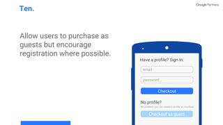
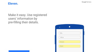


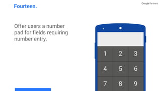


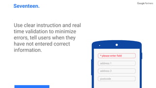
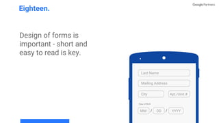
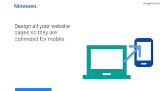
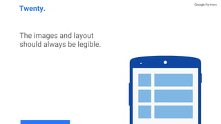
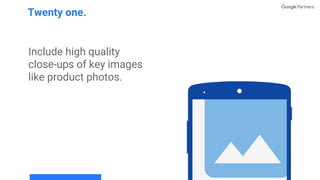


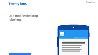


The document outlines 25 principles for effective mobile site design, emphasizing the importance of clear call-to-action elements, easy navigation, and user-friendly features. Key suggestions include optimizing search functionalities, facilitating guest checkouts, and ensuring mobile compatibility of all website pages. The guidelines aim to enhance user experience by simplifying information entry and providing relevant content quickly.


![Metaverse: Blockchain NFT Smart Contract and Decentraland [TH]](https://cdn.slidesharecdn.com/ss_thumbnails/nftitemandmetaverse-220218072344-thumbnail.jpg?width=640&height=640&fit=bounds)


