
Recommended
Recommended
More Related Content
Viewers also liked
Viewers also liked (12)
Similar to 2014 Woking's Canal Quarter presentation - Yanghuan Hu
Similar to 2014 Woking's Canal Quarter presentation - Yanghuan Hu (20)
Recently uploaded
Recently uploaded (20)
2014 Woking's Canal Quarter presentation - Yanghuan Hu
- 1. Woking’s Canal Quarter Yanghuan Hu
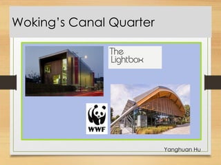
- 2. An App for Woking’s Canal Quarter My aim for this project is to create an app that will promote Woking’s Canal Quarter. I have decided to make this app to be appeal to children. I will have to make this in the style that will be best suited for them and make it visually interesting. I will look into the lines, and colours that was in the Light Box Gallery. I will also try out the combination of Lines and colours with architectures. 1
- 3. Design: An App for Woking’s Canal Quarter These are the inspiration for my art work. I really like the way that those artists drew the lines in different direction to create the details on the subject. I also like the way the artist combine colours with the line drawing to create dimensions and gives the illusion to the illustration. And now I’m going to use these techniques and apply them onto my artwork. 2
- 4. Aesthetics: Artwork 3 The artwork in my animation will be base on the architectures in Woking combining with lines and colours that was in the Light Box Gallery and WWF. Some of my drawings of the Canal Quarter were in black and white so I perhaps would add colours onto them later on in my animation. My app will show the emphasises on the colour, line and structure of the Canal Quarter.
- 5. Aesthetics: Typography Within my app I would like to use the same typeface throughout the whole animation. I am going to search into different fonts that I like and see if I could use it in my app. I want something that looks friendly and not too dramatic. Welcome to The Light Box. I really like this font as looks really simple and neat. Welcome to The Light Box. I like this font because its bold and clear. Welcome to The Light Box I like the how this font’s letters are all in capital letters which make the texts easier to read and look very clean. Welcome to The Light Box. – this is the first typeface I picked and I this is my favourite one. I am going to use this font through out the app as its very simple and clean, its also very easy to read. 4
- 6. Aesthetics: Colour Scheme 5 These are some screenshot of colour swatches of the photographs I took of the Canal Quarter, these are some images of my main focuses of my app. I made these colour swatches by using the software called ‘Kuler’ it help me to select the main colours of the image. By doing this it enables me to move further onto the colouring stage and I would know which colour would be appropriate to use on my illustrations.
- 7. Storyboard 6 Stage 1 Stage 2 This will be the first slide of my app. There will be an illustration behind the mask and it will be reveal by the circle that enlarges while moving around the page. There will also be a text slide along after the whole illustration appears. The text will say ‘WELCOME TO THE LIGHT BOX Stage 3 Stage 4
- 8. Storyboard Stage 1 This will be the second slide of my app. I will also be using mask to reveal the illustration gradually, but this time it will be reveal the illustration from the top right corner. After the illustration revealed as a whole I will add colours onto the it and add gradient effect to it. There will also be some text sliding through, and it will be some information about the Canal Quarter. Stage 2 Stage 3 Stage 4
- 9. Storyboard Stage 1 This will be the last slide of my app. As I used masking for my previous pages I will be using masking again for this one. Because the illustration I decided to put into this slide was in the same style as the slide 2, I will colour it in the same style as well and add gradient effect on to it too. Just like the other slides I will have text sliding though and promote Woking Canal Quarter. Stage 2 Stage 3 Stage 4
- 10. Final Realisation 7 This the final look of the first animation I made being placed onto an app template.
- 11. Final Realisation This the final look of the second animation I made being placed onto an app template.
- 12. Final Realisation This the final look of the third animation I made being placed onto an app template.