7
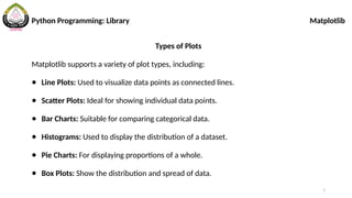
Python Programming: LibraryMatplotlib
Types of Plots
Matplotlib supports a variety of plot types, including:
● Line Plots: Used to visualize data points as connected lines.
● Scatter Plots: Ideal for showing individual data points.
● Bar Charts: Suitable for comparing categorical data.
● Histograms: Used to display the distribution of a dataset.
● Pie Charts: For displaying proportions of a whole.
● Box Plots: Show the distribution and spread of data.
9
Python Programming: LibraryMatplotlib
Line Plotting
import matplotlib.pyplot as plt
# Sample data
x = [1, 2, 3, 4, 5]
y = [10, 8, 6, 4, 2]
# Create a line plot
plt.plot(x, y)
# Display the plot
plt.show()
11
Python Programming: LibraryMatplotlib
Adding Labels and Title
import matplotlib.pyplot as
plt
x1 = [1, 2, 3, 4, 5]
y1 = [10, 8, 6, 4, 2]
plt.plot(x1, y1)
plt.xlabel("X-axis Label")
plt.ylabel("Y-axis Label")
plt.title("Title of the
Setting Axis Limits
# Set x-axis limits
plt.xlim(0, 6)
# Set y-axis limits
plt.ylim(0, 12)
12.
12
Adding Legends
import matplotlib.pyplotas
plt
x = [1, 2, 3, 4, 5]
y = [10, 8, 6, 4, 2]
plt.plot(x, y, label="Line
1")
plt.legend()
Changing Line Styles and Colors
import matplotlib.pyplot as
plt
x = [1, 2, 3, 4, 5]
y = [10, 8, 6, 4, 2]
plt.plot(x, y,
linestyle='--', color='red')
plt.show()
Python Programming: Library Matplotlib
13.
13
Subplots
import matplotlib.pyplot as
plt
#Sample data
x = [1, 2, 3, 4, 5]
y = [10, 8, 6, 4, 2]
# Create a 2x2 grid of
subplots, select the first
# Select the second subplot
plt.subplot(2, 2, 2)
plt.scatter(x, y)
plt.show()
Python Programming: Library Matplotlib
14.
14
Saving Plot
import matplotlib.pyplotas
plt
# Sample data
x = [1, 2, 3, 4, 5]
y = [10, 8, 6, 4, 2]
# Create a 2x2 grid of
subplots, select the first
# Select the second subplot
plt.subplot(2, 2, 2)
plt.scatter(x, y)
plt.savefig("my_plot.png")
Python Programming: Library Matplotlib
15.
15
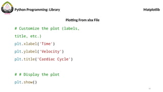
Plotting From xlsxFile
# pip install openpyxl
import pandas as pd
import numpy as np
import matplotlib.pyplot as
plt
# Read data from Excel file
df = pd.read_excel('inlet
velocity.xlsx')
# Extract columns from the
DataFrame and convert to
NumPy arrays
x = np.array(df['Time'])
y = np.array(df['Velocity'])
# Create a line plot
plt.plot(x, y)
Python Programming: Library Matplotlib
16.
16
Plotting From xlsxFile
# Customize the plot (labels,
title, etc.)
plt.xlabel('Time')
plt.ylabel('Velocity')
plt.title('Cardiac Cycle')
# # Display the plot
plt.show()
Python Programming: Library Matplotlib


![9
Python Programming: Library Matplotlib
Line Plotting
import matplotlib.pyplot as plt
# Sample data
x = [1, 2, 3, 4, 5]
y = [10, 8, 6, 4, 2]
# Create a line plot
plt.plot(x, y)
# Display the plot
plt.show()](https://image.slidesharecdn.com/2-250717012559-68c834b4/85/2-Python-Library-Matplotlibmmmmmmmm-pptx-9-320.jpg)
![10
Python Programming: Library Matplotlib
Multiple Lines in One Figure
import matplotlib.pyplot as plt
# Sample data
x1 = [1, 2, 3, 4, 5]
y1 = [10, 8, 6, 4, 2]
x2 = [1, 2, 3, 4, 5]
y2 = [1, 2, 3, 4, 5]
plt.plot(x1, y1)
plt.scatter(x2, y2)
plt.show()](https://image.slidesharecdn.com/2-250717012559-68c834b4/85/2-Python-Library-Matplotlibmmmmmmmm-pptx-10-320.jpg)
![11
Python Programming: Library Matplotlib
Adding Labels and Title
import matplotlib.pyplot as
plt
x1 = [1, 2, 3, 4, 5]
y1 = [10, 8, 6, 4, 2]
plt.plot(x1, y1)
plt.xlabel("X-axis Label")
plt.ylabel("Y-axis Label")
plt.title("Title of the
Setting Axis Limits
# Set x-axis limits
plt.xlim(0, 6)
# Set y-axis limits
plt.ylim(0, 12)](https://image.slidesharecdn.com/2-250717012559-68c834b4/85/2-Python-Library-Matplotlibmmmmmmmm-pptx-11-320.jpg)
![12
Adding Legends
import matplotlib.pyplot as
plt
x = [1, 2, 3, 4, 5]
y = [10, 8, 6, 4, 2]
plt.plot(x, y, label="Line
1")
plt.legend()
Changing Line Styles and Colors
import matplotlib.pyplot as
plt
x = [1, 2, 3, 4, 5]
y = [10, 8, 6, 4, 2]
plt.plot(x, y,
linestyle='--', color='red')
plt.show()
Python Programming: Library Matplotlib](https://image.slidesharecdn.com/2-250717012559-68c834b4/85/2-Python-Library-Matplotlibmmmmmmmm-pptx-12-320.jpg)
![13
Subplots
import matplotlib.pyplot as
plt
# Sample data
x = [1, 2, 3, 4, 5]
y = [10, 8, 6, 4, 2]
# Create a 2x2 grid of
subplots, select the first
# Select the second subplot
plt.subplot(2, 2, 2)
plt.scatter(x, y)
plt.show()
Python Programming: Library Matplotlib](https://image.slidesharecdn.com/2-250717012559-68c834b4/85/2-Python-Library-Matplotlibmmmmmmmm-pptx-13-320.jpg)
![14
Saving Plot
import matplotlib.pyplot as
plt
# Sample data
x = [1, 2, 3, 4, 5]
y = [10, 8, 6, 4, 2]
# Create a 2x2 grid of
subplots, select the first
# Select the second subplot
plt.subplot(2, 2, 2)
plt.scatter(x, y)
plt.savefig("my_plot.png")
Python Programming: Library Matplotlib](https://image.slidesharecdn.com/2-250717012559-68c834b4/85/2-Python-Library-Matplotlibmmmmmmmm-pptx-14-320.jpg)
![15
Plotting From xlsx File
# pip install openpyxl
import pandas as pd
import numpy as np
import matplotlib.pyplot as
plt
# Read data from Excel file
df = pd.read_excel('inlet
velocity.xlsx')
# Extract columns from the
DataFrame and convert to
NumPy arrays
x = np.array(df['Time'])
y = np.array(df['Velocity'])
# Create a line plot
plt.plot(x, y)
Python Programming: Library Matplotlib](https://image.slidesharecdn.com/2-250717012559-68c834b4/85/2-Python-Library-Matplotlibmmmmmmmm-pptx-15-320.jpg)