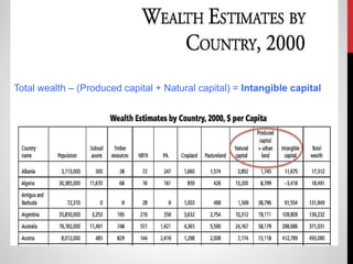
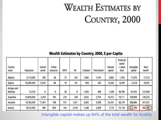
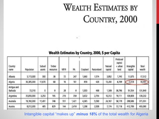
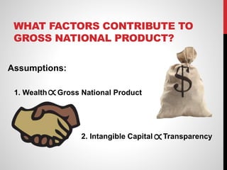
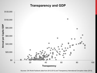
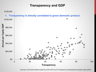
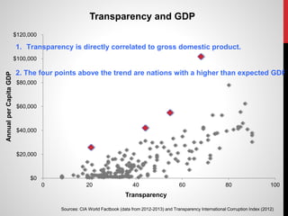
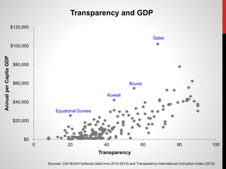
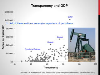
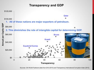
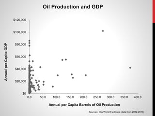
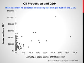
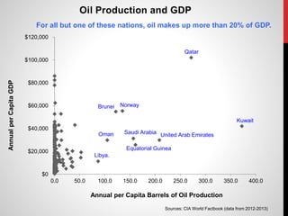
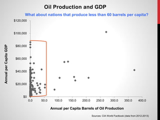
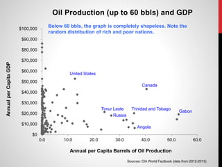
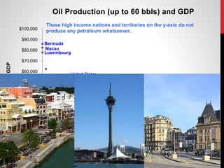
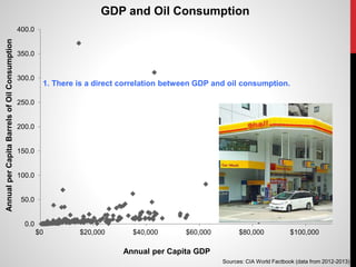
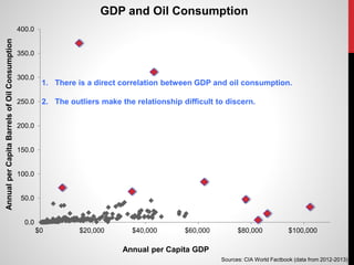
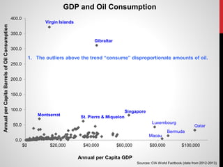
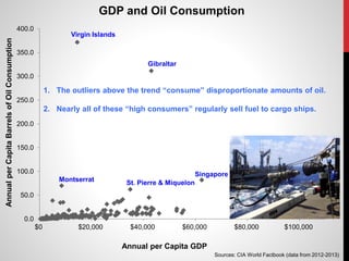
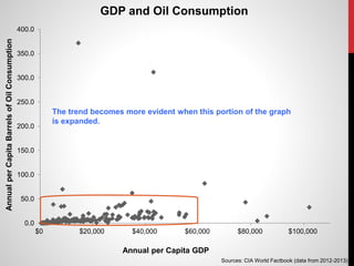
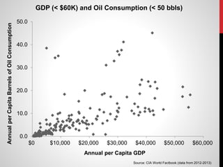
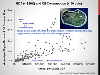
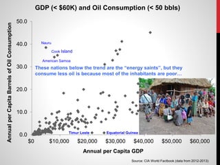
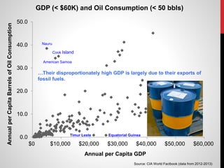
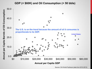
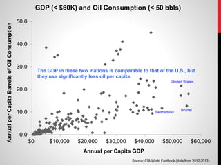
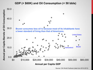
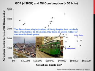
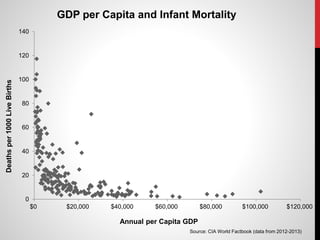
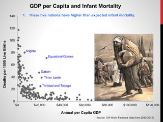
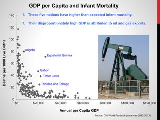
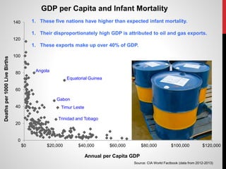
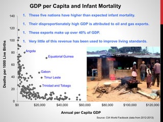
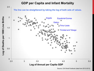
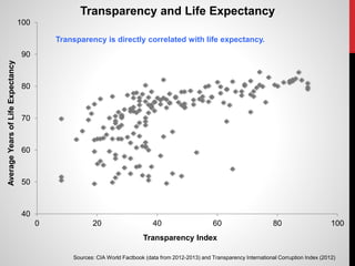
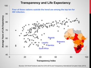
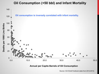
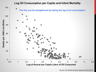
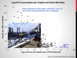
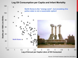
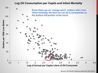
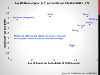
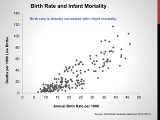
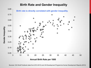
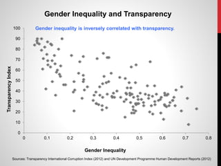
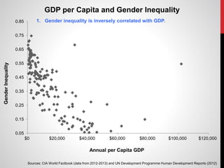
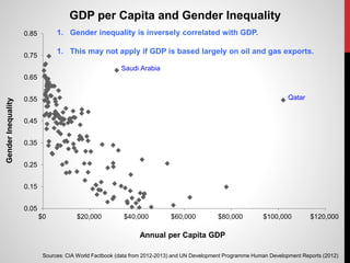
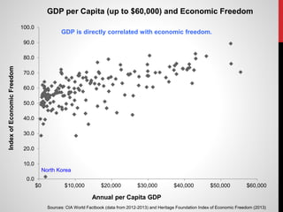
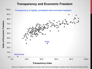
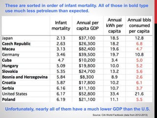
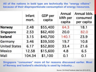
GENERATING SCATTERPLOTS
TO STUDY THE RELATIONSHIP
BETWEEN DEVELOPMENT
AND CONSUMPTION
Session 1.9: AFACCT Conference 2016, January 7, 2016 at
the College of Southern Maryland
by Dr. Antonio R. Chaves, adjunct instructor of Biology
at Montgomery College in Takoma Park
email: Antonio.Chaves@montgomerycollege.edu
In 2006 the World Bank published a meticulous analysis on sources of
international wealth itemized in 2000.
At the end of the publication, the data is presented in a chart that
lists countries in alphabetical order:
The total wealth is made up of three components;…
…natural, produced, and intangible capital.
Total wealth – (Produced capital + Natural capital) = Intangible capital
Intangible capital makes up 84% of the total wealth for Austria
Intangible capital “makes up” minus 18% of the total wealth for Algeria
GRASPING THE INTANGIBLE
1. Why is there such a large
difference between Austria and
Algeria?
2. What makes up intangible
capital?
Education is important…
Rule of law is even more important.
The World Bank publication is 188 pages. Reason Magazine
provided a useful summary:
The following inquiry-based activity directs students to generate a wide
variety of scatterplots using raw data that is readily available online. The
graphs presented represent only a fraction of what is possible. Some were
selected because they concur with the World Bank’s analysis of national
wealth. Others were selected for insights they provide on the relationship
between wealth, development, and consumption.
WHAT FACTORS CONTRIBUTE TO
GROSS NATIONAL PRODUCT?
Assumptions:
1. Wealth Gross National Product
2. Intangible Capital Transparency
The following sources were
used to generate the
scatterplots for this section:
1. The CIA World Factbook
1. Transparency International
$0
$20,000
$40,000
$60,000
$80,000
$100,000
$120,000
0 20 40 60 80 100
AnnualperCapitaGDP
Transparency
Transparency and GDP
Sources: CIA World Factbook (data from 2012-2013) and Transparency International Corruption Index (2012)
$0
$20,000
$40,000
$60,000
$80,000
$100,000
$120,000
0 20 40 60 80 100
AnnualperCapitaGDP
Transparency
Transparency and GDP
Sources: CIA World Factbook (data from 2012-2013) and Transparency International Corruption Index (2012)
1. Transparency is directly correlated to gross domestic product.
$0
$20,000
$40,000
$60,000
$80,000
$100,000
$120,000
0 20 40 60 80 100
AnnualperCapitaGDP
Transparency
Transparency and GDP
Sources: CIA World Factbook (data from 2012-2013) and Transparency International Corruption Index (2012)
1. Transparency is directly correlated to gross domestic product.
2. The four points above the trend are nations with a higher than expected GDP.
$0
$20,000
$40,000
$60,000
$80,000
$100,000
$120,000
0 20 40 60 80 100
AnnualperCapitaGDP
Transparency
Transparency and GDP
Sources: CIA World Factbook (data from 2012-2013) and Transparency International Corruption Index (2012)
Kuwait
Equatorial Guinea
Brunei
Qatar
$0
$20,000
$40,000
$60,000
$80,000
$100,000
$120,000
0 20 40 60 80 100
AnnualperCapitaGDP
Transparency
Transparency and GDP
Sources: CIA World Factbook (data from 2012-2013) and Transparency International Corruption Index (2012)
Kuwait
Equatorial Guinea
Brunei
Qatar
1. All of these nations are major exporters of petroleum.
2. This diminishes the role of intangible capital for determining GDP.
$0
$20,000
$40,000
$60,000
$80,000
$100,000
$120,000
0.0 50.0 100.0 150.0 200.0 250.0 300.0 350.0 400.0
AnnualperCapitaGDP
Annual per Capita Barrels of Oil Production
Oil Production and GDP
Sources: CIA World Factbook (data from 2012-2013)
$0
$20,000
$40,000
$60,000
$80,000
$100,000
$120,000
0.0 50.0 100.0 150.0 200.0 250.0 300.0 350.0 400.0
AnnualperCapitaGDP
Annual per Capita Barrels of Oil Production
Oil Production and GDP
Sources: CIA World Factbook (data from 2012-2013)
There is almost no correlation between petroleum production and GDP.
$0
$20,000
$40,000
$60,000
$80,000
$100,000
$120,000
0.0 50.0 100.0 150.0 200.0 250.0 300.0 350.0 400.0
AnnualperCapitaGDP
Annual per Capita Barrels of Oil Production
Oil Production and GDP
Sources: CIA World Factbook (data from 2012-2013)
Qatar
Kuwait
United Arab Emirates
Equatorial Guinea
Saudi Arabia
NorwayBrunei
Oman
Libya.
For all but one of these nations, oil makes up more than 20% of GDP.
$0
$20,000
$40,000
$60,000
$80,000
$100,000
$120,000
0.0 50.0 100.0 150.0 200.0 250.0 300.0 350.0 400.0
AnnualperCapitaGDP
Annual per Capita Barrels of Oil Production
Oil Production and GDP
Sources: CIA World Factbook (data from 2012-2013)
What about nations that produce less than 60 barrels per capita?
$0
$10,000
$20,000
$30,000
$40,000
$50,000
$60,000
$70,000
$80,000
$90,000
$100,000
0.0 10.0 20.0 30.0 40.0 50.0 60.0
AnnualperCapitaGDP
Annual per Capita Barrels of Oil Production
Oil Production (up to 60 bbls) and GDP
Sources: CIA World Factbook (data from 2012-2013)
United States
Gabon
Angola
Russia
Timur Leste
Canada
Trinidad and Tobago
Below 60 bbls, the graph is completely shapeless. Note the
random distribution of rich and poor nations.
$0
$10,000
$20,000
$30,000
$40,000
$50,000
$60,000
$70,000
$80,000
$90,000
$100,000
0.0 10.0 20.0 30.0 40.0 50.0 60.0
AnnualperCapitaGDP
Annual per Capita Barrels of Oil Production
Oil Production (up to 60 bbls) and GDP
Sources: CIA World Factbook (data from 2012-2013)
United States
Gabon
Angola
Russia
Bermuda
Macau
Luxembourg
Timur Leste
Canada
Trinidad and Tobago
These high income nations and territories on the y-axis do not
produce any petroleum whatsoever.
0.0
50.0
100.0
150.0
200.0
250.0
300.0
350.0
400.0
$0 $20,000 $40,000 $60,000 $80,000 $100,000
AnnualperCapitaBarrelsofOilConsumption
Annual per Capita GDP
GDP and Oil Consumption
Sources: CIA World Factbook (data from 2012-2013)
0.0
50.0
100.0
150.0
200.0
250.0
300.0
350.0
400.0
$0 $20,000 $40,000 $60,000 $80,000 $100,000
AnnualperCapitaBarrelsofOilConsumption
Annual per Capita GDP
GDP and Oil Consumption
Sources: CIA World Factbook (data from 2012-2013)
1. There is a direct correlation between GDP and oil consumption.
0.0
50.0
100.0
150.0
200.0
250.0
300.0
350.0
400.0
$0 $20,000 $40,000 $60,000 $80,000 $100,000
AnnualperCapitaBarrelsofOilConsumption
Annual per Capita GDP
GDP and Oil Consumption
Sources: CIA World Factbook (data from 2012-2013)
1. There is a direct correlation between GDP and oil consumption.
2. The outliers make the relationship difficult to discern.
0.0
50.0
100.0
150.0
200.0
250.0
300.0
350.0
400.0
$0 $20,000 $40,000 $60,000 $80,000 $100,000
AnnualperCapitaBarrelsofOilConsumption
Annual per Capita GDP
GDP and Oil Consumption
Virgin Islands
Gibraltar
Singapore
Qatar
Bermuda
Macau
Luxembourg
Montserrat St. Pierre & Miquelon
Sources: CIA World Factbook (data from 2012-2013)
1. The outliers above the trend “consume” disproportionate amounts of oil.
2. Nearly all of these “high consumers” regularly sell fuel to cargo ships.
0.0
50.0
100.0
150.0
200.0
250.0
300.0
350.0
400.0
$0 $20,000 $40,000 $60,000 $80,000 $100,000
AnnualperCapitaBarrelsofOilConsumption
Annual per Capita GDP
GDP and Oil Consumption
Sources: CIA World Factbook (data from 2012-2013)
The trend becomes more evident when this portion of the graph
is expanded.
0.0
10.0
20.0
30.0
40.0
50.0
$0 $10,000 $20,000 $30,000 $40,000 $50,000 $60,000
AnnualperCapitaBarrelsofOilConsumption
Annual per Capita GDP
GDP (< $60K) and Oil Consumption (< 50 bbls)
Source: CIA World Factbook (data from 2012-2013)
0.0
10.0
20.0
30.0
40.0
50.0
$0 $10,000 $20,000 $30,000 $40,000 $50,000 $60,000
AnnualperCapitaBarrelsofOilConsumption
Annual per Capita GDP
GDP (< $60K) and Oil Consumption (< 50 bbls)
Source: CIA World Factbook (data from 2012-2013)
American Samoa
Cook Island
Equatorial Guinea
Nauru
Timur Leste
These points above the trend represent remote Pacific Islands that rely
on petroleum shipments for all their energy needs.
0.0
10.0
20.0
30.0
40.0
50.0
$0 $10,000 $20,000 $30,000 $40,000 $50,000 $60,000
AnnualperCapitaBarrelsofOilConsumption
Annual per Capita GDP
GDP (< $60K) and Oil Consumption (< 50 bbls)
Source: CIA World Factbook (data from 2012-2013)
American Samoa
Cook Island
Equatorial Guinea
Nauru
Timur Leste
These nations below the trend are the “energy saints”, but they
consume less oil is because most of the inhabitants are poor…
0.0
10.0
20.0
30.0
40.0
50.0
$0 $10,000 $20,000 $30,000 $40,000 $50,000 $60,000
AnnualperCapitaBarrelsofOilConsumption
Annual per Capita GDP
GDP (< $60K) and Oil Consumption (< 50 bbls)
Source: CIA World Factbook (data from 2012-2013)
American Samoa
Cook Island
Equatorial Guinea
Nauru
Timur Leste
…Their disproportionately high GDP is largely due to their exports of
fossil fuels.
0.0
10.0
20.0
30.0
40.0
50.0
$0 $10,000 $20,000 $30,000 $40,000 $50,000 $60,000
AnnualperCapitaBarrelsofOilConsumption
Annual per Capita GDP
GDP (< $60K) and Oil Consumption (< 50 bbls)
Source: CIA World Factbook (data from 2012-2013)
United States
The U.S. is on the trend because the amount of oil it consumes is
proportionate to its GDP.
0.0
10.0
20.0
30.0
40.0
50.0
$0 $10,000 $20,000 $30,000 $40,000 $50,000 $60,000
AnnualperCapitaBarrelsofOilConsumption
Annual per Capita GDP
GDP (< $60K) and Oil Consumption (< 50 bbls)
Source: CIA World Factbook (data from 2012-2013)
Switzerland
United States
Brunei
The GDP in these two nations is comparable to that of the U.S., but
they use significantly less oil per capita.
0.0
10.0
20.0
30.0
40.0
50.0
$0 $10,000 $20,000 $30,000 $40,000 $50,000 $60,000
AnnualperCapitaBarrelsofOilConsumption
Annual per Capita GDP
GDP (< $60K) and Oil Consumption (< 50 bbls)
Source: CIA World Factbook (data from 2012-2013)
Switzerland
United States
Brunei
Brunei consumes less oil is because most of its inhabitants have
a lower standard of living than that of Americans.
0.0
10.0
20.0
30.0
40.0
50.0
$0 $10,000 $20,000 $30,000 $40,000 $50,000 $60,000
AnnualperCapitaBarrelsofOilConsumption
Annual per Capita GDP
GDP (< $60K) and Oil Consumption (< 50 bbls)
Source: CIA World Factbook (data from 2012-2013)
Switzerland
United States
The Swiss have a high standard of living despite their relatively
low consumption, so this nation may serve as useful model for
sustainable development.
WHAT FACTORS CONTRIBUTE
TO QUALITY OF LIFE?
Assumption:
Quality of Life Infant Survival and Life Expectancy
0
20
40
60
80
100
120
140
$0 $20,000 $40,000 $60,000 $80,000 $100,000 $120,000
Deathsper1000LiveBirths
Annual per Capita GDP
GDP per Capita and Infant Mortality
Source: CIA World Factbook (data from 2012-2013)
0
20
40
60
80
100
120
140
$0 $20,000 $40,000 $60,000 $80,000 $100,000 $120,000
Deathsper1000LiveBirths
Annual per Capita GDP
GDP per Capita and Infant Mortality
Equatorial Guinea
Source: CIA World Factbook (data from 2012-2013)
Gabon
Timur Leste
Trinidad and Tobago
Angola
1. These five nations have higher than expected infant mortality.
1. Their disproportionately high GDP is attributed to oil and gas exports.
1. These exports make up over 40% of GDP.
1. Very little of this revenue has been used to improve living standards.
0
0.5
1
1.5
2
2.5
2.5 3 3.5 4 4.5 5 5.5
LogofDeathsper1000LiveBirths
Log of Annual per Capita GDP
GDP per Capita and Infant Mortality
Equatorial Guinea
Source: CIA World Factbook (data from 2012-2013)
Gabon
Timur Leste
Trinidad and Tobago
Angola
The line can be straightened by taking the log of both sets of values.
40
50
60
70
80
90
100
0 20 40 60 80 100
AverageYearsofLifeExpectancy
Transparency Index
Transparency and Life Expectancy
Sources: CIA World Factbook (data from 2012-2013) and Transparency International Corruption Index (2012)
Transparency is directly correlated with life expectancy.
40
50
60
70
80
90
100
0 20 40 60 80 100
AverageYearsofLifeExpectancy
Transparency Index
Transparency and Life Expectancy
Sources: CIA World Factbook (data from 2012-2013) and Transparency International Corruption Index (2012)
Rwanda
Namibia
Lesotho
South Africa
Botswana
Four of these nations outside the trend are among the top ten for
HIV infection.
0
20
40
60
80
100
120
140
0.0 10.0 20.0 30.0 40.0 50.0
Deathsper1000LiveBirths
Annual per Capita Barrels of Oil Consumption
Oil Consumption (<50 bbl) and Infant Mortality
Source: CIA World Factbook (data from 2012-2013)
Oil consumption is inversely correlated with infant mortality.
0
20
40
60
80
100
120
0.5 1 1.5 2 2.5 3 3.5 4 4.5 5 5.5
Deathsper1000LiveBirths
Log of Annual per Capita Liters of Oil Consumed
Log Oil Consumption per Capita and Infant Mortality
Source: CIA World Factbook (data from 2012-2013)
The line can be straightened by taking the log of oil consumption.
0
20
40
60
80
100
120
0.5 1 1.5 2 2.5 3 3.5 4 4.5 5 5.5
Deathsper1000LiveBirths
Log of Annual per Capita Liters of Oil Consumed
Log Oil Consumption per Capita and Infant Mortality
Gibraltar
Virgin Islands
Source: CIA World Factbook (data from 2012-2013)
These territories on the right “consume” more oil
due to their aforementioned role in shipping.
0
20
40
60
80
100
120
0.5 1 1.5 2 2.5 3 3.5 4 4.5 5 5.5
Deathsper1000LiveBirths
Log of Annual per Capita Liters of Oil Consumed
Log Oil Consumption per Capita and Infant Mortality
North Korea
Source: CIA World Factbook (data from 2012-2013)
North Korea is the “energy saint”, but emulating this
police state is not a reasonable option!
0
20
40
60
80
100
120
0.5 1 1.5 2 2.5 3 3.5 4 4.5 5 5.5
Deathsper1000LiveBirths
Log of Annual per Capita Liters of Oil Consumed
Log Oil Consumption per Capita and Infant Mortality
Source: CIA World Factbook (data from 2012-2013)
Since there are no “energy saint” outliers with a low
infant mortality, the best we can do is concentrate on
the bottom left portion of the trend.
2
2.5
3
3.5
4
4.5
5
5.5
6
6.5
7
2.6 2.7 2.8 2.9 3
Deathsper1000LiveBirths
Log of Annual per Capita Liters of Oil Consumed
Log Oil Consumption (< 3) per Capita and Infant Mortality (< 7)
Cuba
Hungary
Slovakia
Croatia
Bosnia and Herzegovina
Serbia Poland
Source: CIA World Factbook (data from 2012-2013)
Macau
Nearly all of these are nations in Eastern Europe.
We will take a more in-depth look at them later.
.
WHAT IS THE ROLE OF
CULTURE AND POLICY?
Culture-related:
Gender Inequality and Birth Rate
Policy-related:
Transparency and Economic Freedom
The following additional
sources were used to
generate the scatterplots for
this section:
1. The U.N. Development
Programme
1. The Heritage Foundation
0
20
40
60
80
100
120
140
0 5 10 15 20 25 30 35 40 45 50
Deathsper1000LiveBirths
Annual Birth Rate per 1000
Birth Rate and Infant Mortality
Source: CIA World Factbook (data from 2012-2013)
Birth rate is directly correlated with infant mortality.
0.05
0.15
0.25
0.35
0.45
0.55
0.65
0.75
0.85
5 10 15 20 25 30 35 40 45 50
GenderInequality
Annual Birth Rate per 1000
Birth Rate and Gender Inequality
Sources: CIA World Factbook (data from 2012-2013) and UN Development Programme Human Development Reports (2012)
Birth rate is directly correlated with gender inequality.
0
10
20
30
40
50
60
70
80
90
100
0 0.1 0.2 0.3 0.4 0.5 0.6 0.7 0.8
TransparencyIndex
Gender Inequality
Gender Inequality and Transparency
Sources: Transparency International Corruption Index (2012) and UN Development Programme Human Development Reports (2012)
Gender inequality is inversely correlated with transparency.
0.05
0.15
0.25
0.35
0.45
0.55
0.65
0.75
0.85
$0 $20,000 $40,000 $60,000 $80,000 $100,000 $120,000
GenderInequality
Annual per Capita GDP
GDP per Capita and Gender Inequality
Sources: CIA World Factbook (data from 2012-2013) and UN Development Programme Human Development Reports (2012)
1. Gender inequality is inversely correlated with GDP.
0.05
0.15
0.25
0.35
0.45
0.55
0.65
0.75
0.85
$0 $20,000 $40,000 $60,000 $80,000 $100,000 $120,000
GenderInequality
Annual per Capita GDP
GDP per Capita and Gender Inequality
Saudi Arabia
Qatar
Sources: CIA World Factbook (data from 2012-2013) and UN Development Programme Human Development Reports (2012)
1. Gender inequality is inversely correlated with GDP.
1. This may not apply if GDP is based largely on oil and gas exports.
0.0
10.0
20.0
30.0
40.0
50.0
60.0
70.0
80.0
90.0
100.0
$0 $10,000 $20,000 $30,000 $40,000 $50,000 $60,000
IndexofEconomicFreedom
Annual per Capita GDP
GDP per Capita (up to $60,000) and Economic Freedom
Sources: CIA World Factbook (data from 2012-2013) and Heritage Foundation Index of Economic Freedom (2013)
North Korea
GDP is directly correlated with economic freedom.
0.0
10.0
20.0
30.0
40.0
50.0
60.0
70.0
80.0
90.0
100.0
0.2 20.2 40.2 60.2 80.2 100.2
IndexofEconomicFreedom
Transparency Index
Transparency and Economic Freedom
Sources: Transparency International Corruption Index (2012) and Heritage Foundation Index of Economic Freedom (2013)
North Korea
Cuba
Transparency is tightly correlated with economic freedom.
USING “DATA SORT” TO FURTHER STUDY
THE ENERGY “SAINTS” AND “VILLAINS”
Photo by Marco Gomez
Source: CIA World Factbook (data from 2012-2013)
These are sorted in order of infant mortality. All of those in bold type
use much less petroleum than expected.
Unfortunately, nearly all of them have a much lower GDP than the U.S.
Source: CIA World Factbook (data from 2012-2013)
All of the nations in bold type are technically the “energy villains”
because of their disproportionate consumption of energy resources.
Singapore “consumes” more oil for reasons discussed earlier. Most
of Norway and Iceland’s electricity is used by industry…
Iceland and Norway have a surplus of hydroelectric power.
This inexpensive electricity is used to smelt large
amounts of aluminum.
This energy-intensive product is then shipped all over
the world. So in a sense, Norway and Iceland are
“exporting” their surplus electricity.
GUIDING THE STUDENTS
1. Monitor students so they
do not waste time
generating useless
graphs.
1. Remind students that
correlation does not
necessarily mean “cause
and effect”.
$0
$20,000
$40,000
$60,000
$80,000
$100,000
$120,000
0.00E+00 5.00E+08 1.00E+09 1.50E+09
AnnualperCapitaGDP
Total Population
A Totally Useless Graph
This is a sample of what you might get when
students generate all their graphs at home!
0
20
40
60
80
100
120
140
0 5 10 15 20 25 30 35 40 45 50
Deathsper1000LiveBirths
Annual Birth Rate per 1000
Birth Rate and Infant Mortality
Source: CIA World Factbook (data from 2012-2013)
Having more babies does not increase infant mortality!
GUIDING THE STUDENTS
Students learn better when
they discover these trends on
their own, so you should not
discuss these trends with the
students prior to the
assignment.
The real wealth of a nation is its people –both women and
men. And the purpose of development is to create an
enabling environment for people to enjoy long, healthy, and
creative lives. This simple but powerful truth is too often
forgotten in the pursuit of material and financial wealth.
Mahbub ul Haq, Human Development Reports
of the U. N. Development Programme in 1990
Few have the patience to sit through 10-20
consecutive scatterplots, so I want to thank Wikimedia
and the users who generously donated the images
that made this presentation more accessible.
A video summary of this presentation is available at:
https://vimeo.com/148881351
This video shows how to compile data from the CIA:
https://vimeo.com/127325585
NOTES:

1 9 chaves16

  • 1.
    GENERATING SCATTERPLOTS TO STUDYTHE RELATIONSHIP BETWEEN DEVELOPMENT AND CONSUMPTION Session 1.9: AFACCT Conference 2016, January 7, 2016 at the College of Southern Maryland by Dr. Antonio R. Chaves, adjunct instructor of Biology at Montgomery College in Takoma Park email: Antonio.Chaves@montgomerycollege.edu
  • 2.
    In 2006 theWorld Bank published a meticulous analysis on sources of international wealth itemized in 2000.
  • 3.
    At the endof the publication, the data is presented in a chart that lists countries in alphabetical order:
  • 4.
    The total wealthis made up of three components;…
  • 5.
    …natural, produced, andintangible capital.
  • 6.
    Total wealth –(Produced capital + Natural capital) = Intangible capital
  • 7.
    Intangible capital makesup 84% of the total wealth for Austria
  • 8.
    Intangible capital “makesup” minus 18% of the total wealth for Algeria
  • 9.
    GRASPING THE INTANGIBLE 1.Why is there such a large difference between Austria and Algeria? 2. What makes up intangible capital?
  • 10.
  • 11.
    Rule of lawis even more important.
  • 12.
    The World Bankpublication is 188 pages. Reason Magazine provided a useful summary:
  • 13.
    The following inquiry-basedactivity directs students to generate a wide variety of scatterplots using raw data that is readily available online. The graphs presented represent only a fraction of what is possible. Some were selected because they concur with the World Bank’s analysis of national wealth. Others were selected for insights they provide on the relationship between wealth, development, and consumption.
  • 14.
    WHAT FACTORS CONTRIBUTETO GROSS NATIONAL PRODUCT? Assumptions: 1. Wealth Gross National Product 2. Intangible Capital Transparency
  • 15.
    The following sourceswere used to generate the scatterplots for this section: 1. The CIA World Factbook 1. Transparency International
  • 18.
    $0 $20,000 $40,000 $60,000 $80,000 $100,000 $120,000 0 20 4060 80 100 AnnualperCapitaGDP Transparency Transparency and GDP Sources: CIA World Factbook (data from 2012-2013) and Transparency International Corruption Index (2012)
  • 19.
    $0 $20,000 $40,000 $60,000 $80,000 $100,000 $120,000 0 20 4060 80 100 AnnualperCapitaGDP Transparency Transparency and GDP Sources: CIA World Factbook (data from 2012-2013) and Transparency International Corruption Index (2012) 1. Transparency is directly correlated to gross domestic product.
  • 20.
    $0 $20,000 $40,000 $60,000 $80,000 $100,000 $120,000 0 20 4060 80 100 AnnualperCapitaGDP Transparency Transparency and GDP Sources: CIA World Factbook (data from 2012-2013) and Transparency International Corruption Index (2012) 1. Transparency is directly correlated to gross domestic product. 2. The four points above the trend are nations with a higher than expected GDP.
  • 21.
    $0 $20,000 $40,000 $60,000 $80,000 $100,000 $120,000 0 20 4060 80 100 AnnualperCapitaGDP Transparency Transparency and GDP Sources: CIA World Factbook (data from 2012-2013) and Transparency International Corruption Index (2012) Kuwait Equatorial Guinea Brunei Qatar
  • 22.
    $0 $20,000 $40,000 $60,000 $80,000 $100,000 $120,000 0 20 4060 80 100 AnnualperCapitaGDP Transparency Transparency and GDP Sources: CIA World Factbook (data from 2012-2013) and Transparency International Corruption Index (2012) Kuwait Equatorial Guinea Brunei Qatar 1. All of these nations are major exporters of petroleum.
  • 23.
    $0 $20,000 $40,000 $60,000 $80,000 $100,000 $120,000 0 20 4060 80 100 AnnualperCapitaGDP Transparency Transparency and GDP Sources: CIA World Factbook (data from 2012-2013) and Transparency International Corruption Index (2012) Kuwait Equatorial Guinea Brunei Qatar 1. All of these nations are major exporters of petroleum. 2. This diminishes the role of intangible capital for determining GDP.
  • 24.
    $0 $20,000 $40,000 $60,000 $80,000 $100,000 $120,000 0.0 50.0 100.0150.0 200.0 250.0 300.0 350.0 400.0 AnnualperCapitaGDP Annual per Capita Barrels of Oil Production Oil Production and GDP Sources: CIA World Factbook (data from 2012-2013)
  • 25.
    $0 $20,000 $40,000 $60,000 $80,000 $100,000 $120,000 0.0 50.0 100.0150.0 200.0 250.0 300.0 350.0 400.0 AnnualperCapitaGDP Annual per Capita Barrels of Oil Production Oil Production and GDP Sources: CIA World Factbook (data from 2012-2013) There is almost no correlation between petroleum production and GDP.
  • 26.
    $0 $20,000 $40,000 $60,000 $80,000 $100,000 $120,000 0.0 50.0 100.0150.0 200.0 250.0 300.0 350.0 400.0 AnnualperCapitaGDP Annual per Capita Barrels of Oil Production Oil Production and GDP Sources: CIA World Factbook (data from 2012-2013) Qatar Kuwait United Arab Emirates Equatorial Guinea Saudi Arabia NorwayBrunei Oman Libya. For all but one of these nations, oil makes up more than 20% of GDP.
  • 27.
    $0 $20,000 $40,000 $60,000 $80,000 $100,000 $120,000 0.0 50.0 100.0150.0 200.0 250.0 300.0 350.0 400.0 AnnualperCapitaGDP Annual per Capita Barrels of Oil Production Oil Production and GDP Sources: CIA World Factbook (data from 2012-2013) What about nations that produce less than 60 barrels per capita?
  • 28.
    $0 $10,000 $20,000 $30,000 $40,000 $50,000 $60,000 $70,000 $80,000 $90,000 $100,000 0.0 10.0 20.030.0 40.0 50.0 60.0 AnnualperCapitaGDP Annual per Capita Barrels of Oil Production Oil Production (up to 60 bbls) and GDP Sources: CIA World Factbook (data from 2012-2013) United States Gabon Angola Russia Timur Leste Canada Trinidad and Tobago Below 60 bbls, the graph is completely shapeless. Note the random distribution of rich and poor nations.
  • 29.
    $0 $10,000 $20,000 $30,000 $40,000 $50,000 $60,000 $70,000 $80,000 $90,000 $100,000 0.0 10.0 20.030.0 40.0 50.0 60.0 AnnualperCapitaGDP Annual per Capita Barrels of Oil Production Oil Production (up to 60 bbls) and GDP Sources: CIA World Factbook (data from 2012-2013) United States Gabon Angola Russia Bermuda Macau Luxembourg Timur Leste Canada Trinidad and Tobago These high income nations and territories on the y-axis do not produce any petroleum whatsoever.
  • 30.
    0.0 50.0 100.0 150.0 200.0 250.0 300.0 350.0 400.0 $0 $20,000 $40,000$60,000 $80,000 $100,000 AnnualperCapitaBarrelsofOilConsumption Annual per Capita GDP GDP and Oil Consumption Sources: CIA World Factbook (data from 2012-2013)
  • 31.
    0.0 50.0 100.0 150.0 200.0 250.0 300.0 350.0 400.0 $0 $20,000 $40,000$60,000 $80,000 $100,000 AnnualperCapitaBarrelsofOilConsumption Annual per Capita GDP GDP and Oil Consumption Sources: CIA World Factbook (data from 2012-2013) 1. There is a direct correlation between GDP and oil consumption.
  • 32.
    0.0 50.0 100.0 150.0 200.0 250.0 300.0 350.0 400.0 $0 $20,000 $40,000$60,000 $80,000 $100,000 AnnualperCapitaBarrelsofOilConsumption Annual per Capita GDP GDP and Oil Consumption Sources: CIA World Factbook (data from 2012-2013) 1. There is a direct correlation between GDP and oil consumption. 2. The outliers make the relationship difficult to discern.
  • 33.
    0.0 50.0 100.0 150.0 200.0 250.0 300.0 350.0 400.0 $0 $20,000 $40,000$60,000 $80,000 $100,000 AnnualperCapitaBarrelsofOilConsumption Annual per Capita GDP GDP and Oil Consumption Virgin Islands Gibraltar Singapore Qatar Bermuda Macau Luxembourg Montserrat St. Pierre & Miquelon Sources: CIA World Factbook (data from 2012-2013) 1. The outliers above the trend “consume” disproportionate amounts of oil.
  • 34.
    0.0 50.0 100.0 150.0 200.0 250.0 300.0 350.0 400.0 $0 $20,000 $40,000$60,000 $80,000 $100,000 AnnualperCapitaBarrelsofOilConsumption Annual per Capita GDP GDP and Oil Consumption Virgin Islands Gibraltar Singapore Qatar Bermuda Macau Luxembourg Montserrat St. Pierre & Miquelon Sources: CIA World Factbook (data from 2012-2013) 1. The outliers above the trend “consume” disproportionate amounts of oil. 2. Nearly all of these “high consumers” regularly sell fuel to cargo ships.
  • 35.
    0.0 50.0 100.0 150.0 200.0 250.0 300.0 350.0 400.0 $0 $20,000 $40,000$60,000 $80,000 $100,000 AnnualperCapitaBarrelsofOilConsumption Annual per Capita GDP GDP and Oil Consumption Sources: CIA World Factbook (data from 2012-2013) The trend becomes more evident when this portion of the graph is expanded.
  • 36.
    0.0 10.0 20.0 30.0 40.0 50.0 $0 $10,000 $20,000$30,000 $40,000 $50,000 $60,000 AnnualperCapitaBarrelsofOilConsumption Annual per Capita GDP GDP (< $60K) and Oil Consumption (< 50 bbls) Source: CIA World Factbook (data from 2012-2013)
  • 37.
    0.0 10.0 20.0 30.0 40.0 50.0 $0 $10,000 $20,000$30,000 $40,000 $50,000 $60,000 AnnualperCapitaBarrelsofOilConsumption Annual per Capita GDP GDP (< $60K) and Oil Consumption (< 50 bbls) Source: CIA World Factbook (data from 2012-2013) American Samoa Cook Island Equatorial Guinea Nauru Timur Leste These points above the trend represent remote Pacific Islands that rely on petroleum shipments for all their energy needs.
  • 38.
    0.0 10.0 20.0 30.0 40.0 50.0 $0 $10,000 $20,000$30,000 $40,000 $50,000 $60,000 AnnualperCapitaBarrelsofOilConsumption Annual per Capita GDP GDP (< $60K) and Oil Consumption (< 50 bbls) Source: CIA World Factbook (data from 2012-2013) American Samoa Cook Island Equatorial Guinea Nauru Timur Leste These nations below the trend are the “energy saints”, but they consume less oil is because most of the inhabitants are poor…
  • 39.
    0.0 10.0 20.0 30.0 40.0 50.0 $0 $10,000 $20,000$30,000 $40,000 $50,000 $60,000 AnnualperCapitaBarrelsofOilConsumption Annual per Capita GDP GDP (< $60K) and Oil Consumption (< 50 bbls) Source: CIA World Factbook (data from 2012-2013) American Samoa Cook Island Equatorial Guinea Nauru Timur Leste …Their disproportionately high GDP is largely due to their exports of fossil fuels.
  • 40.
    0.0 10.0 20.0 30.0 40.0 50.0 $0 $10,000 $20,000$30,000 $40,000 $50,000 $60,000 AnnualperCapitaBarrelsofOilConsumption Annual per Capita GDP GDP (< $60K) and Oil Consumption (< 50 bbls) Source: CIA World Factbook (data from 2012-2013) United States The U.S. is on the trend because the amount of oil it consumes is proportionate to its GDP.
  • 41.
    0.0 10.0 20.0 30.0 40.0 50.0 $0 $10,000 $20,000$30,000 $40,000 $50,000 $60,000 AnnualperCapitaBarrelsofOilConsumption Annual per Capita GDP GDP (< $60K) and Oil Consumption (< 50 bbls) Source: CIA World Factbook (data from 2012-2013) Switzerland United States Brunei The GDP in these two nations is comparable to that of the U.S., but they use significantly less oil per capita.
  • 42.
    0.0 10.0 20.0 30.0 40.0 50.0 $0 $10,000 $20,000$30,000 $40,000 $50,000 $60,000 AnnualperCapitaBarrelsofOilConsumption Annual per Capita GDP GDP (< $60K) and Oil Consumption (< 50 bbls) Source: CIA World Factbook (data from 2012-2013) Switzerland United States Brunei Brunei consumes less oil is because most of its inhabitants have a lower standard of living than that of Americans.
  • 43.
    0.0 10.0 20.0 30.0 40.0 50.0 $0 $10,000 $20,000$30,000 $40,000 $50,000 $60,000 AnnualperCapitaBarrelsofOilConsumption Annual per Capita GDP GDP (< $60K) and Oil Consumption (< 50 bbls) Source: CIA World Factbook (data from 2012-2013) Switzerland United States The Swiss have a high standard of living despite their relatively low consumption, so this nation may serve as useful model for sustainable development.
  • 44.
    WHAT FACTORS CONTRIBUTE TOQUALITY OF LIFE? Assumption: Quality of Life Infant Survival and Life Expectancy
  • 45.
    0 20 40 60 80 100 120 140 $0 $20,000 $40,000$60,000 $80,000 $100,000 $120,000 Deathsper1000LiveBirths Annual per Capita GDP GDP per Capita and Infant Mortality Source: CIA World Factbook (data from 2012-2013)
  • 46.
    0 20 40 60 80 100 120 140 $0 $20,000 $40,000$60,000 $80,000 $100,000 $120,000 Deathsper1000LiveBirths Annual per Capita GDP GDP per Capita and Infant Mortality Equatorial Guinea Source: CIA World Factbook (data from 2012-2013) Gabon Timur Leste Trinidad and Tobago Angola 1. These five nations have higher than expected infant mortality.
  • 47.
    0 20 40 60 80 100 120 140 $0 $20,000 $40,000$60,000 $80,000 $100,000 $120,000 Deathsper1000LiveBirths Annual per Capita GDP GDP per Capita and Infant Mortality Equatorial Guinea Source: CIA World Factbook (data from 2012-2013) Gabon Timur Leste Trinidad and Tobago Angola 1. These five nations have higher than expected infant mortality. 1. Their disproportionately high GDP is attributed to oil and gas exports.
  • 48.
    0 20 40 60 80 100 120 140 $0 $20,000 $40,000$60,000 $80,000 $100,000 $120,000 Deathsper1000LiveBirths Annual per Capita GDP GDP per Capita and Infant Mortality Equatorial Guinea Source: CIA World Factbook (data from 2012-2013) Gabon Timur Leste Trinidad and Tobago Angola 1. These five nations have higher than expected infant mortality. 1. Their disproportionately high GDP is attributed to oil and gas exports. 1. These exports make up over 40% of GDP.
  • 49.
    0 20 40 60 80 100 120 140 $0 $20,000 $40,000$60,000 $80,000 $100,000 $120,000 Deathsper1000LiveBirths Annual per Capita GDP GDP per Capita and Infant Mortality Equatorial Guinea Source: CIA World Factbook (data from 2012-2013) Gabon Timur Leste Trinidad and Tobago Angola 1. These five nations have higher than expected infant mortality. 1. Their disproportionately high GDP is attributed to oil and gas exports. 1. These exports make up over 40% of GDP. 1. Very little of this revenue has been used to improve living standards.
  • 50.
    0 0.5 1 1.5 2 2.5 2.5 3 3.54 4.5 5 5.5 LogofDeathsper1000LiveBirths Log of Annual per Capita GDP GDP per Capita and Infant Mortality Equatorial Guinea Source: CIA World Factbook (data from 2012-2013) Gabon Timur Leste Trinidad and Tobago Angola The line can be straightened by taking the log of both sets of values.
  • 51.
    40 50 60 70 80 90 100 0 20 4060 80 100 AverageYearsofLifeExpectancy Transparency Index Transparency and Life Expectancy Sources: CIA World Factbook (data from 2012-2013) and Transparency International Corruption Index (2012) Transparency is directly correlated with life expectancy.
  • 52.
    40 50 60 70 80 90 100 0 20 4060 80 100 AverageYearsofLifeExpectancy Transparency Index Transparency and Life Expectancy Sources: CIA World Factbook (data from 2012-2013) and Transparency International Corruption Index (2012) Rwanda Namibia Lesotho South Africa Botswana Four of these nations outside the trend are among the top ten for HIV infection.
  • 53.
    0 20 40 60 80 100 120 140 0.0 10.0 20.030.0 40.0 50.0 Deathsper1000LiveBirths Annual per Capita Barrels of Oil Consumption Oil Consumption (<50 bbl) and Infant Mortality Source: CIA World Factbook (data from 2012-2013) Oil consumption is inversely correlated with infant mortality.
  • 54.
    0 20 40 60 80 100 120 0.5 1 1.52 2.5 3 3.5 4 4.5 5 5.5 Deathsper1000LiveBirths Log of Annual per Capita Liters of Oil Consumed Log Oil Consumption per Capita and Infant Mortality Source: CIA World Factbook (data from 2012-2013) The line can be straightened by taking the log of oil consumption.
  • 55.
    0 20 40 60 80 100 120 0.5 1 1.52 2.5 3 3.5 4 4.5 5 5.5 Deathsper1000LiveBirths Log of Annual per Capita Liters of Oil Consumed Log Oil Consumption per Capita and Infant Mortality Gibraltar Virgin Islands Source: CIA World Factbook (data from 2012-2013) These territories on the right “consume” more oil due to their aforementioned role in shipping.
  • 56.
    0 20 40 60 80 100 120 0.5 1 1.52 2.5 3 3.5 4 4.5 5 5.5 Deathsper1000LiveBirths Log of Annual per Capita Liters of Oil Consumed Log Oil Consumption per Capita and Infant Mortality North Korea Source: CIA World Factbook (data from 2012-2013) North Korea is the “energy saint”, but emulating this police state is not a reasonable option!
  • 57.
    0 20 40 60 80 100 120 0.5 1 1.52 2.5 3 3.5 4 4.5 5 5.5 Deathsper1000LiveBirths Log of Annual per Capita Liters of Oil Consumed Log Oil Consumption per Capita and Infant Mortality Source: CIA World Factbook (data from 2012-2013) Since there are no “energy saint” outliers with a low infant mortality, the best we can do is concentrate on the bottom left portion of the trend.
  • 58.
    2 2.5 3 3.5 4 4.5 5 5.5 6 6.5 7 2.6 2.7 2.82.9 3 Deathsper1000LiveBirths Log of Annual per Capita Liters of Oil Consumed Log Oil Consumption (< 3) per Capita and Infant Mortality (< 7) Cuba Hungary Slovakia Croatia Bosnia and Herzegovina Serbia Poland Source: CIA World Factbook (data from 2012-2013) Macau Nearly all of these are nations in Eastern Europe. We will take a more in-depth look at them later. .
  • 59.
    WHAT IS THEROLE OF CULTURE AND POLICY? Culture-related: Gender Inequality and Birth Rate Policy-related: Transparency and Economic Freedom
  • 60.
    The following additional sourceswere used to generate the scatterplots for this section: 1. The U.N. Development Programme 1. The Heritage Foundation
  • 63.
    0 20 40 60 80 100 120 140 0 5 1015 20 25 30 35 40 45 50 Deathsper1000LiveBirths Annual Birth Rate per 1000 Birth Rate and Infant Mortality Source: CIA World Factbook (data from 2012-2013) Birth rate is directly correlated with infant mortality.
  • 64.
    0.05 0.15 0.25 0.35 0.45 0.55 0.65 0.75 0.85 5 10 1520 25 30 35 40 45 50 GenderInequality Annual Birth Rate per 1000 Birth Rate and Gender Inequality Sources: CIA World Factbook (data from 2012-2013) and UN Development Programme Human Development Reports (2012) Birth rate is directly correlated with gender inequality.
  • 65.
    0 10 20 30 40 50 60 70 80 90 100 0 0.1 0.20.3 0.4 0.5 0.6 0.7 0.8 TransparencyIndex Gender Inequality Gender Inequality and Transparency Sources: Transparency International Corruption Index (2012) and UN Development Programme Human Development Reports (2012) Gender inequality is inversely correlated with transparency.
  • 66.
    0.05 0.15 0.25 0.35 0.45 0.55 0.65 0.75 0.85 $0 $20,000 $40,000$60,000 $80,000 $100,000 $120,000 GenderInequality Annual per Capita GDP GDP per Capita and Gender Inequality Sources: CIA World Factbook (data from 2012-2013) and UN Development Programme Human Development Reports (2012) 1. Gender inequality is inversely correlated with GDP.
  • 67.
    0.05 0.15 0.25 0.35 0.45 0.55 0.65 0.75 0.85 $0 $20,000 $40,000$60,000 $80,000 $100,000 $120,000 GenderInequality Annual per Capita GDP GDP per Capita and Gender Inequality Saudi Arabia Qatar Sources: CIA World Factbook (data from 2012-2013) and UN Development Programme Human Development Reports (2012) 1. Gender inequality is inversely correlated with GDP. 1. This may not apply if GDP is based largely on oil and gas exports.
  • 68.
    0.0 10.0 20.0 30.0 40.0 50.0 60.0 70.0 80.0 90.0 100.0 $0 $10,000 $20,000$30,000 $40,000 $50,000 $60,000 IndexofEconomicFreedom Annual per Capita GDP GDP per Capita (up to $60,000) and Economic Freedom Sources: CIA World Factbook (data from 2012-2013) and Heritage Foundation Index of Economic Freedom (2013) North Korea GDP is directly correlated with economic freedom.
  • 69.
    0.0 10.0 20.0 30.0 40.0 50.0 60.0 70.0 80.0 90.0 100.0 0.2 20.2 40.260.2 80.2 100.2 IndexofEconomicFreedom Transparency Index Transparency and Economic Freedom Sources: Transparency International Corruption Index (2012) and Heritage Foundation Index of Economic Freedom (2013) North Korea Cuba Transparency is tightly correlated with economic freedom.
  • 70.
    USING “DATA SORT”TO FURTHER STUDY THE ENERGY “SAINTS” AND “VILLAINS” Photo by Marco Gomez
  • 71.
    Source: CIA WorldFactbook (data from 2012-2013) These are sorted in order of infant mortality. All of those in bold type use much less petroleum than expected. Unfortunately, nearly all of them have a much lower GDP than the U.S.
  • 72.
    Source: CIA WorldFactbook (data from 2012-2013) All of the nations in bold type are technically the “energy villains” because of their disproportionate consumption of energy resources. Singapore “consumes” more oil for reasons discussed earlier. Most of Norway and Iceland’s electricity is used by industry…
  • 73.
    Iceland and Norwayhave a surplus of hydroelectric power.
  • 74.
    This inexpensive electricityis used to smelt large amounts of aluminum.
  • 75.
    This energy-intensive productis then shipped all over the world. So in a sense, Norway and Iceland are “exporting” their surplus electricity.
  • 76.
    GUIDING THE STUDENTS 1.Monitor students so they do not waste time generating useless graphs. 1. Remind students that correlation does not necessarily mean “cause and effect”.
  • 77.
    $0 $20,000 $40,000 $60,000 $80,000 $100,000 $120,000 0.00E+00 5.00E+08 1.00E+091.50E+09 AnnualperCapitaGDP Total Population A Totally Useless Graph This is a sample of what you might get when students generate all their graphs at home!
  • 78.
    0 20 40 60 80 100 120 140 0 5 1015 20 25 30 35 40 45 50 Deathsper1000LiveBirths Annual Birth Rate per 1000 Birth Rate and Infant Mortality Source: CIA World Factbook (data from 2012-2013) Having more babies does not increase infant mortality!
  • 79.
    GUIDING THE STUDENTS Studentslearn better when they discover these trends on their own, so you should not discuss these trends with the students prior to the assignment.
  • 80.
    The real wealthof a nation is its people –both women and men. And the purpose of development is to create an enabling environment for people to enjoy long, healthy, and creative lives. This simple but powerful truth is too often forgotten in the pursuit of material and financial wealth. Mahbub ul Haq, Human Development Reports of the U. N. Development Programme in 1990
  • 81.
    Few have thepatience to sit through 10-20 consecutive scatterplots, so I want to thank Wikimedia and the users who generously donated the images that made this presentation more accessible. A video summary of this presentation is available at: https://vimeo.com/148881351 This video shows how to compile data from the CIA: https://vimeo.com/127325585 NOTES: