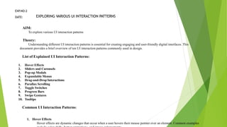
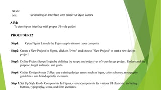
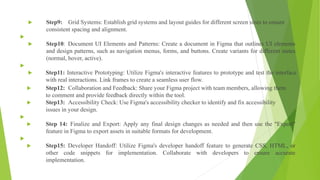
AIM:
To explore various UI interaction patterns
Theory:
Understanding different UI interaction patterns is essential for creating engaging and user-friendly digital interfaces. This document provides a brief overview of ten UI interaction patterns commonly used in design.
List of Explained UI Interaction Patterns:
1.Hover Effects
2.Sliders and Carousels
3.Pop-up Modals
4.Expandable Menus
5.Drag-and-Drop Interactions
6.Parallax Scrolling
7.Toggle Switches
8.Progress Bars
9.Swipe Gestures
10.Tooltips
Common UI Interaction Patterns:
1.Hover Effects
Hover effects are dynamic changes that occur when a user hovers their mouse pointer over an element. Common examples include color shifts, button animations, and image enlargements.
2.Sliders and Carousels
Sliders and carousels allow multiple pieces of content to occupy a single screen space, which users can navigate through by swiping or clicking arrows. They are useful for showcasing multiple images or content pieces without cluttering the interface.
3.Pop-up Modals
Pop-up modals are overlay windows that display additional content or actions. They often appear when triggered by a button or link, providing focused user interactions without leaving the current context.
4.Expandable Menus
Expandable menus, such as accordions or collapsible panels, reveal hidden content or options when clicked. They are effective for organizing and presenting information in a compact format.
5.Drag-and-Drop Interactions
Drag-and-drop interactions enable users to move elements within a digital interface. These interactions are often used for reordering items, organizing content, or customizing layouts.
6.Parallax Scrolling
Parallax scrolling creates a 3D effect by moving background elements at different speeds as users scroll. It's often used for storytelling or adding depth to web pages.
7.Toggle Switches
Toggle switches allow users to turn features on or off with a simple toggle. They are common in settings, preferences, and filtering options.
8.Progress Bars
Progress bars display the completion status of a task, providing visual feedback to users. They are commonly used in forms, file uploads, and loading screens.
9.Swipe Gestures
Swipe gestures involve horizontal or vertical finger movements on touch screens. They are used for navigation, image galleries, and content browsing.
10.Tooltips
Tooltips provide supplementary information when users hover or tap on an element. They are useful for explaining functions, features, or abbreviations in a concise manner.
Conclusion:
This theoretical overview highlights the key characteristics and use cases of ten common UI interaction patterns. Understanding these patterns is crucial for designing user-centric and effective digital interfaces.
Developing an interface with proper UI Style Guides
AIM:
To develop an interface with proper UI style guides
PROCEDURE:
Step1: Open Figma Launch the Figma application on your computer.
Step2: Create a New Project In Figma,
2. CCS370 UI AND UX DESIGN
LAB MANUAL
S.NO. EXPERIMENTS
PAGE NO
DATE SIGNATURE
1. Designing a Responsive layout for an societal application.
Æ. Exploring various UI Interaction Patterns
3.
Developing an interface with proper UI Style Guides
4.
Developing Wireflow diagram for application using open source software
5.
Exploring various open source collaborative interface Platform
6.
Hands on Design Thinking Process for a new product
7.
Brainstorming feature for proposed product
8.
Defining the Look and Feel of the new Project
9.
Create a Sample Pattern Library for that product (Mood board, Fonts, Colors
based on UI principles)
3. 10. Identify a customer problem to solve
11.
Conduct end-to-end user research - User
research, creating personas, Ideation
process (User stories, Scenarios), Flow
diagrams, Flow
12.
Sketch, design with popular tool and build
a prototype and perform usability testing
and identify improvements
4. EXP
.NO:1
DESIGNING A RESPONSIVE LAYOUT FOR AN SOCIETAL APPLICATION
DATE:
AIM:
To design a responsive layout for an societal application
Procedure:
Step 1: Design Guidelines in Figma Create a design system file with color styles, text styles, and components.
Step 2: Breakpoint Artboards in Figma Use the "Artboard" tool to create artboards for each breakpoint.
Step 3: Wireframing in Figma Use the "Pen" or "Shape" tools to draw wireframes within each artboard.
Step 4: Content and Elements in Figma Add text, images, buttons, and forms within the wireframes.
Step 5: Responsive Design in Figma Set constraints for each element to determine how they adapt to different
screen sizes. Use "Auto Layout" to maintain flexibility.
Step 6: Components and Styles in Figma Create components by selecting elements and converting them into
components. Apply shared styles for text, colors, and typography.
Step 7: Interactions and Animations in Figma Use the "Prototype" tab to define interactions and animations.
Link frames to create a seamless user flow.
5. Step 8: Feedback and Collaboration in Figma Share your Figma project
with team members, allowing them to comment and provide feedback
directly in the tool.
Step 9: Accessibility in Figma Use the accessibility checker to identify
and fix accessibility issues in your design.
Step 10: Finalize and Export in Figma Apply final design changes as
needed and then use the "Export" feature to export assets in suitable
formats for development.
6.
7. EXP
.NO:2
EXPLORING VARIOUS UI INTERACTION PATTERNS
DATE:
AIM:
To explore various UI interaction patterns
Theory:
Understanding different UI interaction patterns is essential for creating engaging and user-friendly digital interfaces. This
document provides a brief overview of ten UI interaction patterns commonly used in design.
List of Explained UI Interaction Patterns:
1. Hover Effects
2. Sliders and Carousels
3. Pop-up Modals
4. Expandable Menus
5. Drag-and-Drop Interactions
6. Parallax Scrolling
7. Toggle Switches
8. Progress Bars
9. Swipe Gestures
10. Tooltips
Common UI Interaction Patterns:
1. Hover Effects
Hover effects are dynamic changes that occur when a user hovers their mouse pointer over an element. Common examples
8. 1. Sliders and Carousels
Sliders and carousels allow multiple pieces of content to occupy a single screen space, which users can navigate through by
swiping or clicking arrows. They are useful for showcasing multiple images or content pieces without cluttering the interface.
1. Pop-up Modals
Pop-up modals are overlay windows that display additional content or actions. They often appear when triggered by a button or link,
providing focused user interactions without leaving the current context.
1. Expandable Menus
Expandable menus, such as accordions or collapsible panels, reveal hidden content or options when clicked. They are effective for
organizing and presenting information in a compact format.
1. Drag-and-Drop Interactions
Drag-and-drop interactions enable users to move elements within a digital interface. These interactions are often used for reordering
items, organizing content, or customizing layouts.
1. Parallax Scrolling
Parallax scrolling creates a 3D effect by moving background elements at different speeds as users scroll. It's often used for
storytelling or adding depth to web pages.
1. Toggle Switches
Toggle switches allow users to turn features on or off with a simple toggle. They are common in settings, preferences, and
filtering options.
1. Progress Bars
Progress bars display the completion status of a task, providing visual feedback to users. They are commonly used in forms, file
uploads, and loading screens.
1. Swipe Gestures
Swipe gestures involve horizontal or vertical finger movements on touch screens. They are used for navigation, image galleries,
and content browsing.
1. Tooltips
Tooltips provide supplementary information when users hover or tap on an element. They are useful for explaining functions,
features, or abbreviations in a concise manner.
9. EXP
.NO:3
Developing an interface with proper UI Style Guides
DATE:
AIM:
To develop an interface with proper UI style guides
PROCEDURE:
Step1: Open Figma Launch the Figma application on your computer.
Step2: Create a New Project In Figma, click on "New" and choose "New Project" to start a new design
project.
Step3: Define Project Scope Begin by defining the scope and objectives of your design project. Understand the
purpose, target audience, and goals.
Step4: Gather Design Assets Collect any existing design assets such as logos, color schemes, typography
guidelines, and brand-specific elements.
Step 5:Set Up Style Guide Components In Figma, create components for various UI elements, including
buttons, typography, icons, and form elements.
10. Step9: Grid Systems: Establish grid systems and layout guides for different screen sizes to ensure
consistent spacing and alignment.
Step10: Document UI Elements and Patterns: Create a document in Figma that outlines UI elements
and design patterns, such as navigation menus, forms, and buttons. Create variants for different states
(normal, hover, active).
Step11: Interactive Prototyping: Utilize Figma's interactive features to prototype and test the interface
with real interactions. Link frames to create a seamless user flow.
Step12: Collaboration and Feedback: Share your Figma project with team members, allowing them
to comment and provide feedback directly within the tool.
Step13: Accessibility Check: Use Figma's accessibility checker to identify and fix accessibility
issues in your design.
Step 14: Finalize and Export: Apply any final design changes as needed and then use the "Export"
feature in Figma to export assets in suitable formats for development.
Step15: Developer Handoff: Utilize Figma's developer handoff feature to generate CSS, HTML, or
other code snippets for implementation. Collaborate with developers to ensure accurate
implementation.
12. EXP
.NO:4
Developing Wireflow diagram for application using open source software
DATE:
AIM:
To develop a Wireflow diagram for application using Figma
PROCEDURE:
Step 1: Open Figma: Launch the Figma application on your computer.
Step 2: Create a New Figma File: In Figma, click on "New" and choose "New File" to start a new project specifically
for your wireflow diagram.
Step 3: Define the Application's User Flow: Begin by understanding the user flow of your application. Identify key
screens and interactions that users will experience.
Step 4: Create Artboards for Screens: In your Figma file, create individual artboards for each screen of the
application. Artboards represent the visual interface of your app.
Step 5: Design Screen Elements: Within each artboard, design and arrange the user interface elements, including
buttons, text, images, and other components.
Maintain a consistent design throughout.
13. Step 6: Linking Screens: Use Figma's interactive features to link screens together. Define interactions, such as
tapping a button to navigate to another screen.
Step 7: Create Arrows for Navigation: On your artboards, use Figma's line tool to draw arrows or lines
that represent the flow of navigation between screens.
Step 8: Add Descriptive Text: Include text labels to describe the purpose of each screen and interaction.
This helps in clarifying the wireflow for viewers.
Step 9: Organize the Flow: Arrange the artboards and arrows in a logical sequence to represent the intended
user flow through the application.
Step 10: Test Interactions: Use Figma's prototype mode to test the interactions and ensure that the wireflow
accurately represents the user journey.
Step 11: Collaboration and Feedback: Share your wireflow diagram with team members and stakeholders.
Allow them to provide feedback and comments directly within Figma.
Step 12: Refine and Update: Based on feedback, refine and update the wireflow diagram as needed.
Ensure that it accurately reflects the application's user flow.
Step 13: Export or Share: Once the wireflow diagram is finalized, you can export it in various formats or
share it with relevant team members for implementation.
15. EXP
.NO:5
Exploring various open source collaborative interface Platform
DATE:
AIM:
To explore various open source collaborative interface Platform
Theory:
Exploring various open-source collaborative interface platforms is essential for designing user-
friendly and efficient digital interfaces. This document offers an overview of different open-source
platforms to facilitate UI/UX design collaboration.
List of Explored Open Source Collaborative Interface Platforms:
1. Figma Community
2. GitHub
3. GitLab
4. InVision Freehand
5. Adobe XD (Starter Plan)
6. Miro (Free Plan)
7. Sketch for Teams (Beta)
8. Gravit Designer
9. Vectr 10.Penpot
16. 1. Figma Community Figma Community offers real-time collaboration, version history
tracking, commenting, and prototyping capabilities. It provides access to a vast library
of community-created design resources.
1. GitHub GitHub, known for version control with Git, offers collaboration via
repositories, issue tracking, project management, and extensive integration options. It
is a platform used by developers and designers alike.
1. GitLab GitLab is an end-to-end DevOps platform that features repository
management, continuous integration and deployment (CI/CD), and collaboration tools.
It serves as a comprehensive tool for software development and design.
17. 1. InVision Freehand InVision Freehand is an online whiteboard for collaboration, allowing real-time sketching,
ideation, and integration with InVision's design tools. It supports commenting and feedback, focusing on design
collaboration and prototyping.
1. Adobe XD (Starter Plan) Adobe XD is a vector-based design tool with shared cloud documents, co-editing
with collaborators, prototyping, and animation features. It integrates seamlessly with other Adobe products.
1. Miro (Free Plan) Miro is an online collaborative whiteboard for visual brainstorming and ideation. It
supports real-time collaboration, integrations with design and project management tools, and is ideal for
brainstorming and visual collaboration.
1. Sketch for Teams (Beta) Sketch for Teams is a vector-based design tool with shared cloud documents,
collaboration features with team members, and support for third-party plugins and integrations. It is designed
for design collaboration and system design.
1. Gravit Designer Gravit Designer is a cross-platform vector design tool with real- time collaboration, multi-
user editing, and sharing capabilities. It offers cloud storage for design files and is suitable for vector design
collaboration.
1. Vectr Vectr is a web-based vector graphics editor with real-time collaboration, shareable design projects,
simplicity, and ease of use. It is a beginner-friendly option for design collaboration.
1. Penpot Penpot is an open-source design and prototyping platform featuring real-time collaboration, version
control, a vector-based design tool, and a user-centric interface. It is ideal for design system collaboration.
18. EXP
.NO:6
Hands on Design Thinking Process for a new product
DATE:
AIM:
To explore various Hands On Design Thinking process stages for a new product
Theory:
The hands-on design thinking process is a vital approach for creating user- centered websites and web applications. This document provides
an overview of the key stages and methods involved in designing a new website or web app.
1. Empathize
In this stage, empathize with the potential users of the website or web app. Conduct user interviews, surveys, and observations to gain a
deep understanding of their needs, preferences, and pain points. Create user personas to represent different user segments.
1. Define
Based on the insights gathered during the empathy stage, define the core problem you aim to solve with your website or web app. Craft a
clear problem statement that serves as a guiding beacon throughout the design process.
1. Ideate
Foster creativity and brainstorm potential solutions to the defined problem. Gather your design team and employ techniques like
brainstorming sessions, mind mapping, and sketching to generate a wide range of design concepts and ideas.
1. Prototype
Create tangible representations of your design ideas through prototyping. Develop low-fidelity wireframes, interactive mockups, or
clickable prototypes using design tools such as Figma or Adobe XD. Focus on quick, iterative design iterations.
1. Test
Gather valuable user feedback by conducting usability testing with the prototypes. Observe how users interact with your website or web
app concept and collect insights into their preferences and behaviors. Iterate on the design based on user reactions and identified needs.
19. EXP
.NO:7
Brainstorming feature for proposed product
DATE:
AIM:
To understand what brainstorming is and to come up with features for the proposed product that we are going to be designing.
THEORY:
Introduction:
The success of a website depends on the quality and relevance of its features. Brainstorming is a crucial step in identifying the
features that will make your website innovative and user-friendly. This document outlines the process of brainstorming features
for your website design.
1. Define Project Goals and Audience:
Clearly define the goals and objectives of your website. Identify your target audience and their needs, problems, and
preferences.
1. Assemble a Diverse Team:
Gather a diverse team that includes stakeholders from different departments and backgrounds. This diversity can bring fresh
perspectives and ideas to the brainstorming process.
1. User Personas:
Create user personas to represent your target audience. Understand your users' needs and pain points to brainstorm features
that cater to their specific requirements.
1. Brainstorming Features:
Hold brainstorming sessions with your team. Encourage open and creative thinking. Focus on generating a wide range of
feature ideas. Here are some sample features that could be added to your website design:
User Registration and Profiles:Allow users to create accounts and manage their profiles.
20. Search Functionality: Implement a robust search feature for easy content discovery.
Responsive Design: Ensure that the website is accessible and functional on various devices.
Navigation Menus: Create intuitive navigation menus for easy user movement.
Content Management System (CMS): Enable content creation, editing, and publishing.
Feedback and Contact Forms: Provide options for users to share feedback and contact the website owner.
Social Media Integration: Incorporate social sharing and linking for wider exposure.
E-commerce Features: If applicable, add features like product listings, shopping carts, and secure payment
processing.
Blog or News Section: Share relevant and engaging content to keep users informed.
User Reviews and Ratings: Allow users to rate and review products or services.
Notification System: Implement alerts or notifications for user engagement.
Analytics and Reporting: Include tools for tracking website performance and user behavior.
Chat or Support Feature: Offer real-time support or chat options for user inquiries.
21. 1. Prioritize Features:
After generating a list of potential features, prioritize them based on their alignment
with project goals, potential impact on user experience, and feasibility within your
project's scope and resources.
1. FeasibilityAssessment:
Assess the technical, financial, and resource feasibility of each feature.
1. Prototyping and Testing:
Create low-fidelity prototypes or mockups with selected features. Conduct user testing to
gather feedback and refine the feature list.
1. Iteration:
Based on user feedback, iterate on the website's feature set. Adjust, enhance, or eliminate
features as needed to improve the user experience.
22. EXP
.NO:8
Defining the Look and Feel of the new Project
DATE:
AIM:
To define the look and feel of a project
PROCEEDURE:
STEP 1 : Emphasize the importance of a user friendly UIUX design. Set clear expectations for the lab's
outcome. Highlight the impact of good design on user engagement and satisfaction.
STEP 2: Clearly define the project's objectives and goals. Specify the target audience and their
characteristics. Identify any specific requirements or constraints (e.g., branding guidelines, platform
limitations).
.
23. STEP 3: Study competitors and industry leaders for design inspiration. Conduct user
surveys or interviews to understand preferences and pain points. Analyze user behavior
on similar platforms or products to inform design decisions.
STEP4 : Include a variety of visual elements (images, icons, patterns) to explore
different design directions. Ensure that the mood board reflects the project's intended
tone, style, and emotion. Experiment with different color palettes and typography
options to find a cohesive look.
STEP 5:
Focus on creating clear, intuitive layouts that prioritize functionality. Avoid incorporating specific design
elements; concentrate on structure and navigation. Seek input from team members to refine wireframes
for optimal usability.
24. STEP 6: Apply feedback from stakeholders to refine and enhance the highfidelity mockups. Pay
attention to details such as spacing, alignment, and consistency. Ensure that the design aligns with
the project's overall vision and goals.
STEP 7:
Create interactive prototypes that simulate real user interactions. Test and refine the prototypes to
ensure seamless navigation and functionality Use animations and transitions to provide a realistic
user experience.
STEP 8: Select a diverse group of users to gather a range of perspectives. Ask specific questions
about usability, navigation, and overall experience. Use user feedback to identify areas for
improvement in the UIUX design.
STEP 9: Include a clear rationale for design choices, explaining how they support the project's
goals. Create a comprehensive style guide with specific details on colors, typography, and UI
elements. Provide organized access to wireframes, mockups, and prototypes for future reference.
25. STEP 10: Use visuals and clear explanations to effectively communicate design choices.
Highlight how the design aligns with the project's objectives and target audience. Invite questions
and feedback from stakeholders for further refinement.
STEP 11: Prioritize feedback based on its impact on user experience and project goals.
Collaborate with team members to implement necessary revisions efficiently. Conduct additional
testing if major design changes are made to ensure optimal usability.
26. EXP
.NO:9
Create a Sample Pattern Library for that product
DATE:
AIM:
To create a sample pattern library for the product that we are going to build
PROCEDURE:
STEP 1: Establish a cohesive design foundation through a pattern library.
Emphasize the importance of consistent design elements.
STEP 2: Purpose: Set visual direction with images, color schemes, typography, and UI elements. Use digital tools for compilation.
Ensure alignment with project goals and target audience.
STEP 3: Importance: Fonts impact readability and visual consistency. Research and choose fonts that match the
project's tone and style. Consider legibility across different screens and devices.
STEP 4: Significance: Colors convey emotions and establish visual hierarchy. Generate primary and secondary colors
for accessibility and contrast. Ensure a balanced and harmonious palette.
STEP 5: Provide usage guidelines for headings, body text, and special cases (e.g., buttons, labels). Specify font sizes,
weights, and styles for different UI elements. Maintain consistency in font choices.
27. STEP 6: Define styles for common UI elements (e.g., buttons,
forms, icons). Ensure consistency in appearance and behavior across
the project. Specify states like hover, active, and disabled.
STEP 7:Stress the importance of designing for accessibility for inclusivity.
Provide guidelines for text legibility and color contrast. Ensure
compliance with accessibility standards (e.g., WCAG).
OUTPUT:
28. EXP
.NO:10
Identify a customer problem to solve
DATE:
AIM:
To identify a customer problem to solve and come up with solutions for the said
problem
THEORY:
Introduction:
Understanding and addressing customer problems is a critical aspect of business success. This document
outlines a systematic approach for identifying customer problems and crafting tailored solutions.
1. Customer Research:
Customer research is the foundation of identifying problems. Start with surveys and interviews to
directly engage with your target audience.
Analyzing customer data, feedback, and behavior patterns can also provide valuable insights into their
pain points. Additionally, studying your competitors can reveal common industry issues. Conduct
market research to understand market trends and customer preferences.
1. Problem Definition:
Once you have gathered data, prioritize the problems based on their impact on customers and your
business. Create clear and concise problem statements to articulate the challenges your customers face.
These statements serve as the foundation for developing solutions that directly address these issues.
Ensure that problem definitions are aligned with your business goals.
29. 1. Solution Ideation:
Brainstorming is a crucial step in generating innovative solutions. Collaborate with a diverse team,
including individuals from various departments and backgrounds. They can provide fresh perspectives
and creative ideas. Techniques such as mind mapping, ideation sessions, or design thinking workshops
can help in generating a wide range of potential solutions.
1. Prototype and Testing:
To develop effective solutions, create prototypes or minimum viable products (MVPs) that represent your
ideas. Testing these prototypes with actual users is essential to gather feedback and validate the proposed
solutions. Iteration based on user feedback is key to refining and improving your solutions to ensure they
effectively address the identified problems.
1. Implementation:
Once you have refined and validated your solutions, move forward with development and
implementation. Collaborate with your team to ensure a smooth transition. During the implementation
phase, it's crucial to monitor the performance and user satisfaction of your solutions. Be prepared to make
adjustments and improvements as needed.
1. Customer Feedback Loop:
Establishing channels for ongoing customer feedback is vital. This can include feedback forms, surveys,
customer support interactions, and social media. Create an iterative feedback loop where customer
insights drive continuous improvements. Responding to feedback promptly and making necessary
changes helps maintain strong customer relationships.
30. Additional Methods for Identifying and Solving Customer Problems:
Social Listening: Monitor social media channels and online forums to gain real-time
insights into customer sentiments, concerns, and pain points.
Customer Journey Mapping: Visualize the customer journey to identify touchpoints
where problems may arise and opportunities for improvement.
User Testing and User Experience (UX) Research: Observe how users interact with your
products to uncover usability and design issues.
A/B Testing: Experiment with different solutions to identify which ones work best
through data-driven testing.
Customer Support and Service Data: Analyze customer support interactions and
service data to identify recurring issues and areas for improvement.
Innovation Workshops: Organize workshops or brainstorming sessions with cross-
functional teams to explore creative solutions.
31. EXP
.NO:11
Conduct end-to-end user research - User
research, creating personas, Ideation process, Flow diagrams, Flow Mapping
DATE:
AIM:
To Conduct end-to-end user research - User research, creating personas, Ideation process, Flow diagrams,
Flow Mapping
PROCEDURE:
STEP 1: Goal: Gather comprehensive insights about end users and ideate based on those insights.
Emphasize user centric design approach.
STEP 2: Methods: Use surveys, interviews, analytics to understand user needs and preferences.
Focus on gathering data about user behaviors, pain points, and goals.
32. STEP 3: Purpose: Create fictional representations of different user types for
reference. Include demographics, behaviors, goals, and pain points to make personas
relatable.
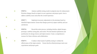
STEP 4: Importance: Ideation is key to designing usercentric solutions.
Start with user stories and scenarios to define specific user tasks.
STEP 5: Format: "As a [type of user], I want to [perform an action] so that [achieve a
goal]." Define specific user tasks within the project.
STEP 6: Provide detailed contexts for user stories to help visualize the user's
journey. Describe the context, actions, and expected outcomes.
33. STEP 7: Visualize user flows using flowcharting tools or software.
Map out the sequence of steps a user takes to accomplish tasks.
STEP 8: Create a visual map illustrating the entire user journey.
Include decision points, interactions, and touchpoints with the
project.
STEP 9: Compile all research data, personas, user stories,
scenarios, flow diagrams, and flow mapping. Provide explanations
and justifications based on user insights.
STEP 10:Share documentation for team and stakeholder review.
Gather feedback on user research findings and ideation process.
34.
35.
36. EXP
.NO:12
Sketch, design with popular tool and build a prototype and perform usability testing and
identify improvements
DATE:
AIM:
To Sketch, design with popular tool and build a prototype and perform usability testing and identify
improvements
PROCEDURE:
STEP 1: Goal: Progress from initial sketches to a refined prototype through a structured design
process. Emphasize the importance of
user centered design.
STEP 2: Initial phase: Start with rough sketches on paper to visualize layout and navigation.
Focus on basic elements before transitioning to digital design.
STEP 3: Translate sketches to digital designs using a design tool like Adobe XD or Figma.
Incorporate specific design elements, color schemes, and typography for a polished look.
37. STEP 4: Create an interactive prototype with the chosen design tool to simulate
user interactions. Ensure smooth transitions and functionality for an accurate
representation.
STEP 5: Prepare a usability testing plan with tasks for participants (or
selftesting).Record observations and gather feedback on usability and user experience.
Focus on identifying pain points and areas for improvement.
38. STEP 6: Analyze usability testing results to pinpoint areas for enhancement.
Prioritize changes based on impact on user experience and project goals. Aim to
address usability issues and refine the overall experience.
STEP 7: Implement necessary adjustments to the prototype based on
identified improvements. Ensure that changes positively impact usability and user
satisfaction.
STEP 8: Record the entire process, including sketches, digital designs,
prototype, usability testing plan, and results. Provide detailed explanations and
justifications for design choices and improvements. Create a comprehensive
resource for future reference and collaboration.
STEP 9: Conduct a final round of usability testing to validate the
effectiveness of the improvements. Ensure that the refined prototype meets user
expectations and project goals.