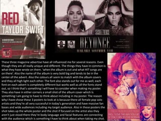
1. These three magazine advertise have all influenced me for several reasons. Even
though they are all really unique and different. The things they have in common is
what they have wrote on them. ‘when the album is out and what HIT songs are
on there’. Also the name of the album is very bold big and tends to be in the
center of the advert. Also the colours all seem to match with the album covers
and they all high light each other. The font also stands out for me as well, each
font on each advert is completely different but works well as all the fonts stand
out, so I think that’s something I will have to consider when making my poster.
They also have in either corners a small shot of the album cover which Is
something I am going to have to think about including in my poster. The reason
why I have chose these 3 posters to look at is because there all female pop solo
artists and they’re all very successful in today’s generation and have massive fan
bases and wide audiences including my target audience. Also in these posters the
shot takes up the whole poster and the shot if focused on the artist also they
aren’t just stood there they’re body language and facial features are connecting
with the audience which is something I have to think about when taking my shot.