FULL ENJOY - 9953040155 Call Girls in Shahdara | Delhi
Student films
1. https://youtu.be/EYfrm0pFCQo?list=PL64VAGrrxA5vlNDV5iVWJ
8dXADMYlD3lj
Escapism opening sequence.
My first impressions of the the video are that its defiantly a
student/indie film because of the lack of typical cinematic
shots you would find in a industry type film. I found the title
sequence to be disengaging because of that absence of
cinematic feel but I understood there intentions. Unfortunately
these ideas of confusion weren't presented in a way that the
viewer could easily engage to the title sequence and feel the
perplexed motion that the character shows on screen.
What I interpreted from these choices of shots
is that they tried to create this sort of disorients
to the viewer. The shots use the same kinesics
from the character, from shot to shot but
obviously this character quickly changes the
environment and as the viewer we cant tell
what is real and what is not.
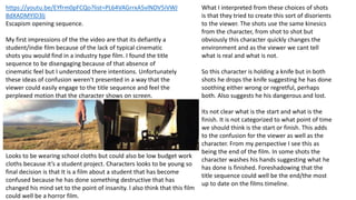
So this character is holding a knife but in both
shots he drops the knife suggesting he has done
soothing either wrong or regretful, perhaps
both. Also suggests he his dangerous and lost.
Its not clear what is the start and what is the
finish. It is not categorized to what point of time
we should think is the start or finish. This adds
to the confusion for the viewer as well as the
character. From my perspective I see this as
being the end of the film. In some shots the
character washes his hands suggesting what he
has done is finished. Foreshadowing that the
title sequence could well be the end/the most
up to date on the films timeline.
Looks to be wearing school cloths but could also be low budget work
cloths because it’s a student project. Characters looks to be young so
final decision is that It is a film about a student that has become
confused because he has done something destructive that has
changed his mind set to the point of insanity. I also think that this film
could well be a horror film.
2. The Edge - AS Level Media Studies Opening Sequence
by Rory Campbellhttps://youtu.be/24nQdBL8M3w
The Edge looks to be a spy type film (cops and robbers) vigilante vs the law. Mostly they use cinematic shots that move with the
frame and try to keep with the kinesics so the visual story is told. Some of the titles don’t do them justice such as the Christian
Campbell credit that is blended in with the wall so whilst its subtle its also hard to notice any given attention.
They use cleverly designed fonts/titles such as The Edge title that stands right out. I
don’t really see the point in it though. It feels to me that they have used this design
to demonstrate there ability to create textual design. I feel that this does does not
benefit the product of the title sequence, making the visual of the title of the film
pointless and non relative to the narrative.
Although they still created shots that
carried out, one from the other, nicely
and in order so it was easy to understand
to the viewer. However, even though
some shots looked grate I feel that they
were left on for to long causing me to
disengage with the title sequence.
Because of this though the information is
quite clear. The character to the left is
clearly on the run from the men in the
suits because he seems to have
something they want.
3. Leah Reid G321 Fondation Productionhttps://youtu.be/sAWv9CkLW_4
Hidden. What am guessing the film is called as its not fully clear
until the end of the film and there is no indication on the
YouTube title. Interesting character choice, drawing me into the
film. Average guy reflecting on life, I didn't’t see the need for a
monologue as it tells to much of the story before the film
would begin. The titling work is nice and subtle. Making sure
the focus is all on this man. Rappid changes in color from
lighter greens to darker grays in the next shot. Subliminal story
telling.
I felt that this title sequence could have been a lot
shorter as I found towards the end that I began to lose
focus witch is the opposite to what you want out of a
title sequence.