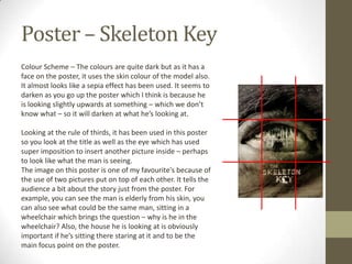
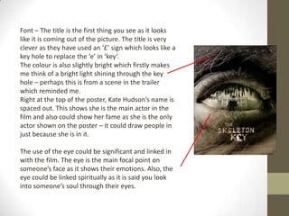
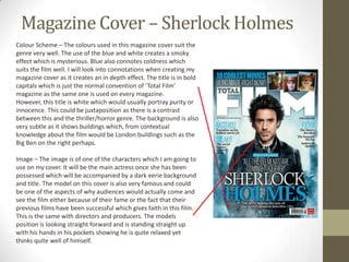
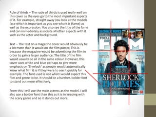
This summarizes a document analyzing trailers and posters for three horror films: The Possession, The Apparition, and The Skeleton Key.
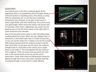
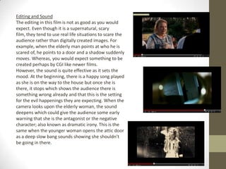
1) It provides a detailed breakdown of key elements in the trailers such as credits, narrative structure, performances, camera work, editing, sound, and release dates.
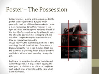
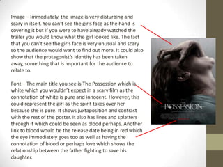
2) It also analyzes the posters for The Possession and The Skeleton Key, examining aspects like color scheme, composition, images, and fonts used.
3) Overall, the document offers a thorough textual analysis of various technical and persuasive elements across the trailers and posters to promote the three horror movies.