
Recommended
More Related Content
What's hot
What's hot (19)
Similar to Contentsprocess
Similar to Contentsprocess (20)
More from Sarah Louise
More from Sarah Louise (8)
Recently uploaded
Recently uploaded (20)
Contentsprocess
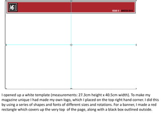
- 1. I opened up a white template (measurements: 27.3cm height x 40.5cm width). To make my magazine unique I had made my own logo, which I placed on the top right hand corner. I did this by using a series of shapes and fonts of different sizes and rotations. For a banner, I made a red rectangle which covers up the very top of the page, along with a black box outlined outside.
- 2. Then I added contents in a bold, suitable font against the red. Below the page I added lines (a house style a chose that runs throughout the magazine, these lines can able be seen on my masthead. To make it appear unique to my magazine, I placed the social media connections in between the lines. Below the banner, I added the features and regulars inside a black rectangle, with a white triangle to allow the readers to navigate.
- 3. Placing my images (which I edited beforehand so that they will all match a similar tone and filter) all over my magazine, I was then able to know where my texts will go. My images are all of my own, which included both outdoor and indoor images for variety.
- 4. Before adding my texts I used the line tool and placed it under the features and regulars section of the contents page. For the images, I added box shapes underneath the image where I will then add my text.
- 5. Here I placed the page numbers and article titles
- 6. My final outcome with article description added. The lines helped separate the description of the article and page numbers/article title in the aim to make it look aesthetically pleasing – which I think I was able to achieve.