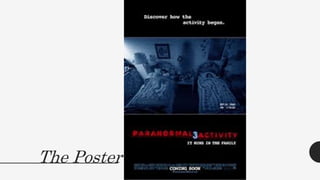
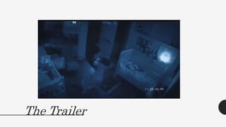
3. • The Paranormal ActivityThree poster shows two children in bed shown through a night vision camera.The camera has a tinge ofblue over the lenses to
empathise the fact this footage is being filmed at night.
• The font reading ‘Discover how the activity began’. Is written in a computer-styled text.This is stereotypically used to show an electronic origin of the font. All of
the movie details are towards the bottom of the poster.The ‘Paranormal Activity’ logo has stayed the same throughout the sequels and stands out most being the
only red thing on the page.
• The font for the logo is blurred and distorted to create the genre of horror through text.The use of the edit of dates on the footage shows that it is footage which
has been filmed, making the footage semen more personal.The fact that the poster is distorted and also dark overall, it makes the audience build tension and
have to concentrate on the poster to gain details.The image is placed in the middle of the poster to make it visually appealing and to also take a still image from
the film.
• The main colours on the poster are black, red, white and blue.This is quite a contrast of colours as the black connotes darkness and mystery in this context, it also
gives a huge indication of danger and links back to the story line.The red connotes danger and blood also, suggesting that it is a violent film.The whit suggests
purity, but only the fonts are pure, suggesting to the audience that nothing else is in the film.The blue finally connotes danger and also gives a sense of water.The
way the picture is underneath a blue edit suggests that the characters in the film are being overwhelmed and drowning due tothe house.
• The fonts look although they have been typed onto the picture using an old typewriter.This makes the film seem more old-fashioned and more believable, as
ghosts were less overlooked a decade ago than they are now.The red font of the title sticks out a lot and is in a sans seriffont.This is to make it seem as serious as
the producers of the poster can make it, but at the still time it standing out and being noticeable.
• It is very basic language, which suggests that the target it more of a middle class than a higher class audience. From knowledge, this film is very popular among
teenagers. So the language being basic can allow a different range of people to actually view the film and be attracted to it, due to the basic language and
welcoming brand identity of the film/poster.
• The image is of a dark bedroom, with two characters inside sleeping. Everything seems very normal and stereotypical at first,but if you look closer, in between
the beds is a shadow of another character.The way you have to glance at the poster more than once to see the images of the third character, makes it more
enticing.There is a blue edit over the top of it to show that it is on camera, but it also gives a significant message thatthe characters in the film are being
enveloped in whatever is in their home and they are actually drowning.
5. The Trailer
• The image is clearly blue and distorted as it is a home footage video.This is much the same as the poster. It follows the home footage theme and also shows a
blue tinge over the camera to make it clear that it is night time.
• The edit of the numbers over the top of the image also relate directly back to the poster.
• The trailer also has low key lighting, even when the night vision effect is over the top of the footage.This makes it clear to convey the horror genre and also
yet again, relates directly back to the poster.
• A woman in shown in the still image holding her baby in the night.This is a very normal image and makes the audience wonder why she is holding her baby
when she is asleep.
• The only thing you focus on in the image is the character which is also very similar to the poster.This makes it apparent that something is about to happen and
builds tension as to why this particular scene is important.
• There isn’t actually much colour in the image apart from blue.There is a very bright light glowing in the picture, which could be the start of the demon coming
through the picture.The crib is white and so is the majority of the other furniture in the baby’s room, this suggests that the baby is the only pure thing about
the house anymore.
• The font on this picture is just the camera details in the bottom of the page.This is the same as the image on the poster, which clearly links the two pieces of
work together.The writing is in white and is just a standard time on a camera.The time is nearly ‘12:00PM’ which is a very cliché time for something bad to
happen at night.
• The language is yet again, just a basic time setting on the camera.There isn’t much other language in the image, the body language of the woman holding the
baby just seems enticed on the baby and not worried about the white glow happening on the wall infront of her.
• The image is very relaxed. It has the blue edit over the top, yet again signifying that something could be drowning the family which is living in the house
among them.The fact that the family have had to put cameras up in their home in the first place already signifys that something is very wrong and disturbed
in this house. Due to the fact they have actually had to obstruct their own privacy in order to just feel safe again.