1. I have chosen to analyse this magazine as it suitably fits in my genre, I plan on
using the main codes and conventions of this magazine to re produce my own
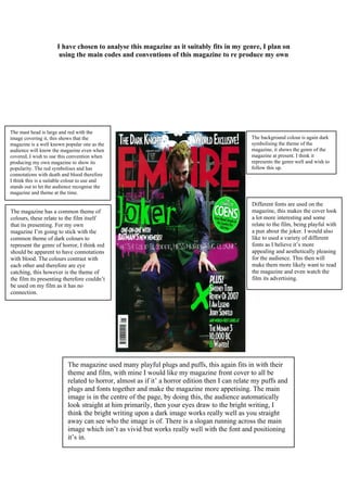
The mast head is large and red with the
image covering it, this shows that the The background colour is again dark
magazine is a well known popular one as the symbolising the theme of the
audience will know the magazine even when magazine, it shows the genre of the
covered, I wish to use this convention when magazine at present. I think it
producing my own magazine to show its represents the genre well and wish to
popularity. The red symbolises and has follow this up.
connotations with death and blood therefore
I think this is a suitable colour to use and
stands out to let the audience recognise the
magazine and theme at the time.
Different fonts are used on the
The magazine has a common theme of magazine, this makes the cover look
colours, these relate to the film itself a lot more interesting and some
that its presenting. For my own relate to the film, being playful with
magazine I’m going to stick with the a pun about the joker. I would also
common theme of dark colours to like to used a variety of different
represent the genre of horror, I think red fonts as I believe it’s more
should be apparent to have connotations appealing and aesthetically pleasing
with blood. The colours contrast with for the audience. This then will
each other and therefore are eye make them more likely want to read
catching, this however is the theme of the magazine and even watch the
the film its presenting therefore couldn’t film its advertising.
be used on my film as it has no
connection.
The magazine used many playful plugs and puffs, this again fits in with their
theme and film, with mine I would like my magazine front cover to all be
related to horror, almost as if it’ a horror edition then I can relate my puffs and
plugs and fonts together and make the magazine more appetising. The main
image is in the centre of the page, by doing this, the audience automatically
look straight at him primarily, then your eyes draw to the bright writing, I
think the bright writing upon a dark image works really well as you straight
away can see who the image is of. There is a slogan running across the main
image which isn’t as vivid but works really well with the font and positioning
it’s in.
2. magazine.
Here you can see the tag line/subheading at the
very top in white, it gives insight to what will
be inside the magazine, whether relating to the
main image or not. It’s in white and therefore
stands out and is attractive to the audience.