
Recommended
Recommended
More Related Content
Viewers also liked
Viewers also liked (14)
Similar to Shocking Youth Road Safety
Similar to Shocking Youth Road Safety (20)
More from rachel_mather
Recently uploaded
Recently uploaded (20)
Shocking Youth Road Safety
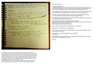
- 1. Issue: Youth Driving Company: Dying to drive An organisation that puts on one day events where they re-enact a car accident scene, with all three emergency services. Includes several workshops about the emergency services and they also show driving adverts that have been banned in the UK. As an organisation what would you want to achieve in terms of communication. What would it be that your company needs to communicate, in order of importance. To reduce the death and serious injury in young drivers on Herefordshires roads. Using shock tactics to make the issue stick in young peoples heads. What single thought would you like to leave the audience thinking or reacting too after seeing the piece of design/communication. Leave them feeling shocked and bring them back to reality Making young people aware of their decisions and choices when it comes to driving or getting in the car with other young drivers Target audience school students age 16-24 What would be the message you would want to say (1 sentence) Dying to drive, your choices, your responsibility Do you have any ideas on how you would choose to portray the message?(in terms of leaflets, posters, adverts) No ideas, but in a graphically impactive way (shocking) Advertising Hypothetically how much would you as an organisation realistically pay just to get an idea of the type of publication to create. No idea The company that I have chosen to design for are Dying to Drive, they offer an educational day/experience where an hour long car crash scene is presented, where all of the emergency services attend. There are then workshops and first aid training included in the day. I chose to do this company as this is something I went on with my school, I felt the issue of road safety, youth driving and the experience stuck in my mind for a long time, yet the company had no advertising or design work. I felt that making them visible was a good place to start. The sketchbook page is where I outline what I think the companies problems are and the document is the questions and answers that I got from my company.
- 3. These are my three ideas, one being quite out there and almost impossible. 1. My first idea was an advertising/information pack that could be sent to schools to get them to sign up their students. 2. Idea two was a key ring that would act as a keepsake from the day where a photograph of each student would be inserted into a car crash scene, this would make the issue more personal to the students. 3. The third idea was a projection/video that people would have to watch on their dashboard every time they turned the key in the ignition as a constant reminder. I chose to do the advertising pack as I think this could be something that they would actually use within their company. This page shows the things that could go in it and the way it could be presented/posted to the schools
- 4. After deciding to do the information pack I started to think about design. I thought I would do the poster first and then base the other publications and content on this design, so that the pack has a uniform appearance. Most of the ideas were typographic. The first being a speedo where the engine lights were the consequences, such as a wheel chair or death, I didn’t think this was shocking enough for my target audience. Another idea was a person lying on the road with a typographic pool of blood next to them and the third idea which was the idea I chose was to have a person remembering someone they’d lost on the roads and shows their thoughts in a typographic thought bubble.
- 5. These pages show my thoughts throughout the project and the reasons why I made the changes I did. It shows why I changed the thought bubble and the reasoning behind how the person was sat and looked.
- 6. These pages show my difficulty with the placement and appearance of the bollard and the trouble i had with making the flowers look clear. The pages also show comments from tutorials and crits with the changes made.