Graphic Design for Social Media
•Download as PPTX, PDF•
0 likes•801 views

Graphic Design for Social Media

Recommended
More Related Content
What's hot
What's hot (20)
Similar to Graphic Design for Social Media
Similar to Graphic Design for Social Media (20)
More from Professor Bauer
More from Professor Bauer (20)
Recently uploaded
Recently uploaded (20)
Graphic Design for Social Media
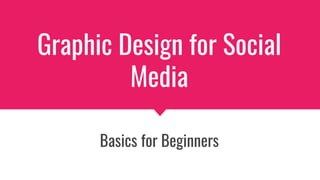
- 1. Graphic Design for Social Media Basics for Beginners
- 2. Simplicity Don’t clutter your design. Simple is better. Don’t write too much info - do your best to communicate through images rather than have your readers scan through lots of text.
- 3. Negative Space The space in your design that's not occupied by any visual or written element. Use negative space to keep your design from getting cluttered.
- 4. Balance Keep your visual elements balanced. Use contrasting colors, different size fonts, graphics, etc.
- 5. Rule of Thirds Imagine a grid that splits the graphic into thirds vertically and horizontally. Place the subject along those grid lines. The intersections of the lines are especially compelling. This works regardless of the size of the frame or the visual medium you are designing in.
- 6. Visual Hierarchy Everyone reads top to bottom and those of us who speak English read left to right. This means our eyes move in a diagonal from the top left to bottom right of an image. Visual Hierarchy is using elements like color and font size to convey the importance of information in a graphic.
- 7. Text
- 8. Serif vs. Sans Serif Serifs are small marks located on the ends of a letter. Serif fonts contain serifs, while Sans Serif fonts do not. Sans serif fonts are best for social media. (Costello, ch. 8)
- 9. Using Color with Fonts Pick a contrasting shade that stands out from the background. Dark type on a light background is generally easier for people to read than light-colored type on a dark background. (Costello, ch. 8)
- 10. Design Tips for Text Limit up to three colors, which should harmonize to each other and with the color of the background and the dominant color(s) of the graphic Limit to two typefaces Limit up to three sizes Avoid underlining (Costello, ch. 8)
- 11. Color
- 12. Complimentary Colors Directly across from each other on the color wheel Make each other appear brighter and more intense
- 13. Analogous Colors Next to each other on the color wheel Create a feeling of harmony
- 14. Warm Colors Build excitement Appear larger than cool colors
- 15. Cool Colors Can be calming Seem to recede