
Recommended
More Related Content
Similar to Graphic Design first class (1).pptx
Similar to Graphic Design first class (1).pptx (20)
Recently uploaded
Recently uploaded (20)
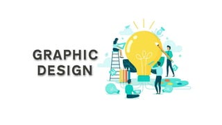
Graphic Design first class (1).pptx
- 2. Graphic Design Intro • Graphic design is the process of visual communication and problem- solving through the use of typography, photography, and illustration. The field is considered a subset of visual communication and communication design. Graphic designers create and combine symbols, images and text to form visual representations of ideas and messages. They use typography, visual arts, and page layout techniques to create visual compositions. Common uses of graphic design include corporate design (logos and branding), editorial design (magazines, newspapers and books), wayfinding or environmental design, advertising, web design, communication design, product packaging, and signage.
- 3. Raster Vs Vector Pixel: In Computer graphics a pixel, dots, or picture element is a physical point in a picture. A pixel is simply the smallest addressable element of a picture represented on a screen. A majority of pictures that we see on our computer screen are raster images. Raster Graphics Raster images use bit maps to store information. This means a large file needs a large bitmap. File extensions: .BMP, .TIF, .GIF, .JPG Bitmap: In computer graphics, a bitmap is a mapping from some domain (for example, a range of integers) to bits, that is, values which are zero or one. Vector Graphics Making use of sequential commands or mathematical statements or programs which place lines or shapes in a 2-D or 3-D environment is referred to as Vector Graphics. Vector graphics are best for printing since it is composed of a series of mathematical curves. File extensions:. SVG, .EPS, .PDF, .AI, .DXF
- 4. Differences between Vector and Raster graphics The main difference between vector and raster graphics is that raster graphics are composed of pixels, while vector graphics are composed of paths. A raster graphic, such as a gif or jpeg, is an array of pixels of various colors, which together form an image.
- 5. RASTER File extensions: .BMP, .TIF, .GIF, .JPG TIF - Tagged Image File Format, abbreviated TIFF or TIF, is a computer file format for storing raster graphics images, popular among graphic artists, the publishing industry, and photographers. BMP – Bitmap GIF - Graphics Interchange Format JPEG - JPG/JPEG is Joint Photographic Experts Group. JPEG is usually known as JPG.
- 6. VECTOR File extensions: .SVG, .PDF, .EPS, .AI SVG - Scalable Vector Graphics (SVG) is an Extensible Markup Language (XML)-based vector image format for two- dimensional graphics with support for interactivity and animation. EPS - EPS is a file extension for a graphics file format used in vector- based images in Adobe Illustrator. EPS stands for Encapsulated PostScript. An EPS file can contain text as well as graphics. PDF - PDF (Portable Document Format) is a file format that has captured all the elements of a printed document as an electronic image that you can view, navigate, print, or forward to someone else. PDF files are created using Adobe Acrobat , Acrobat Capture, or similar products.
- 7. Typography is the art and craft of arranging type. It’s critically important to the work of graphic designer, content writers and marketing professionals. The choices related to the layout, color scheme and typeface will decide the difference between a good and poor design. Typography is consisting of font and color.
- 8. COMMON TYPES OF FONTS
- 9. Serif fonts Serif fonts have little strokes called serifs attached to the main part of the letter. Because of their classic look, they're a good choice for more traditional projects. They're also common in print publications, like magazines and newspapers. Sans serif fonts Sans serif fonts don't have that extra stroke—hence the name, which is French for without serif. This style is considered more clean and modern than serif fonts. Also, it tends to be easier to read on computer screens, including smartphones and tablets. Display fonts Display fonts come in many different styles, like script, blackletter, all caps, and just plain fancy. Because of their decorative nature, display fonts are best for small amounts of text, like titles and headers and more graphic-heavy designs.
- 10. SERIF VS SANS SERIF FONTS
- 11. Choosing a font In a way, fonts have their own language. They all have something to say beyond the words on the page. They can come across as casual or neutral, exotic or graphic. That's why it's important to think about your message, then choose a font that fits. Fonts to avoid Some fonts come with extra baggage, including Comic Sans, Curlz, and Papyrus. There's nothing particularly wrong with these fonts—they just have a certain reputation for being outdated and overused. Fonts Example
- 12. Maybe you've heard terms like kerning, leading, tracking, and hierarchy. For those with more experience, these concepts are essential for creating professional-looking designs. As a beginner, you don't need to know everything about these terms—just enough to inform your work and help you talk about design with more confidence. Other important terms Hierarchy Hierarchy is used to guide the reader's eye to whatever is most important. In other words, it shows them where to begin and where to go next using different levels of emphasis. Establishing hierarchy is simple: Just decide which elements you want the reader to notice first, then make them stand out. High-level items are usually larger, bolder, or different in some way. Remember to keep it simple and stick to just a few complementary styles.
- 13. Leading Leading (rhymes with wedding) is the space between lines of text, also known as line spacing. If you're not sure how much line spacing to use, don't fret—the default is usually fine. The goal is to make your text as comfortable to read as possible. Too much or too little spacing, as in the example below, can make things unpleasant for the reader.
- 14. Kerning Kerning is the space between specific characters. Unlike tracking, it varies over the course of the word because each letter fits together differently. Some fonts have what we call bad kerning, making certain letters look improperly spaced. If a font you're using has bad kerning, it's best to cut your losses and choose something else.
- 15. Putting it all together Well-crafted text can mean the difference between something ordinary and something extraordinary—even if you're just getting started with design. All it takes is an interest in typography and you'll start to notice more, see more, and be able to do more in your own work.
- 16. COLOR Color plays a vital role in design and everyday life. It can draw your eye to an image. Sometimes it can trigger an emotional response. It can even communicate something important without using words at all. So how do we know which colors look good together and which ones don't? The answer is simple: Color theory. Artists and designers have followed color theory for centuries, but anyone can learn more about it. It can help you feel confident in many different situations, whether it's choosing colors for a design or putting together the perfect outfit. With a little insight, you'll be looking at color in a whole new way.
- 17. In color theory, colors are organized on a color wheel and grouped into 3 categories: primary colors, secondary colors and tertiary colors. Color basics
- 18. RGB Stands for "Red Green Blue." RGB refers to three hues of light that can be mixed together to create different colors. Combining red, green, and blue light is the standard method of producing color images on screens, such as TVs, computer monitors, and smartphone screens. CMYK Stands for "Cyan Magenta Yellow Key/Black." These are the four basic colors used for printing color images.
- 19. Color wheel basics WARM COLOR COOL COLOR The color wheel consists of three primary colors (red, yellow, blue), three secondary colors (colors created when primary colors are mixed: green, orange, purple) and six tertiary colors (colors made from primary and secondary colors, such as blue-green or red-violet). Warm colors are generally associated with energy, brightness, and action. Cool colors are often identified with calm, peace, and serenity.
- 20. Choosing the right colors Every color sends a message. It's important to consider the tone of your project, and choose a color palette that fits. For example, bright colors tend to have a fun or modern vibe. Desaturated colors often appear more serious or businesslike. Sometimes it just depends on the context. With practice and creativity, there's no limit to what you can do.
- 21. Avoiding common mistakes There are a few classic dos and don'ts when it comes to color. For instance, have you ever seen colors that seem to vibrate when they're placed next to each other? The solution is to tone it down. Start with one color, and try adjusting its lightness, darkness, or saturation. Sometimes a little contrast is all your color palette needs.
- 22. Readability is an important factor in any design. Your colors should be legible and easy on the eyes, especially when working with text. Sometimes that means NOT using color—at least not in every little detail. Neutral colors like black, white, and gray can help you balance your design, so when you do use color, it really stands out.
- 23. Putting it all together Everywhere you look, there's color, color, and more color. It can be intimidating to use it in your work, but it doesn't have to be. Just keep experimenting, and remember what you've learned about color theory. Soon, choosing great-looking colors will feel like second nature.