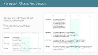
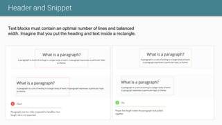
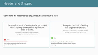
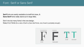
Download to read offline


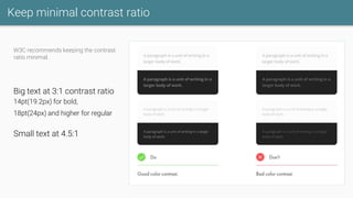
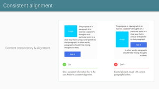
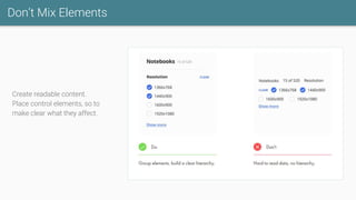
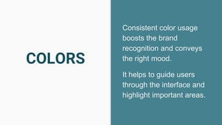
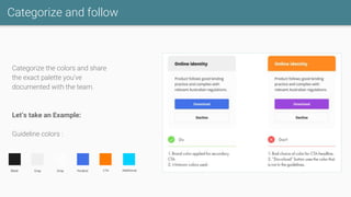
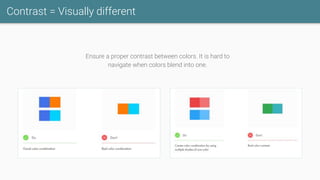
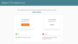
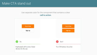


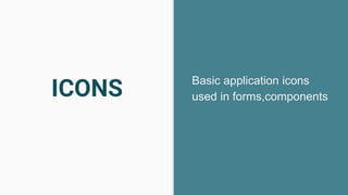
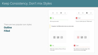
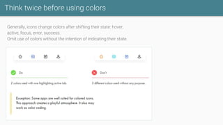
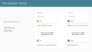

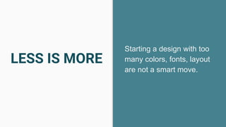
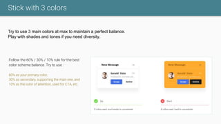
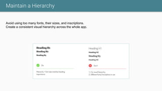


The document outlines UI/UX tips and guidelines focusing on accessibility, color usage, component consistency, and typography for effective design. It emphasizes maintaining a minimal contrast ratio, consistent element alignment, and using a limited color palette to enhance brand recognition and user navigation. Key recommendations include ensuring readable font sizes, simplifying text formatting, and adhering to a consistent visual hierarchy.


![[KubeCon EU 2022] Running containerd and k3s on macOS](https://cdn.slidesharecdn.com/ss_thumbnails/lima-220519142933-3d747f68-thumbnail.jpg?width=640&height=640&fit=bounds)


