The Anatomy of Letters - A Guide to Letter Parts and Typography Terms
•
2 likes•1,049 views

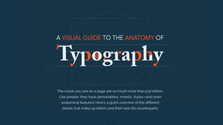
Although you probably know the difference between serif and sans-serif fonts, typography is actually so much more interesting than that. Did you know that letters can be dissected into parts as if they were a puzzle? Like people, fonts have personalities, moods, styles—and even anatomical features! In this Slideshare, we will look at the different parts that make up letters and their real-life counterparts, visualized in the guide below with some fun analogies. Read more at https://visme.co/blog/type-anatomy/#kJ38ofjQg3Coi0hP.99

Recommended
More Related Content
What's hot
What's hot (20)
Similar to The Anatomy of Letters - A Guide to Letter Parts and Typography Terms
Similar to The Anatomy of Letters - A Guide to Letter Parts and Typography Terms (17)
More from Payman Taei
More from Payman Taei (7)
Recently uploaded
Recently uploaded (20)
The Anatomy of Letters - A Guide to Letter Parts and Typography Terms
- 1. The words you see on a page are so much more than just letters. Like people, they have personalities, moods, styles—and even anatomical features! Here's a quick overview of the different details that make up letters and their real-life counterparts.
- 2. Leg Arm A straight or curved portion of a letter that extends upwards or outwards, attached at one end and free at the other A portion of a letter that extends downwards, attached at one end and free at the other.
- 3. Ear The small stroke that extends outwards from a lowercase g in some typeface styles. Shoulder The stroke that curves downwards and to the right of the lowercase h, m and n.
- 4. Tail The decorative curved descender of a capital Q, R and K. The descenders of the lower case g, j, p, q, and y are also sometimes called tails. Spine The spine is the main curved stroke inside the upper and lower case S.
- 5. Other kinds of internal letter parts
- 6. The x-height isn’t exactly a part but rather a measurement. It measures the height of all lowercase letters that are part of the same typeface. It’s called x-height because the letter x of each typeface is what determines the measurement. X-height
- 7. The cap height is a measurement of capital letters. All capital letters in the same typeface have the same cap height. The most accurate measurement is taken from flat-bottomed characters like the letter E. Cap Height
- 8. A stroke is the main vertical diagonal line in a letter. Stroke
- 9. Ascender An ascender is a vertical stroke that extends upwards, over the x-height. Descender A descender is a vertical stroke that extends downwards, below the x- height.
- 10. Swash Bar A bar is a horizontal stroke in letters like A, H, e and f. A swash is a fancy or decorative replacement to a terminal or serif in any capital letter.
- 11. Serif A serif is a short line added at the beginning and the end of strokes. Serifs are what make a typeface a serif or a sans serif. Terminal When a letter doesn’t have a serif, the end of the stroke is called a terminal.
- 12. Bowl A bowl is a stroke that creates an enclosed curved space, like in the letters d, b, o, D and B. Counter The counter is the enclosed space in letters like o, b, d, and a. Counters are also created by bowls.
- 13. Spur A spur is a small projection that veers off the main stroke on many capital Gs. Stem The main vertical stroke in upright characters. The first diagonal in "A" or "V" is also called the stem.
- 14. A link is a stroke connecting the bowl and loop of a two- story, lowercase g. Link A loop is an enclosed counter connected to a letter, most specifically the double-story g. LoopLink Loop