How to visually represent competency: spider graphs & radar plots
•
1 like•1,200 views

More and more education programs are seeking to implement competency-based education. This guide explores the pros and cons of using spider graphs to visualize an individual’s competence.

Recommended
More Related Content
What's hot
What's hot (20)
Similar to How to visually represent competency: spider graphs & radar plots
Similar to How to visually represent competency: spider graphs & radar plots (20)
Recently uploaded
Recently uploaded (20)
How to visually represent competency: spider graphs & radar plots
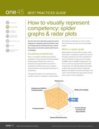
- 1. Medical School Management Software 509 Richards Street, 3rd Floor, Vancouver, BC, V6B 2Z6 | www.one45.com ENCOUNTER LOGS CLERKSHIP LOTTERIES CURRICULUM MANAGEMENT EVALUATIONS SCHEDULES ACCREDITATION REPORTS GRADES BEST PRACTICES GUIDE How to visually represent competency: spider graphs & radar plots As more and more education programs seek to implement competency-based education, they are finding that the fundamental way in which they assess and monitor student performance is changing. Visualizing competencies Since a “competent” professional should be competent in many dimensions, like Knowledge, Professionalism, Patient Care, and so on, the best visual representation of a person’s competence will allow you to see at a glance where that person sits along each dimension of competency. This guide will explore one innovative way to visualize a person’s competence: spider graphs. We will discuss what they are, how to create them, and some pros and cons of using spider graphs. What is a spider graph Spider graphs are also known as spider charts, radar plots, or competency reports. Each axis of the graph represents one of the competencies you are interested in measuring, for example, CanMEDs roles or ACGME competencies. The scale on each axis represents the level of that competency, and it typically follows the Dreyfus model of skill acquisition: Novice, Advanced Beginner, Competent, Proficient, and Expert. The “web” of lines that links the axes shows how the person rates on each competency.
- 2. Medical School Management Software 509 Richards Street, 3rd Floor, Vancouver, BC, V6B 2Z6 | www.one45.com BEST PRACTICES GUIDE ENCOUNTER LOGS CLERKSHIP LOTTERIES CURRICULUM MANAGEMENT EVALUATIONS SCHEDULES ACCREDITATION REPORTS GRADES How to create a spider graph To put a spider graph together, you need to collect assessment data specifically on student competency levels. A common way to do this is by using Likert questions. To use Likert questions to build spider graphs, you need to create questions about particular competencies, and use answer options that correspond to the stages of competency you’re interested in measuring. Once you receive assessment data from these questions, you can plot the values on a spider graph. Benefits of using spider graphs Benefit 1: They provide a very easy way to see if someone is competent or not By overlaying multiple “webs” on a spider graph, you can do visual comparisons against reference data sets very easily. For example, you could compare a student to his peer group by overlaying the average spider graph from the entire class on top of his personal spider graph. Another option is to use a web that is standardized for a particular level of trainee. You could overlay the web for a junior trainee, or a full professional, and see how your student stacks up. Comparing one learner’s spider graph (orange) to a class average (pink) Comparing a junior trainee’s spider graph (dark blue) to a full professional (light blue)
- 3. Medical School Management Software 509 Richards Street, 3rd Floor, Vancouver, BC, V6B 2Z6 | www.one45.com BEST PRACTICES GUIDE ENCOUNTER LOGS CLERKSHIP LOTTERIES CURRICULUM MANAGEMENT EVALUATIONS SCHEDULES ACCREDITATION REPORTS GRADES Benefit 2: They are great input in the development of learning plans Clear deficiencies or strengths in performance are easy to see on spider graphs. When someone is far above or below a standard, you will be able to observe a clear “balloon out” or “cave in” pattern. This makes it easier for time-crunched advisors to find and address issues when they’re working with students. It also makes it easy to identify performers who stand out above the average. These top performers may be able to help others in areas where they are particularly strong. In addition, it may highlight trainees who should move to more advanced levels of training more quickly. Drawbacks of using spider graphs Drawback #1: Subtle issues are hard to see At one45, we see thousands of spider graphs from our clients. The vast majority of graphs look almost the same — they’re round webs of average performance. A clear problem will show itself, but subtle issues are often hidden under the weight of average ratings, rater issues, and the inevitable simplification that occurs when you lump a multifaceted competency such as Professionalism into one general rating. Drawback #2: They’re hard to read for detail Spider graphs are most effective when comparing one person’s performance against a standard or a group’s performance. However, the graph becomes much more confusing once you have more than two webs, or if you have many axes. For that reason, spider graphs should be considered and used judiciously – or not at all. For a more in-depth read on some disadvantages of spider graphs, check out the article “A Critique of Radar Charts” at http://www.scottlogic.com/ blog/2011/09/23/a-critique-of-radar-charts.html Tips and concluding thoughts There are pros and cons to almost any type of report or data visualization. Spider graphs offer an interesting way of looking at competence, and they provide the great advantage of being easy to understand quickly. However, they have some disadvantages, too. If you are interested in generating some spider graphs for your program, start small! Try generating a spider graph by hand and see if it is useful to you or others who are interested in the data. If the exercise proves useful and if you want to move the process forward, consider using technology to speed things up. For example, consider using one45’s reporting tool to generate custom spider graphs for each student. For more information, feel free to contact us at consultation@one45.com. We’d be happy to help.