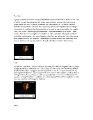
1. The picture -
My shot wasn't taken from my trailer as when I had researched other action thriller trailers such
as Salt for example it was Angelina Jolie posing looking into the camera. I took many many
images during this shoot to get the right image and used one like the Salt poster, the main
character looking into the camera as this has so many connations/denotations of something is
very serious. He could either be after something or he could be scared and fearful. The image is
a mid close up and I used no photoshop editing as I didn't feel it needed to be edited. I made
sure the character was wearing the same clothing as in the trailer so it links together and will
remind the audience where this poster has been taken from and will remind them. I did have a
white background with this image but I felt editing it so the background was black made more
sense as it worked with my colour scheme through out and seemed more domineering.
Font -
The font was taken from a website called 101 free fonts, I use it for my blog titles, other subjects
it's a great website to get fonts to link a certain piece of work such as army style fonts, children
style fonts. I have done a blog post researching on fonts to use. As I have always said with my
genre type the font choices are always extemely basic because of the plot line usually as there is
nothing romantic, funny or happy about it where as a font for a romantic would be swirly old
fashioned writing, like a letter. I used little font with a choice of Arial and Century Gothic as it did
stand out especially in white against the black.
Layout -
2. The layout of my trailer was really important to me as I feel it can tell a lot about a poster. For
example the layout here I have used the image in the middle of the poster so it stands out and
grabs your attention first. With the picture being in the middle it shows that this character could
be seen as dominating and the main charatcer. I used the main characters names at the top
beside him as then it would give the audience something to look at and for example if it was a
big a-list film the audience would then think "oh thats him!" making more people want to see it
because of the actors. The title was really hard for me to decide where to put it, down the side,
at the top... but then as there was nothing going on at the bottom of the picture I decided to put
it there as it stands out as well against everything especially with the black background. I think it
may have looked quite good without the white background on the title but the title it's self was
black and couldn't be changed to white.