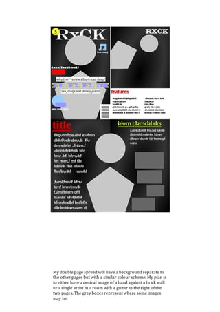
Layout and Drafting 
Magazines such as Kerrang and Q have influenced my plan for my magazine. 
Although the following images show a simple design, I will add details to suit it 
to the results my target audience gave me; for example I will cluster the pages 
to pack content in but without overwhelming the reader. I have taken influence 
from a more sophisticated magazine – Q – on my content page in regards to 
the layout: one section for an image to make it appealing, one section for a list 
of the content in the rest of the magazine. For my double page spread, I will 
place the main image in the centre of the page. This is different from any 
other magazine I ’ve analysed, as they were either one of the two pages or 
only featured on one side. 
As said before, I will be introducing more detail into my pages than what is 
displayed – I have simply created a template that will give me structure and a 
plan so I don’t lose track of my intentions. The skeleton I have created will be 
decorated with different visuals, different colours and different backgrounds 
and different context. The content I use will have been developed to best suit 
my target audience. 
To create my magazine pages, I will use Photoshop. The advantage of using 
Photoshop across all pages is a consistent format can be withheld and all 
capabilities are equal meaning all of the pages have the potential to be 
contained by the House Style. To elaborate on my choice of platform, I am 
familiar enough with Photoshop to perform and produce what is necessary to 
achieve the magazine I want. 
Although the target audience of Q is older than that of mine, I believe the 
combination of its style along with Kerrang’s (who’s target audience is the 
parallel to mine) will produce a magazine of a style not yet on the market. This 
is evident as in my survey showed 82% of people don’t read magazines. My
target audience reaches to 19 year olds of whom most likely are more mature, 
taking influence from Q will help my magazine appeal to them whereas on the 
other hand, keeping my magazine classically clustered I am still interesting 
the 
My front cover will have a central image of a single artist or someone from a 
band. I will position the image over the title ‘RxCK’ as is tradition in many 
magazines. I will display a price sticker-looking icon over the left of the title 
because, on the shelf of shop, this left third will be visible. I will display some of 
the (free) content across the page to compensate for the idea of some areas 
being covered, this way, people can still see what’s on offer. Hugging the 
subtitle of the featured artist’s name will be clues as to what the story is about 
which is clinical for showing what’s inside if the audience is particularly 
interested in the featured artist. I have taken influence from Kerrang’s front 
cover by featuring one artist with several adverts of content inside, also a title 
for the featured artist gives them importance. 
In my content page, I have taken influence from Q’s layout of two designated 
areas. This gives me a chance to include another image both to leave 
breadcrumbs about another article but also to make the page more attractive. 
The formality of the magazine is introduced with the label on the content page. 
younger bracket.
My double page spread will have a background separate to 
the other pages but with a similar colour scheme. My plan is 
to either have a central image of a band against a brick wall 
or a single artist in a room with a guitar to the right of the 
two pages. The grey boxes represent where some images 
may be.

Layout and drafting

  • 1.
    Layout and Drafting Magazines such as Kerrang and Q have influenced my plan for my magazine. Although the following images show a simple design, I will add details to suit it to the results my target audience gave me; for example I will cluster the pages to pack content in but without overwhelming the reader. I have taken influence from a more sophisticated magazine – Q – on my content page in regards to the layout: one section for an image to make it appealing, one section for a list of the content in the rest of the magazine. For my double page spread, I will place the main image in the centre of the page. This is different from any other magazine I ’ve analysed, as they were either one of the two pages or only featured on one side. As said before, I will be introducing more detail into my pages than what is displayed – I have simply created a template that will give me structure and a plan so I don’t lose track of my intentions. The skeleton I have created will be decorated with different visuals, different colours and different backgrounds and different context. The content I use will have been developed to best suit my target audience. To create my magazine pages, I will use Photoshop. The advantage of using Photoshop across all pages is a consistent format can be withheld and all capabilities are equal meaning all of the pages have the potential to be contained by the House Style. To elaborate on my choice of platform, I am familiar enough with Photoshop to perform and produce what is necessary to achieve the magazine I want. Although the target audience of Q is older than that of mine, I believe the combination of its style along with Kerrang’s (who’s target audience is the parallel to mine) will produce a magazine of a style not yet on the market. This is evident as in my survey showed 82% of people don’t read magazines. My
  • 2.
    target audience reachesto 19 year olds of whom most likely are more mature, taking influence from Q will help my magazine appeal to them whereas on the other hand, keeping my magazine classically clustered I am still interesting the My front cover will have a central image of a single artist or someone from a band. I will position the image over the title ‘RxCK’ as is tradition in many magazines. I will display a price sticker-looking icon over the left of the title because, on the shelf of shop, this left third will be visible. I will display some of the (free) content across the page to compensate for the idea of some areas being covered, this way, people can still see what’s on offer. Hugging the subtitle of the featured artist’s name will be clues as to what the story is about which is clinical for showing what’s inside if the audience is particularly interested in the featured artist. I have taken influence from Kerrang’s front cover by featuring one artist with several adverts of content inside, also a title for the featured artist gives them importance. In my content page, I have taken influence from Q’s layout of two designated areas. This gives me a chance to include another image both to leave breadcrumbs about another article but also to make the page more attractive. The formality of the magazine is introduced with the label on the content page. younger bracket.
  • 3.
    My double pagespread will have a background separate to the other pages but with a similar colour scheme. My plan is to either have a central image of a band against a brick wall or a single artist in a room with a guitar to the right of the two pages. The grey boxes represent where some images may be.