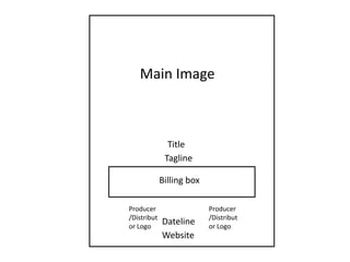
1. Main Image Title Tagline Billing box Producer/Distributor Logo Producer/Distributor Logo Dateline Website
2. I will use this picture on my poster as I feel that it looks very scary considering that the audience would not know who it is, and they would be frightened by the knife. I will use Photoshop to edit the ketchup on the knife to make it more blood-like, and I will also edit the bit where her jeans are showing and make it black. I will use the font “steeltongs” for my billing box as I would like it to look very realistic. This is a main convention in a film poster and I will also centre-align the billing box The tag line will be placed under title and it will be effective with the poster. I will use the same font as the website and date My title haunted will be big on my poster in order to appeal to the audience. I will use the font “rat infested” as this font will make it look creepy by the way the letters are written. This font will be black and bold in contrast to the light background. The approximate size will be “..” depending how it looks on the page and whether it fits across or not. I had another font that I was considering called “Sidewalk” however I tested it and it did not look as good. From researching other film posters, I have found that many include the website at the bottom to keep their audience informed, and this is usually the film titles name . Com. I have written www.haunted.com as my film title and this is very memorable. This text will be size “..” and font “..” I will place this below my date line and will keep this font the same as the dateline font and the tagline. Too many fonts would make my poster look messy and less professional. Haunted Tagline Billing box Producer/Distributor Logo Producer/Distributor Logo I will include logos under my billing box as this looks more professional and I will adjust them so they are the same size. I will have two logos with the “coming soon” in-between. Coming soon www.haunted.com