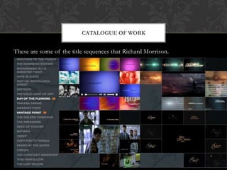
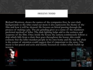
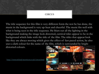
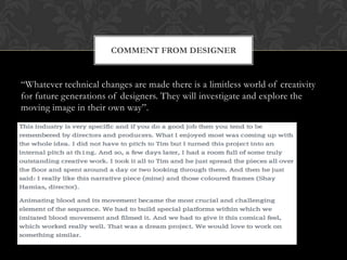
RICHARD MORRISON
By Ben, Michael and Jonathan
BIOGRAPHY

He began his career on the Bond series alongside Maurice Binder. His
career has spanned for 30 years, in this time he has made films like:
Sweeny Todd, Batman, Seed of Chucky, Circus and Day of Flowers. He
was originally drawn to advertisement, so he joined Garland Compton,
then Fowler & Coates and after a successful stint working on film
campaigns he rejoined GSE as Head of Design Department.
In the late 70’s he formed Plume which was a design and production
company for film and TV media, specialising in title sequence; branding
commercials. He has worked on over 150 film title sequences and
worked on film trailers,
CATALOGUE OF WORK

These are some of the title sequences that Richard Morrison.
SWEENY TODD

Richard Morrison, shows the names of the companies first, he uses dark
backgrounds so the titles stand out more it also represents the theme of the
film and how it will be showed. He focuses on blood passing through the
process of making a pie. The pie grinding gives us a sense of the murderers
preferred method of killer. The dark lighting helps add to the eeriness and
suspense of the film. Once inside the house the camera continuously follows a
drip which falls from a chair then goes throughout the house, this could
connote that the killer murders people in his own home and the way the chair
is the center of attention could suggest that it’s important to the story. The
music is fast paced and eerie and mainly focused on violins which builds up
tension.

http://www.richard-morrison.co.uk/sweeney-todd.html
CIRCUS

The title sequence for this film is very different form the rest he has done, the
music in the background is very up-beat and cheerful. The music fits well with
what is being seen in the title sequence. He blurs out all the lighting in the
background making the image look distorted, carnival rides appear to be in the
background which links with the title of the film. The titles that appear look
like they are always moving which gives the effect of fast paced action, he also
uses a dark colour for the name of the film, which is surrounded by bright
distorted colours.

http://www.richard-morrison.co.uk/circus.html
COMMENT FROM DESIGNER

“Whatever technical changes are made there is a limitless world of creativity
for future generations of designers. They will investigate and explore the
moving image in their own way”.

Richard morrison

  • 1.
    RICHARD MORRISON By Ben,Michael and Jonathan
  • 2.
    BIOGRAPHY He began hiscareer on the Bond series alongside Maurice Binder. His career has spanned for 30 years, in this time he has made films like: Sweeny Todd, Batman, Seed of Chucky, Circus and Day of Flowers. He was originally drawn to advertisement, so he joined Garland Compton, then Fowler & Coates and after a successful stint working on film campaigns he rejoined GSE as Head of Design Department. In the late 70’s he formed Plume which was a design and production company for film and TV media, specialising in title sequence; branding commercials. He has worked on over 150 film title sequences and worked on film trailers,
  • 3.
    CATALOGUE OF WORK Theseare some of the title sequences that Richard Morrison.
  • 4.
    SWEENY TODD Richard Morrison,shows the names of the companies first, he uses dark backgrounds so the titles stand out more it also represents the theme of the film and how it will be showed. He focuses on blood passing through the process of making a pie. The pie grinding gives us a sense of the murderers preferred method of killer. The dark lighting helps add to the eeriness and suspense of the film. Once inside the house the camera continuously follows a drip which falls from a chair then goes throughout the house, this could connote that the killer murders people in his own home and the way the chair is the center of attention could suggest that it’s important to the story. The music is fast paced and eerie and mainly focused on violins which builds up tension. http://www.richard-morrison.co.uk/sweeney-todd.html
  • 5.
    CIRCUS The title sequencefor this film is very different form the rest he has done, the music in the background is very up-beat and cheerful. The music fits well with what is being seen in the title sequence. He blurs out all the lighting in the background making the image look distorted, carnival rides appear to be in the background which links with the title of the film. The titles that appear look like they are always moving which gives the effect of fast paced action, he also uses a dark colour for the name of the film, which is surrounded by bright distorted colours. http://www.richard-morrison.co.uk/circus.html
  • 6.
    COMMENT FROM DESIGNER “Whatevertechnical changes are made there is a limitless world of creativity for future generations of designers. They will investigate and explore the moving image in their own way”.