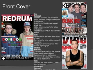
Matty Marshall
In what ways does your media product use, develop
or challenge forms and conventions of real media
products?
Research
They use a simple black and
white colour scheme, although
it isn't colourful it still stands
out effectively as it matches
the tuxedo Rick Ross is
wearing. This reflects the
lifestyle of the artist, rich and
classy, a colourful colour
scheme would not suit the
personality of the rapper.
Rick Ross has been
positioned on one side of
the page and the text on
the other. Not only does it
make the text clearer to
read, it makes him
appear dominate on the
page which is a quality of
Rick Ross and rap of
being the best in the
I think the way a bold drop
capital has been used is
effective as it fits the qualities of
Rick Ross, big and powerful.
Also the introduction paragraph
is a feature which is also very
effective as it gives the reader a
basic idea of what the article is
going to be about. The quote
'You ain't seen nothing yet' has
been used as a short sentence
that grabs the reader's attention
and urges them to see more.
Also the slang 'Ain't' gives the
reader an idea of the artists
idiolect and maybe targets
younger age groups (16+). The
phrase, 'He arrested speakers
nationwide', relates to the rapper
stereotype of violence and
lawlessness, however it subverts
Rick Ross is dressed in a
smart black suit which
presents him as being
someone of power and class.
The way he is casually
holding a champagne glass
and lifting his head high, not
looking towards the camera,
demonstrates his wealth and
masculinity. I think the use of
props, balloons, champagne,
sunglasses, expensive suits
and jewellery reinforces his
dominance in the music
industry and defiantly
portrays the high life that he
lives.
Front Cover
Use
Kerrang!
Used the header of live report and
photo. Separate background for name
of magazine.
Positioning of double page spread
article title.
At the bottom name of other artists
and use of +.
‘World Exclusive Album Report!’ With
banner.
Vibe
Similar font for text going down sides
of page.
Font of text for other articles inside of
magazine.
The posture and seriousness of the
models in photograph.
Develop
Kerrang!
The use of an equal front line however
I used a setting behind them.
I positioned text on top however
developed with vibe and put on bit out
the way of models face.
Vibe
Shape of text down side but I put in
front of the photo.
Challenged
Kerrang!
Contents Page
Use
The Source
Position of the article names on the left.
Red font for the numbering to help it stand
out.
One photo of the artist, image dominated.
The text font used conventional.
The white background on image
Hammer
The title of the page, using the red house
style.
The black background font helps to
separate text from photo, to encourage 3D
effect.
Information for each article under the title.
Develop
The Source
Separated the text from the photo so my
colour scheme could work.
Hammer
The review section at the bottom made it
conventional of hip hop.
Challenged
The road crew section at the top, saw used
in contents page research looked good.
Put artists head over the title, not too far
over still visible but adds 3D effect.
Double Page Spread
Use
The image dominated left side of the page.
The layout of the article.
The white background behind text to make it clear to read.
Develop
The header styled it to fit the artists and magazine.
Writing on image, had to move to make visible on image
due to colouring.
Challenge
Setting in the background, target audience research.
The article 3 columns and use of red because of
interview, fit target audience research.
No J to stick to informal style of my magazine and not
that of Q.
Quote from interview in middle of article, seen used in
other research thought it looked good and effective.
How does your media product represent
particular social groups?
16-25 – Rebellious, Apathetic, Spontaneous,
Fashionable, Realist, Ignorant, Selfish, Aggressive.
How does your media product represent
particular social groups?
I used text to reinforce the stereotype I was portraying about the particular social
group. This allowed me to use lexical choices such as slang, colloquialism, taboo
terms, dysphemisms and swearing to express the personality of the artists/social
group portrayed.
What kind of media institution would distribute
your media product and why?
The distribution company I would use is Harris Publications. They
already distribute XXL and Scratch as well as rock magazines,
Revolver and Guitar World. This means that they have an already
established ability of reaching my target audience.
Harris Publications is an American consumer-magazine publisher,
based in New York City. They already publish over 75 titles covering 9
genres including business, comics, celebrity and lifestyle, sports and
health and of course music.
What kind of media institution would distribute
your media product and why?
Due to the proliferation of
hardware I will advertise to my
audience through the use of
modern technology.
Television has one of the biggest
audiences in the world. Choosing
two of the hottest music channels
to advertise the magazine is
guaranteed to hit a mass
audience.
Social media is getting more and more
popular. Facebook and Twitter having
over 2 billion users between them. Their
advertising/promotion abilities will be a
great way to target a mass audience.
Who would be the audience for your media
product?
Here are 3 members of my target audience:
Name: Ollie
Age: 20
Favourite Artist: Eminem
Name: Jamie
Age: 17
Favourite Artist: A$AP
Rocky
Name: Lewis
Age: 16
Favourite Artist: Kid Cudi
How did you attract/ address your audience?
An interesting story to give an insight into the
lives and personality of the artist.
The page to be image dominated, preferably
in a setting that stands out of the ordinary.
Informal language such as colloquialisms and
slang received with personal pronouns to
create synthetic personalisation, offering the
demographic a chance of diversion and
personal identity.
How did you attract/ address your audience?
Here are 2 videos I made for target audience research when creating my magazine.
Front Cover Rough Cut Logo/Name Feedback
How did you attract/ address your audience?
As you can see I took in all the feedback I was given to
design a magazine suitable for my target audience.
How did you attract/ address your audience?
The language used was conventional
of the genre, it was also similar to
that used of my target audience
creating shared deictic knowledge.
My target audience kept on giving me
feedback on my photography. They
said photos in an interesting setting
would be appealing to them.
How did you attract/ address your audience?
With the help and feedback from my target audience, I
believe I have achieved my aim of creating a professional
and conventional magazine.
What have you learnt about technologies from the
process of constructing this product?
Photography
The manual setting on
the camera allowed me
to change all sorts of
settings such as the
aperture. I was also able
to use the filming option
on the camera when
recoding my target
audience research and
interview.
Zoom
Focus
I used the Canon EOS 1100D to take my photos. I had to be aware of 2 things
when taking photos, the shutter speed and exposure. Getting these spot on
saved me a lot of time later on when I came to Photoshop.
What have you learnt about technologies from the
process of constructing this product?
Rule of Thirds
I used long shots and mid-shots to show off the
setting and clothing of the artists, this is
conventional of hip hop magazines.
What have you learnt about technologies from the
process of constructing this product?
Lighting
What have you learnt about technologies from the
process of constructing this product?
Magnetic lasso tool
Magic wand tool
Spot healing
brush
Healing brush
Red eye tool
Clone stamp
tool
Blur
tool
Smudge
tool
Burn tool
Eraser
What have you learnt about technologies from the
process of constructing this product?
What have you learnt about technologies
from the process of constructing this
product?
What have you learnt about technologies from
the process of constructing this product?
InDesign
Front Cover
Double Page Spread
Contents Page
Looking back at your preliminary task, what do you
feel you have learnt in the progression from it to the
full product?
Looking back at your preliminary task, what do you
feel you have learnt in the progression from it to the
full product?
THE FINAL DESIGN

Matty Marshall Evaluation Presentation

  • 1.
  • 2.
    In what waysdoes your media product use, develop or challenge forms and conventions of real media products? Research They use a simple black and white colour scheme, although it isn't colourful it still stands out effectively as it matches the tuxedo Rick Ross is wearing. This reflects the lifestyle of the artist, rich and classy, a colourful colour scheme would not suit the personality of the rapper. Rick Ross has been positioned on one side of the page and the text on the other. Not only does it make the text clearer to read, it makes him appear dominate on the page which is a quality of Rick Ross and rap of being the best in the I think the way a bold drop capital has been used is effective as it fits the qualities of Rick Ross, big and powerful. Also the introduction paragraph is a feature which is also very effective as it gives the reader a basic idea of what the article is going to be about. The quote 'You ain't seen nothing yet' has been used as a short sentence that grabs the reader's attention and urges them to see more. Also the slang 'Ain't' gives the reader an idea of the artists idiolect and maybe targets younger age groups (16+). The phrase, 'He arrested speakers nationwide', relates to the rapper stereotype of violence and lawlessness, however it subverts Rick Ross is dressed in a smart black suit which presents him as being someone of power and class. The way he is casually holding a champagne glass and lifting his head high, not looking towards the camera, demonstrates his wealth and masculinity. I think the use of props, balloons, champagne, sunglasses, expensive suits and jewellery reinforces his dominance in the music industry and defiantly portrays the high life that he lives.
  • 3.
    Front Cover Use Kerrang! Used theheader of live report and photo. Separate background for name of magazine. Positioning of double page spread article title. At the bottom name of other artists and use of +. ‘World Exclusive Album Report!’ With banner. Vibe Similar font for text going down sides of page. Font of text for other articles inside of magazine. The posture and seriousness of the models in photograph. Develop Kerrang! The use of an equal front line however I used a setting behind them. I positioned text on top however developed with vibe and put on bit out the way of models face. Vibe Shape of text down side but I put in front of the photo. Challenged Kerrang!
  • 4.
    Contents Page Use The Source Positionof the article names on the left. Red font for the numbering to help it stand out. One photo of the artist, image dominated. The text font used conventional. The white background on image Hammer The title of the page, using the red house style. The black background font helps to separate text from photo, to encourage 3D effect. Information for each article under the title. Develop The Source Separated the text from the photo so my colour scheme could work. Hammer The review section at the bottom made it conventional of hip hop. Challenged The road crew section at the top, saw used in contents page research looked good. Put artists head over the title, not too far over still visible but adds 3D effect.
  • 5.
    Double Page Spread Use Theimage dominated left side of the page. The layout of the article. The white background behind text to make it clear to read. Develop The header styled it to fit the artists and magazine. Writing on image, had to move to make visible on image due to colouring. Challenge Setting in the background, target audience research. The article 3 columns and use of red because of interview, fit target audience research. No J to stick to informal style of my magazine and not that of Q. Quote from interview in middle of article, seen used in other research thought it looked good and effective.
  • 6.
    How does yourmedia product represent particular social groups? 16-25 – Rebellious, Apathetic, Spontaneous, Fashionable, Realist, Ignorant, Selfish, Aggressive.
  • 7.
    How does yourmedia product represent particular social groups? I used text to reinforce the stereotype I was portraying about the particular social group. This allowed me to use lexical choices such as slang, colloquialism, taboo terms, dysphemisms and swearing to express the personality of the artists/social group portrayed.
  • 8.
    What kind ofmedia institution would distribute your media product and why? The distribution company I would use is Harris Publications. They already distribute XXL and Scratch as well as rock magazines, Revolver and Guitar World. This means that they have an already established ability of reaching my target audience. Harris Publications is an American consumer-magazine publisher, based in New York City. They already publish over 75 titles covering 9 genres including business, comics, celebrity and lifestyle, sports and health and of course music.
  • 9.
    What kind ofmedia institution would distribute your media product and why? Due to the proliferation of hardware I will advertise to my audience through the use of modern technology. Television has one of the biggest audiences in the world. Choosing two of the hottest music channels to advertise the magazine is guaranteed to hit a mass audience. Social media is getting more and more popular. Facebook and Twitter having over 2 billion users between them. Their advertising/promotion abilities will be a great way to target a mass audience.
  • 10.
    Who would bethe audience for your media product? Here are 3 members of my target audience: Name: Ollie Age: 20 Favourite Artist: Eminem Name: Jamie Age: 17 Favourite Artist: A$AP Rocky Name: Lewis Age: 16 Favourite Artist: Kid Cudi
  • 11.
    How did youattract/ address your audience? An interesting story to give an insight into the lives and personality of the artist. The page to be image dominated, preferably in a setting that stands out of the ordinary. Informal language such as colloquialisms and slang received with personal pronouns to create synthetic personalisation, offering the demographic a chance of diversion and personal identity.
  • 12.
    How did youattract/ address your audience? Here are 2 videos I made for target audience research when creating my magazine. Front Cover Rough Cut Logo/Name Feedback
  • 13.
    How did youattract/ address your audience? As you can see I took in all the feedback I was given to design a magazine suitable for my target audience.
  • 14.
    How did youattract/ address your audience? The language used was conventional of the genre, it was also similar to that used of my target audience creating shared deictic knowledge. My target audience kept on giving me feedback on my photography. They said photos in an interesting setting would be appealing to them.
  • 15.
    How did youattract/ address your audience? With the help and feedback from my target audience, I believe I have achieved my aim of creating a professional and conventional magazine.
  • 16.
    What have youlearnt about technologies from the process of constructing this product? Photography The manual setting on the camera allowed me to change all sorts of settings such as the aperture. I was also able to use the filming option on the camera when recoding my target audience research and interview. Zoom Focus I used the Canon EOS 1100D to take my photos. I had to be aware of 2 things when taking photos, the shutter speed and exposure. Getting these spot on saved me a lot of time later on when I came to Photoshop.
  • 17.
    What have youlearnt about technologies from the process of constructing this product? Rule of Thirds I used long shots and mid-shots to show off the setting and clothing of the artists, this is conventional of hip hop magazines.
  • 18.
    What have youlearnt about technologies from the process of constructing this product? Lighting
  • 19.
    What have youlearnt about technologies from the process of constructing this product? Magnetic lasso tool Magic wand tool Spot healing brush Healing brush Red eye tool Clone stamp tool Blur tool Smudge tool Burn tool Eraser
  • 20.
    What have youlearnt about technologies from the process of constructing this product?
  • 21.
    What have youlearnt about technologies from the process of constructing this product?
  • 22.
    What have youlearnt about technologies from the process of constructing this product? InDesign Front Cover Double Page Spread Contents Page
  • 23.
    Looking back atyour preliminary task, what do you feel you have learnt in the progression from it to the full product?
  • 24.
    Looking back atyour preliminary task, what do you feel you have learnt in the progression from it to the full product?
  • 25.